Engaging and Beautiful Data Visualizations with ggplot2
Working with Text
— Exercise Solutions —
Cédric Scherer // posit::conf // September 2023
Exercise 1
Exercise 1
- Take a look at the following visualization.
- For each group of text labels, note how one would add and modify them.
- How could one automate the placement of the labels in- and outside of the bars?
- Create the visualization, as close as possible.
Preparation
Horizontal Bar Chart
p <-
  bikes |>
  filter(!is.na(weather_type), year == "2015") |>
  mutate(weather_type = forcats::fct_reorder(weather_type, count, .fun = sum)) |>
  ggplot(aes(x = count, y = weather_type)) +
  stat_summary(
    geom = "bar", fun = sum,
    color = "grey20", fill = "beige", width = .7
  ) +
  scale_x_continuous(expand = c(0, 0)) +
  coord_cartesian(clip = "off") +
  theme_minimal(base_size = 14, base_family = "Asap SemiCondensed") +
  theme(
    panel.grid.major.y = element_blank(),
    panel.grid.minor = element_blank()
  )

p
Add Count Annotations

Add Count Annotations

Add Count Annotations

Polish Axes
p +
  stat_summary(
    geom = "text", fun = sum,
    aes(label = after_stat(paste0("  ", sprintf("%2.2f", x / 10^6), "M  ")),
        hjust = after_stat(x) > .5*10^6),
    family = "Asap SemiCondensed"
) +
scale_x_continuous(
expand = c(0, 0), name = "**Reported bike shares**, in millions",
breaks = 0:4*10^6, labels = c("0", paste0(1:4, "M"))
) +
theme(
axis.title.x = ggtext::element_markdown(hjust = 0, face = "italic")
)
Polish Axes Labels
p +
  stat_summary(
    geom = "text", fun = sum,
    aes(label = after_stat(paste0("  ", sprintf("%2.2f", x / 10^6), "M  ")),
        hjust = after_stat(x) > .5*10^6),
    family = "Asap SemiCondensed"
  ) +
  scale_x_continuous(
    expand = c(0, 0), name = "**Reported bike shares**, in millions",
    breaks = 0:4*10^6, labels = c("0", paste0(1:4, "M"))
  ) +
  scale_y_discrete(
    labels = stringr::str_to_sentence, name = NULL
  ) +
  theme(
    axis.title.x = ggtext::element_markdown(hjust = 0, face = "italic"),
    axis.text.y = element_text(color = "black", size = rel(1.2))
  )
Add Titles
p +
  stat_summary(
    geom = "text", fun = sum,
    aes(label = after_stat(paste0("  ", sprintf("%2.2f", x / 10^6), "M  ")),
        hjust = after_stat(x) > .5*10^6),
    family = "Asap SemiCondensed"
  ) +
  scale_x_continuous(
    expand = c(0, 0), name = "**Reported bike shares**, in millions",
    breaks = 0:4*10^6, labels = c("0", paste0(1:4, "M"))
  ) +
  scale_y_discrete(
    labels = stringr::str_to_sentence, name = NULL
  ) +
  labs(
    title = "Fair weather preferred—even in London",
    subtitle = "Less than 10% of TfL bikes shares have been reported on rainy, cloudy, or snowy days in 2015.",
    caption = "**Data:** Transport for London / freemeteo.com"
  ) +
  theme(
    axis.title.x = ggtext::element_markdown(hjust = 0, face = "italic"),
    axis.text.y = element_text(color = "black", size = rel(1.2)),
    plot.title.position = "plot",
    plot.title = element_text(face = "bold"),
    plot.subtitle = element_text(margin = margin(b = 20)),
    plot.caption = ggtext::element_markdown(color = "grey40")
  )
Full Code
bikes |>
  filter(year == "2015") |>
  mutate(weather_type = forcats::fct_reorder(weather_type, count, .fun = sum)) |>
  ggplot(aes(x = count, y = weather_type)) +
  stat_summary(
    geom = "bar", fun = sum,
    color = "grey20", fill = "beige", width = .7
  ) +
  stat_summary(
    geom = "text", fun = sum,
    aes(
      label = after_stat(paste0("  ", sprintf("%2.2f", x / 10^6), "M  ")),
      hjust = after_stat(x) > .5*10^6
    ),
    family = "Asap SemiCondensed"
  ) +
  scale_x_continuous(
    breaks = 0:4*10^6,
    labels = c("0", paste0(1:4, "M")),
    expand = c(0, 0),
    name = "**Reported bike shares**, in millions"
  ) +
  scale_y_discrete(labels = stringr::str_to_sentence, name = NULL) +
  coord_cartesian(clip = "off") +
  labs(
    title = "Fair weather preferred—even in London",
    subtitle = "Less than 10% of TfL bikes shares have been reported on rainy, cloudy, or snowy days in 2015.",
    caption = "**Data:** Transport for London / freemeteo.com"
  ) +
  theme_minimal(base_size = 14, base_family = "Asap SemiCondensed") +
  theme(
    panel.grid.major.y = element_blank(),
    panel.grid.minor = element_blank(),
    axis.title.x = ggtext::element_markdown(hjust = 0, face = "italic"),
    axis.text.y = element_text(color = "black", size = rel(1.2)),
    plot.title = element_text(face = "bold"),
    plot.subtitle = element_text(margin = margin(b = 20)),
    plot.title.position = "plot",
    plot.caption = ggtext::element_markdown(color = "grey40")
  )
Exercise 2
Exercise 2
- Create a function that plots the famous Gapminder chart, highlighting one of the continents.
- Extend the code in
02-text-exercises.qmdto annotate a continent your choice of with {ggforce}. - Turn the code into a function with the utility to annotate any continent.
- Optional: Create a second function to highlight a country. :::
Gapminder Bubble Chart
# install.packages("gapminder")

library(gapminder)
library(dplyr)
library(ggplot2)

gm2007 <- filter(gapminder, year == 2007)

ggplot(gm2007, aes(x = gdpPercap, y = lifeExp)) +
  geom_point(
    aes(size = pop), alpha = .5
  ) +
  scale_x_log10(
    breaks = c(500, 2000, 8000, 32000),
    labels = scales::label_dollar(accuracy = 1)
  ) +
  scale_size(
    range = c(1, 12), name = "Population:",
    breaks = c(10, 100, 1000)*1000000,
    labels = scales::label_comma(scale = 1 / 10^6, suffix = "M")
  ) +
  labs(x = "GDP per capita", y = "Life expectancy") +
  theme_minimal(base_family = "Asap SemiCondensed", base_size = 15) +
  theme(panel.grid.minor = element_blank())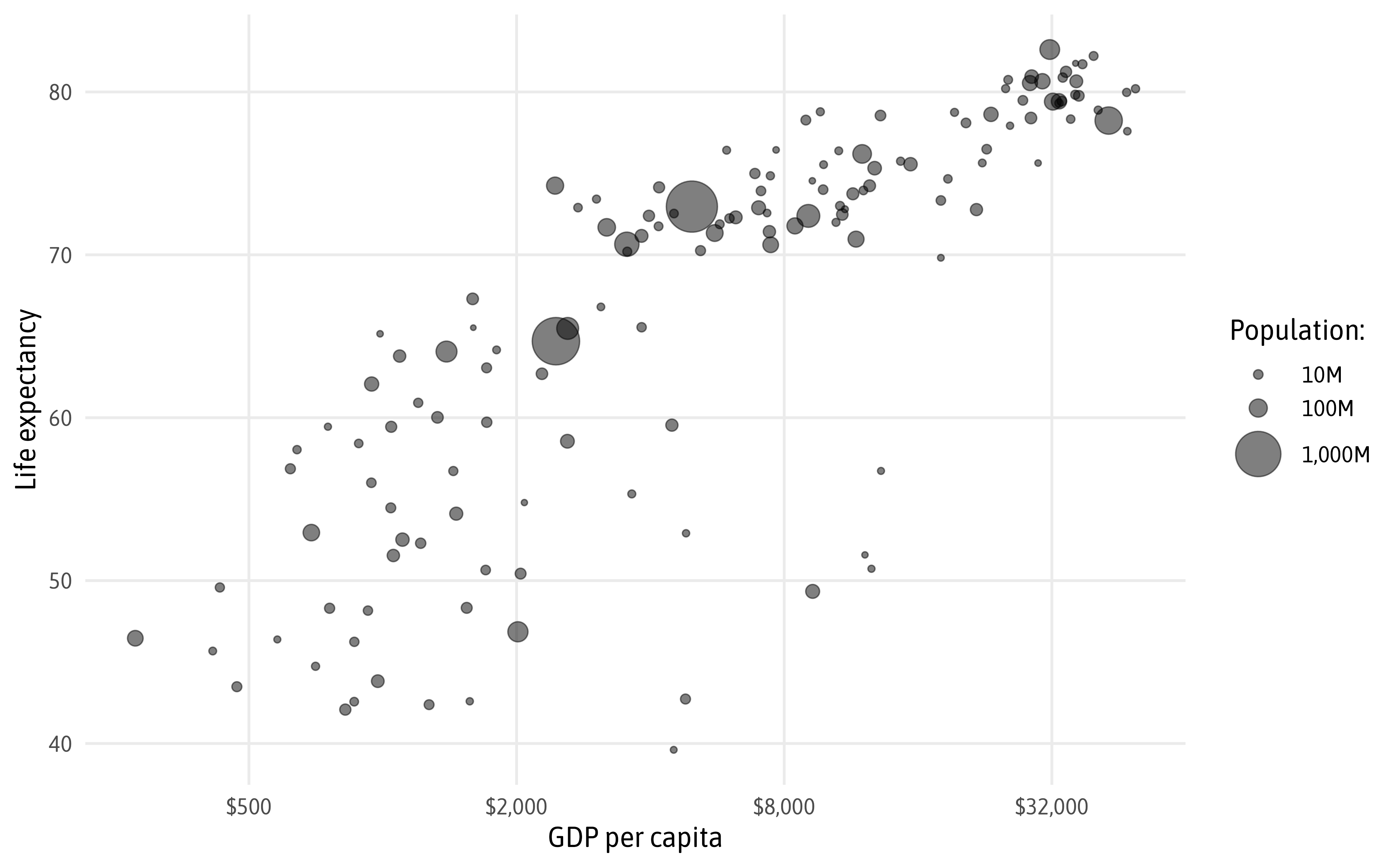
Annotate Continents
ggplot(gm2007, aes(x = gdpPercap, y = lifeExp)) +
  geom_point(
    aes(size = pop), alpha = .5, color = "grey60"
  ) +
  geom_point(
    data = filter(gm2007, continent == "Americas"),
    aes(size = pop), shape = 1, stroke = .7
  ) +
  ggforce::geom_mark_hull(
    aes(label = continent, filter = continent == "Americas"),
    expand = unit(10, "pt"), con.cap = unit(1, "mm"),
    label.family = "Asap SemiCondensed", label.fontsize = 15
  ) +
  scale_x_log10(
    breaks = c(500, 2000, 8000, 32000),
    labels = scales::label_dollar(accuracy = 1)
  ) +
  scale_size(
    range = c(1, 12), name = "Population:",
    breaks = c(10, 100, 1000)*1000000,
    labels = scales::label_comma(scale = 1 / 10^6, suffix = "M")
  ) +
  labs(x = "GDP per capita", y = "Life expectancy") +
  theme_minimal(base_family = "Asap SemiCondensed", base_size = 15) +
  theme(panel.grid.minor = element_blank())
Function to Highlight a Continent
draw_gp_continent <- function(grp) {

  ggplot(gm2007, aes(x = gdpPercap, y = lifeExp)) +
    geom_point(
      aes(size = pop), alpha = .5, color = "grey60"
    ) +
    geom_point(
      data = filter(gm2007, continent == grp),
      aes(size = pop), shape = 1, stroke = .7
    ) +
    ggforce::geom_mark_hull(
      aes(label = continent, filter = continent == grp),
      expand = unit(10, "pt"), con.cap = unit(1, "mm"),
      label.family = "Asap SemiCondensed", label.fontsize = 15
    ) +
    scale_x_log10(
      breaks = c(500, 2000, 8000, 32000),
      labels = scales::label_dollar(accuracy = 1)
    ) +
    scale_size(
      range = c(1, 12), name = "Population:",
      breaks = c(10, 100, 1000)*1000000,
      labels = scales::label_comma(scale = 1 / 10^6, suffix = "M")
    ) +
    labs(x = "GDP per capita", y = "Life expectancy") +
    theme_minimal(base_family = "Asap SemiCondensed", base_size = 15) +
    theme(panel.grid.minor = element_blank())

}


Function to Highlight a Country
draw_gp_country <- function(grp) {

  ggplot(gm2007, aes(x = gdpPercap, y = lifeExp)) +
    geom_point(
      aes(size = pop), alpha = .5, color = "grey60"
    ) +
    ggforce::geom_mark_circle(
      aes(label = country, filter = country == grp),
      expand = unit(15, "pt"), con.cap = unit(0, "mm"),
      # expand = unit(0, "pt"), con.cap = unit(0, "mm"),
      label.family = "Asap SemiCondensed", label.fontsize = 15
    ) +
    geom_point(
      data = filter(gm2007, country == grp),
      aes(size = pop), color = "#9C55E3", show.legend = FALSE
    ) +
    scale_x_log10(
      breaks = c(500, 2000, 8000, 32000),
      labels = scales::label_dollar(accuracy = 1)
    ) +
    scale_size(
      range = c(1, 12), name = "Population:",
      breaks = c(10, 100, 1000)*1000000,
      labels = scales::label_comma(scale = 1 / 10^6, suffix = "M")
    ) +
    labs(x = "GDP per capita", y = "Life expectancy") +
    theme_minimal(base_family = "Asap SemiCondensed", base_size = 15) +
    theme(panel.grid.minor = element_blank())

}


Cédric Scherer // posit::conf(2023)