Engaging and Beautiful Data Visualizations with ggplot2
Working with Colors
— Exercise Solutions —
Cédric Scherer // posit::conf // September 2023
Exercise 1
Exercise 1
- Add colors to our bar chart from the last exercise:
- Encode the bars and direct labels by color for “fair weather” (clear, scattered clouds, broken clouds) and “grey weather” (rain, cloudy, snow)
- Use the same colors to encode the respective text bits in the title (“Fair weather preferred”) and subtitle (“rainy, cloudy, or snowy days”).
Preparation
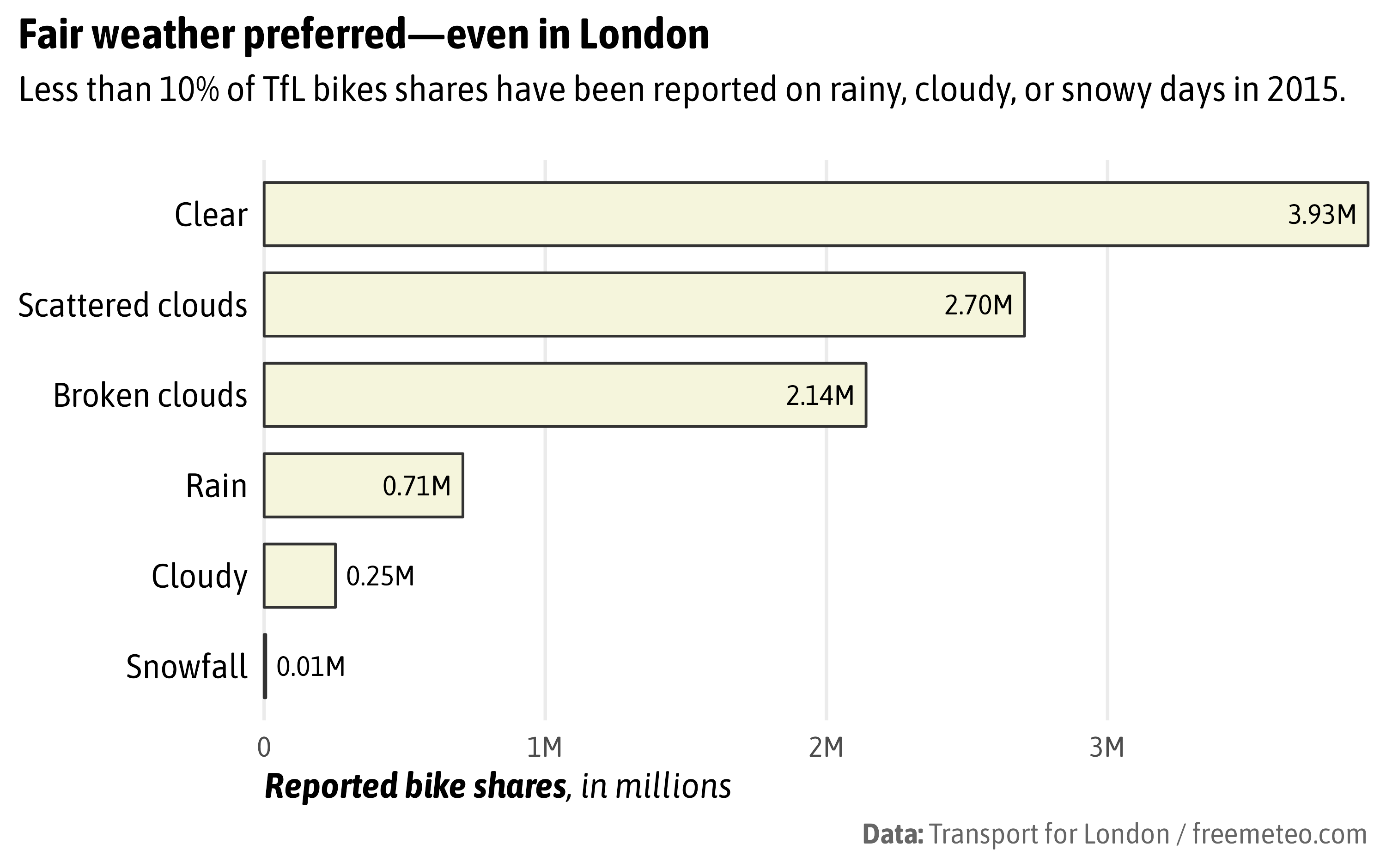
Previous Bar Chart
bikes |>
  filter(year == "2015") |>
  mutate(weather_type = forcats::fct_reorder(weather_type, count, .fun = sum)) |>
  ggplot(aes(x = count, y = weather_type)) +
  stat_summary(
    geom = "bar", fun = sum,
    color = "grey20", fill = "beige", width = .7
  ) +
  stat_summary(
    geom = "text", fun = sum,
    aes(
      label = after_stat(paste0("  ", sprintf("%2.2f", x / 10^6), "M  ")),
      hjust = after_stat(x) > .5*10^6
    ),
    family = "Asap SemiCondensed"
  ) +
  scale_x_continuous(
    expand = c(0, 0), name = "**Reported bike shares**, in millions",
    breaks = 0:4*10^6, labels = c("0", paste0(1:4, "M"))
  ) +
  scale_y_discrete(labels = stringr::str_to_sentence, name = NULL) +
  coord_cartesian(clip = "off") +
  labs(
    title = "Fair weather preferred—even in London",
    subtitle = "Less than 10% of TfL bikes shares have been reported on rainy, cloudy, or snowy days in 2015.",
    caption = "**Data:** Transport for London / freemeteo.com"
  ) +
  theme_minimal(base_size = 14, base_family = "Asap SemiCondensed") +
  theme(
    panel.grid.major.y = element_blank(),
    panel.grid.minor = element_blank(),
    axis.title.x = ggtext::element_markdown(hjust = 0, face = "italic"),
    axis.text.y = element_text(color = "black", size = rel(1.2)),
    plot.title = element_text(face = "bold"),
    plot.subtitle = element_text(margin = margin(b = 20)),
    plot.title.position = "plot",
    plot.caption = ggtext::element_markdown(color = "grey40")
  )
Adjust Geom Colors
bikes |>
  filter(year == "2015") |>
  mutate(weather_type = forcats::fct_reorder(weather_type, count, .fun = sum)) |>
  ggplot(aes(x = count, y = weather_type)) +
  stat_summary(
    fun = sum, geom = "bar", na.rm = TRUE,
    aes(color = weather_type %in% c("rain", "cloudy", "snowfall"),
        fill = after_scale(prismatic::clr_lighten(color, .9))),
    width = .7
  ) +
  stat_summary(
    fun = sum, geom = "text",
    aes(
      label = after_stat(paste0("  ", sprintf("%2.2f", x / 10^6), "M  ")),
      color = weather_type %in% c("rain", "cloudy", "snowfall"),
      hjust = after_stat(x) > .5*10^6
    ),
    family = "Asap SemiCondensed"
  ) +
  scale_x_continuous(
    expand = c(0, 0), name = "**Reported bike shares**, in millions",
    breaks = 0:4*10^6, labels = c("0", paste0(1:4, "M"))
  ) +
  scale_y_discrete(labels = stringr::str_to_sentence, name = NULL) +
  scale_color_manual(values = c("#E2A30A", "#007CB1"), guide = "none") +
  coord_cartesian(clip = "off") +
  labs(
    title = "Fair weather preferred—even in London",
    subtitle = "Less than 10% of TfL bikes shares have been reported on rainy, cloudy, or snowy days in 2015.",
    caption = "**Data:** Transport for London / freemeteo.com"
  ) +
  theme_minimal(base_size = 14, base_family = "Asap SemiCondensed") +
  theme(
    panel.grid.major.y = element_blank(),
    panel.grid.minor = element_blank(),
    axis.title.x = ggtext::element_markdown(hjust = 0, face = "italic"),
    axis.text.y = element_text(color = "black", size = rel(1.2)),
    plot.title = element_text(face = "bold"),
    plot.subtitle = element_text(margin = margin(b = 20)),
    plot.title.position = "plot",
    plot.caption = ggtext::element_markdown(color = "grey40")
  )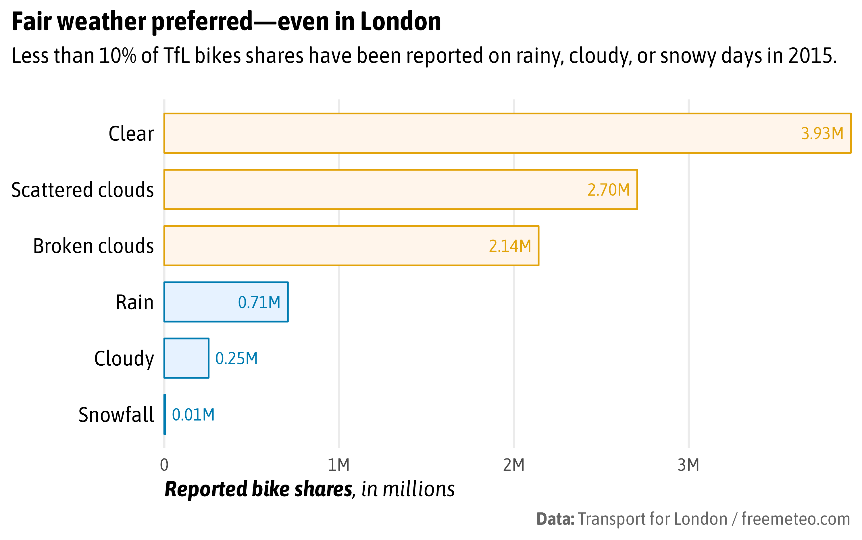
Adjust Titles
bikes |>
  filter(!is.na(weather_type), year == "2015") |>
  mutate(weather_type = forcats::fct_reorder(weather_type, count, .fun = sum)) |>
  ggplot(aes(x = count, y = weather_type)) +
  stat_summary(
    fun = sum, geom = "bar", na.rm = TRUE,
    aes(color = weather_type %in% c("rain", "cloudy", "snowfall"),
        fill = after_scale(prismatic::clr_lighten(color, .9))),
    width = .7
  ) +
  stat_summary(
    fun = sum, geom = "text",
    aes(
      label = after_stat(paste0("  ", sprintf("%2.2f", x / 10^6), "M  ")),
      color = weather_type %in% c("rain", "cloudy", "snowfall"),
      hjust = after_stat(x) > .5*10^6
    ),
    family = "Asap SemiCondensed"
  ) +
  scale_x_continuous(
    expand = c(0, 0), name = "**Reported bike shares**, in millions",
    breaks = 0:4*10^6, labels = c("0", paste0(1:4, "M"))
  ) +
  scale_y_discrete(labels = stringr::str_to_sentence, name = NULL) +
  scale_color_manual(values = c("#E2A30A", "#007CB1"), guide = "none") +
  coord_cartesian(clip = "off") +
  labs(
    title = "<span style='color:#E2A30A;'>Fair weather preferred</span>—even in London",
    subtitle = "Less than 10% of TfL bikes shares have been reported on <span style='color:#007CB1;'>rainy, cloudy, or snowy days</span> in 2015.",
    caption = "**Data:** Transport for London / freemeteo.com"
  ) +
  theme_minimal(base_size = 14, base_family = "Asap SemiCondensed") +
  theme(
    panel.grid.major.y = element_blank(),
    panel.grid.minor = element_blank(),
    axis.title.x = ggtext::element_markdown(hjust = 0, face = "italic"),
    axis.text.y = element_text(color = "black", size = rel(1.2)),
    plot.title = ggtext::element_markdown(face = "bold"),
    plot.subtitle = ggtext::element_markdown(margin = margin(b = 20)),
    plot.title.position = "plot",
    plot.caption = ggtext::element_markdown(color = "grey40")
  )
Exercise 2
Exercise 2
- Create a plot of your choice with a sequential (non-default) color palette.
- Inspect the HCL spectrum. Adjust the palette if needed.
- Test the palette with regard to colorblindness. Adjust the palette if needed.
- Save and share the graphic.
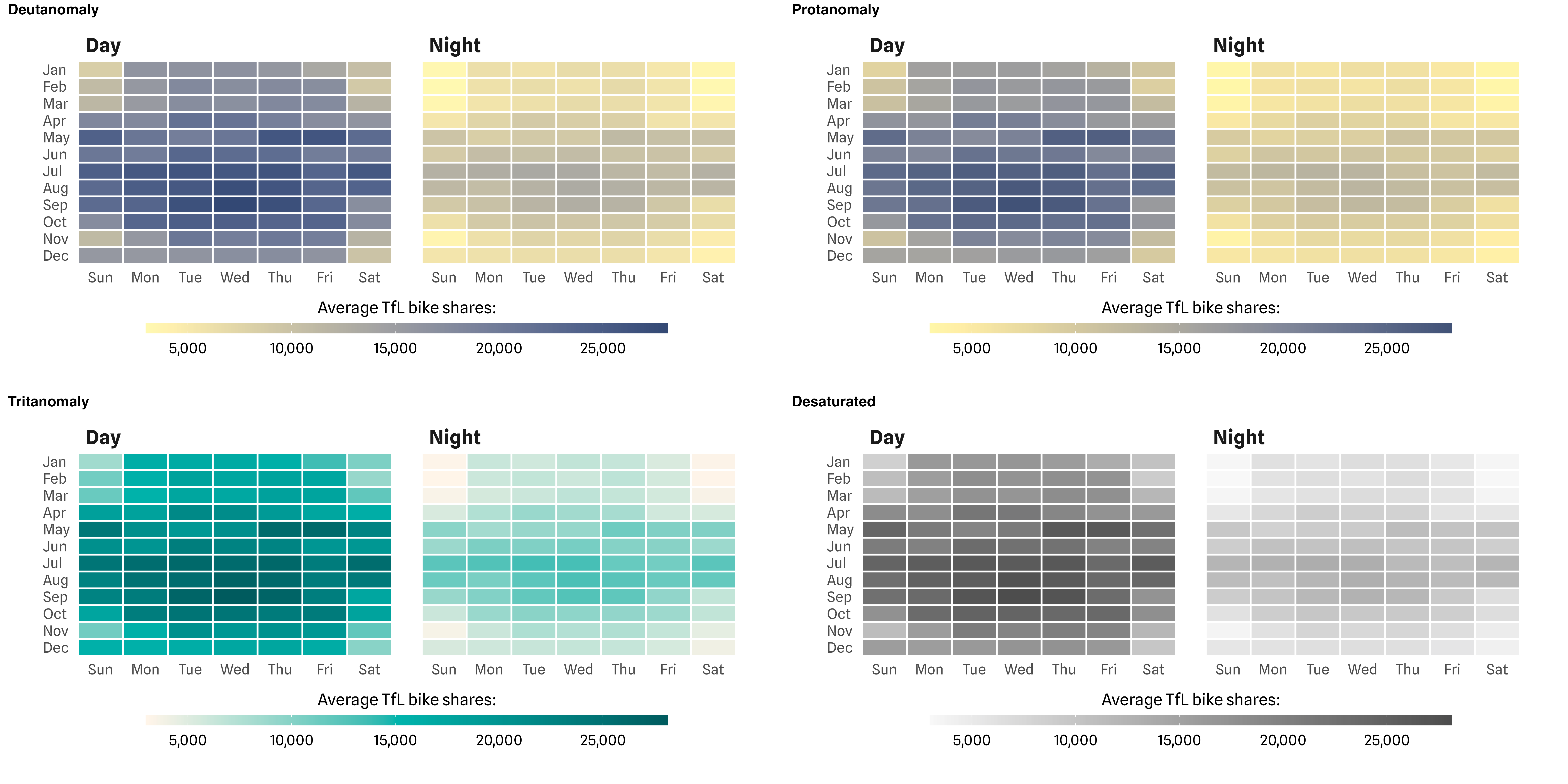
Heatmap
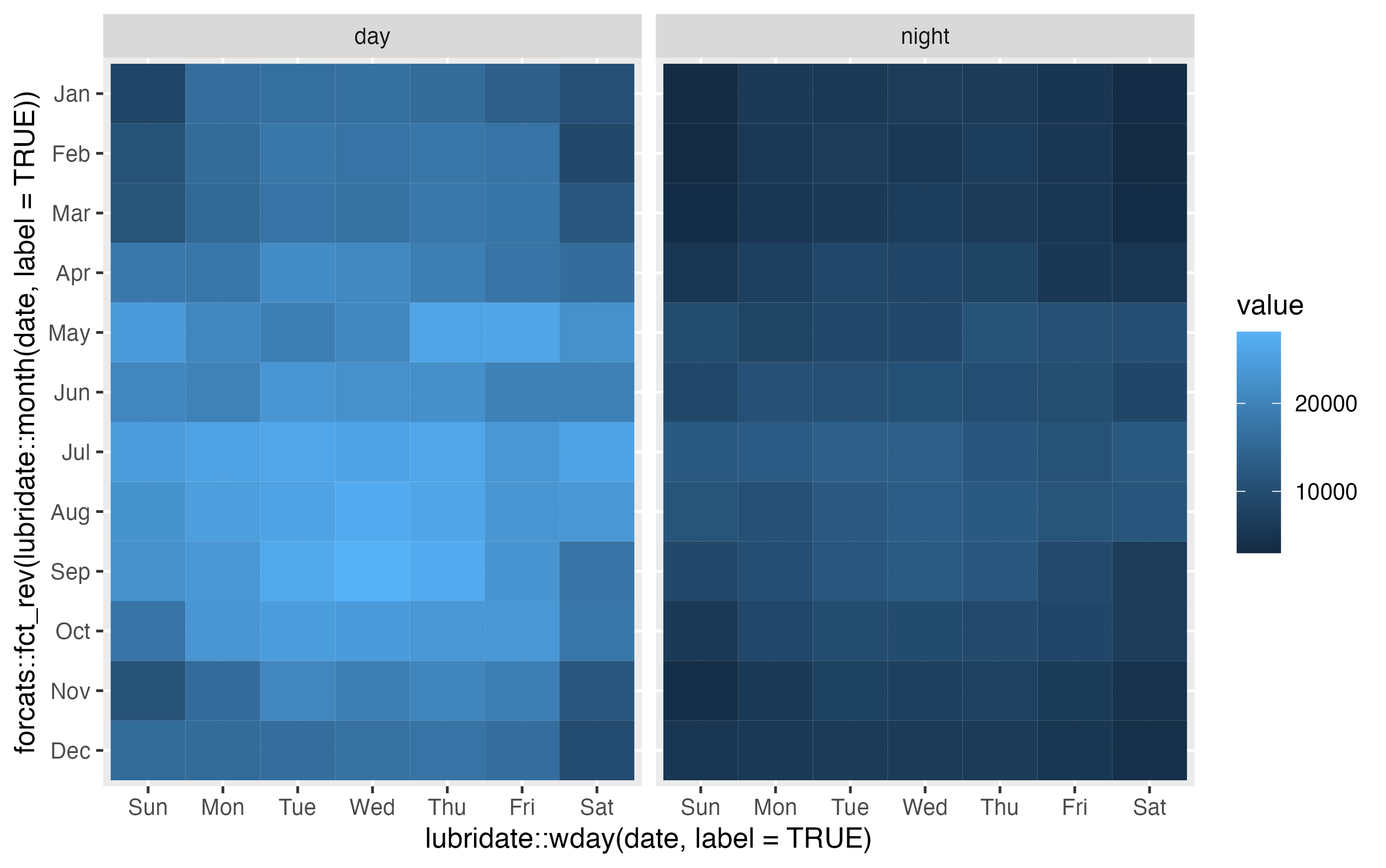
Heatmap
p <-
  ggplot(filter(bikes, year == "2016"),
         aes(x = lubridate::wday(date, label = TRUE),
             y = forcats::fct_rev(lubridate::month(date, label = TRUE)),
             z = count)) +
  stat_summary_2d(geom = "tile", fun = mean, color = "white", linewidth = .7) +
  facet_wrap(~ day_night, labeller = labeller(day_night = stringr::str_to_title)) +
  coord_cartesian(expand = FALSE, clip = "off") +
  labs(x = NULL, y = NULL, fill = "Average TfL bike shares:") +
  guides(fill = guide_colorbar(title.position = "top", title.hjust = .5)) +
  theme_minimal(base_size = 15, base_family = "Spline Sans") +
  theme(
    axis.text.y = element_text(hjust = 0),
    strip.text = element_text(face = "bold", hjust = 0, size = rel(1.1)),
    panel.spacing = unit(1.7, "lines"),
    legend.position = "bottom",
    legend.key.width = unit(6, "lines"),
    legend.key.height = unit(.6, "lines"),
    legend.title = element_text(size = rel(.9)),
    legend.box.margin = margin(t = -10)
  )

p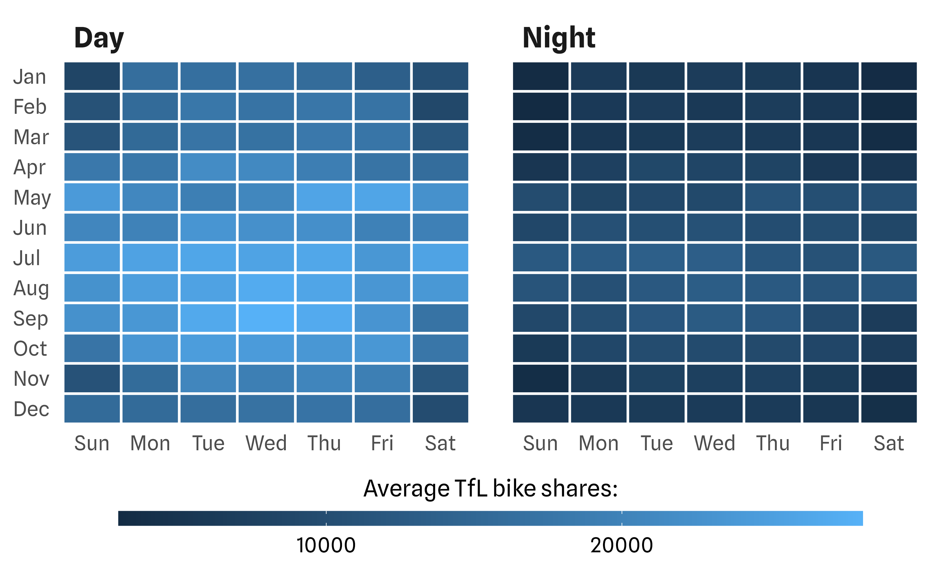
Heatmap

Emulate CVD
Evaluate HCL Spectrum

Export Graphic
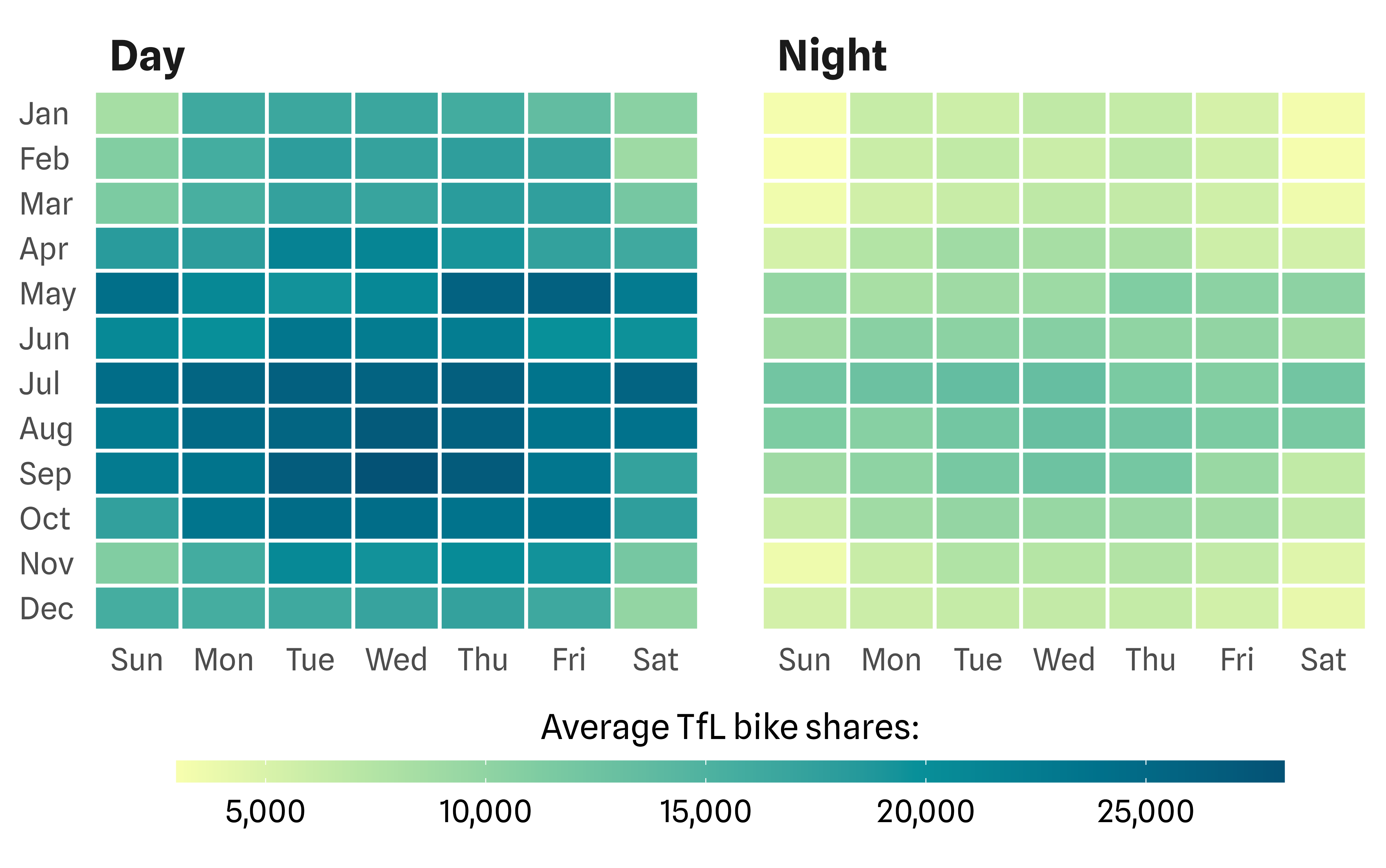
The final PNG graphic.
Cédric Scherer // posit::conf(2023)