Designing Data Visualizations
to Successfully Tell a Story
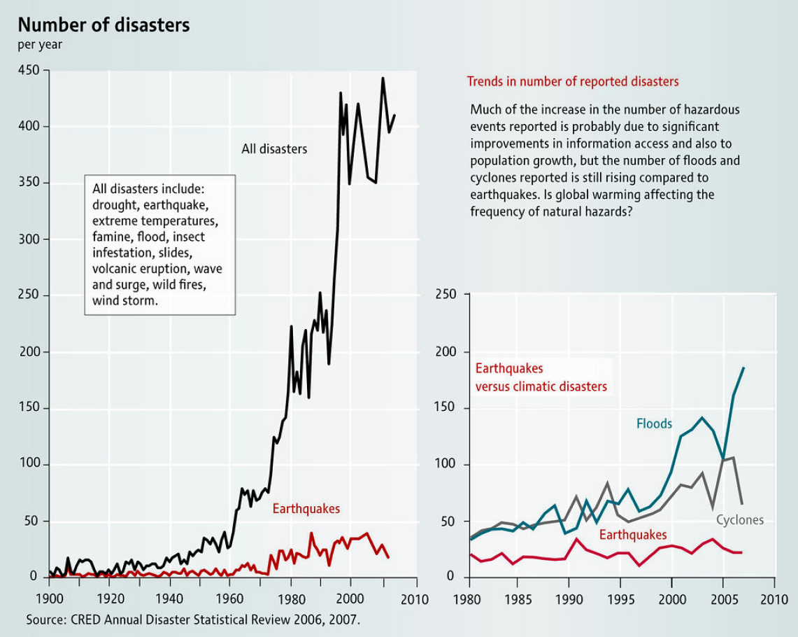
Foundations of Data Visualization
Source: eazybi
Source: Ranganathan et al. 2014
Source: datameer.com
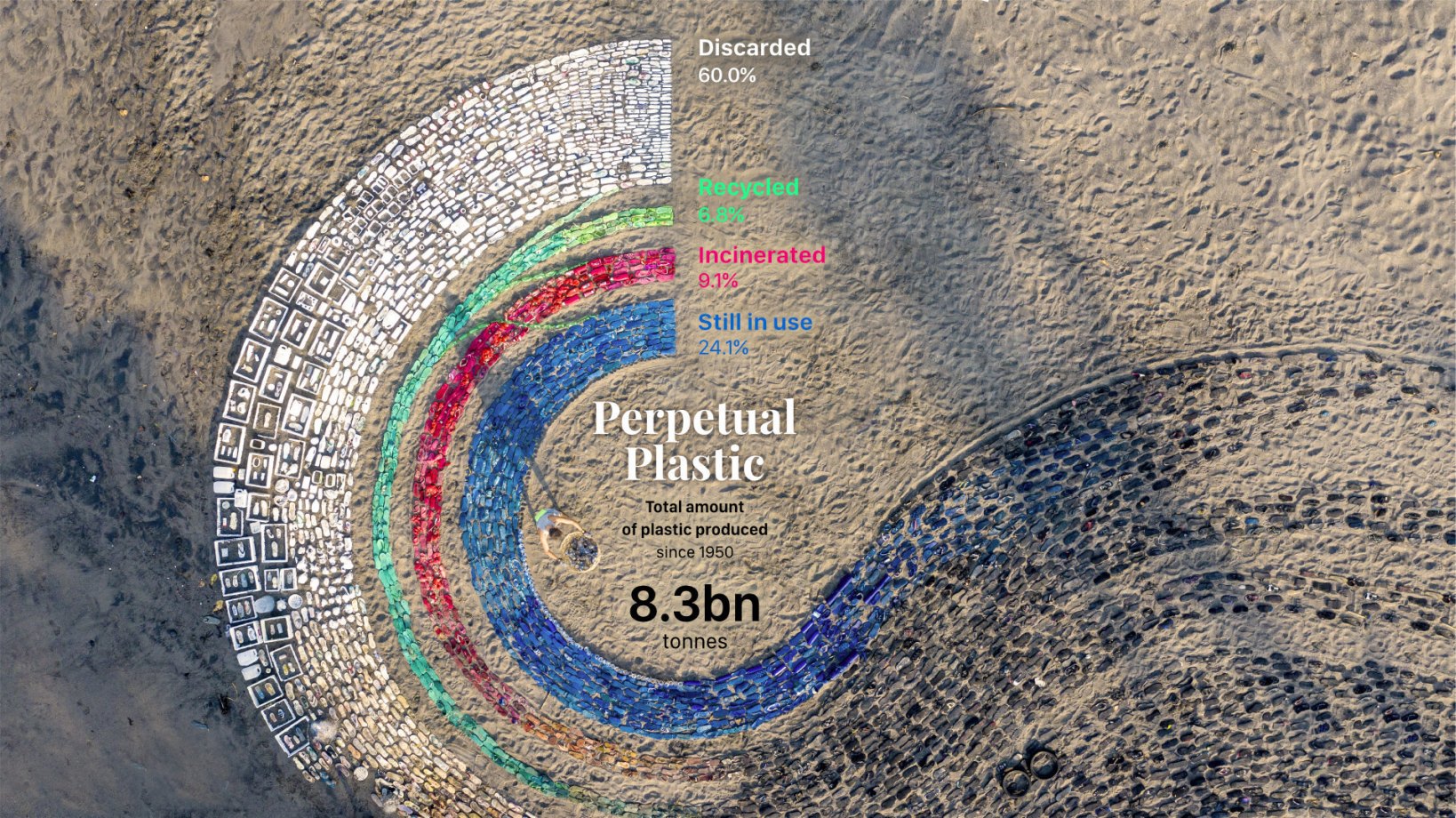
Source: “Perpetual Plastic” by Liina Klauss, Skye Morét & Moritz Stefaner

Source: “Patchwork Kingdoms” by Nadieh Bremer
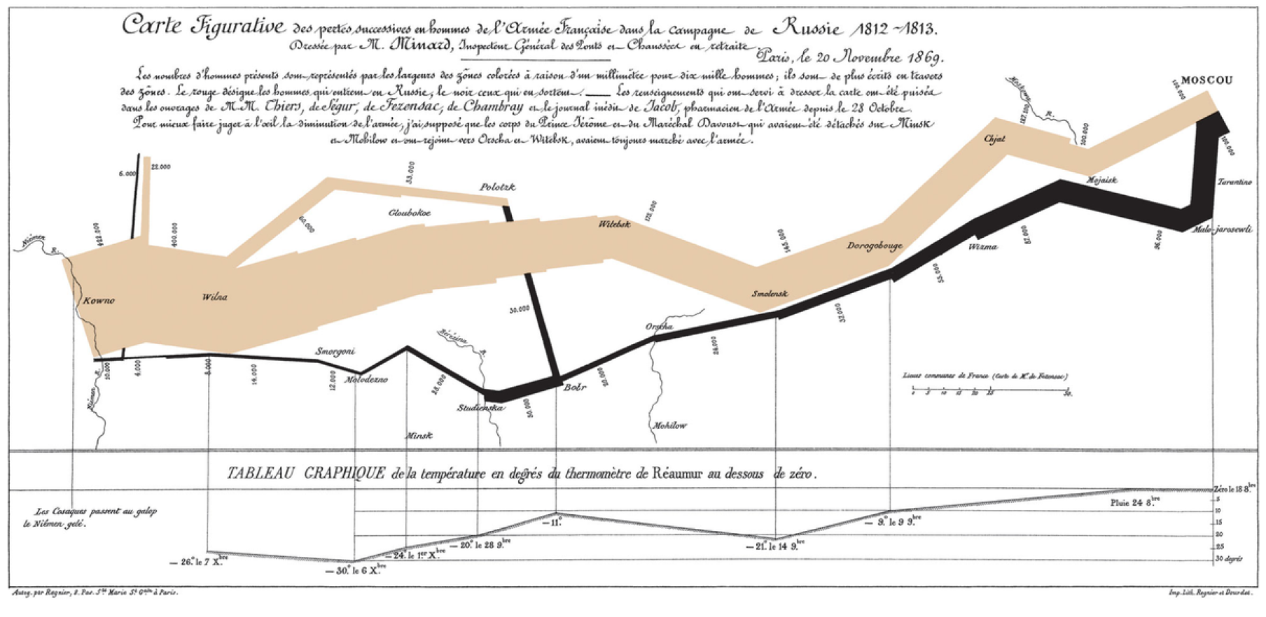
“Carte figurative des pertes successives en hommes de l’Armée Française dans la campagne de Russie 1812–1813” by Charles Joseph Minard (1869)
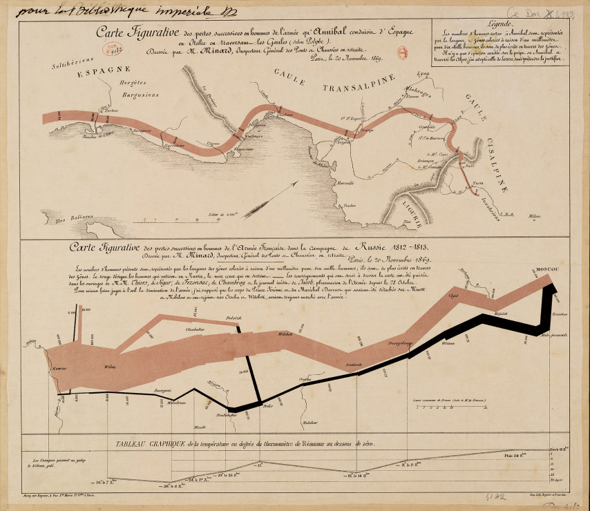
“Carte figurative des pertes successives en hommes de l’Armée qu’Annibal conduisit d’Espagne en Italie en traversant les Gaules (selon Polybe)” (top) and “Carte figurative des pertes successives en hommes de l’Armée Française dans la campagne de Russie 1812–1813” (bottom) by Charles Joseph Minard (1869)
- shows the force levels of the armies of Hannibal (218 BC) and Napoleon (1812-1813), respectively
- some data visualization practioners call it (one of) the best statistical drawings ever created
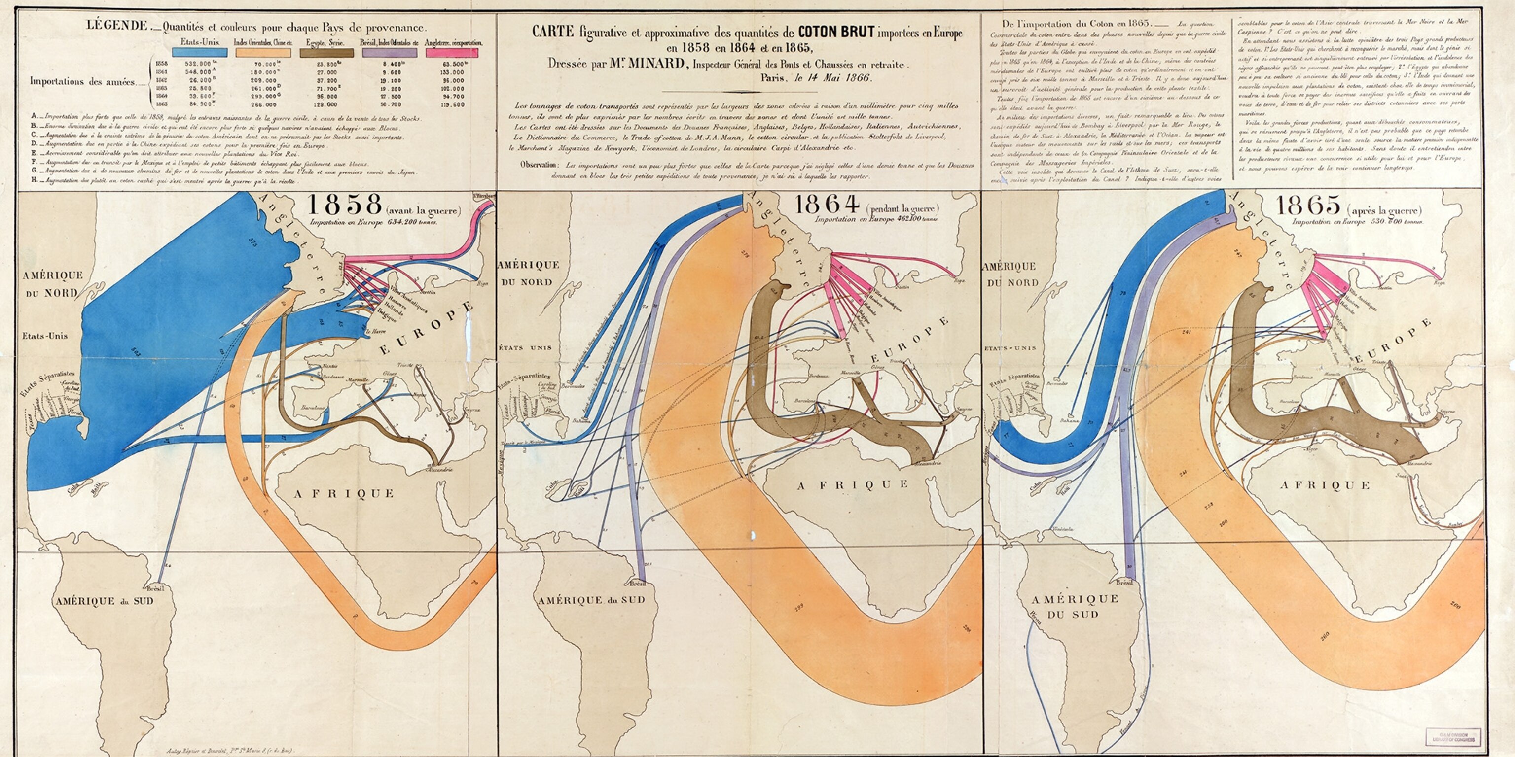
“Carte figurative et approximative des quantités de coton brut importées en Europe en 1858, en 1864 et en 1865” by Charles Joseph Minard (1866)
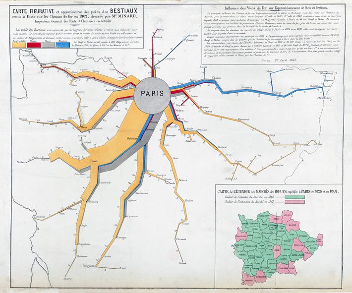
“Carte figurative et approximative des poids des bestiaux venus á Paris sur les chemins de fer en 1862” by Charles Joseph Minard (1864)
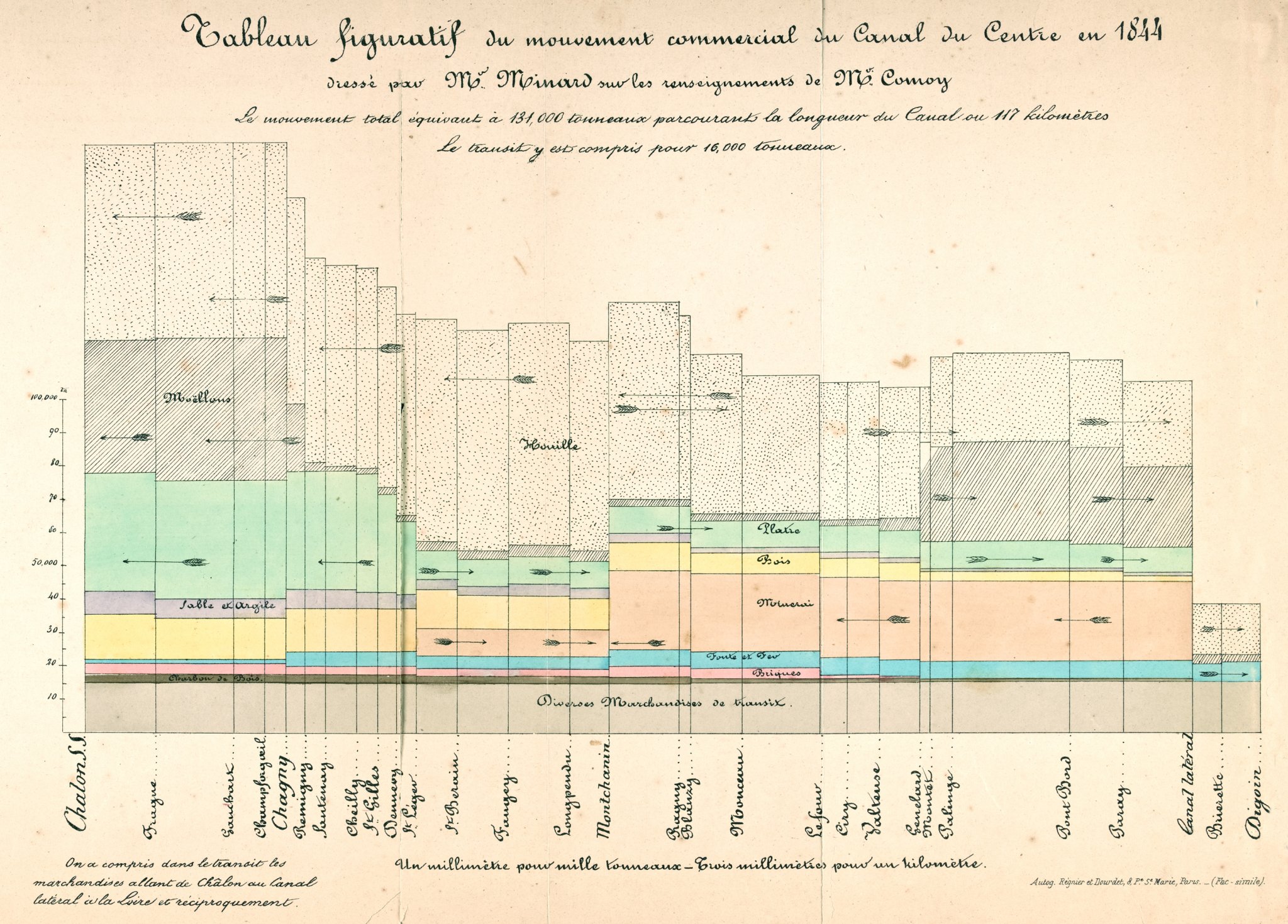
“Tableau figuratif du mouvement commercial du Canal du Centre en 1844” by Charles Joseph Minard (1845)
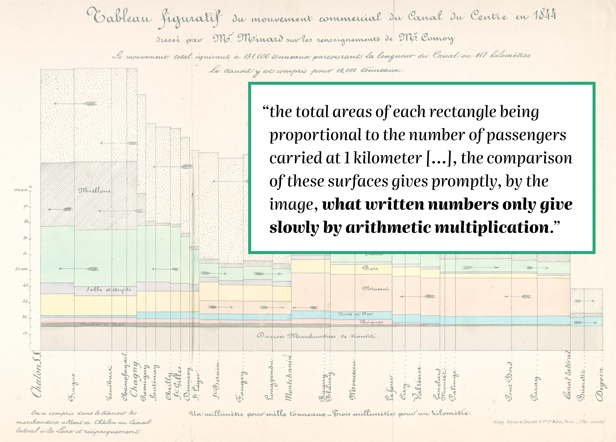
“Tableau figuratif du mouvement commercial du Canal du Centre en 1844” by Charles Joseph Minard (1845)

Wheel diagram of 76,922 placements of the months of December and March on the circumference of an empty circle.
Graphics by Henrik Lied at NRKbeta. Laeng & Hofseth, Front Psychol. 2019
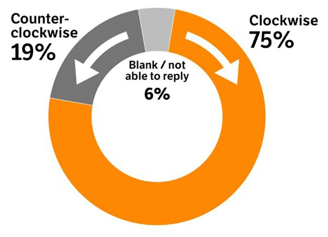
Proportion of respondents choosing opposite direction of time on the year’s wheel.
Graphics by Vidar Kvien, NRK. Laeng & Hofseth, Front Psychol. 2019
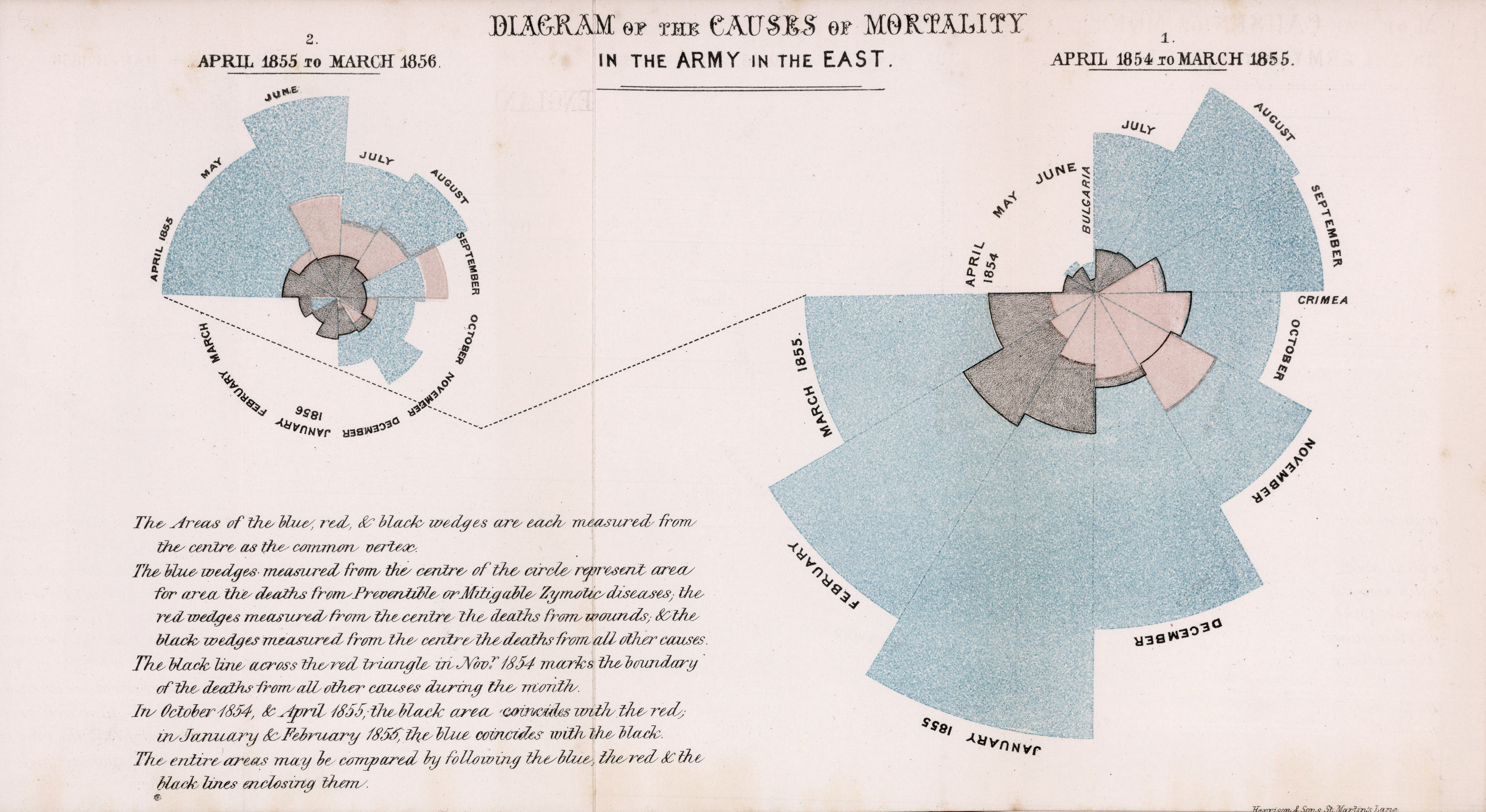
“Diagram of the causes and mortality in the army in the East” (a so-called coxcomb diagram) by Florence Nightingale (1858)
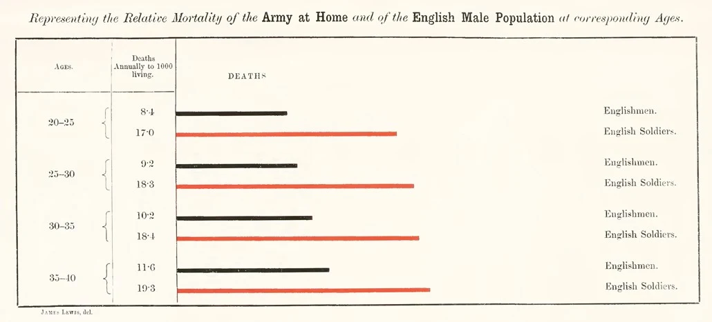
“Relative mortality of the army at home and of the English male population at corresponding ages” by Florence Nightingale (1858)
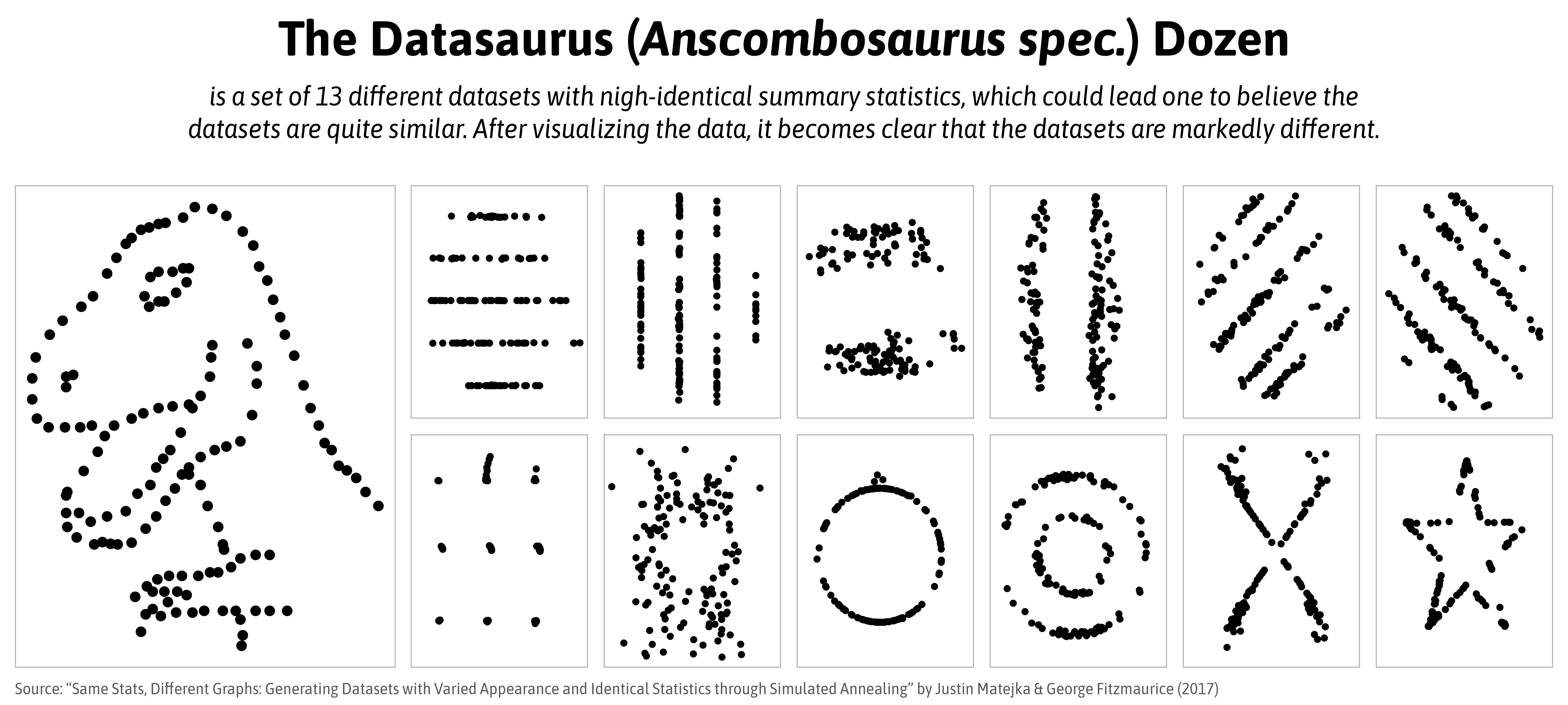
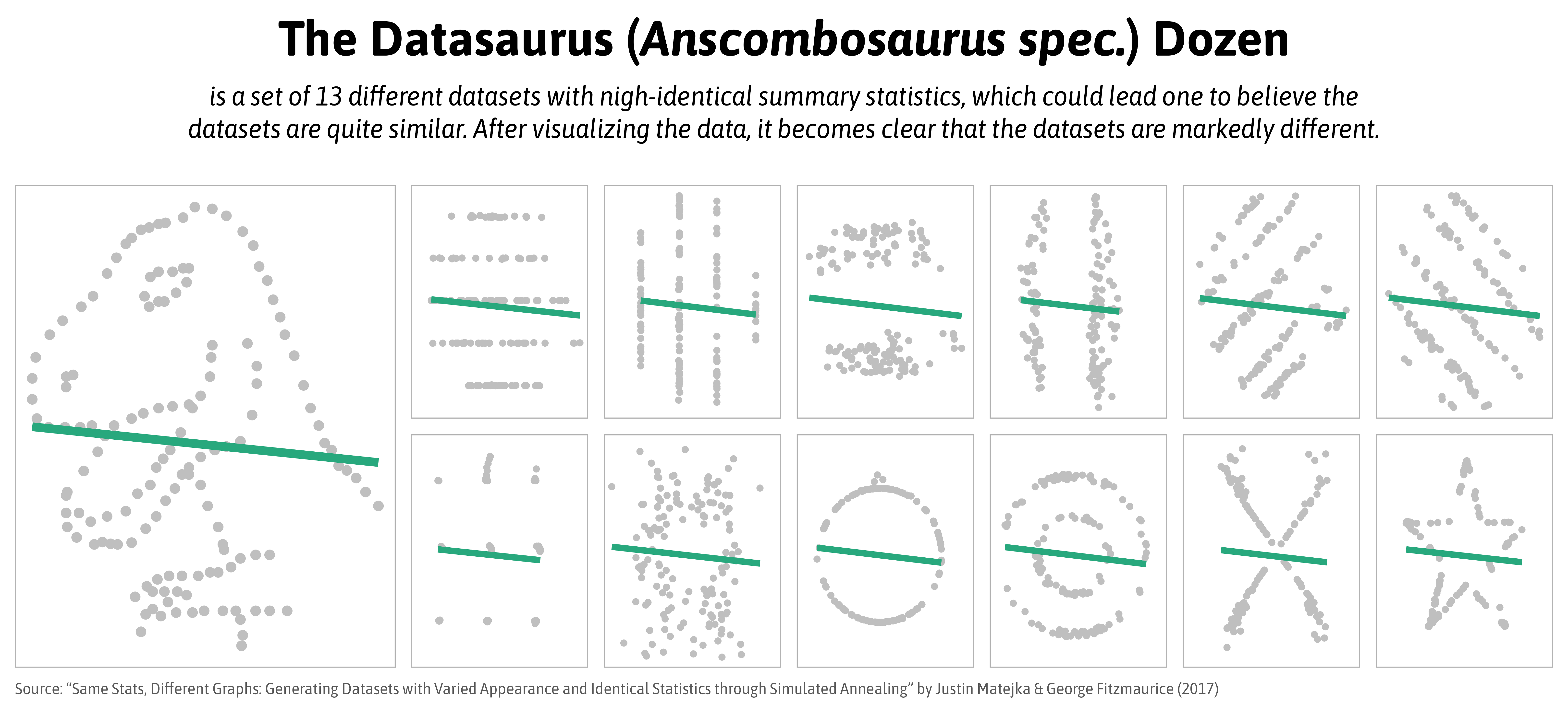
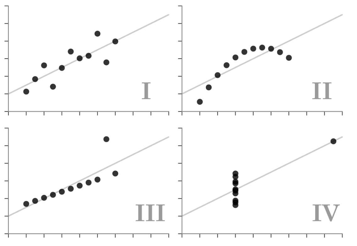
Anscombe’s Quartet
Source: Matejka & Fitzmaurice (2017)
Visualize Your Data!
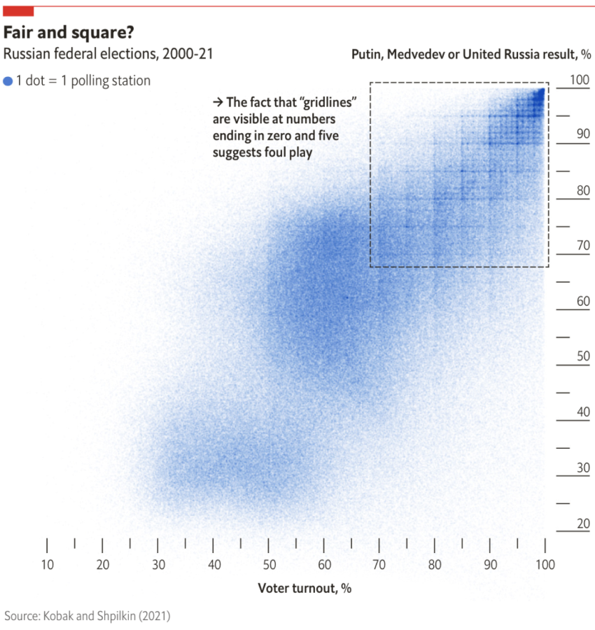
“When Dmitry Kobak and Sergey Shpilkin […] analysed the results, they found that an unusually high number of turnout and vote-share results were multiples of five (eg, 50%, 55%, 60%), a tell-tale sign of manipulation.”
Visualize Your Data!
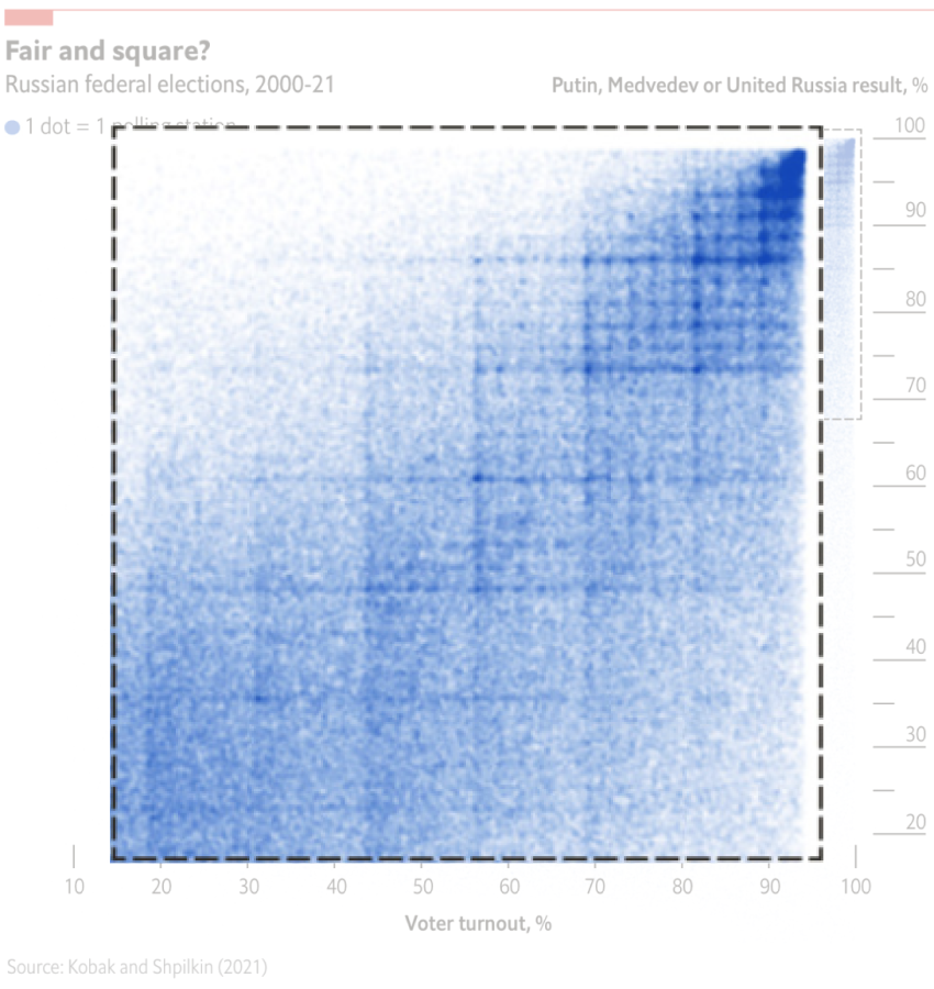
“When Dmitry Kobak and Sergey Shpilkin […] analysed the results, they found that an unusually high number of turnout and vote-share results were multiples of five (eg, 50%, 55%, 60%), a tell-tale sign of manipulation.”

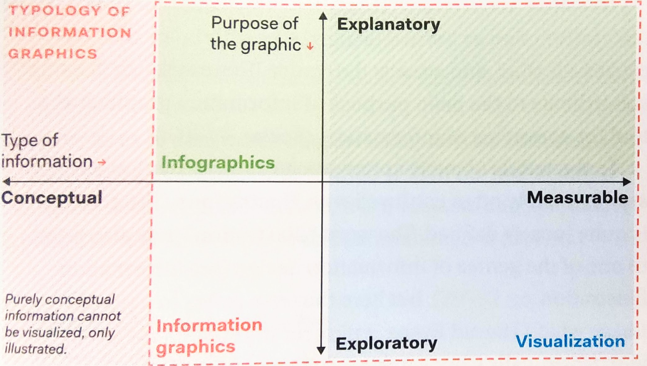
Source: Koponen & Hildén, “Data Visualization Handbook” (2020), page 25

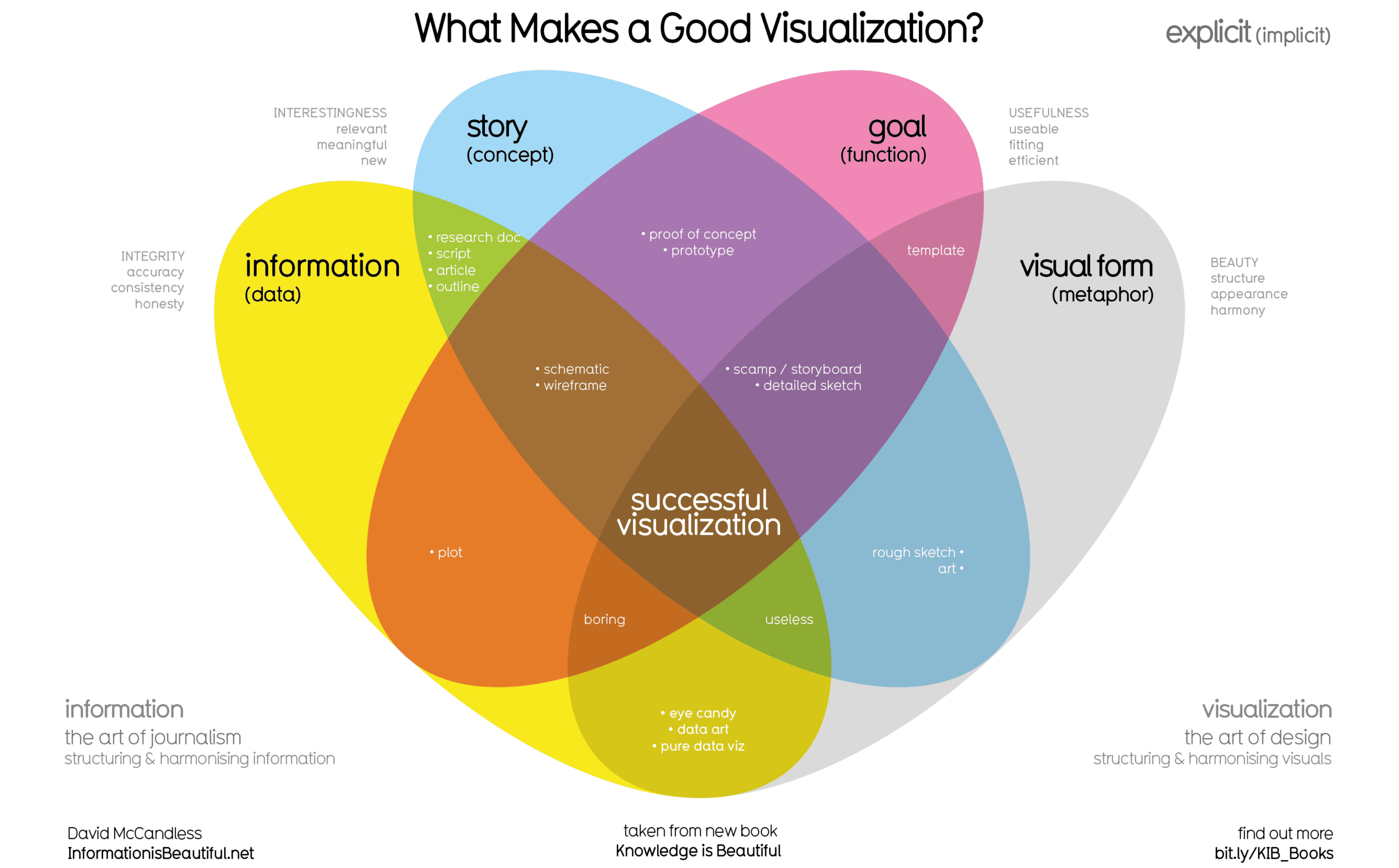
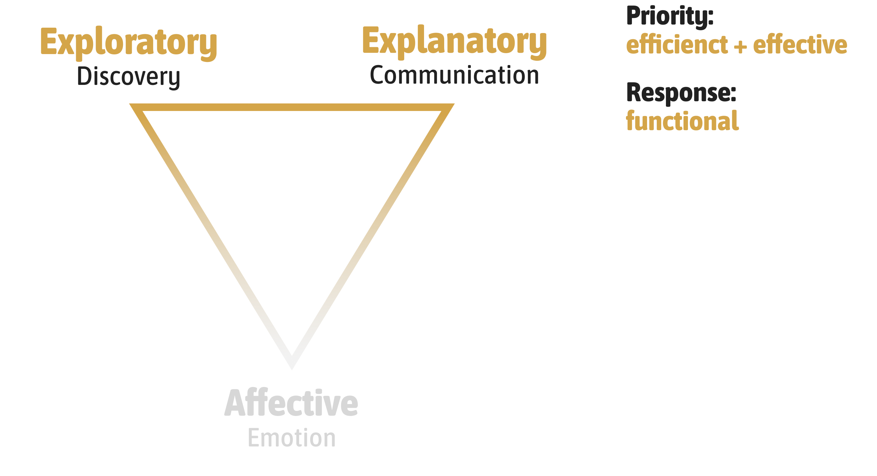
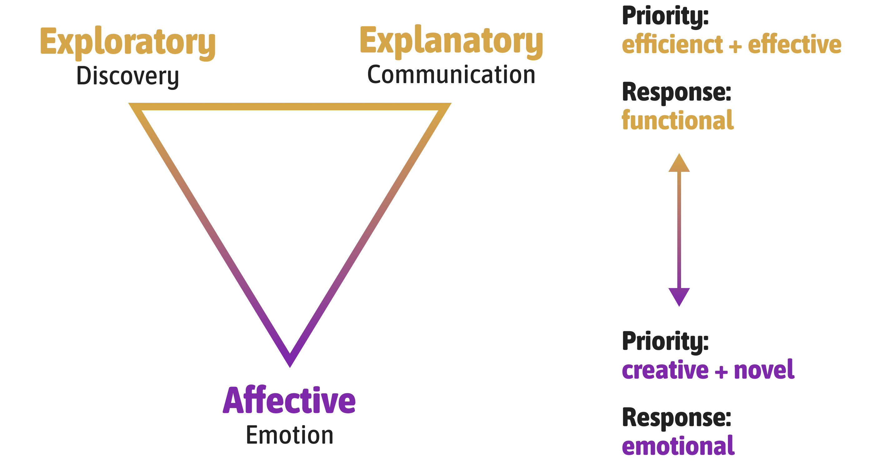
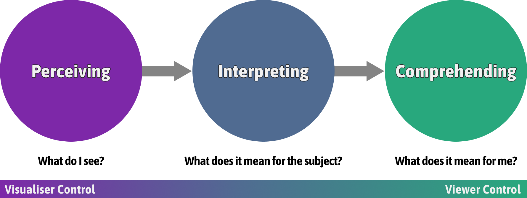
“Vertices of Visualization” by Alberto Cairo, personal communication (modified version)
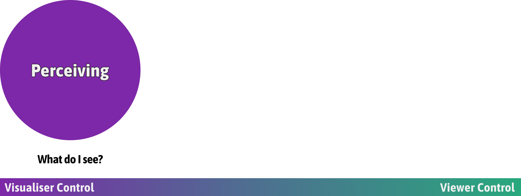
“Vertices of Visualization” by Alberto Cairo, personal communication (modified version)
“Vertices of Visualization” by Alberto Cairo, personal communication (modified version)

Scheme by Andy Kirk (modified)
Scheme by Andy Kirk (modified)

Scheme by Andy Kirk (modified)
Scheme by Andy Kirk (modified)
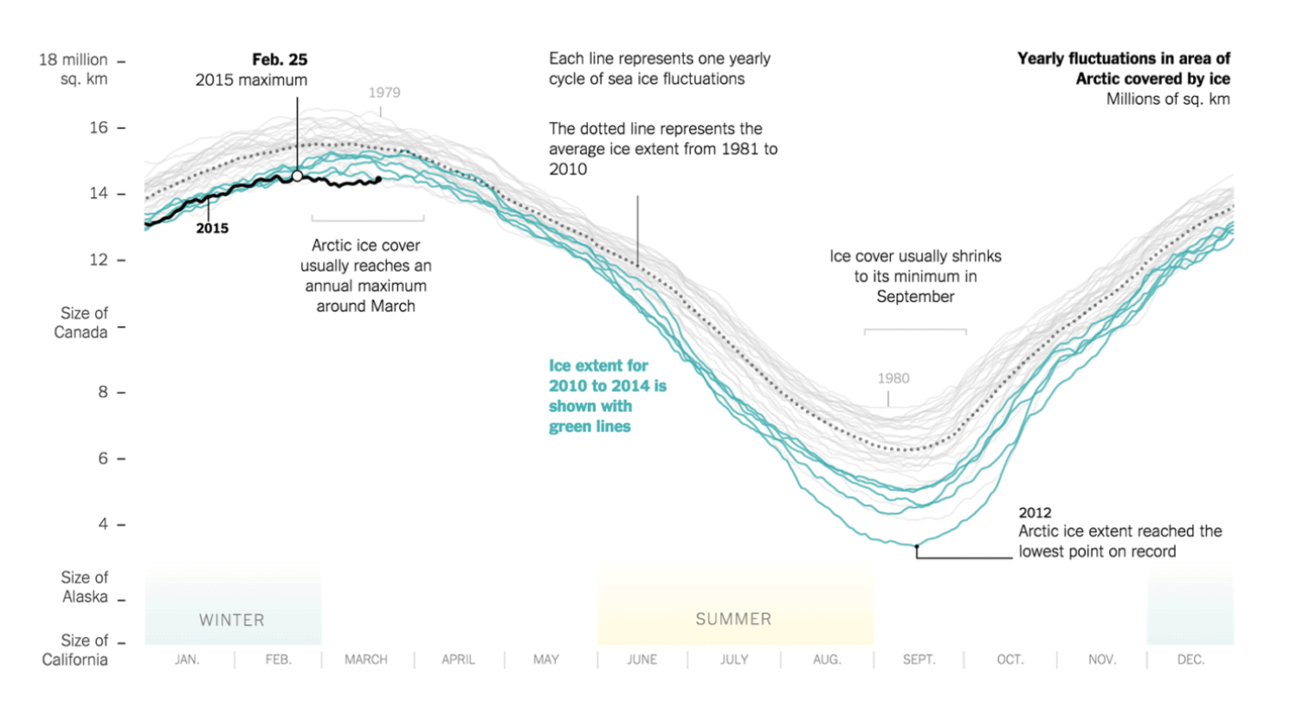
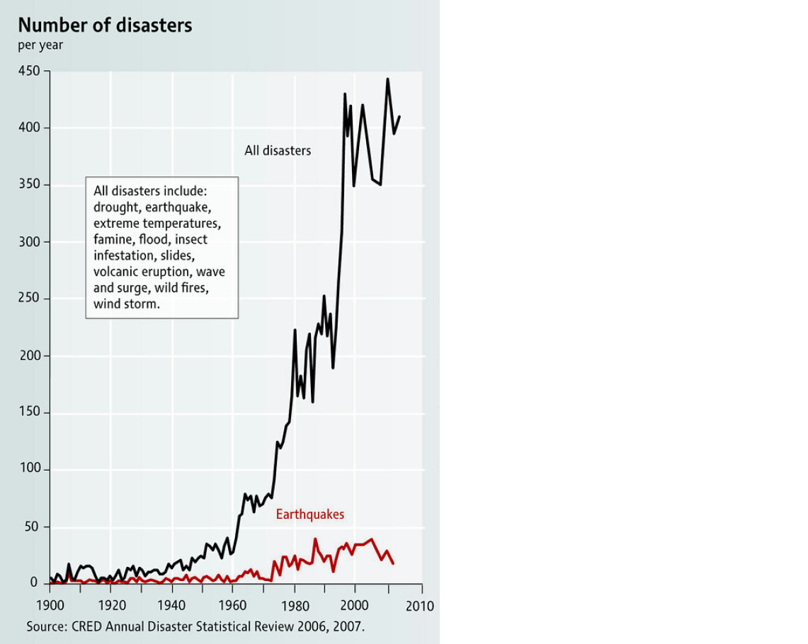
Source: “Yearly Fluctuations in Area of Arctic Covered by Ice” by Derek Watkins (New York Times)
Source: Dr. Robert Rohde (Tweet)