
Designing Data Visualizations
to Successfully Tell a Story
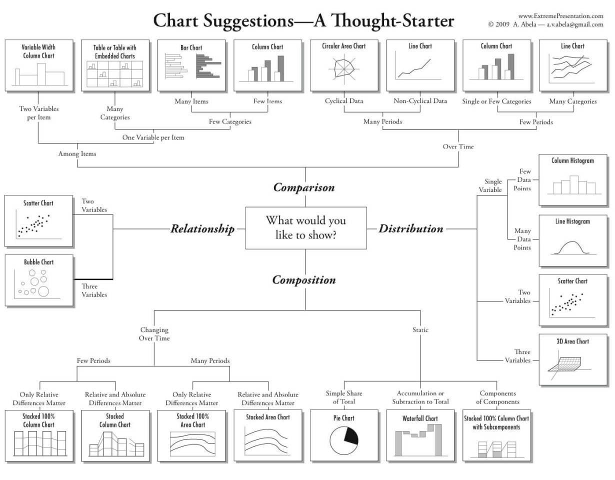
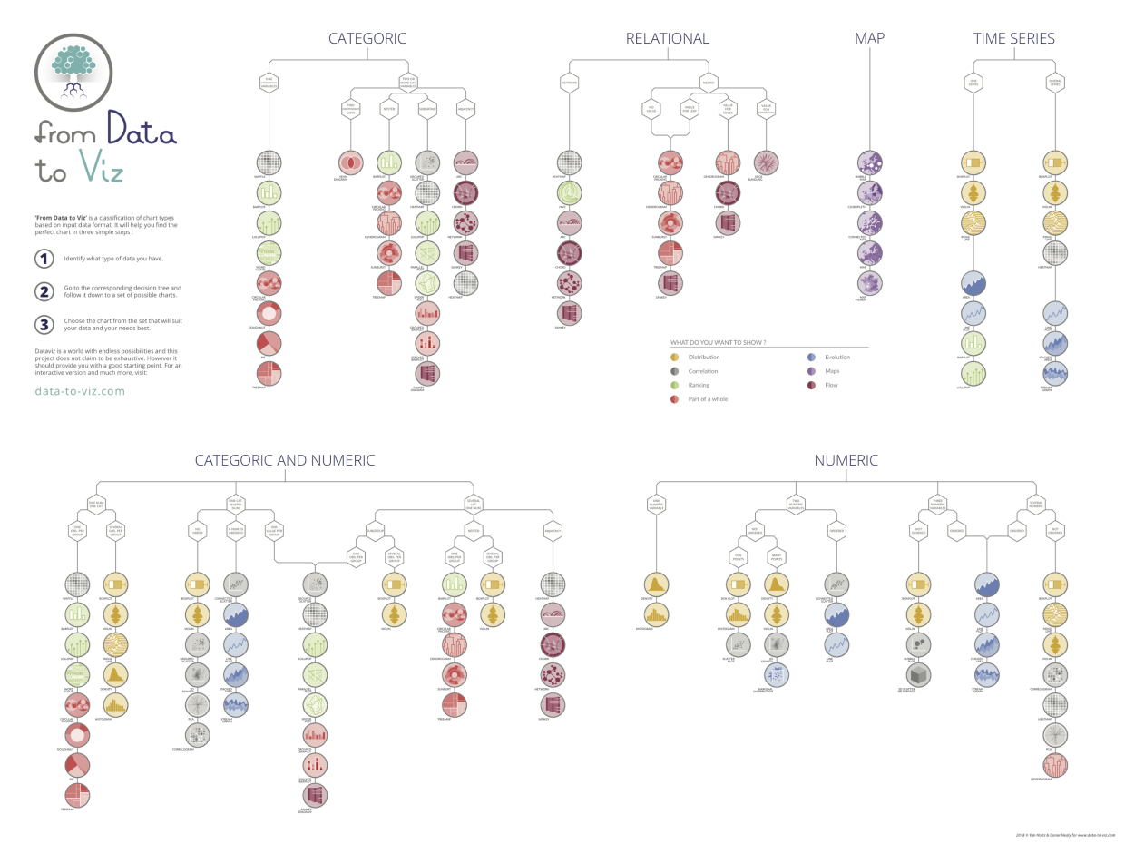
Choose an Appropriate Display
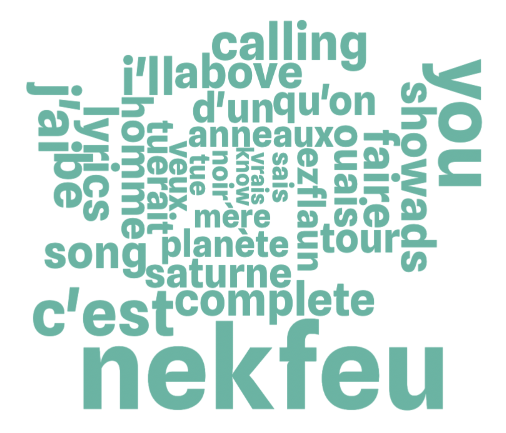
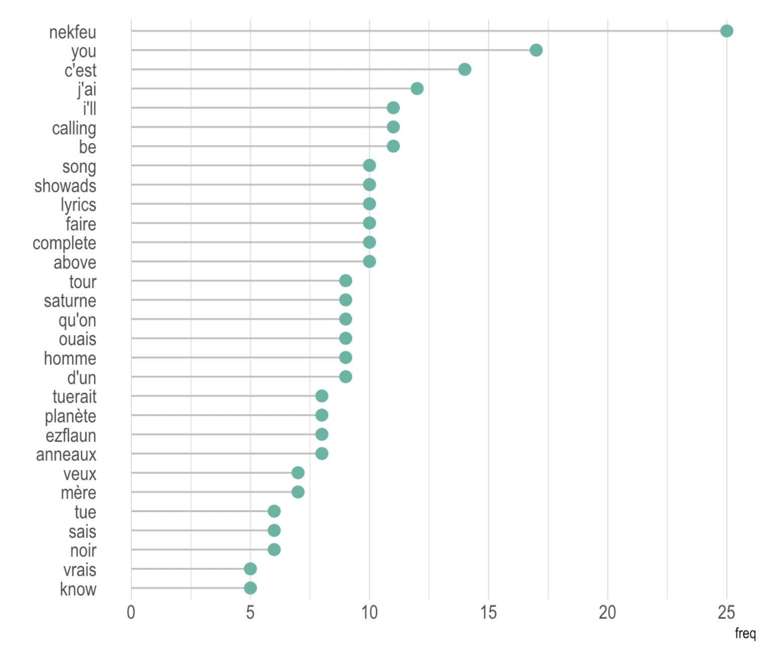
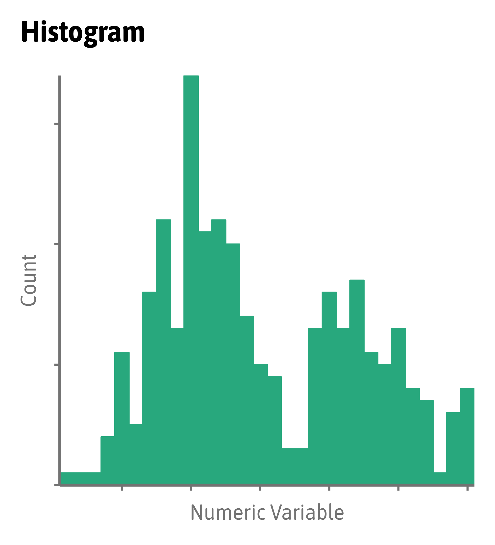
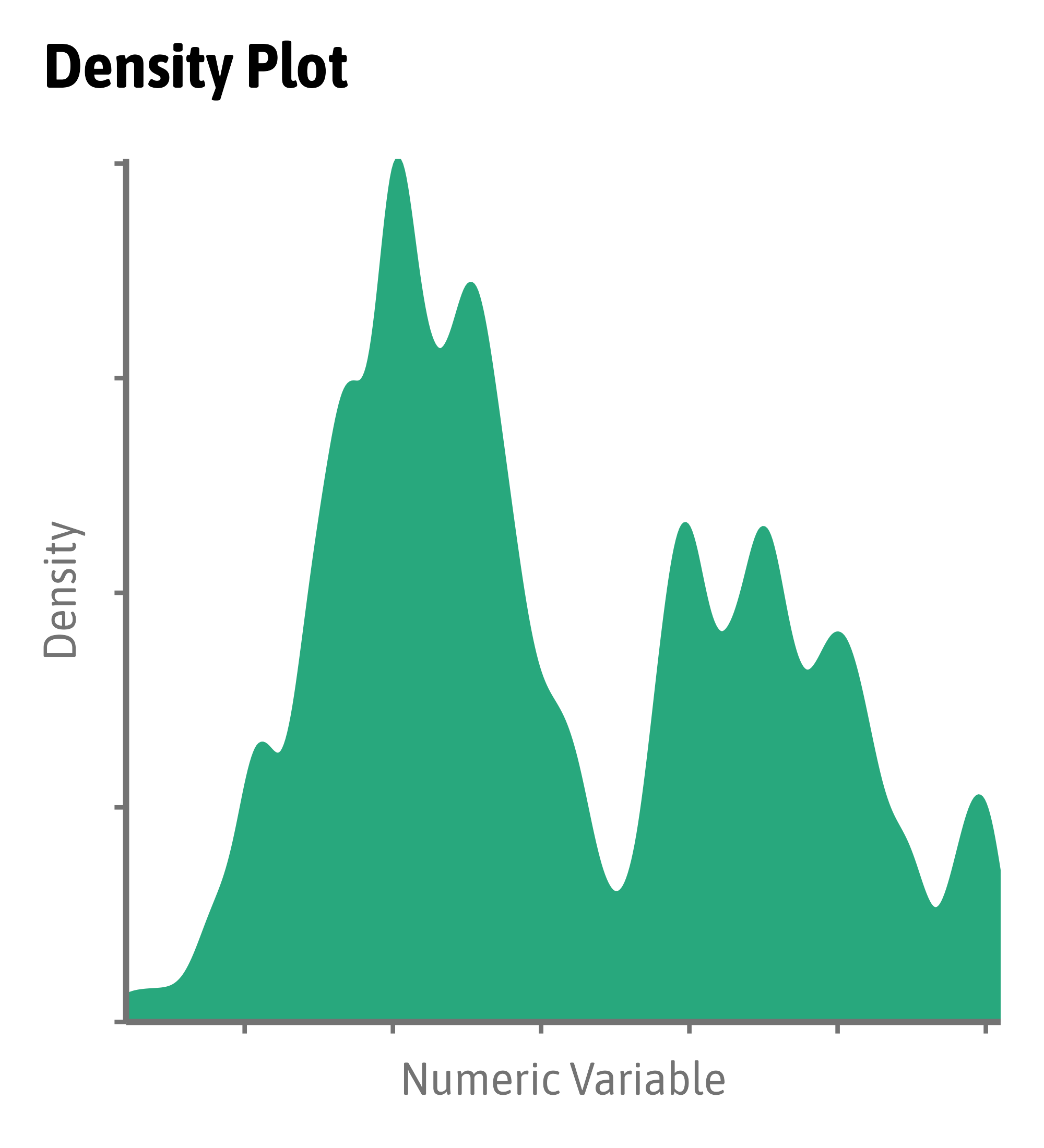
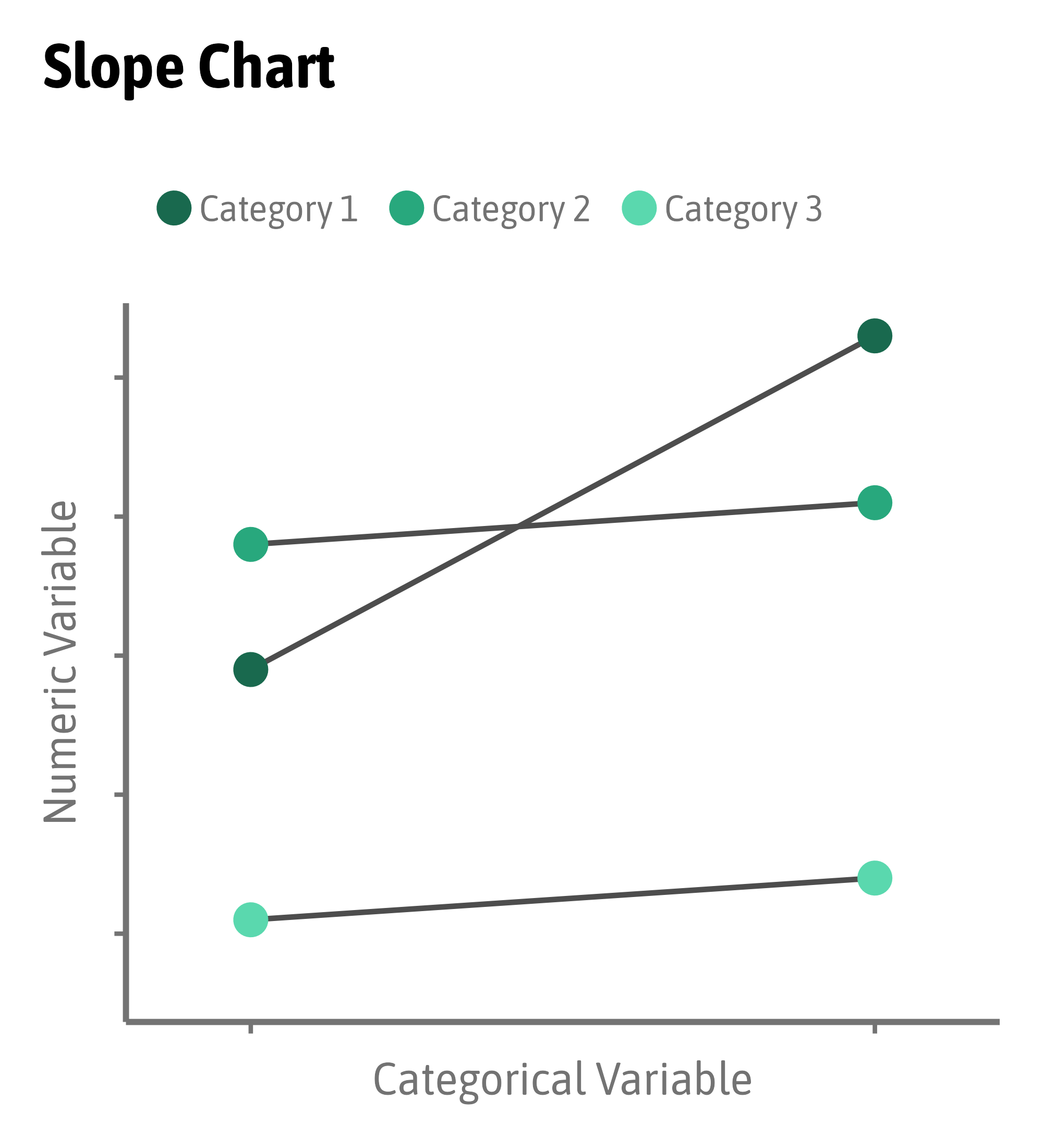
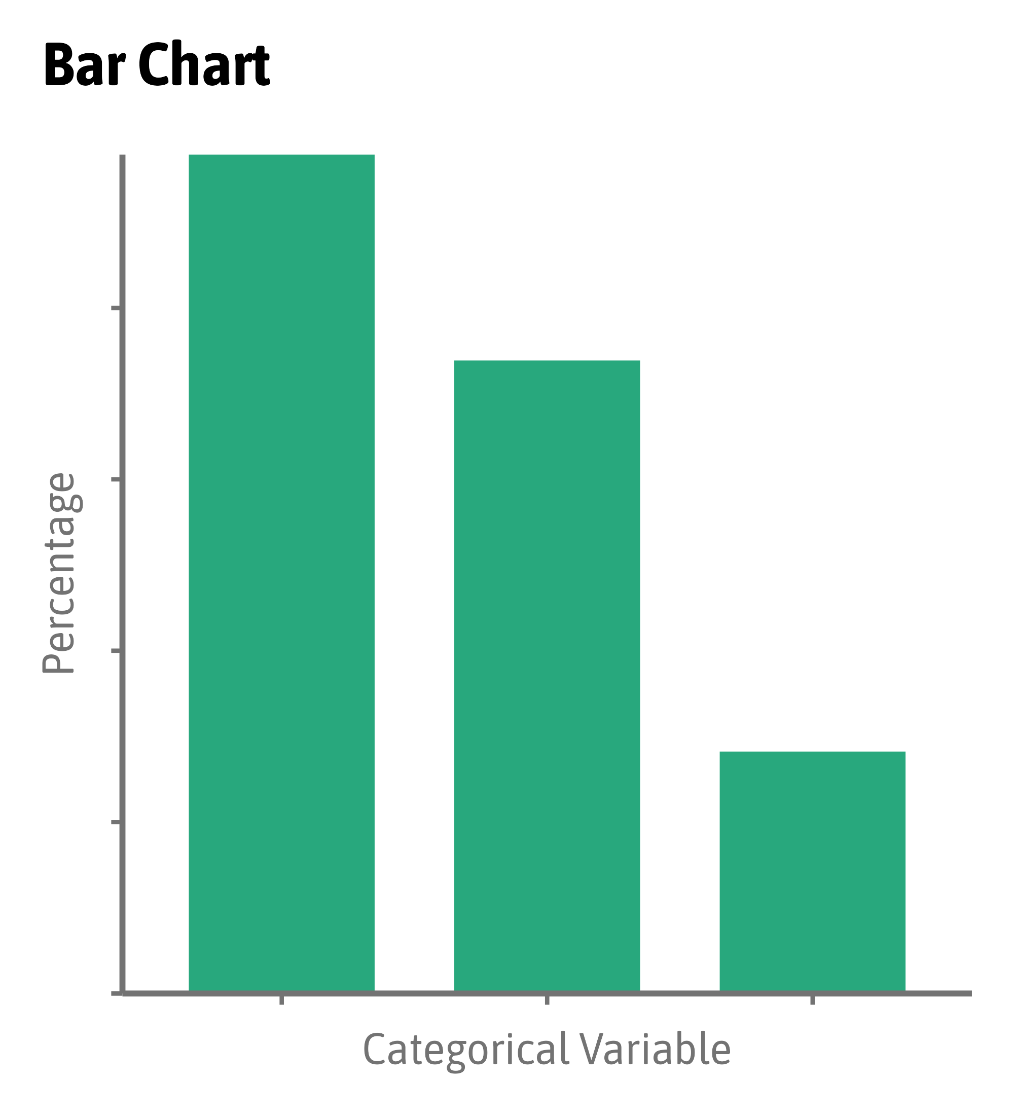
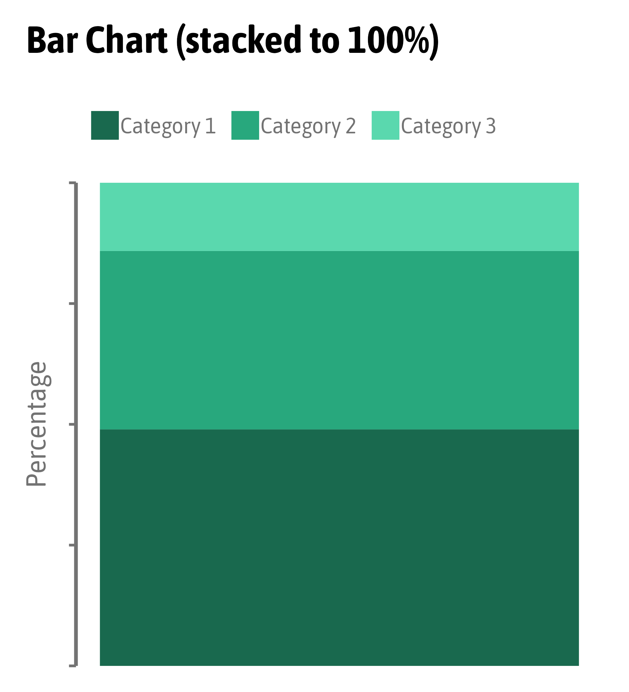
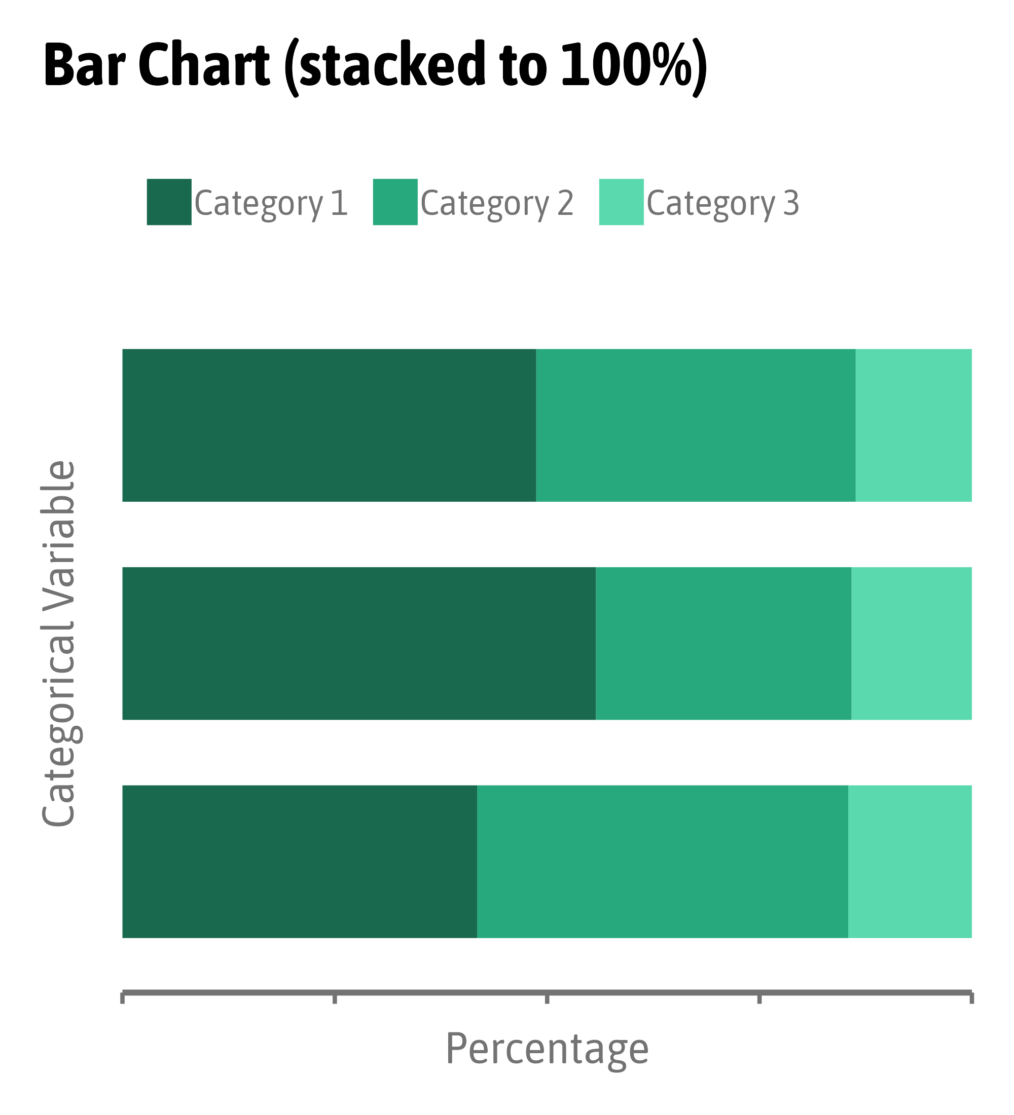
Same Data, Different Encodings


Same Data, Different Encodings


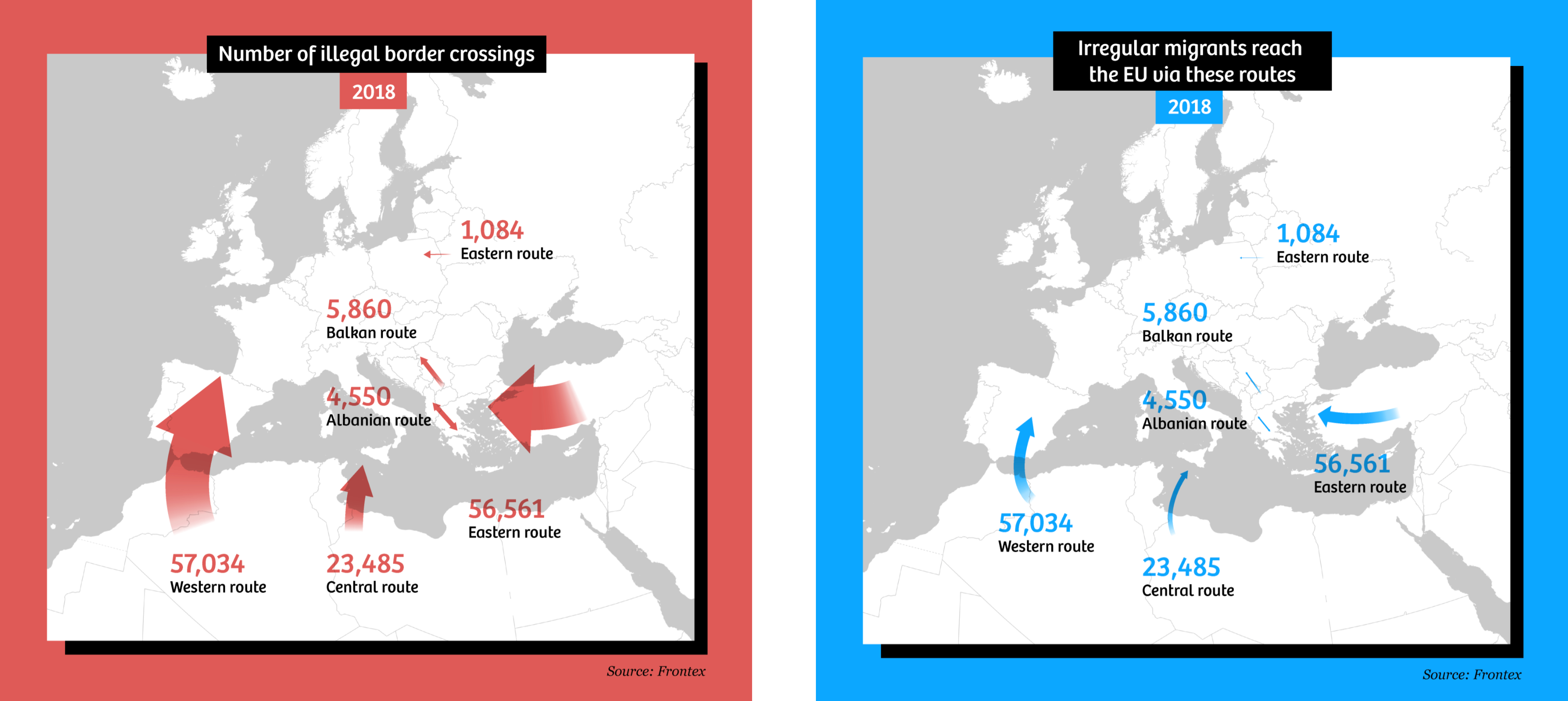
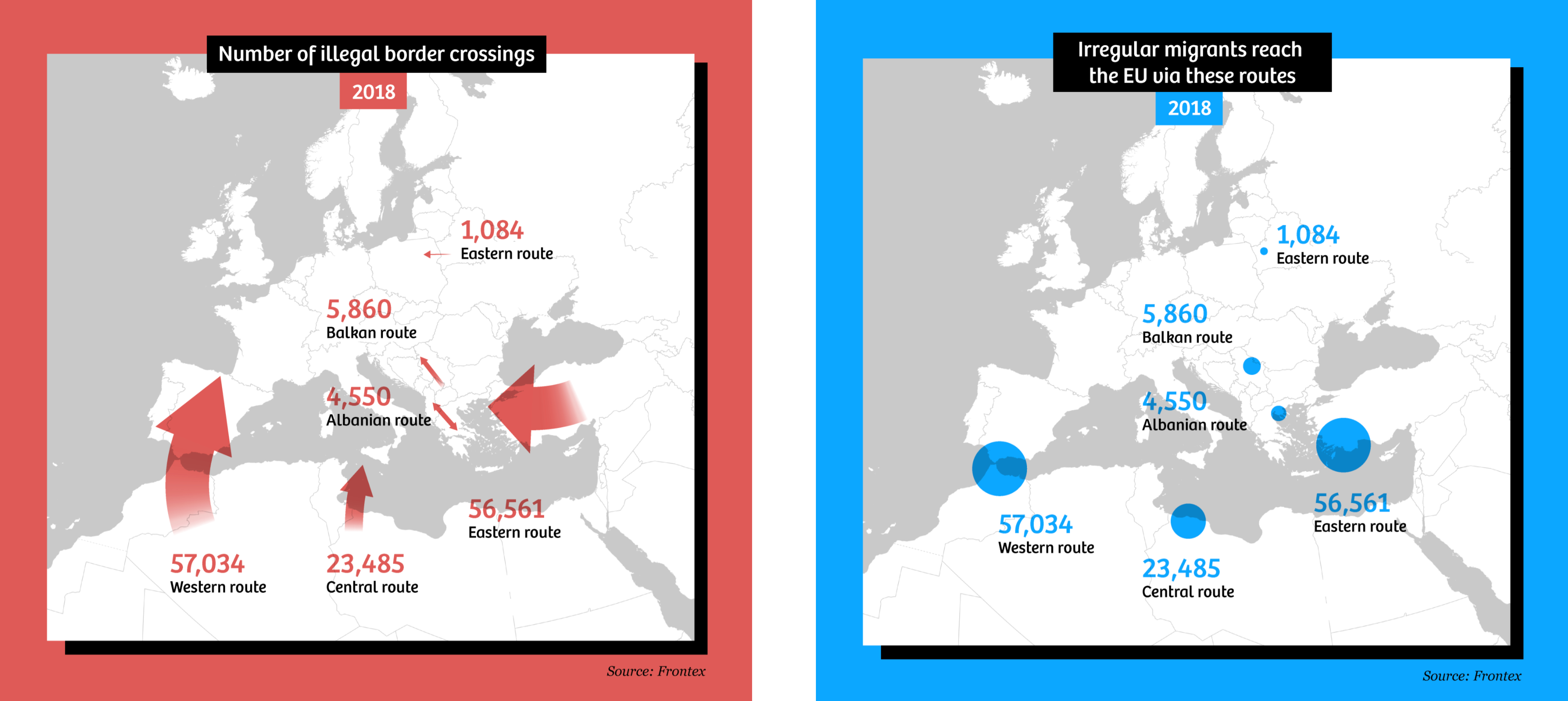
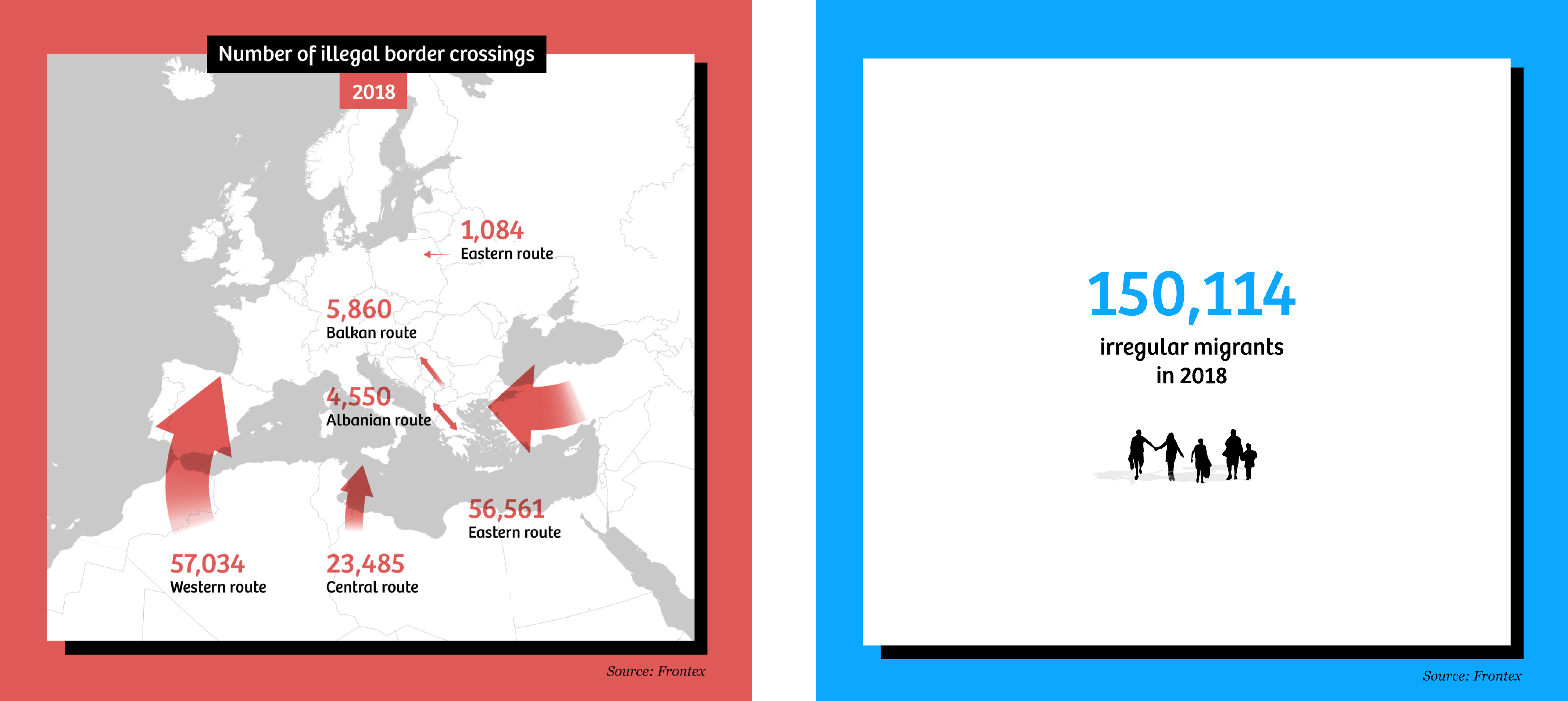
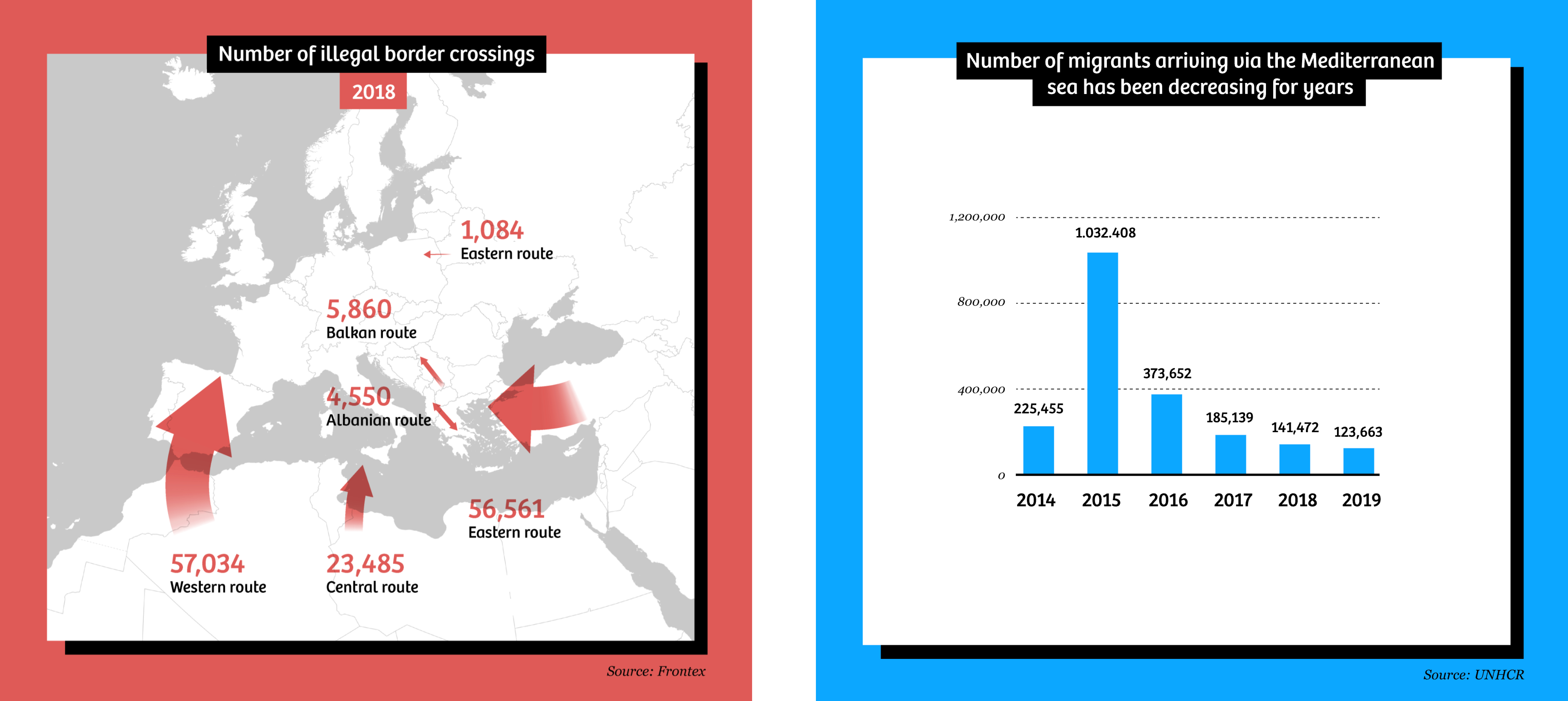
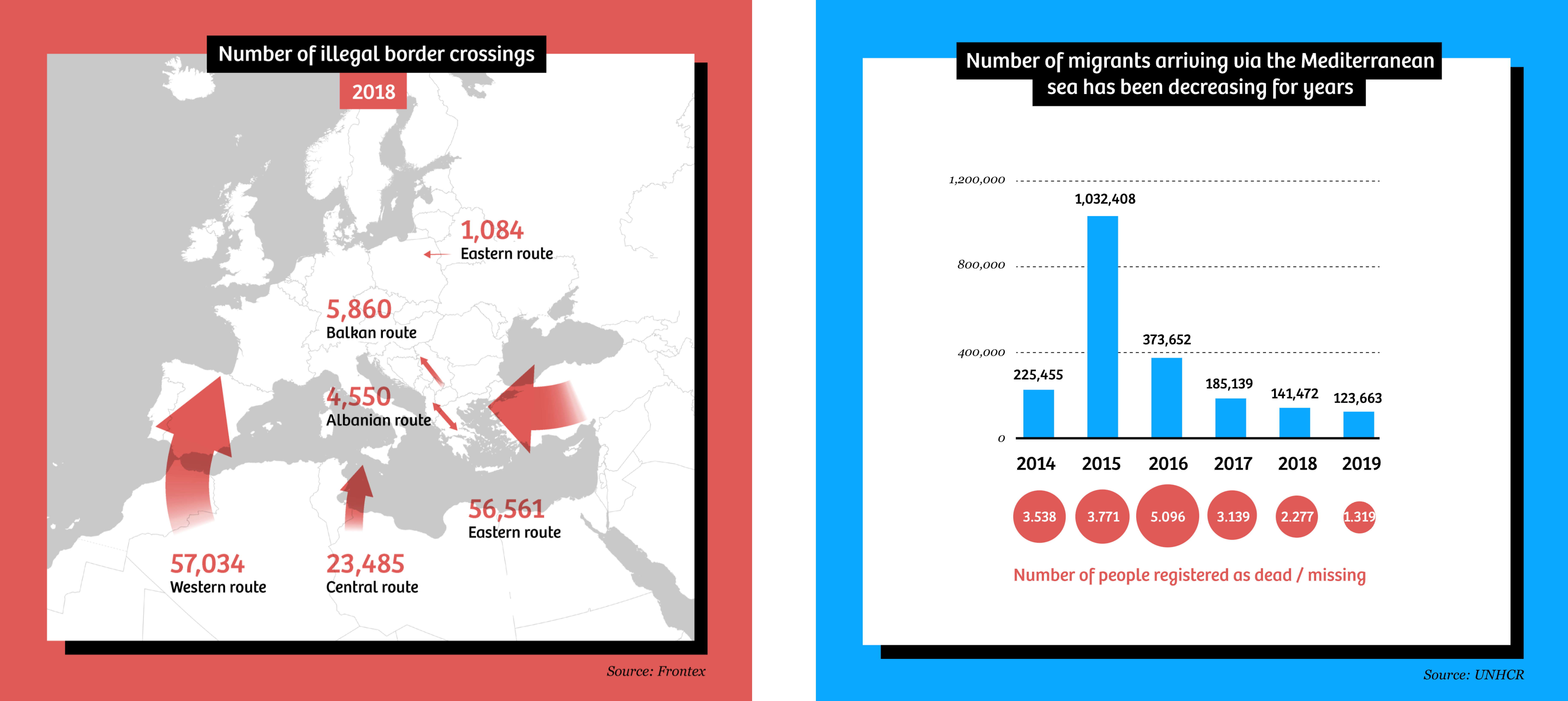
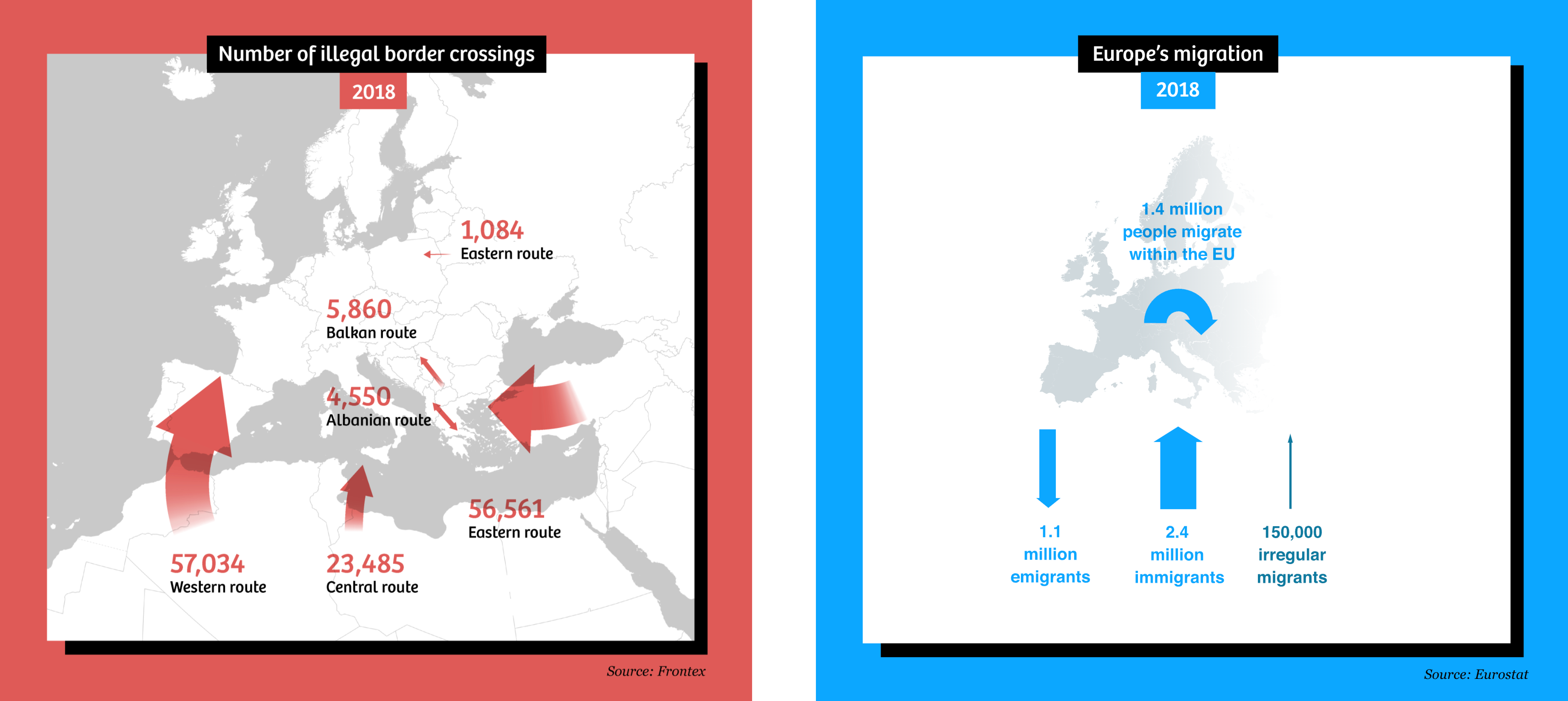
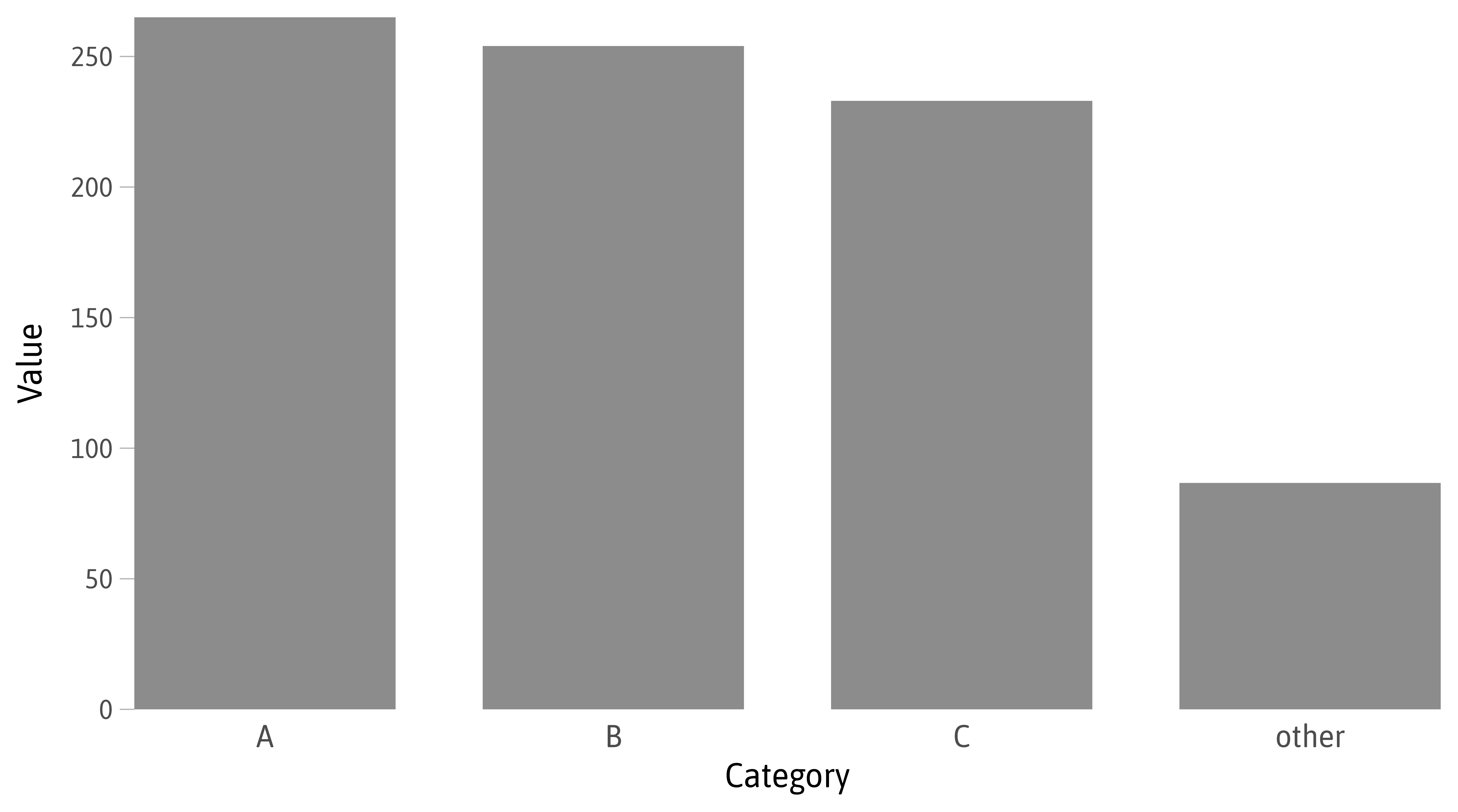
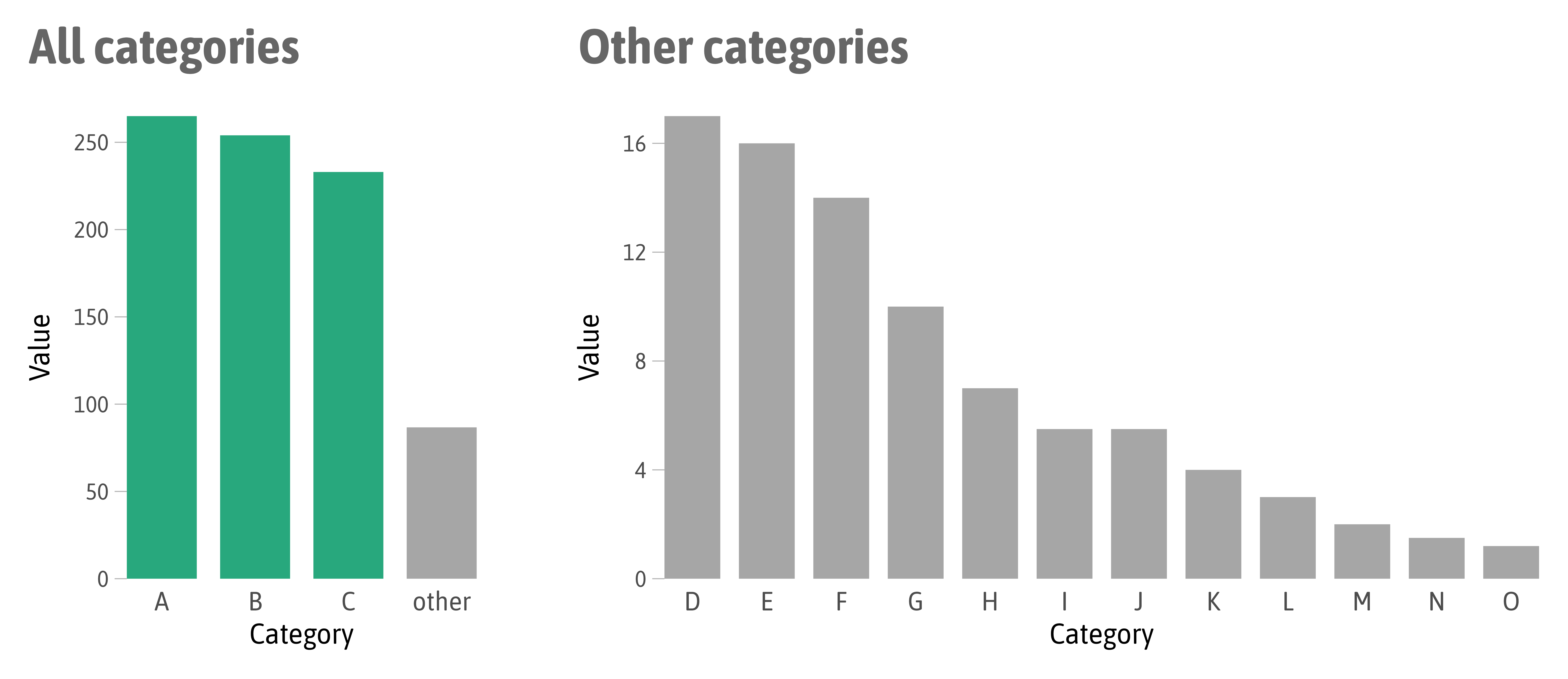
Same Data, Different Emphasis


Same Data, Different Emphasis


Source: “Data Points” by Nathan Yau (p. 104)
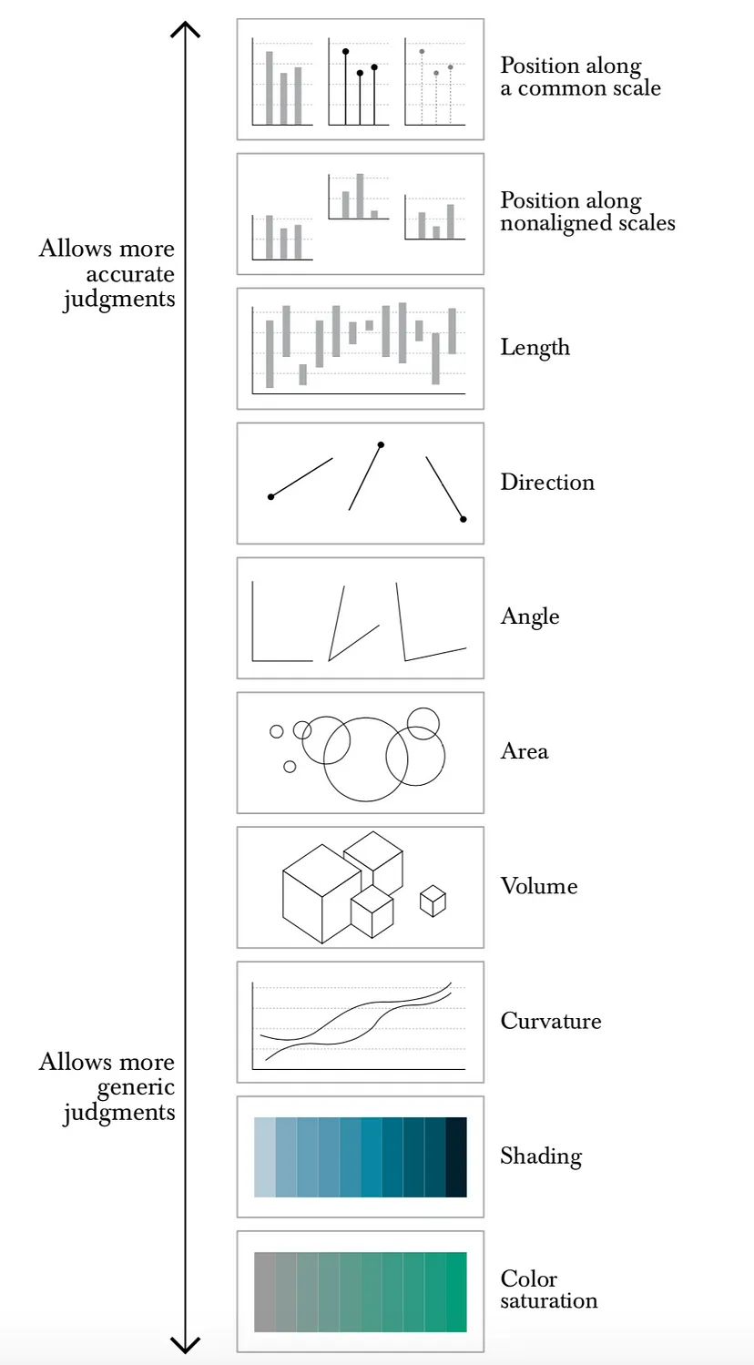
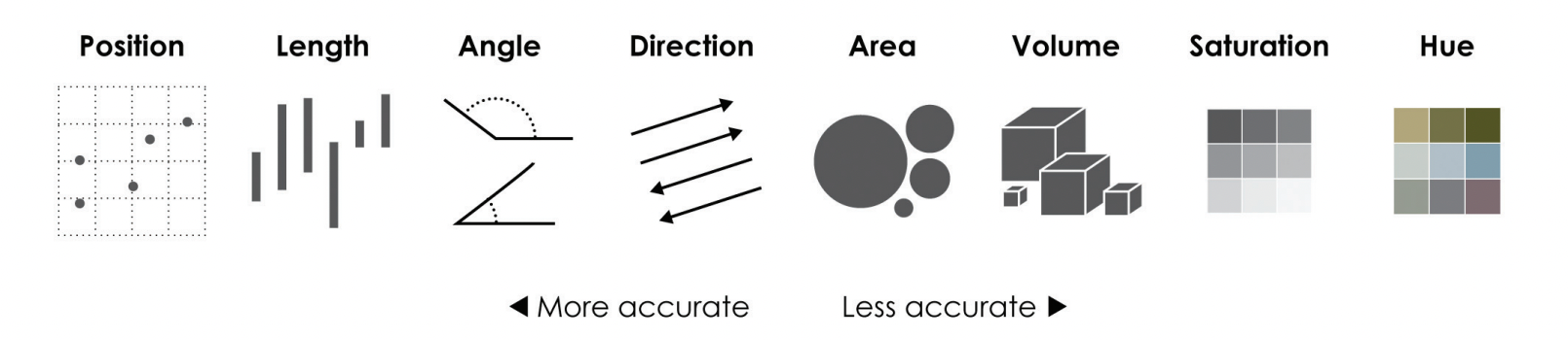
Cleveland’s and McGill’s Scale of Perpetual Elementary Tasks
Source: “The Functional Art” by Alberto Cairo (p. 120)
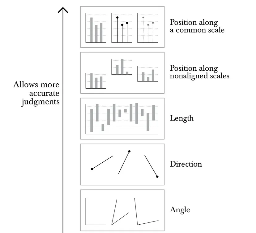
Cleveland’s and McGill’s Scale of Perpetual Elementary Tasks
Source: “The Functional Art” by Alberto Cairo (p. 120)
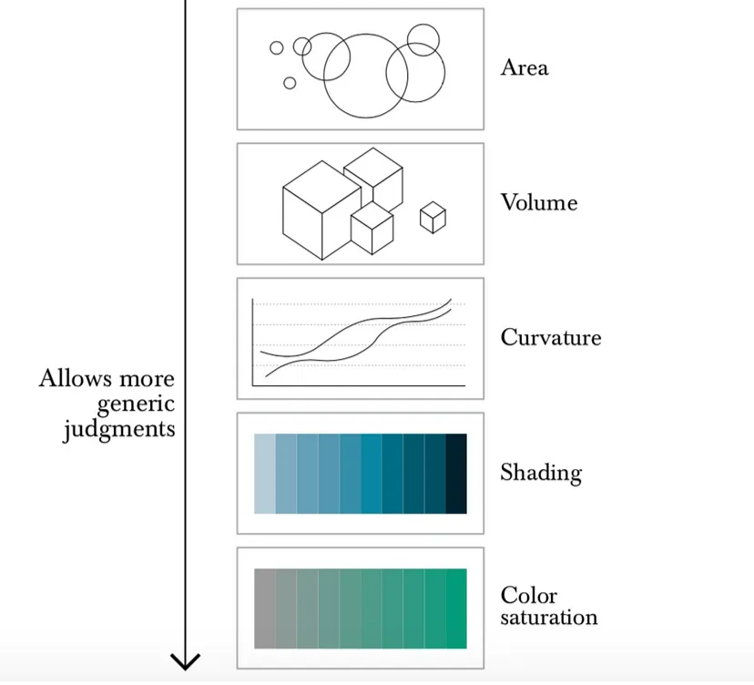
Cleveland’s and McGill’s Scale of Perpetual Elementary Tasks
Source: “The Functional Art” by Alberto Cairo (p. 120)
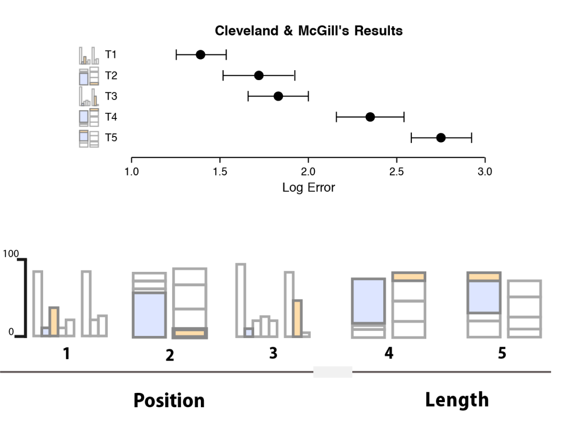
Source: “Data Visualization: A Practical Introduction” by Kieran Healy
Results based on Cleveland and McGill (1984, 1987)

Source: “Data Visualization: A Practical Introduction” by Kieran Healy
Results based on Cleveland and McGill (1984, 1987) and Heer & Bostock (2010)
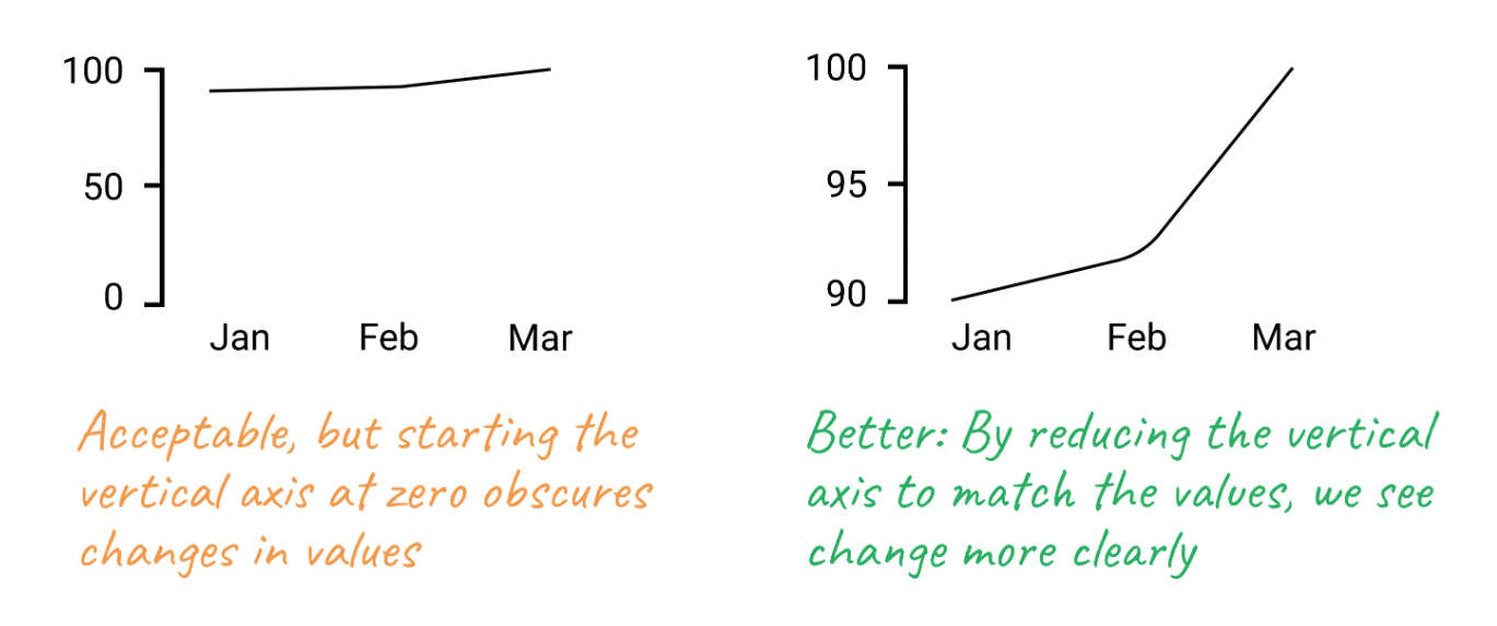
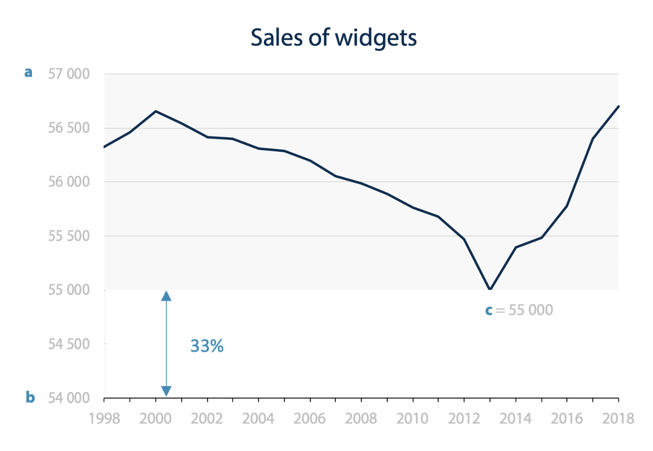
Always Start at Zero?
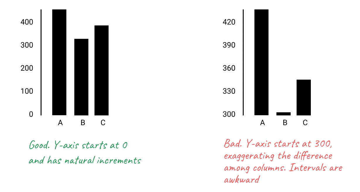
Source: “Hands-On Data Visualization” by Jack Dougherty & Ilya Ilyankou
More on the topic: Correl, Bertini & Francoeri 2020 and Witt (2019)
Always Start at Zero?
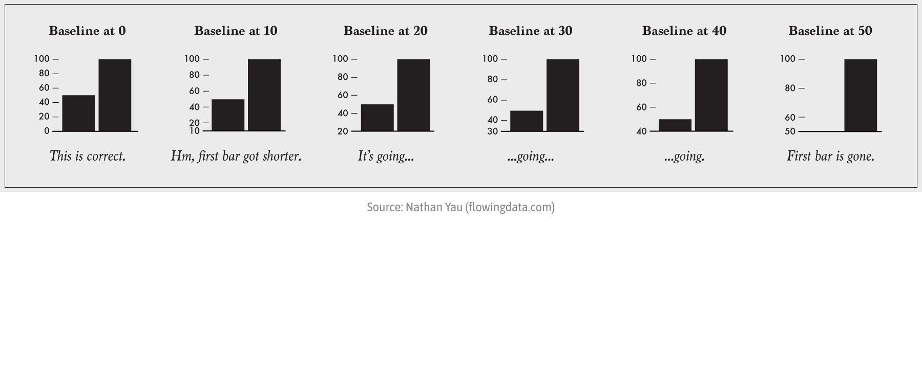
Always Start at Zero?
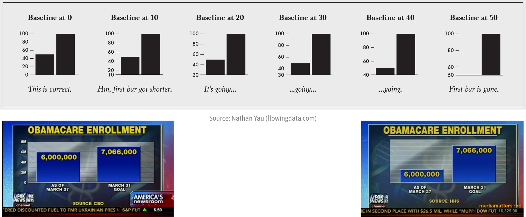
Always Start at Zero?
Source: “Hands-On Data Visualization” by Jack Dougherty & Ilya Ilyankou
Source: Francis Gagnon
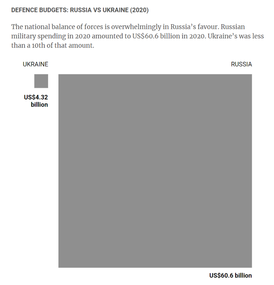
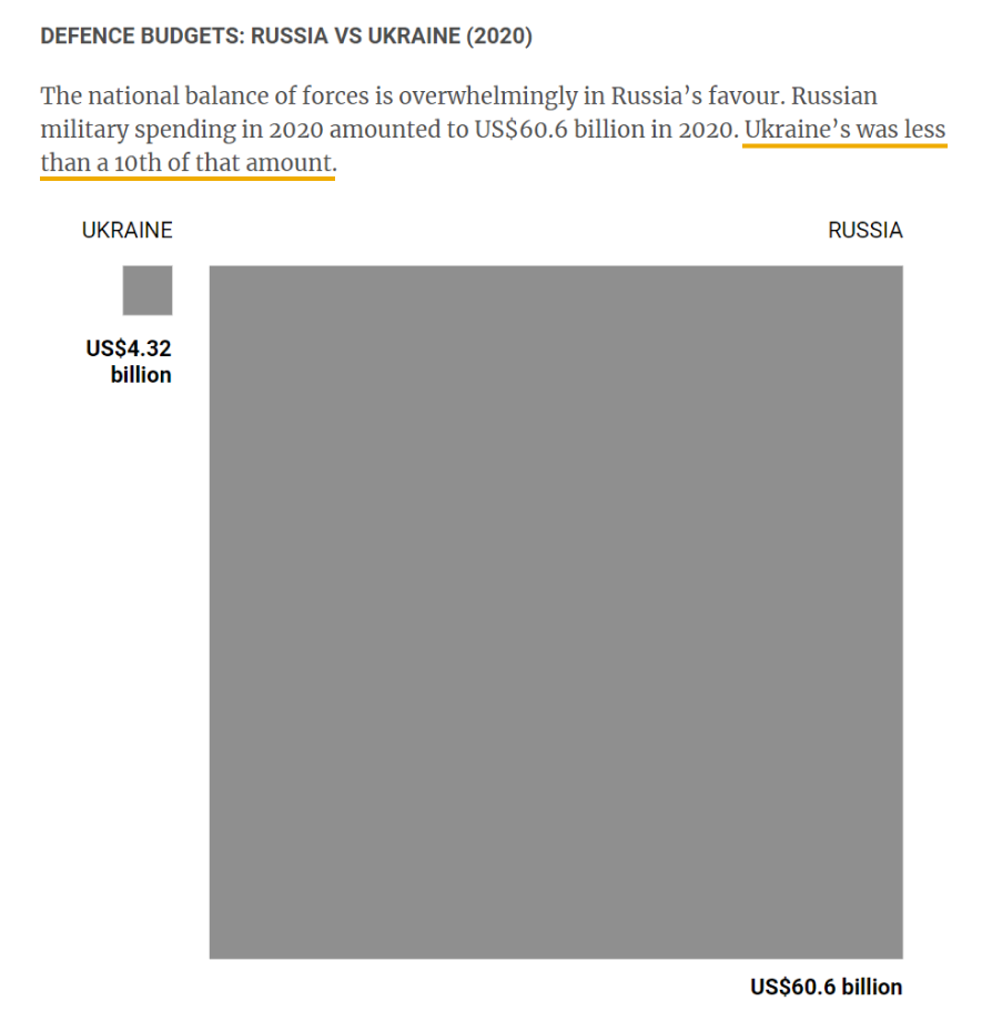
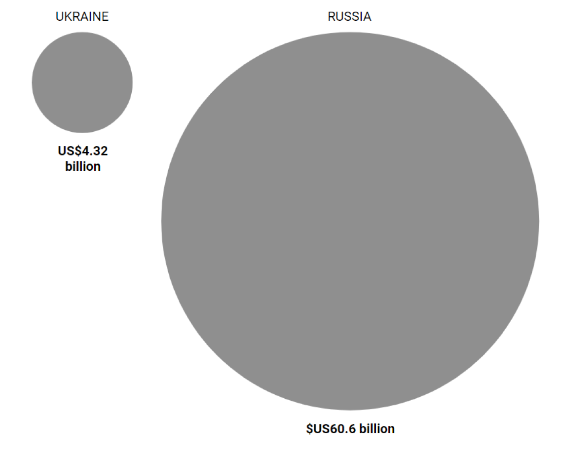
Same Data, Different Scaling


Same Data, Different Scaling


“Russia attacks Ukraine” by SCMP Graphic (South China Morning Post)
“Russia attacks Ukraine” by SCMP Graphic (South China Morning Post)
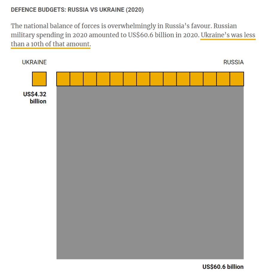
“Russia attacks Ukraine” by SCMP Graphic (South China Morning Post)
“Russia attacks Ukraine” by SCMP Graphic (South China Morning Post)
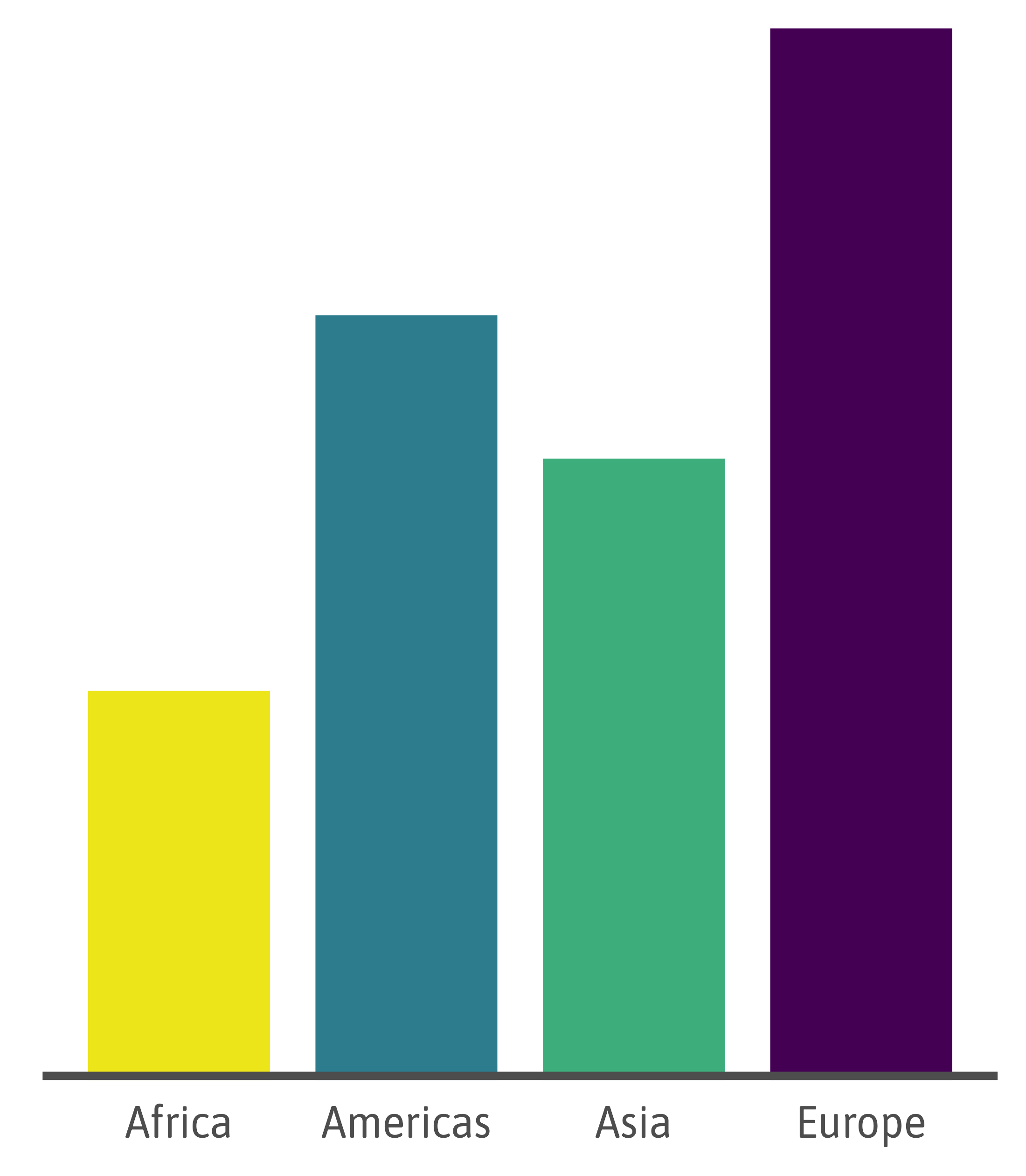
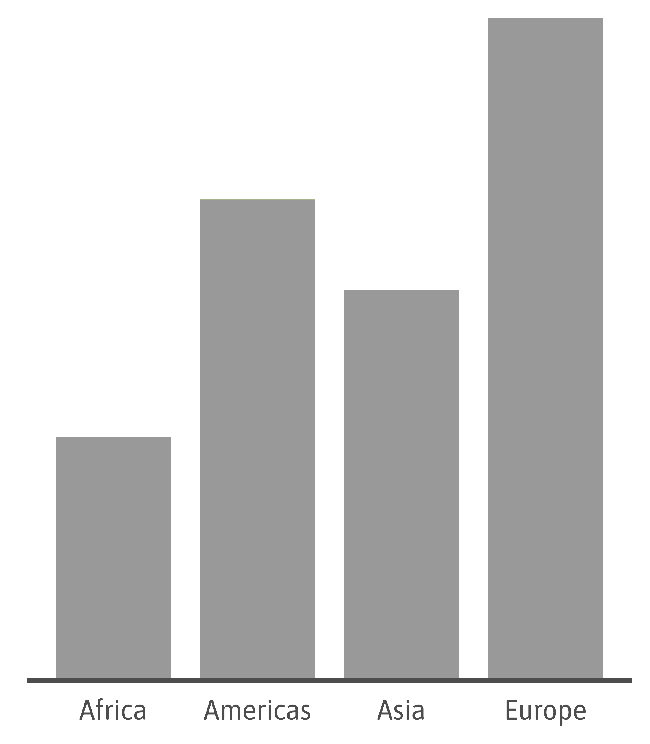
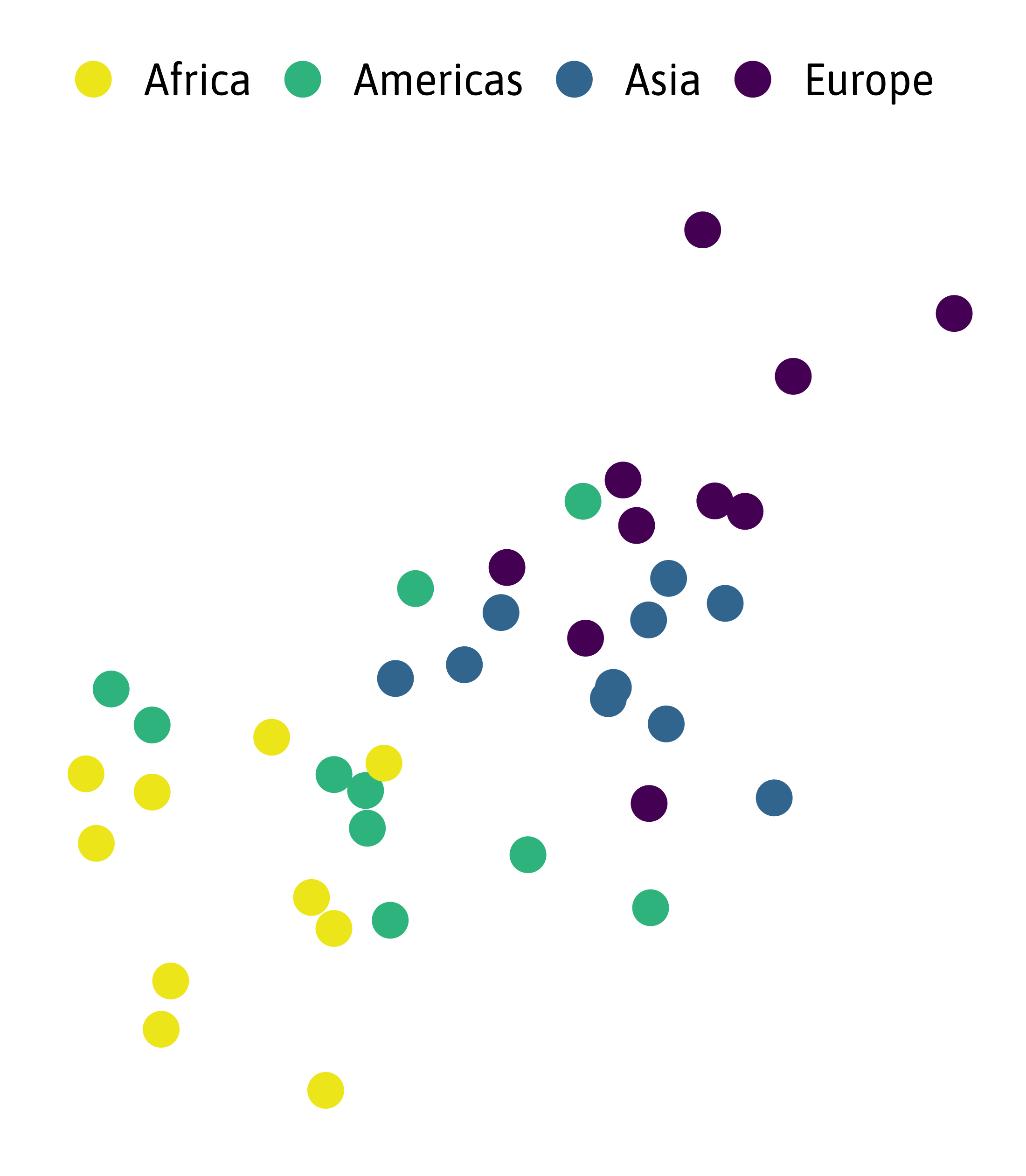
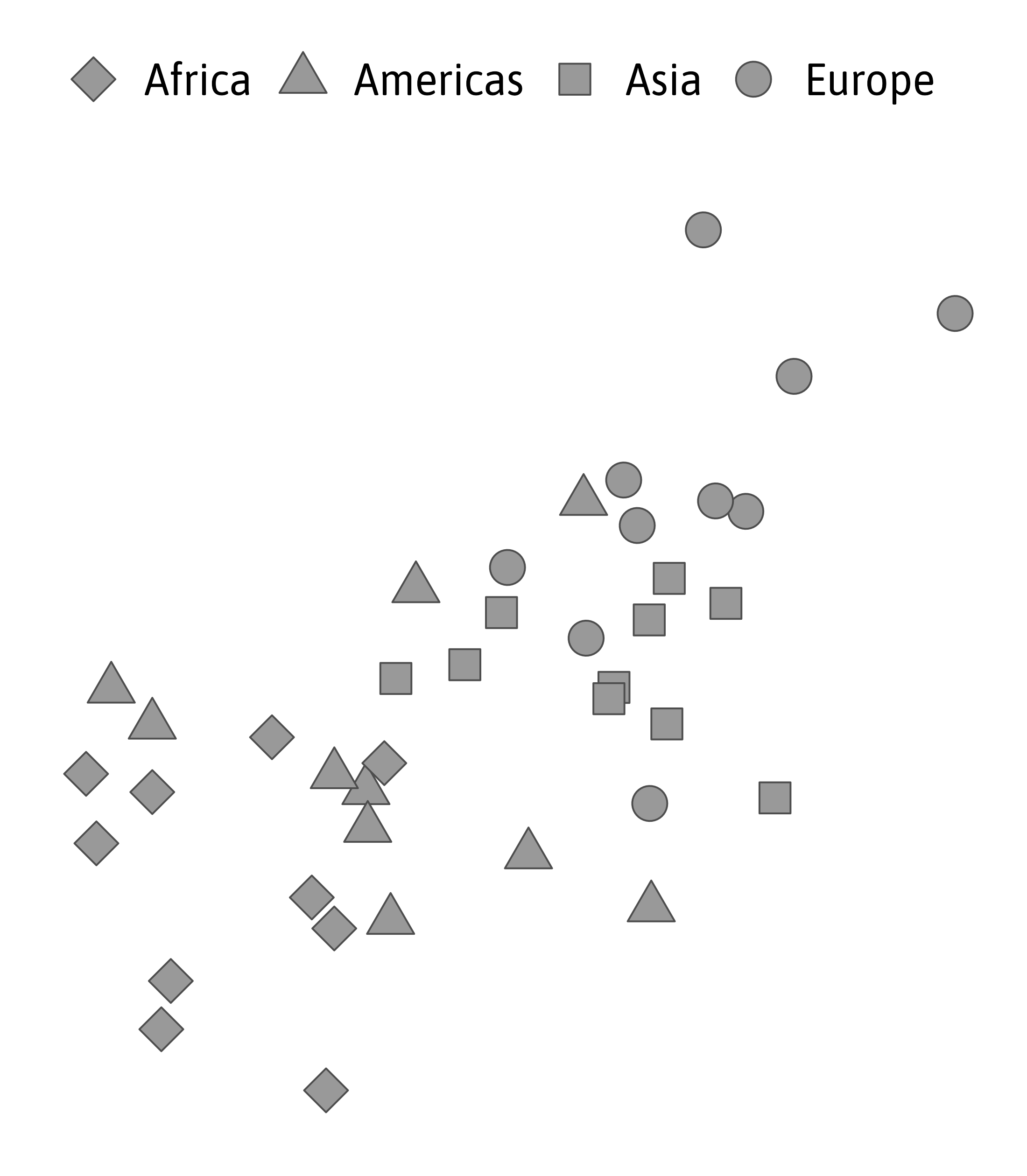
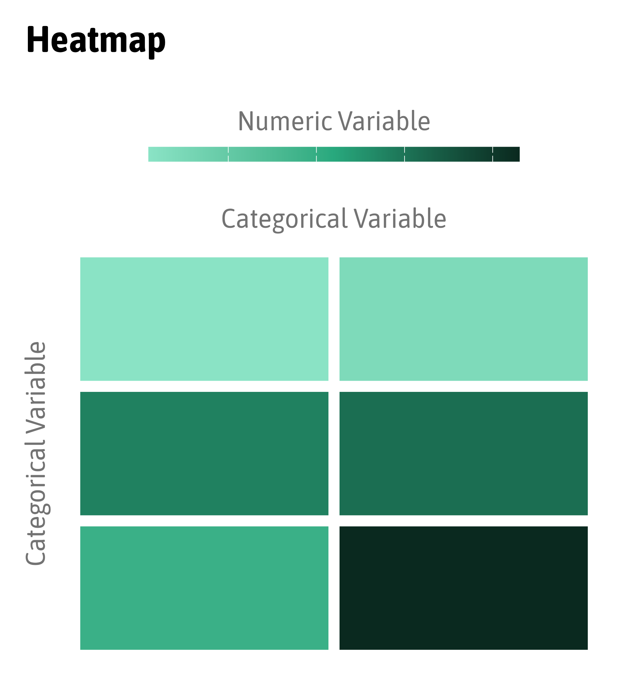
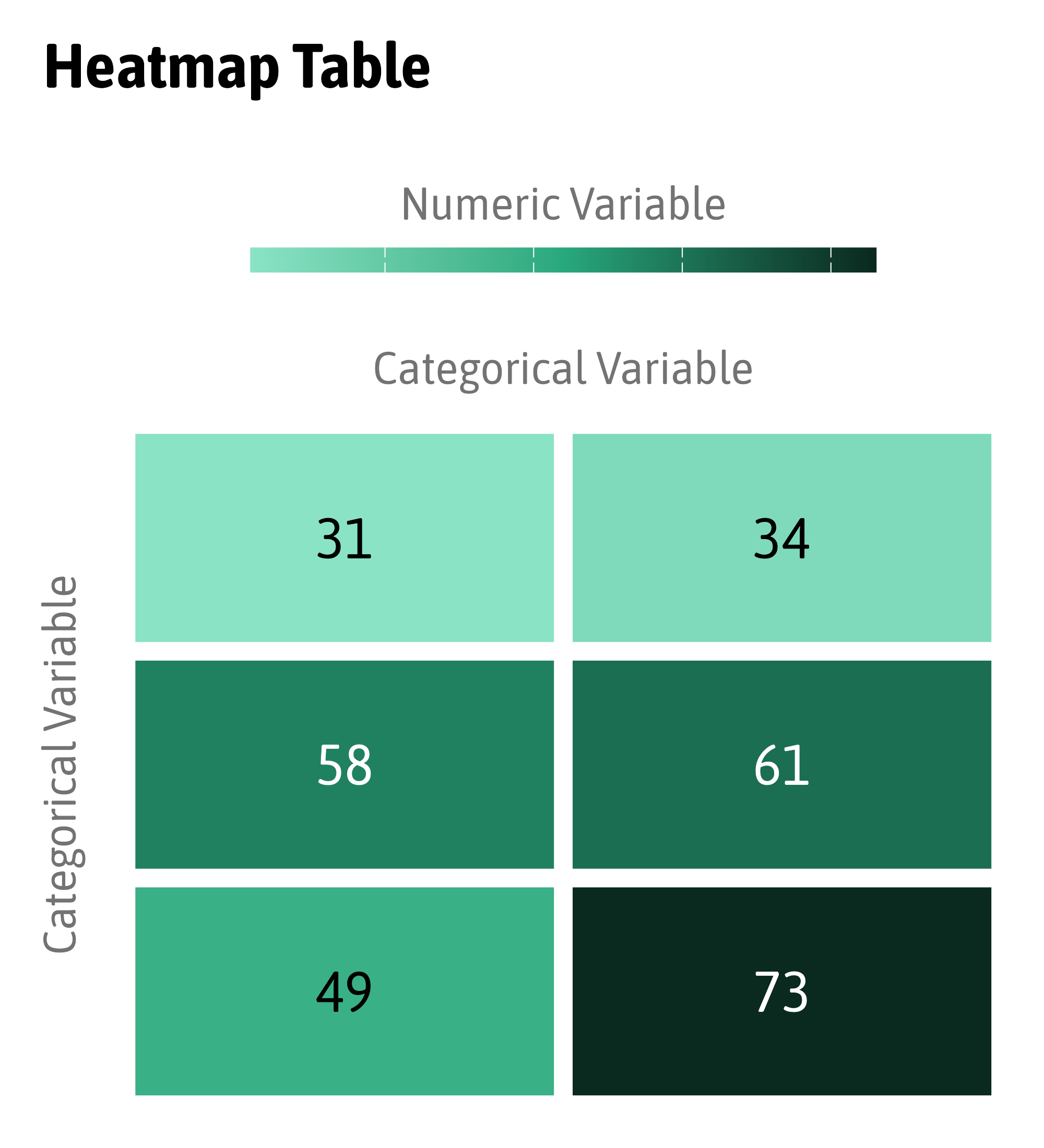
Same Data, Different Palettes


Same Data, Different Palettes


Same Data, Different Palettes


Color Palette Types

Color Palette Types: Dark Equals More (?)
Color Palette Types: Dark Equals More (?)
Color Palette Types

Color Palette Types: Sequential or Diverging?
Color Palette Types: Midpoint
Color Palette Types
Color Palette Types: Sequential

Source: Lisa Charlotte Muth, DataWrapper Blog
Color Palette Types: Sequential Qualitative!
Source: Lisa Charlotte Muth, DataWrapper Blog
Source: Data to Viz
Source: Data to Viz
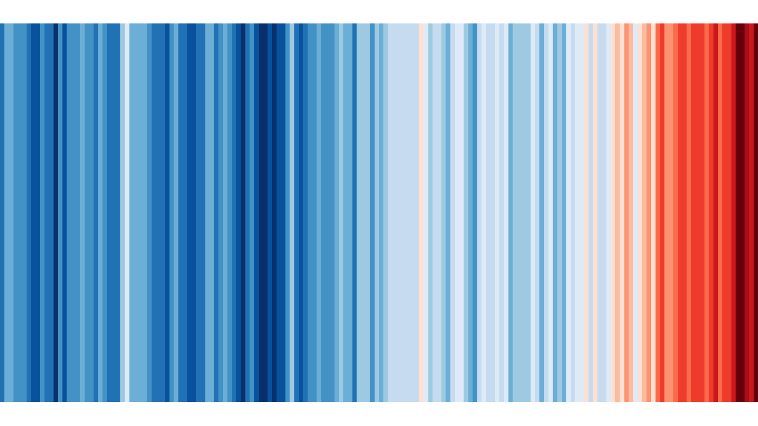
“Warming Stripes” by Ed Hawkins (showyourstripes.info)
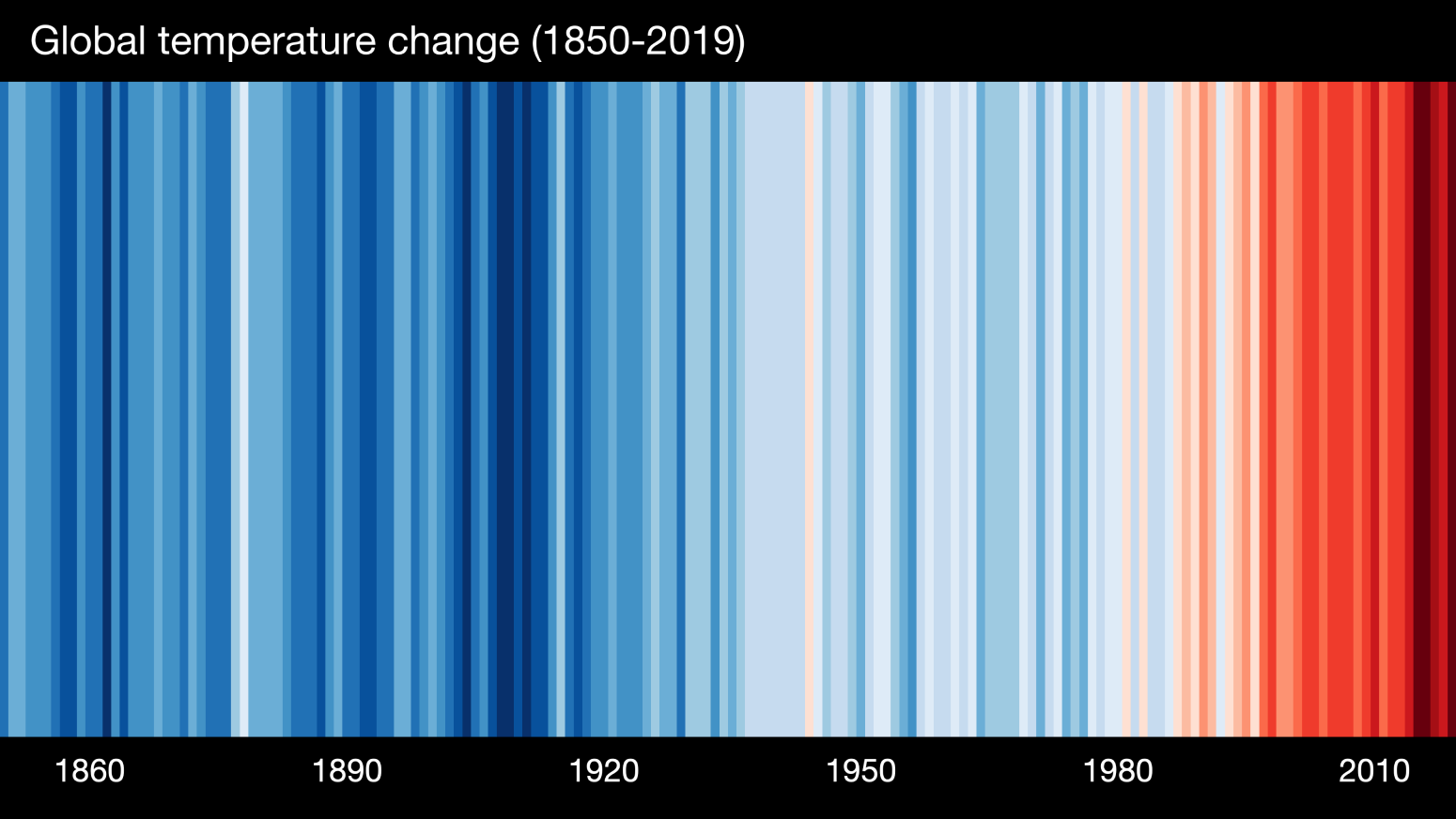
“Warming Stripes” by Ed Hawkins (showyourstripes.info)
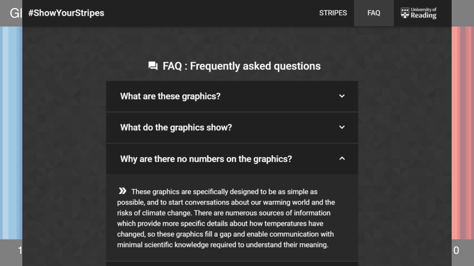
“Warming Stripes” by Ed Hawkins (showyourstripes.info)
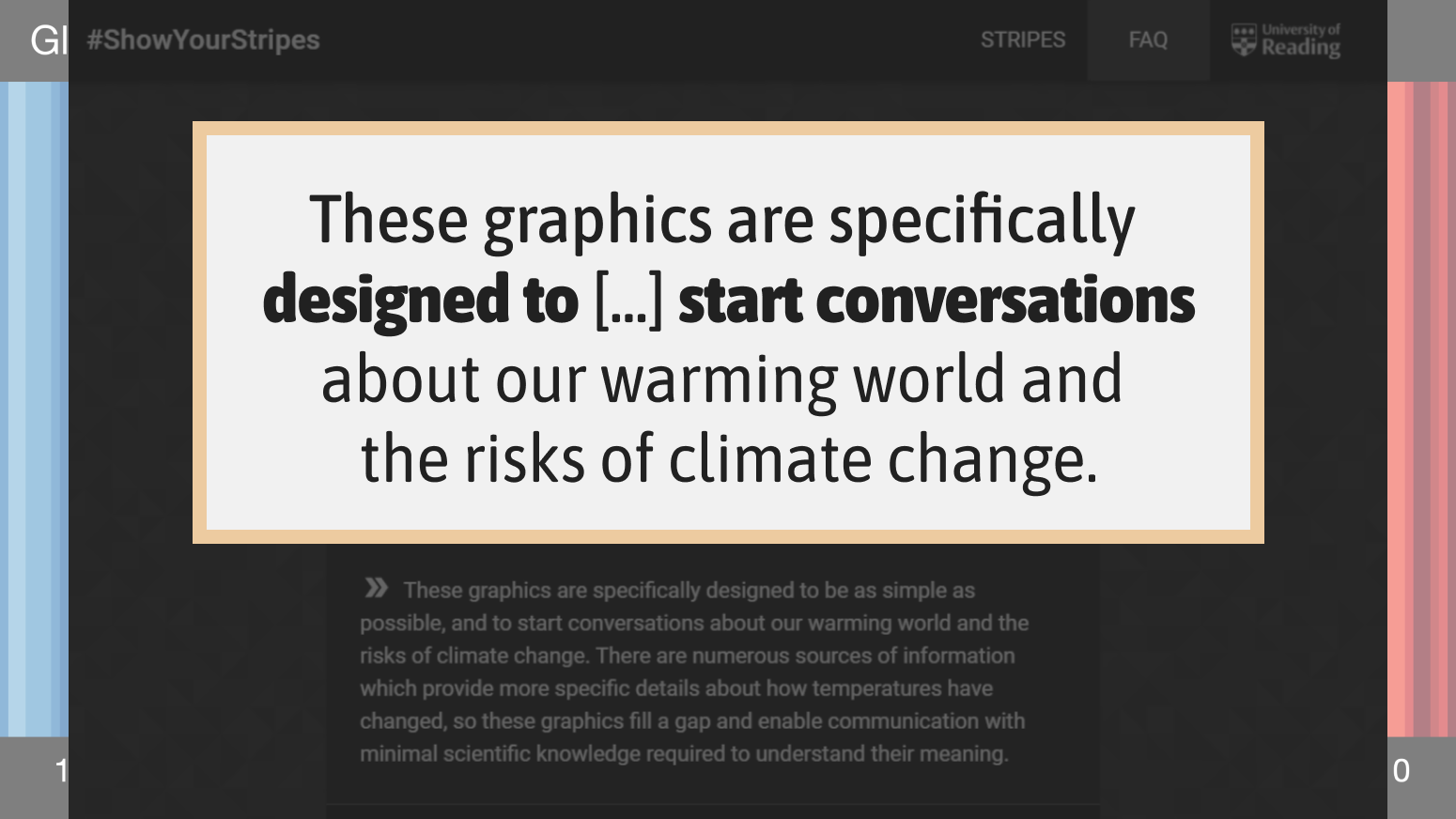
“Warming Stripes” by Ed Hawkins (showyourstripes.info)
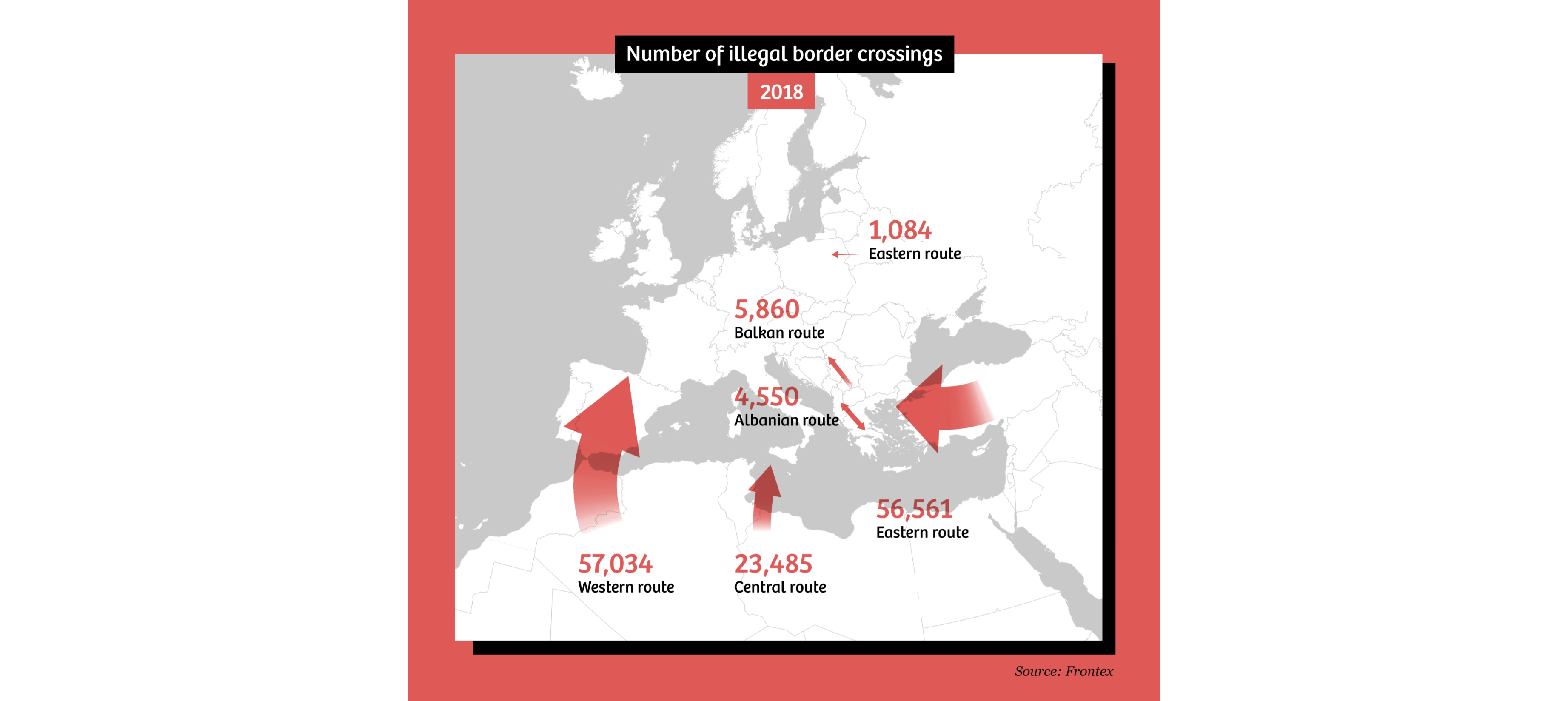
“How maps in the media make us more negative about migrants” by Maite Vermeulen, Leon de Korte & Henk van Houtum
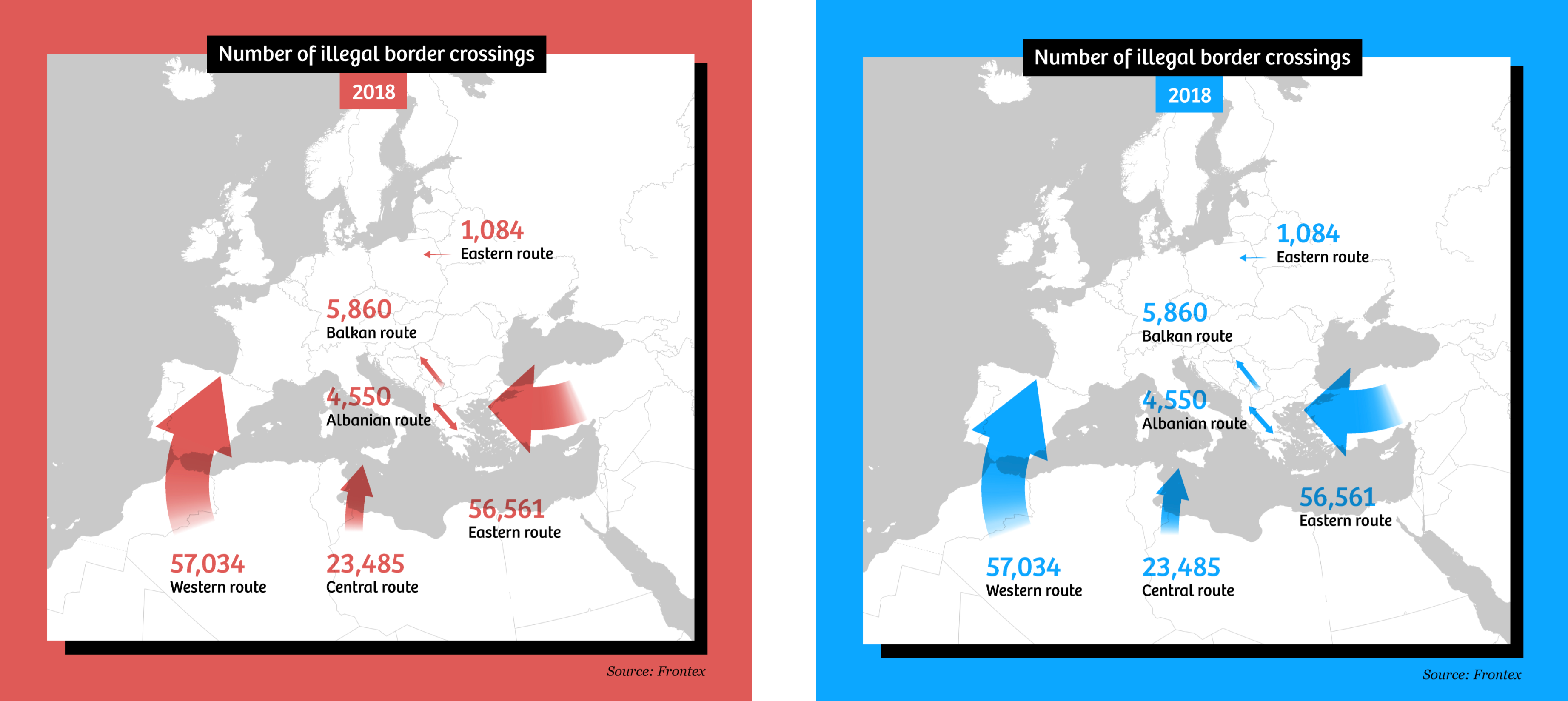
“How maps in the media make us more negative about migrants” by Maite Vermeulen, Leon de Korte & Henk van Houtum
“How maps in the media make us more negative about migrants” by Maite Vermeulen, Leon de Korte & Henk van Houtum
“How maps in the media make us more negative about migrants” by Maite Vermeulen, Leon de Korte & Henk van Houtum
“How maps in the media make us more negative about migrants” by Maite Vermeulen, Leon de Korte & Henk van Houtum
“How maps in the media make us more negative about migrants” by Maite Vermeulen, Leon de Korte & Henk van Houtum
“How maps in the media make us more negative about migrants” by Maite Vermeulen, Leon de Korte & Henk van Houtum
“How maps in the media make us more negative about migrants” by Maite Vermeulen, Leon de Korte & Henk van Houtum
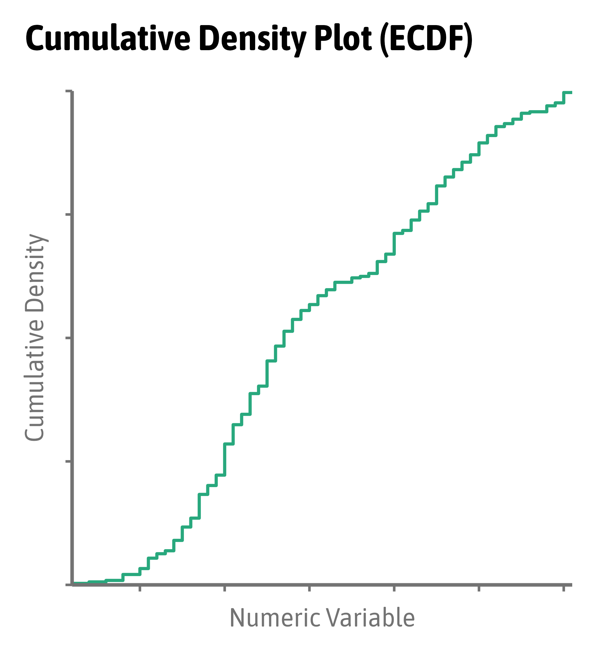
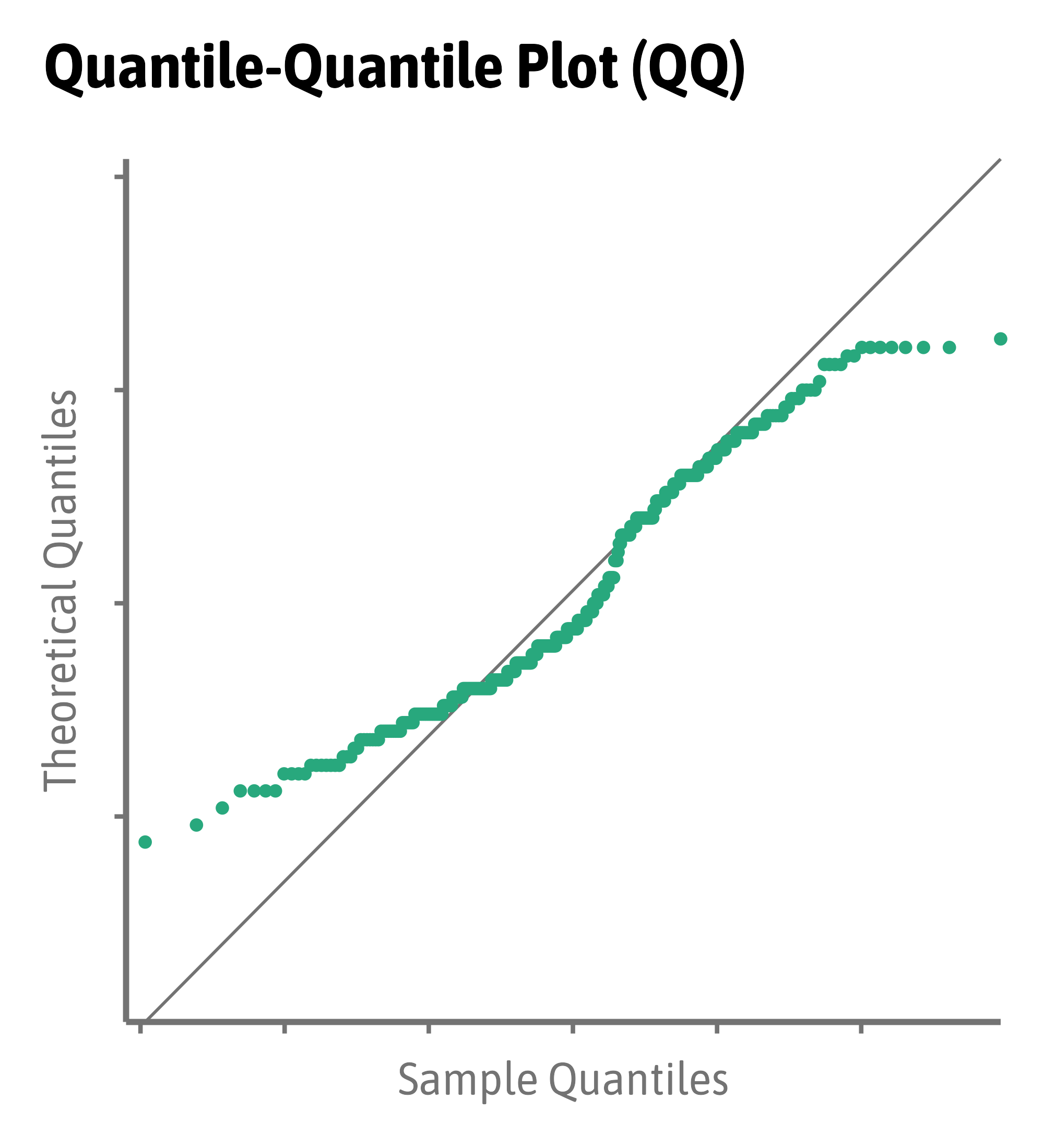
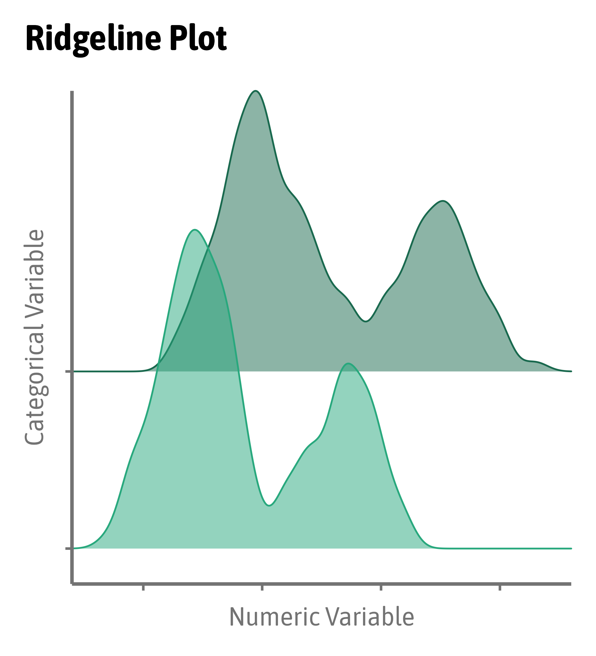
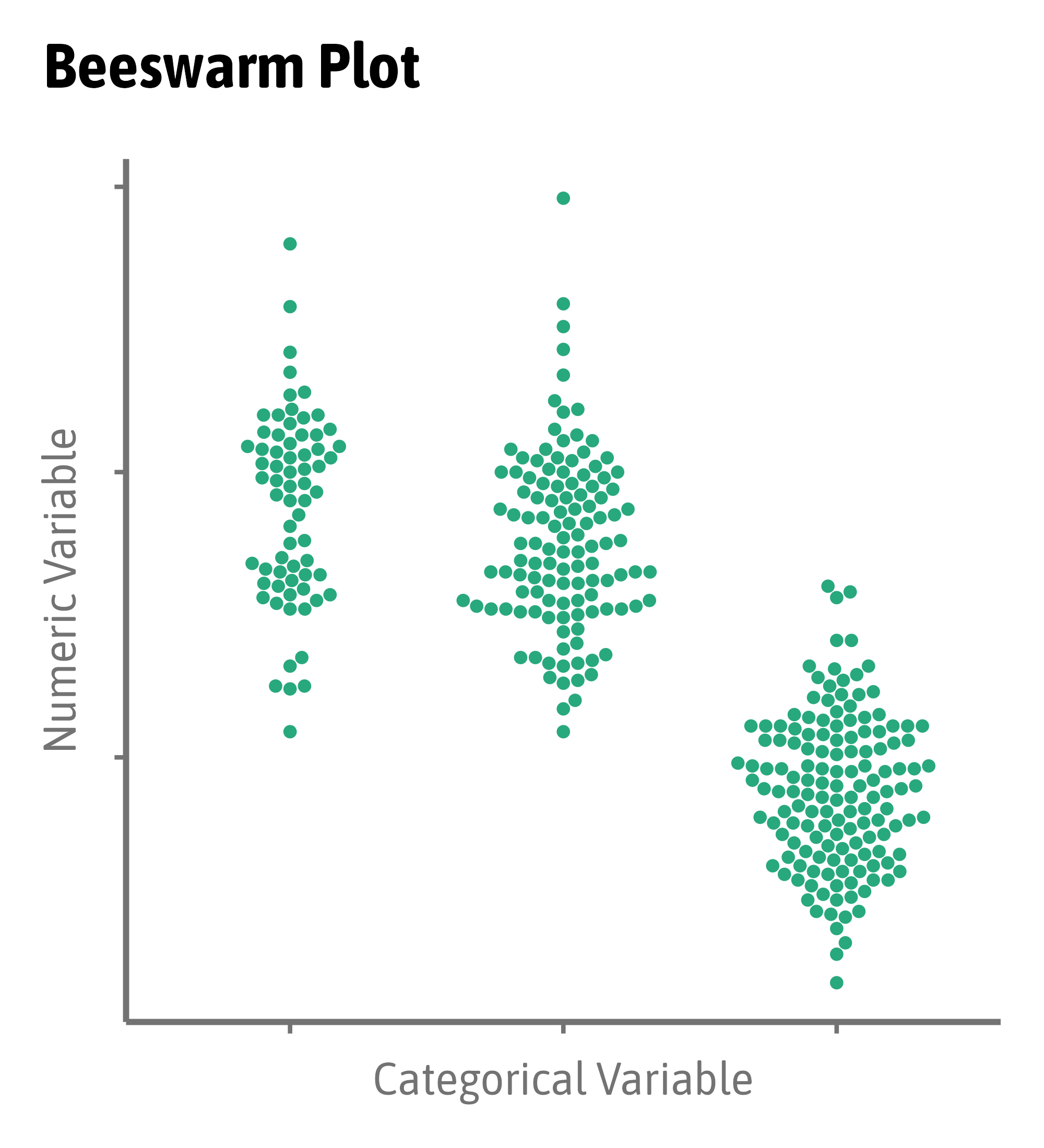
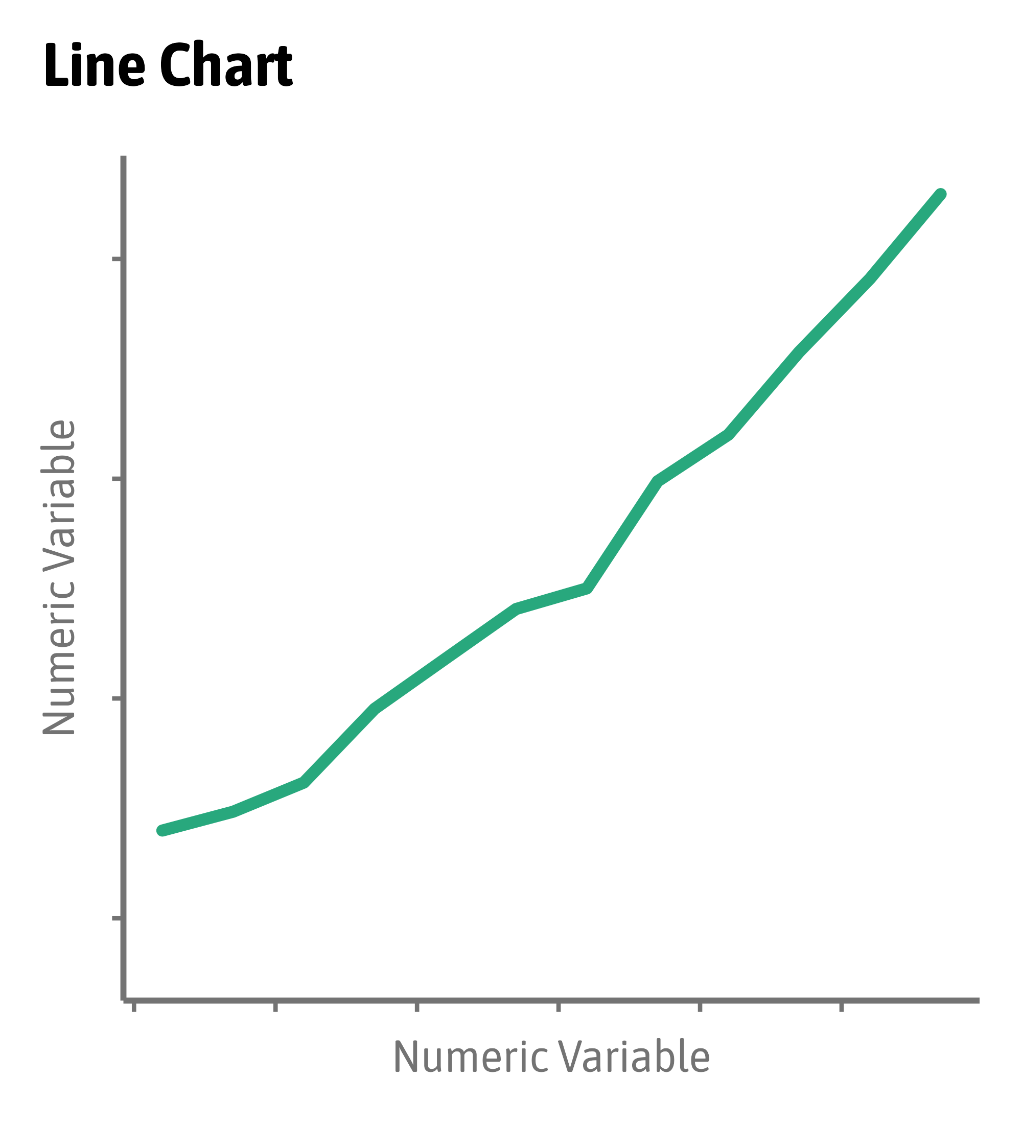
Visualize Distributions
Visualize Distributions
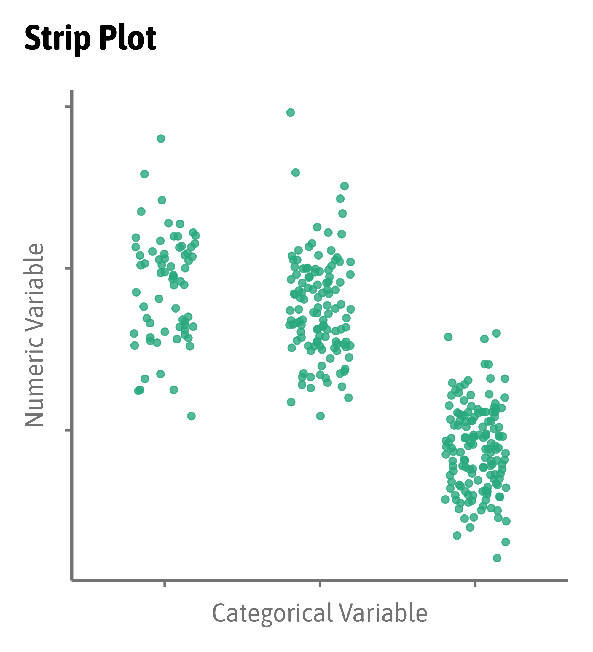
Compare Distributions
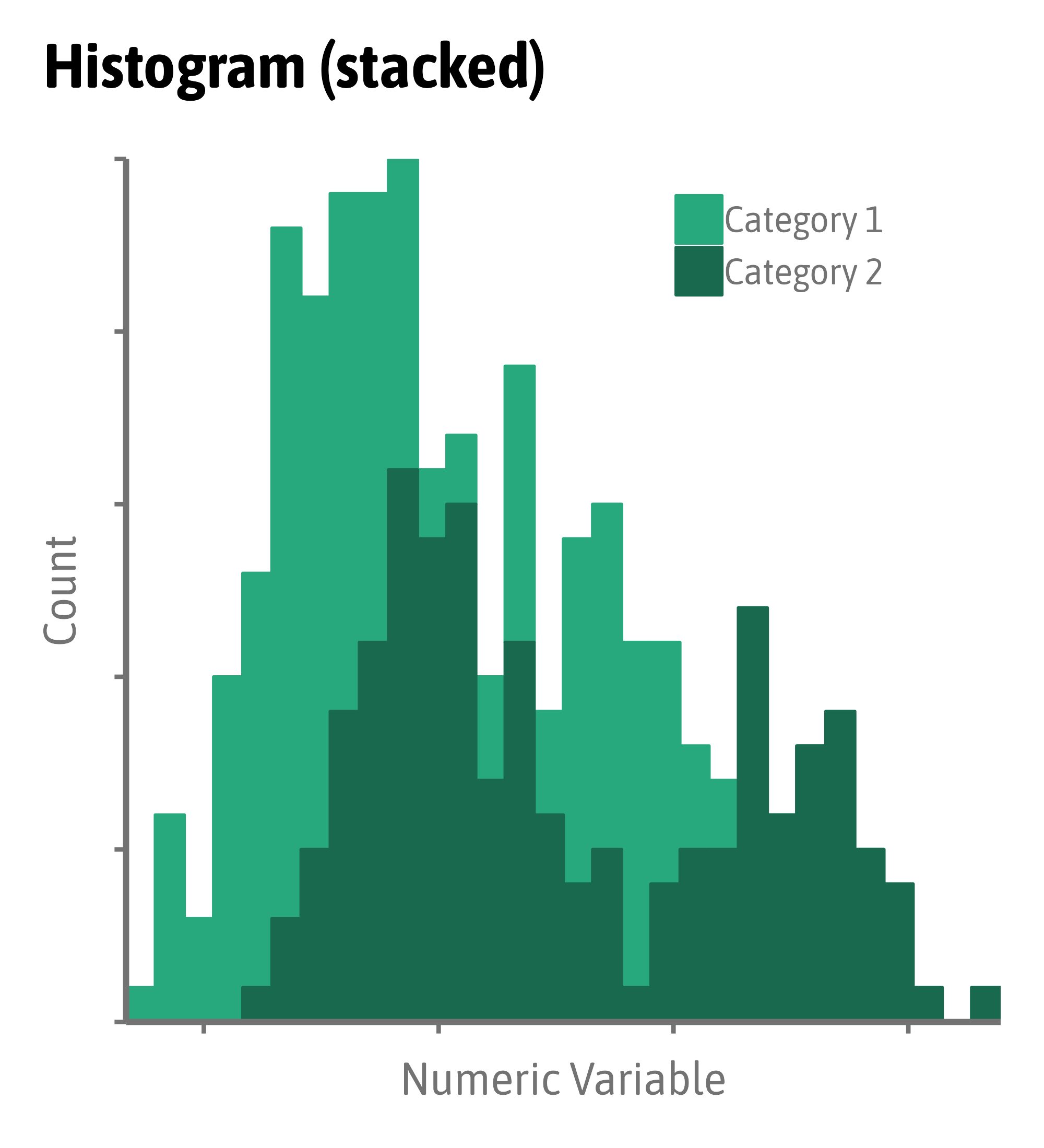
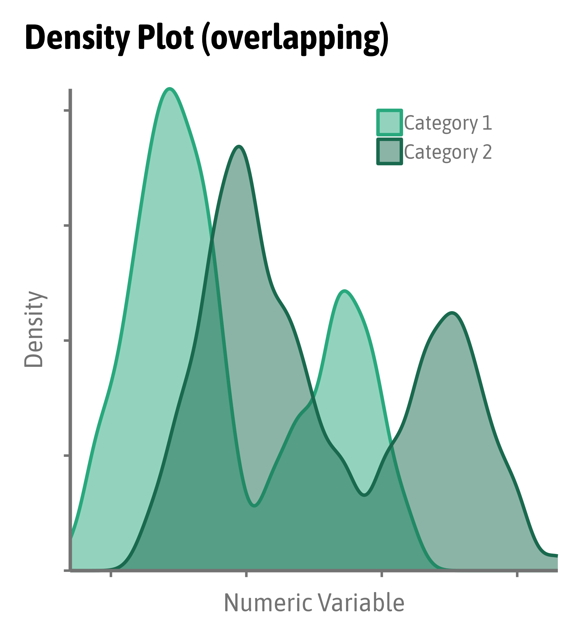
Compare Distributions

Compare Distributions
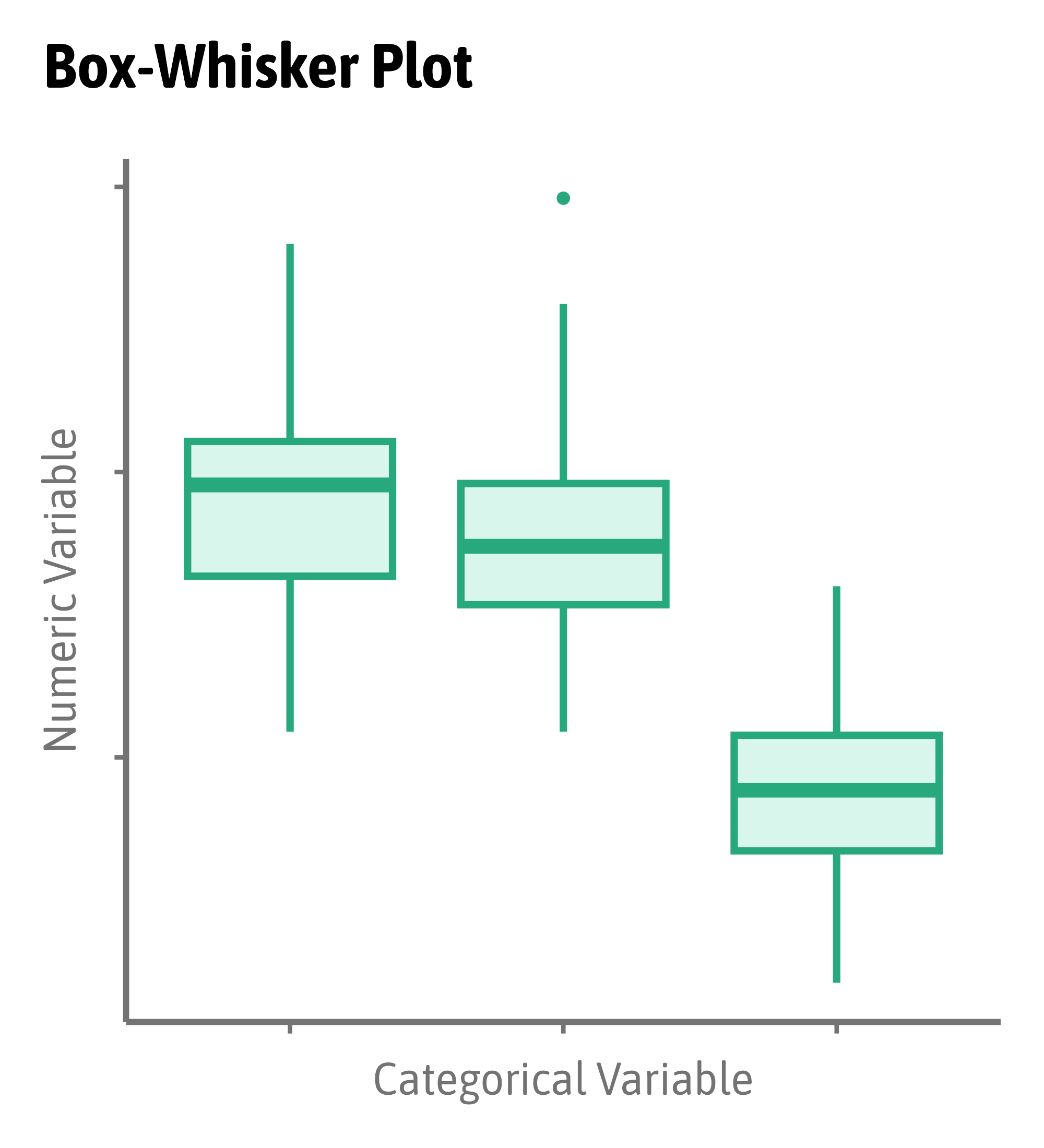
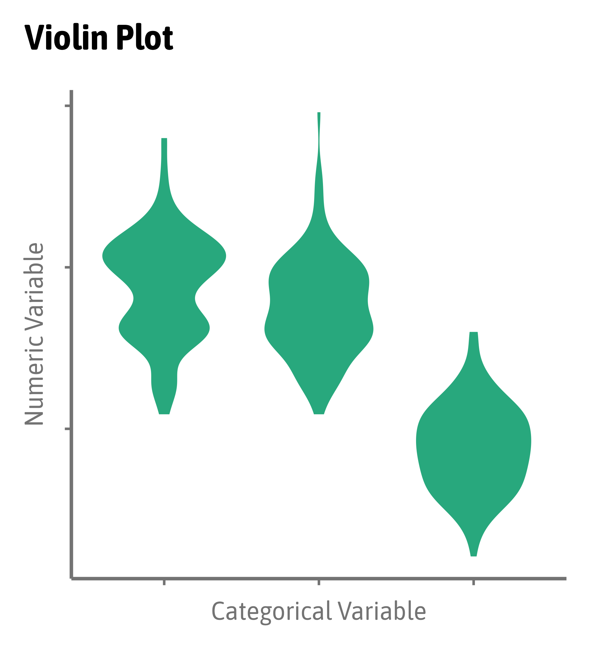
Compare Distributions

Compare Distributions
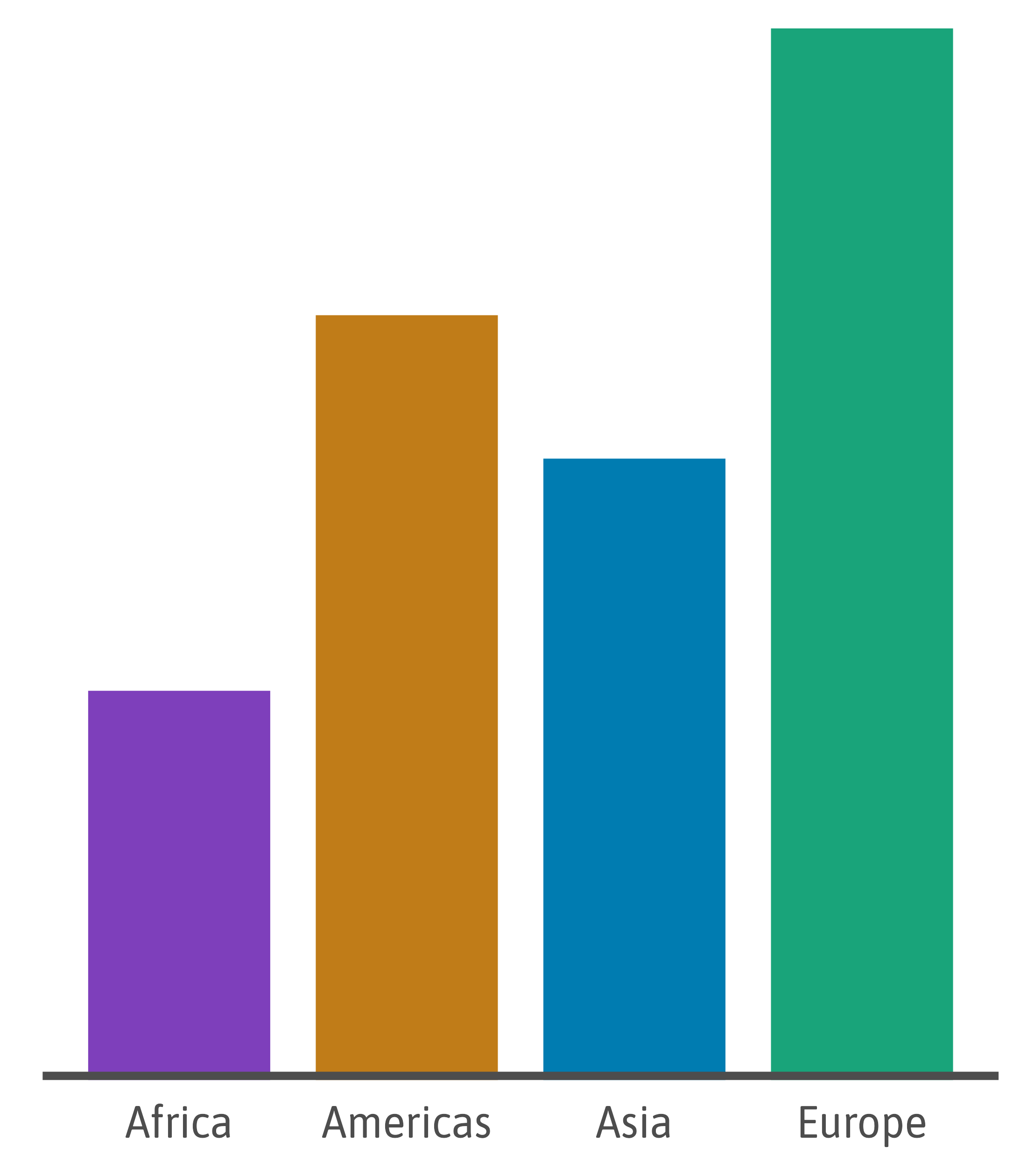
Compare Amounts
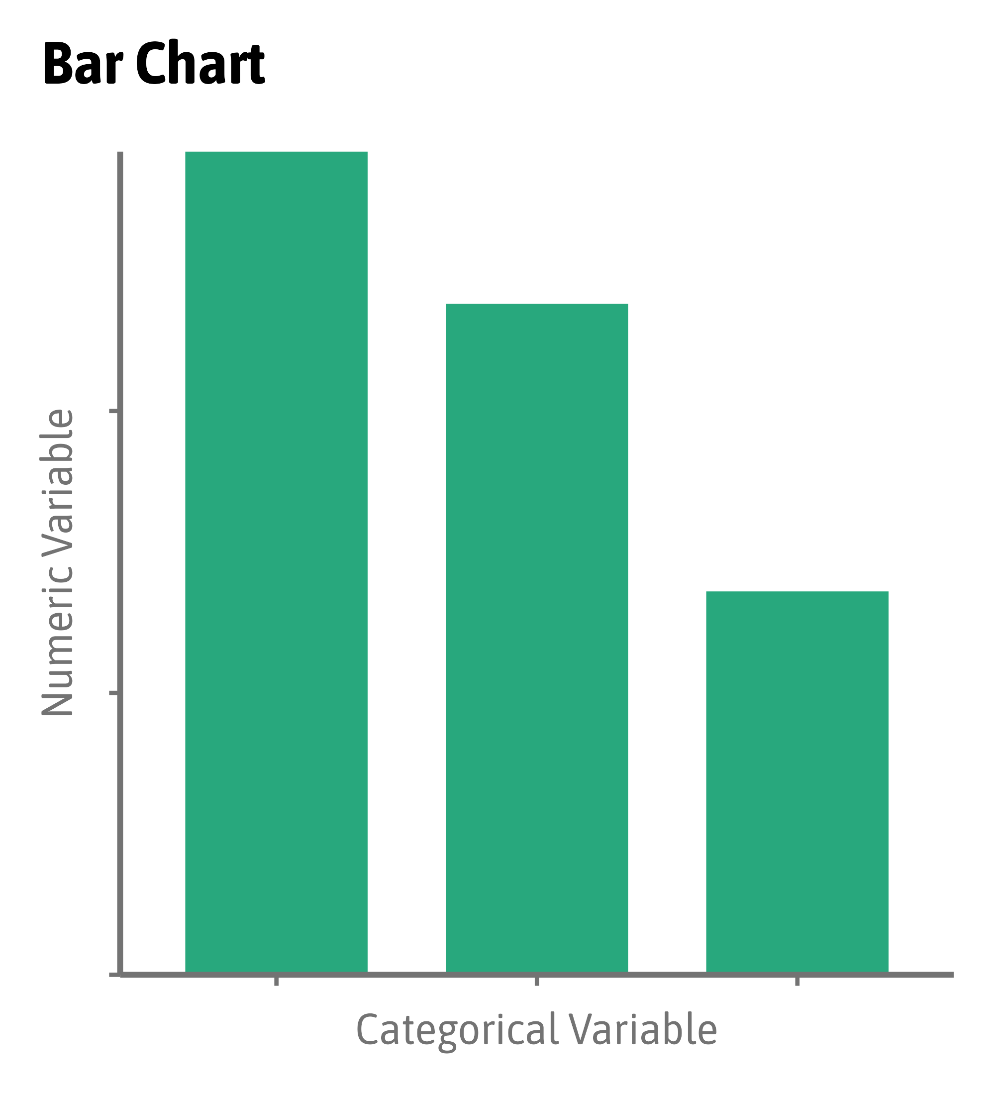
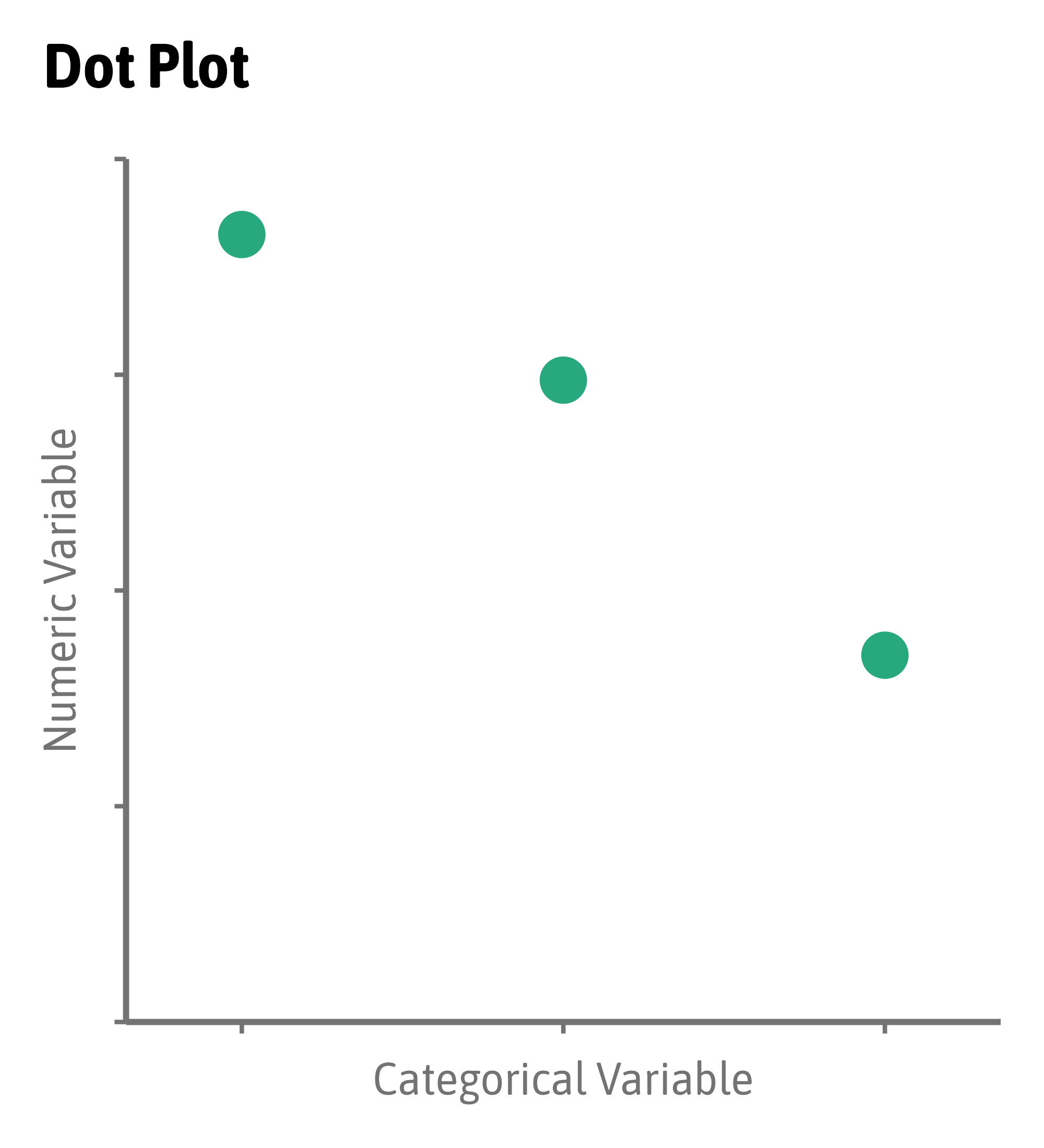
Compare Amounts
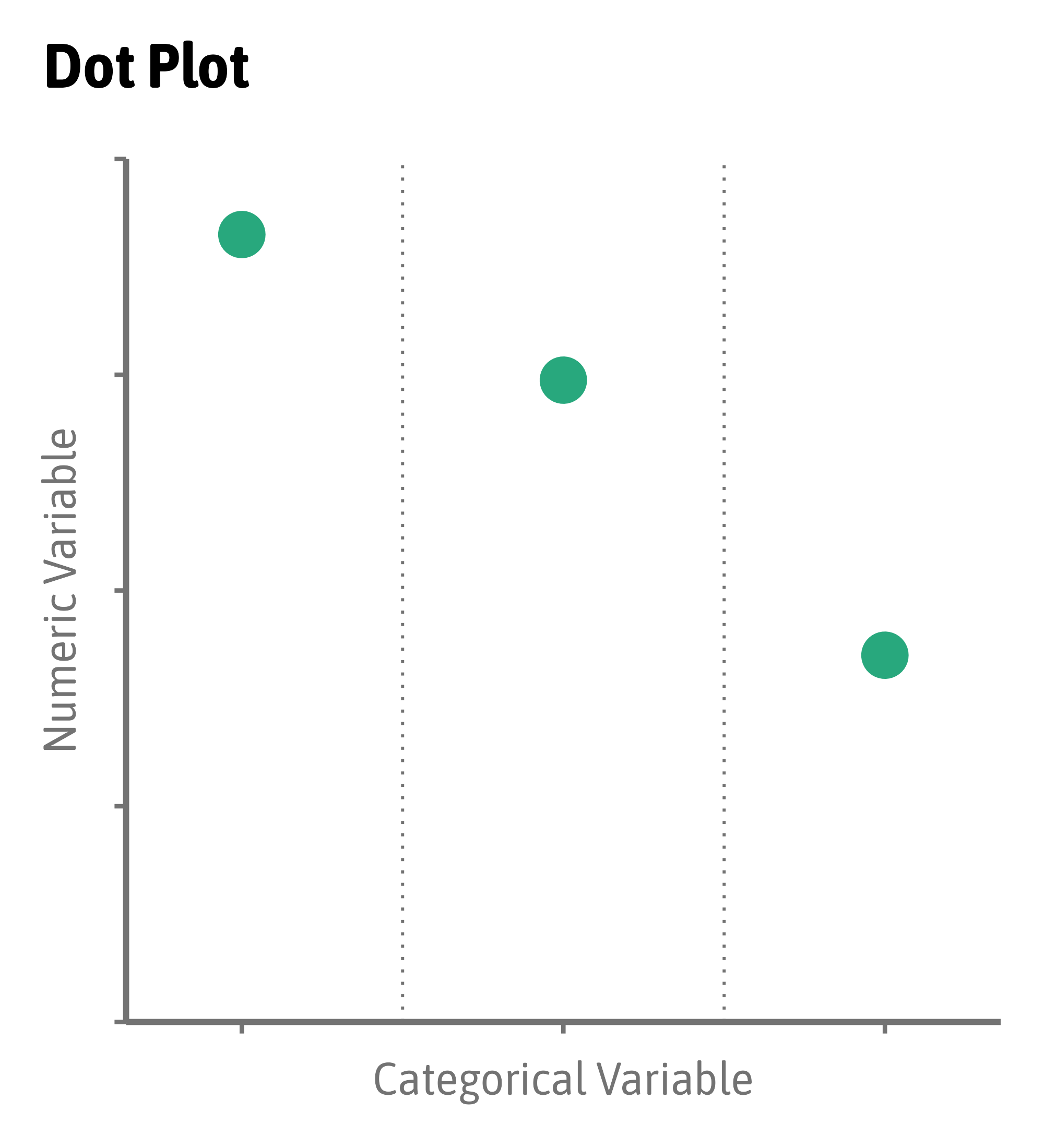
Compare Amounts
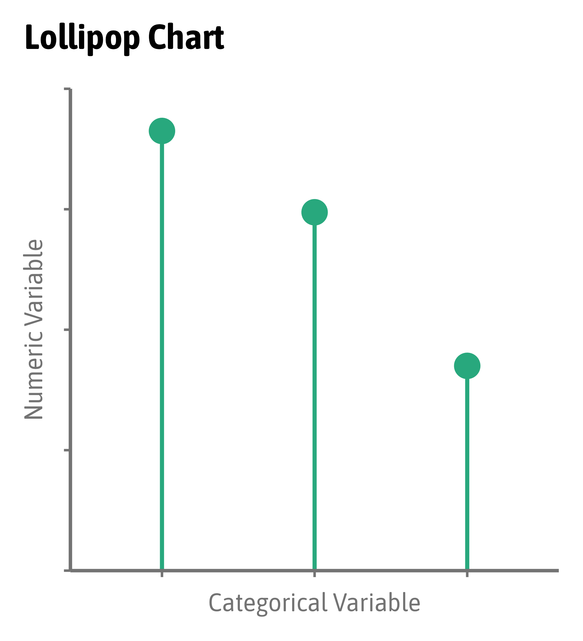
Compare Amounts
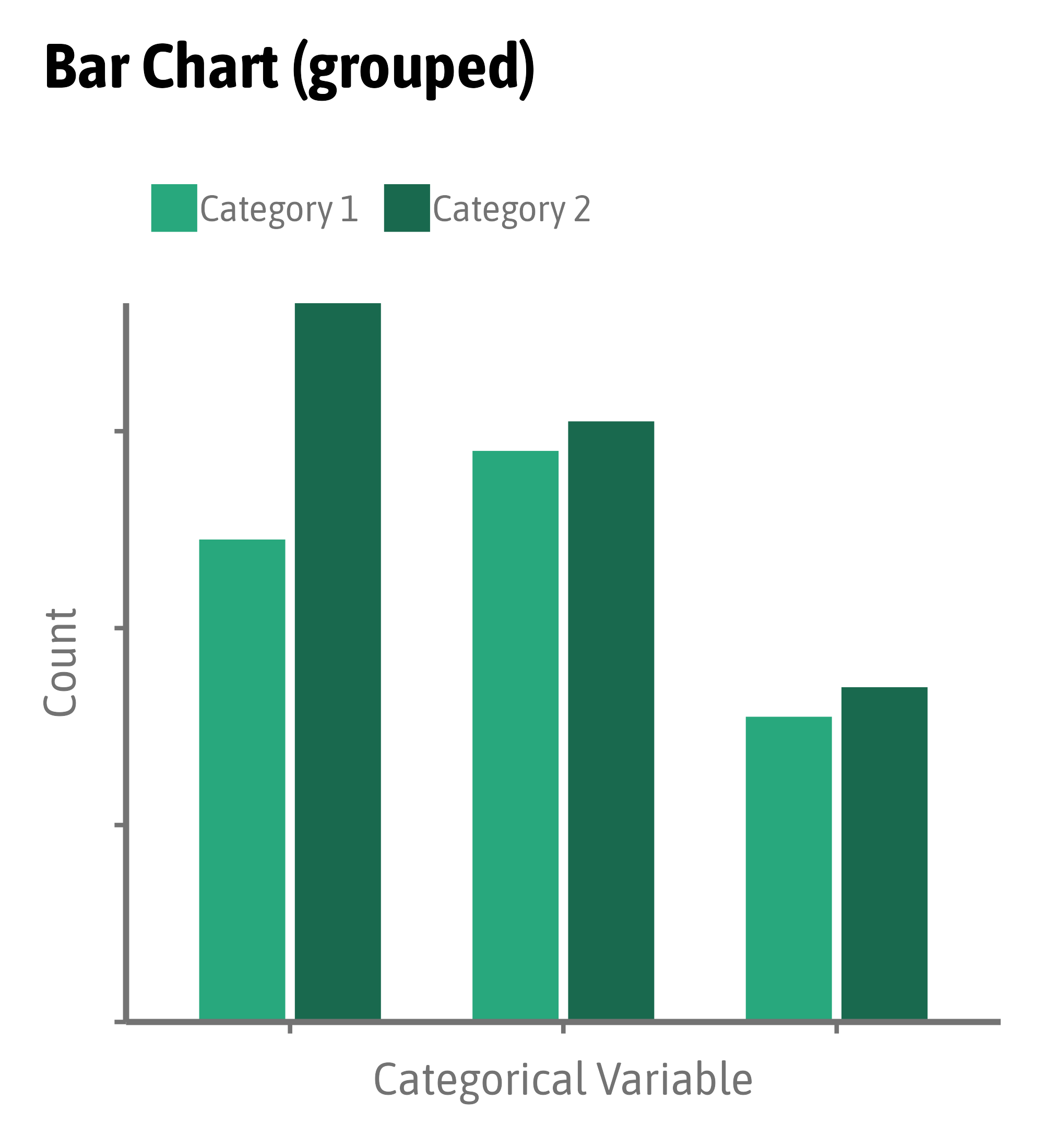
Compare Amounts
Compare Amounts
Compare Amounts
Compare Amounts
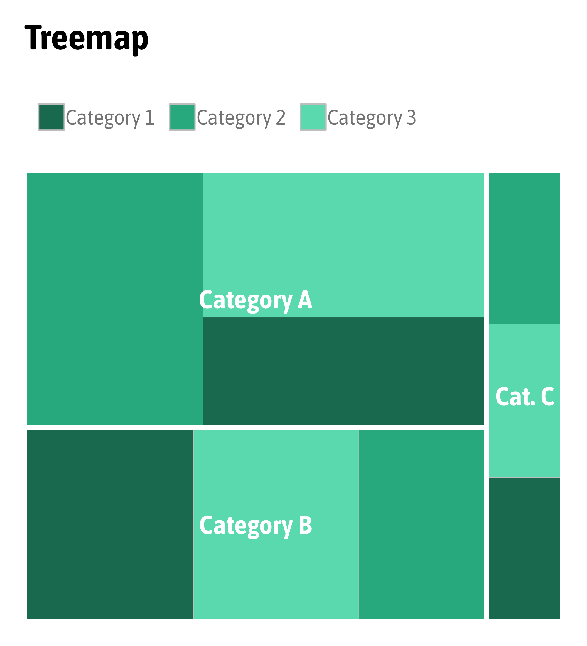
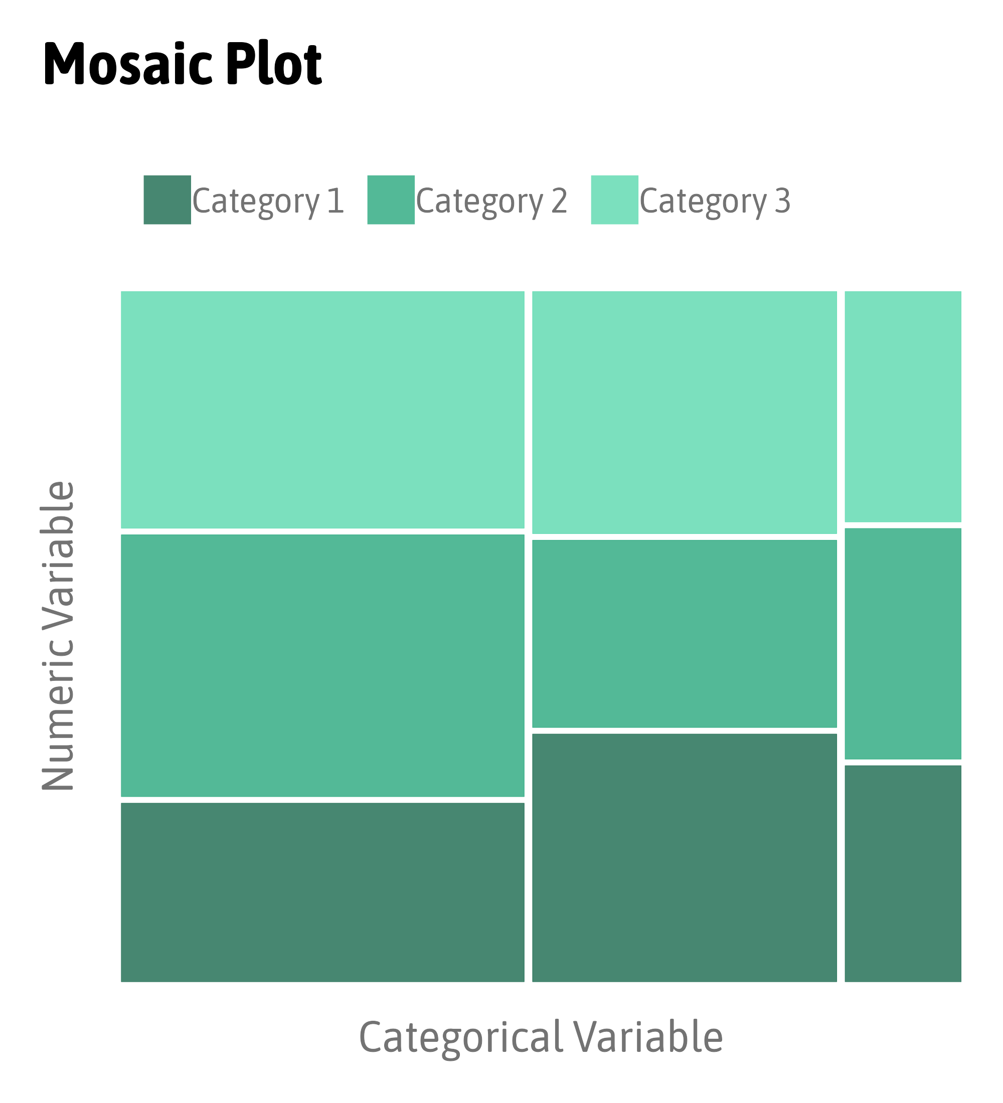
Compare Proportions
Compare Proportions
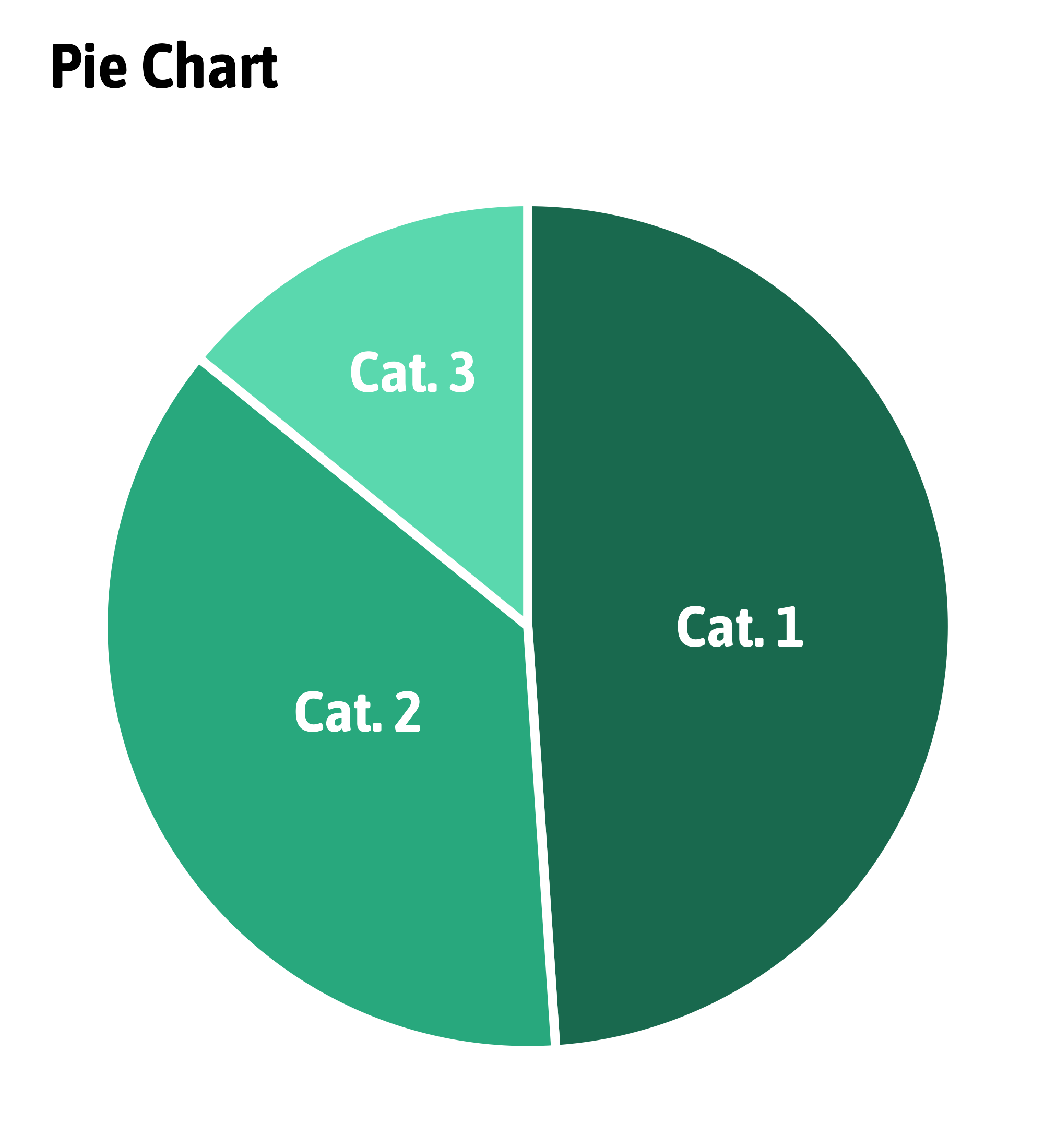
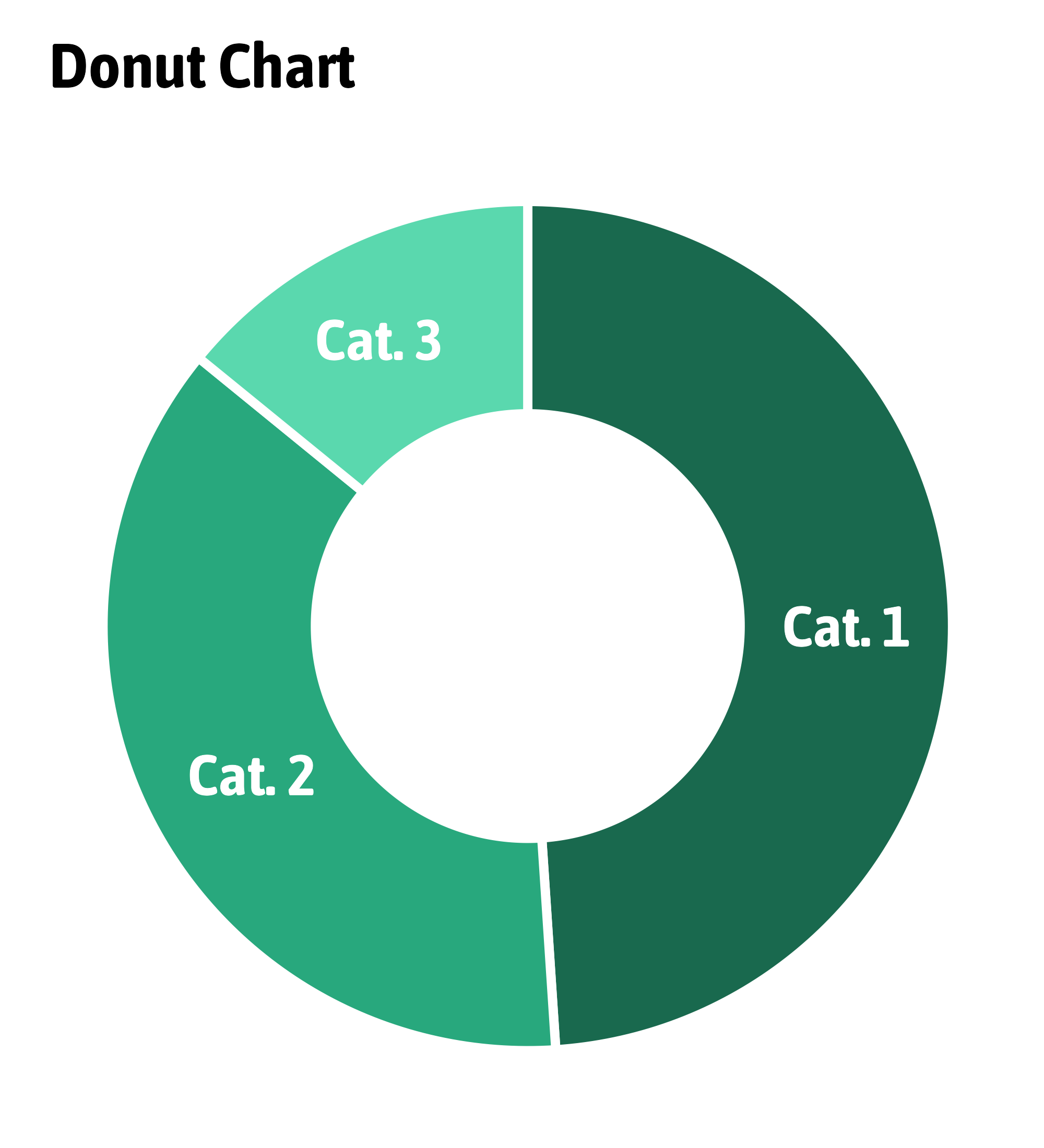
Compare Proportions
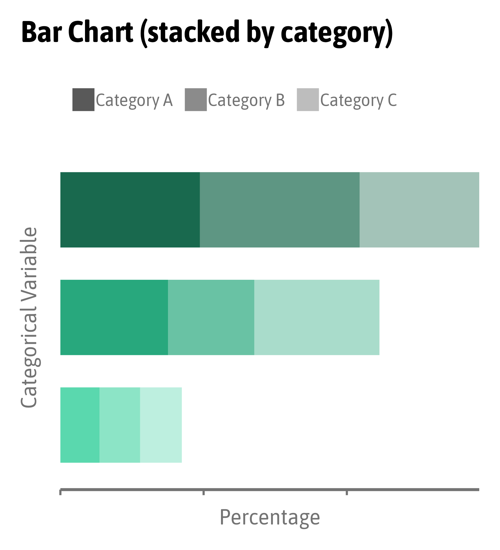
Compare Proportions
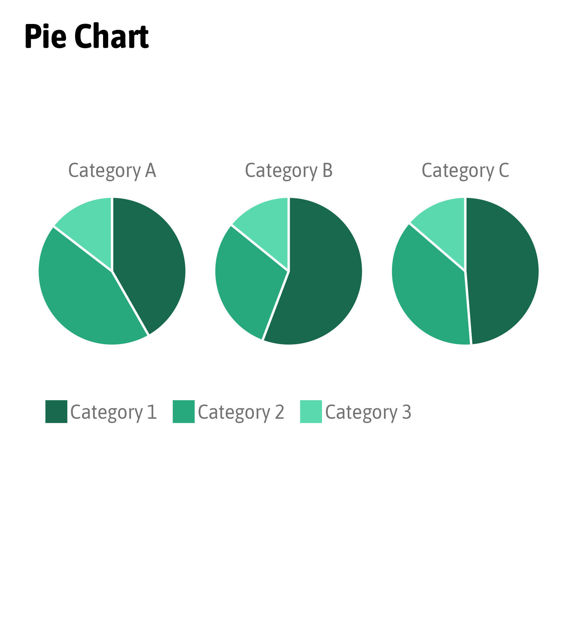
Compare Proportions
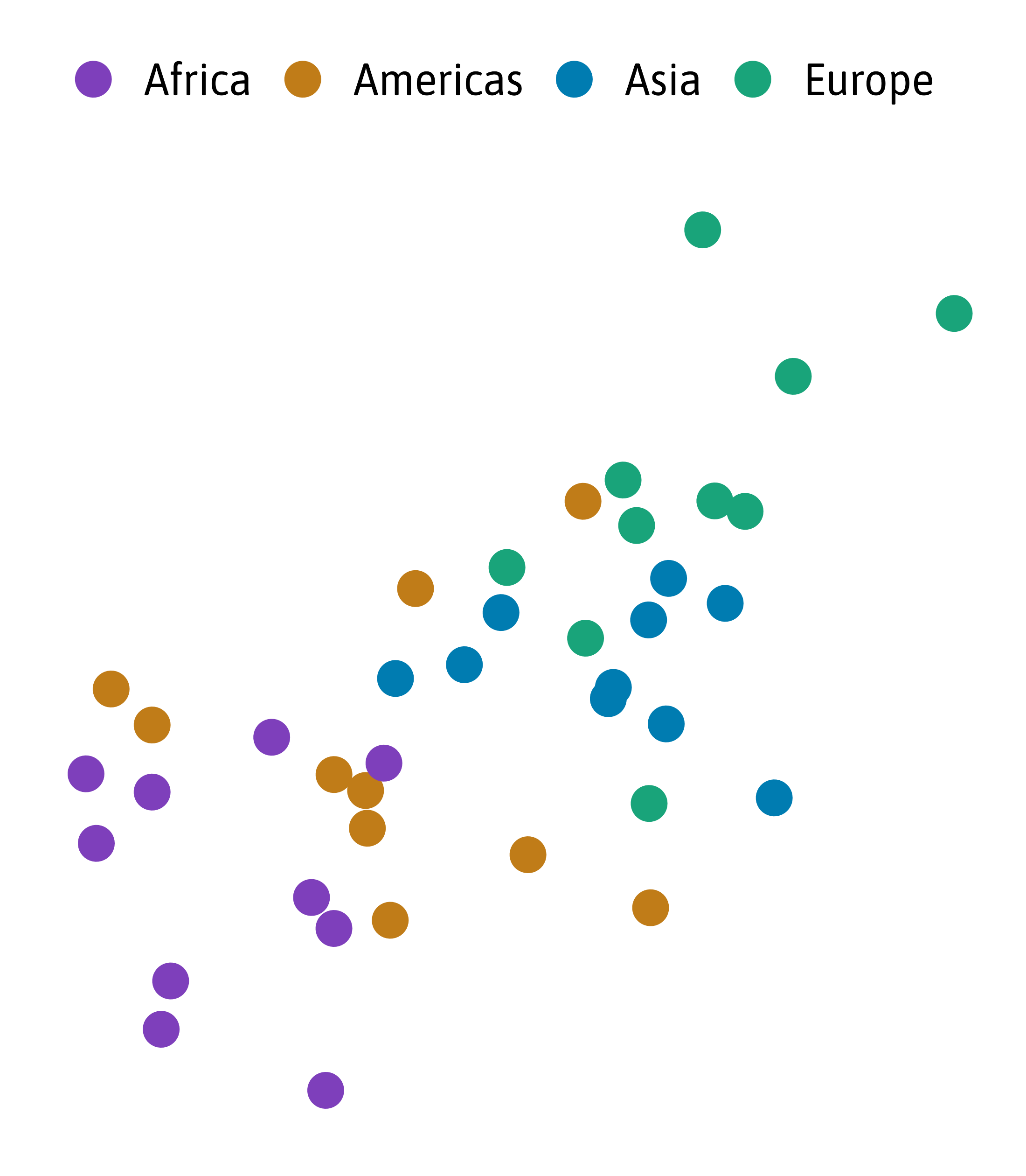
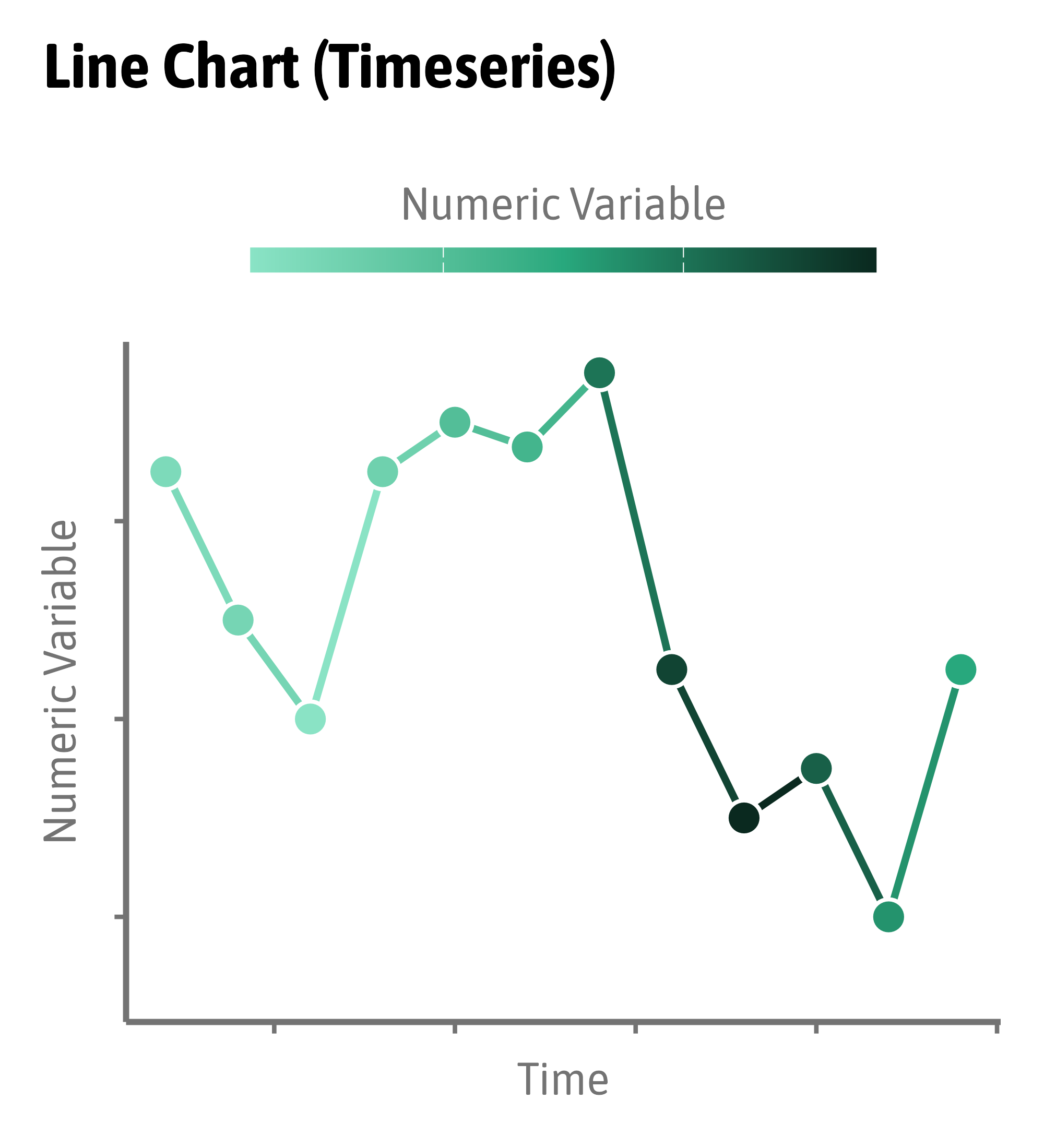
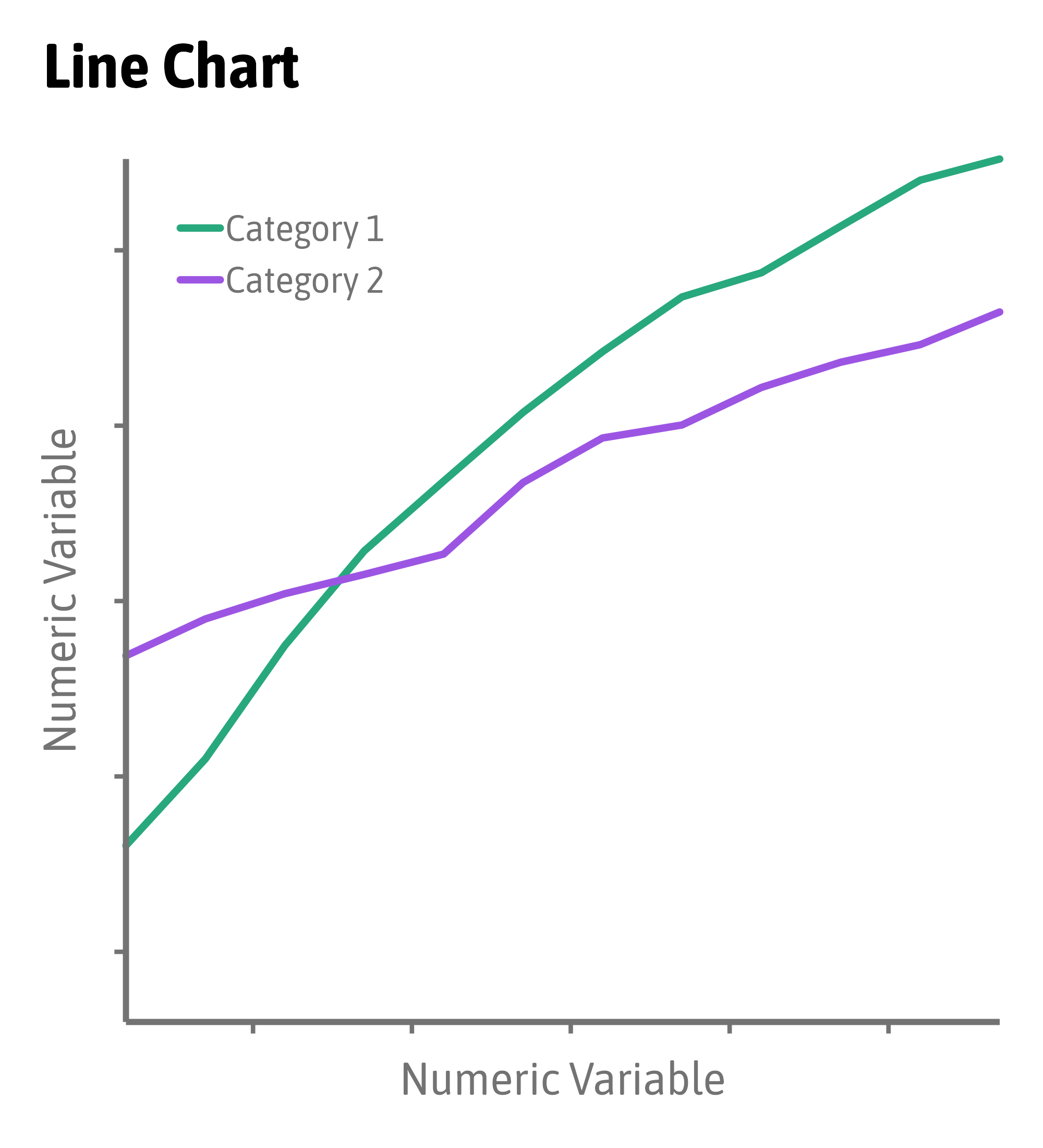
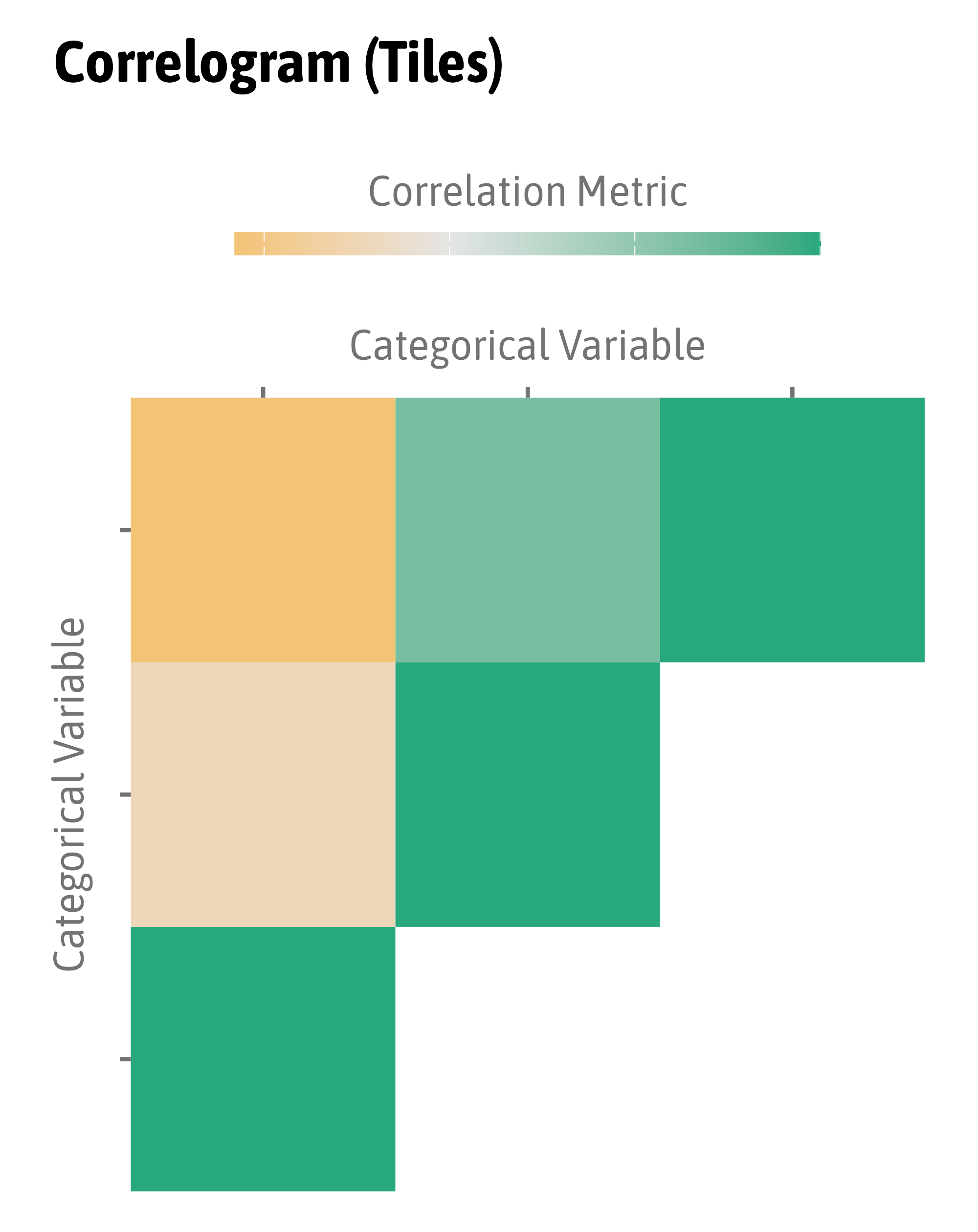
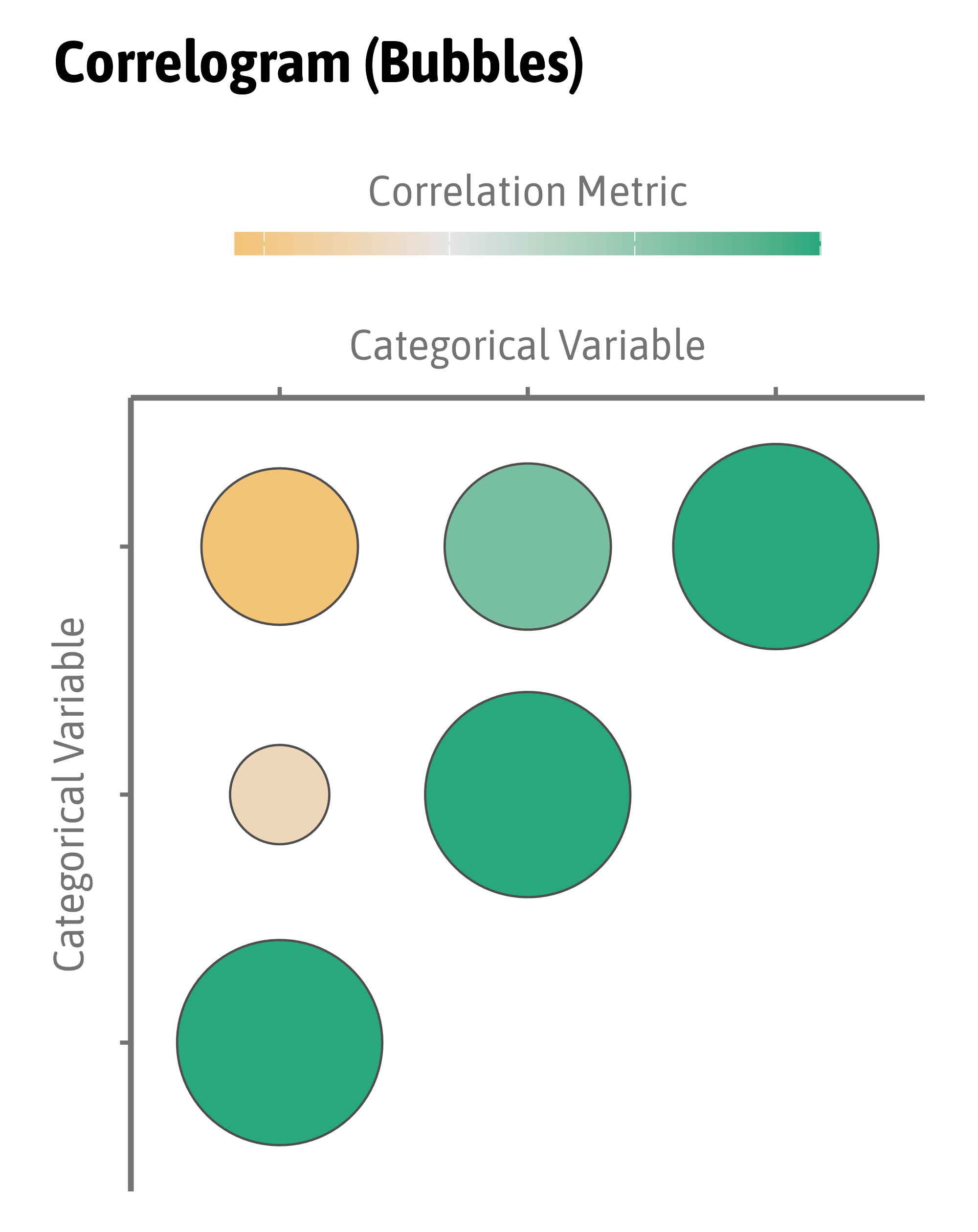
Visualize Relationships
Visualize Relationships
Visualize Relationships
Visualize Relationships

Visualize Relationships
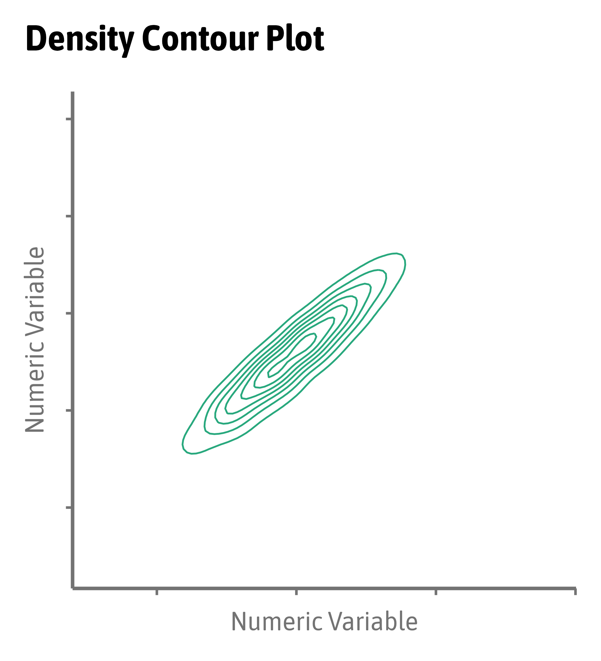
Visualize Relationships
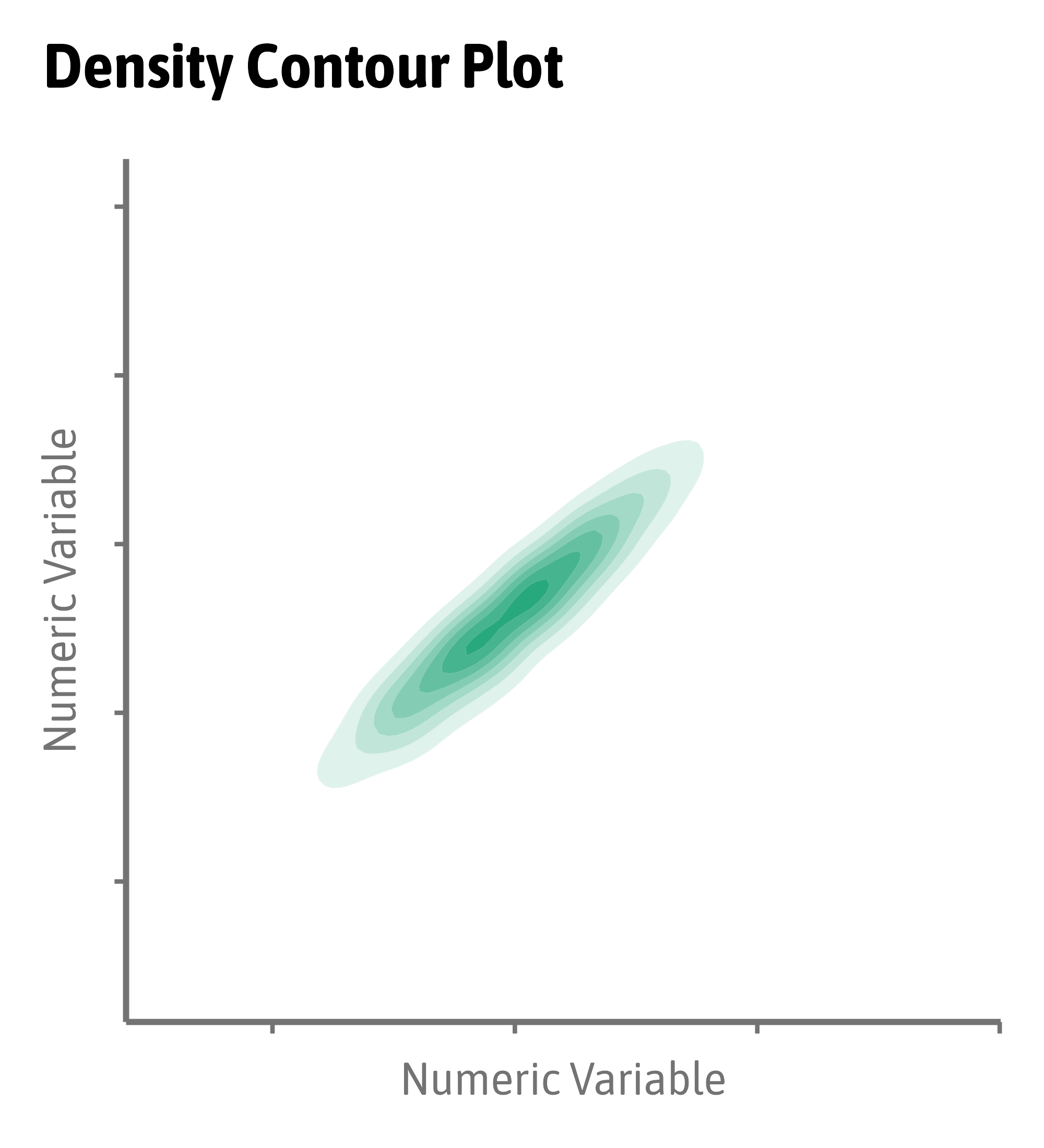
Visualize Relationships
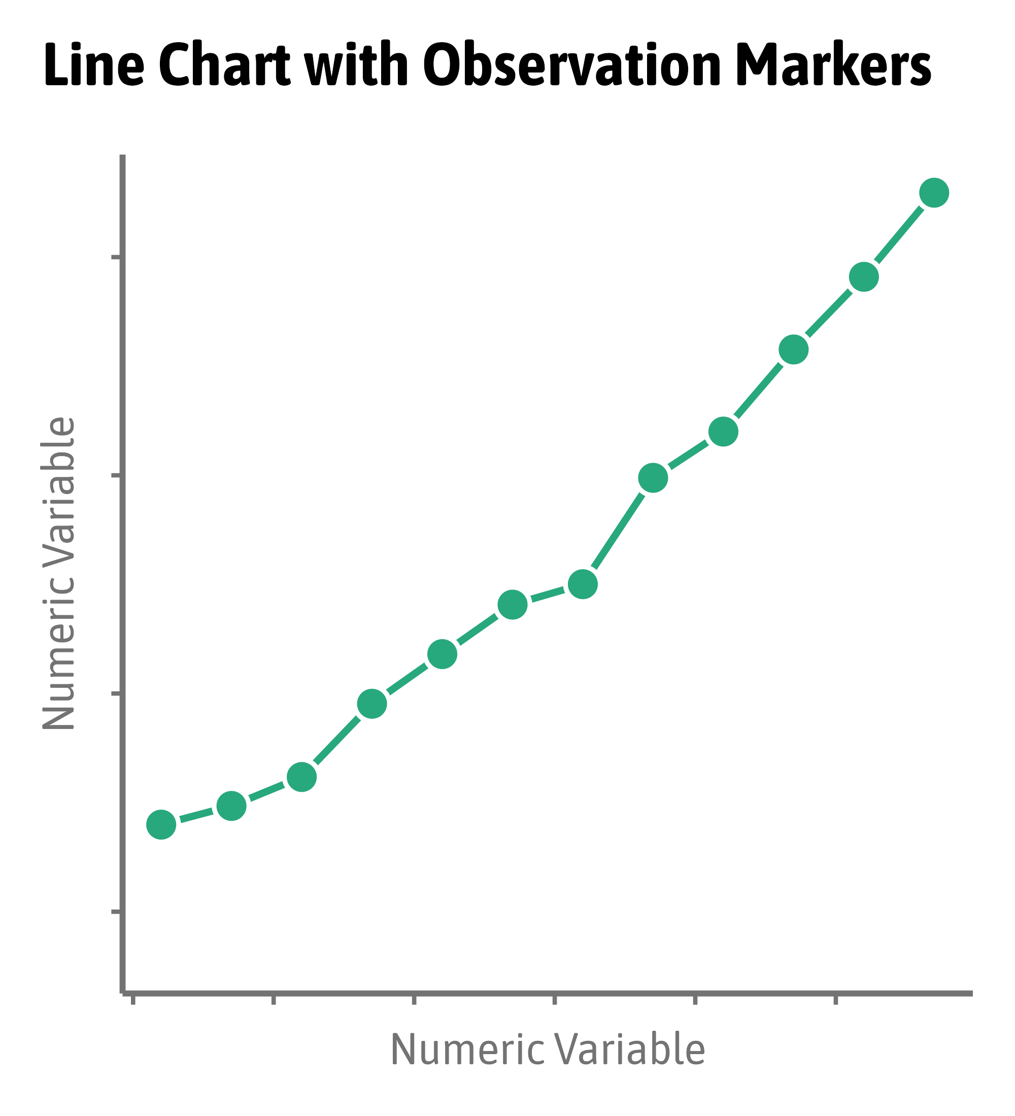
Visualize Relationships
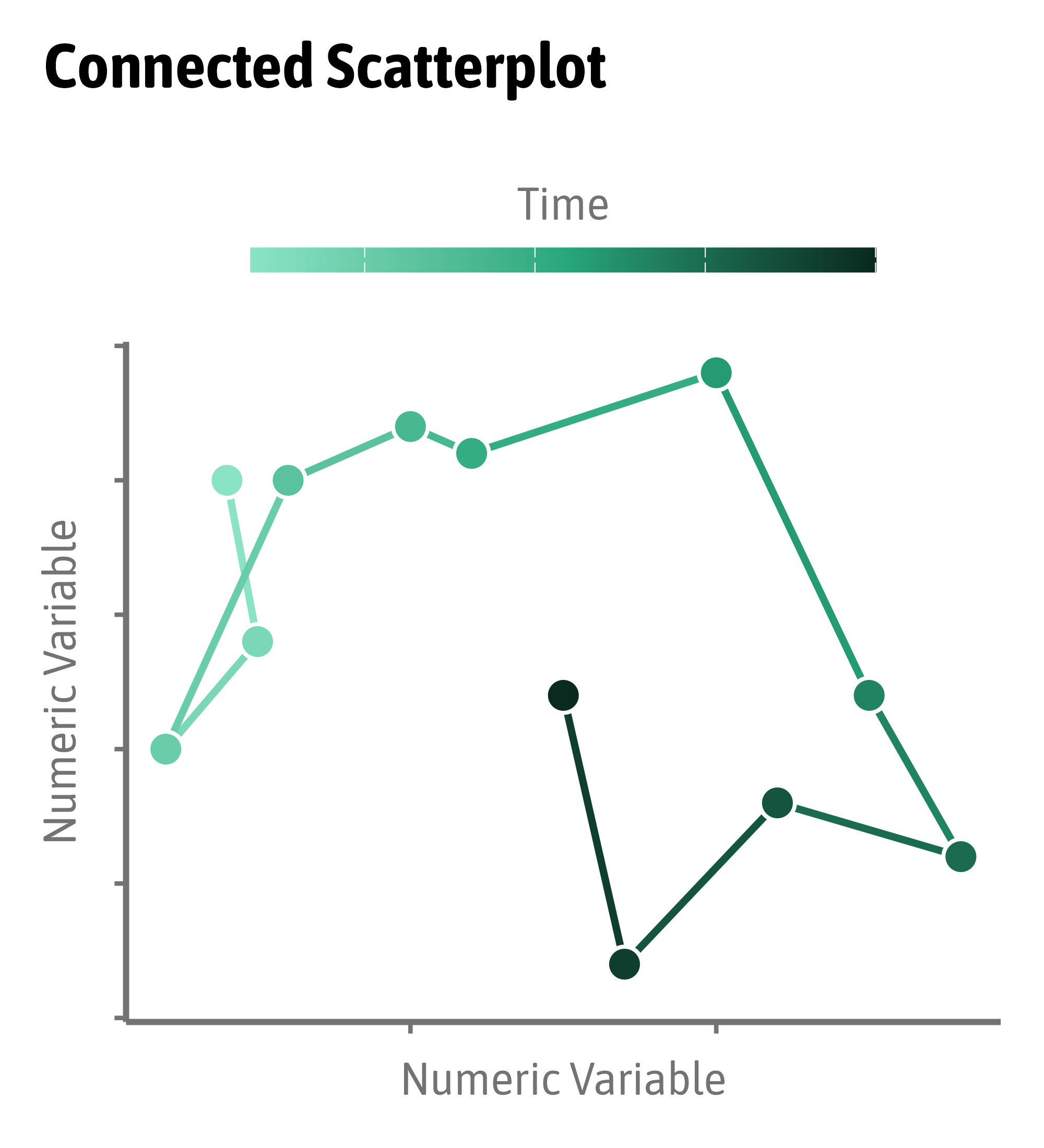
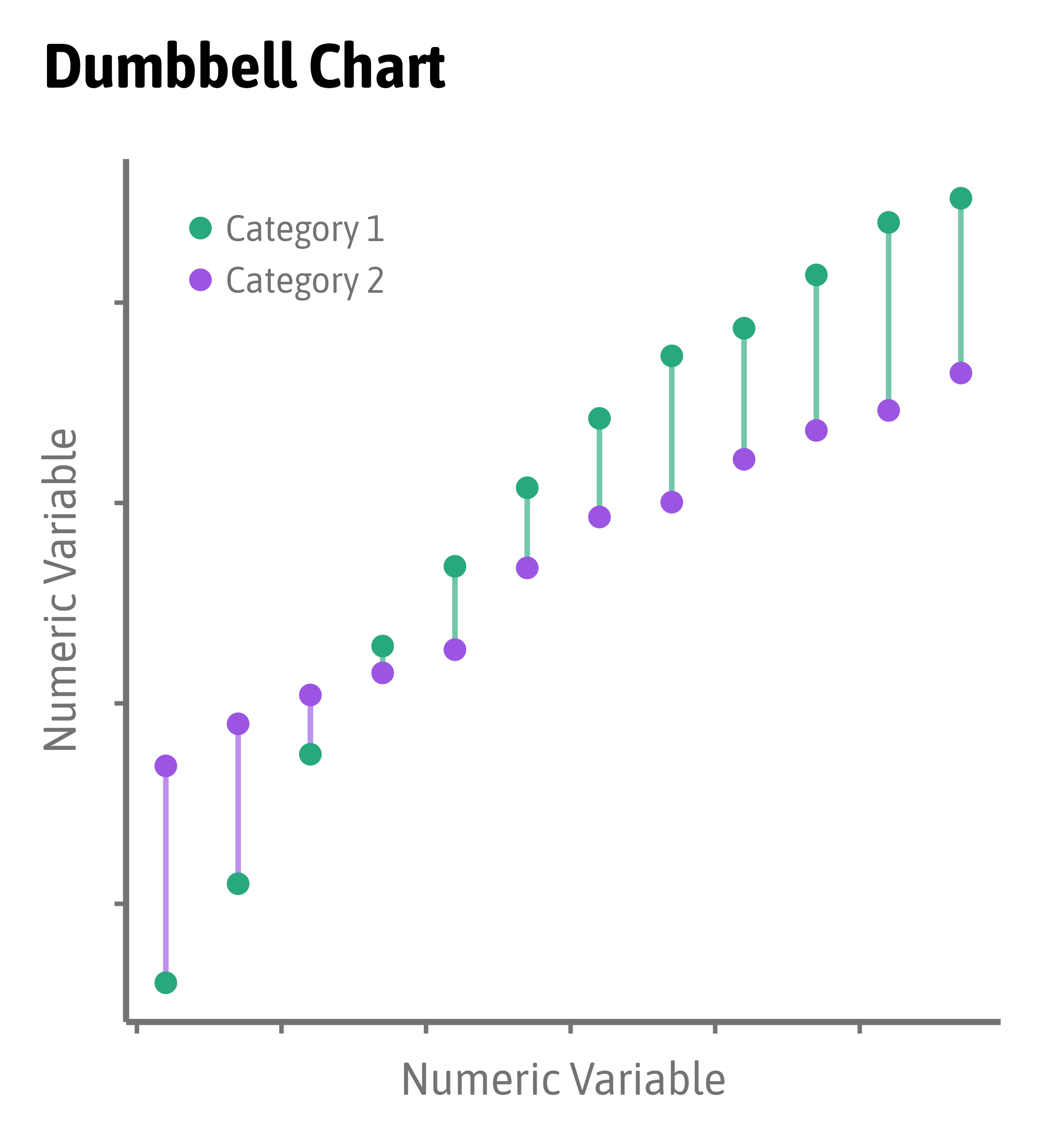
Compare Relationships
Compare Relationships
:::: ::: :::
::::
Compare Relationships
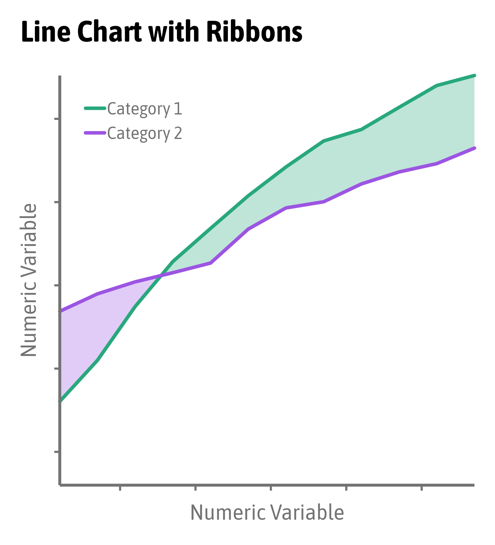
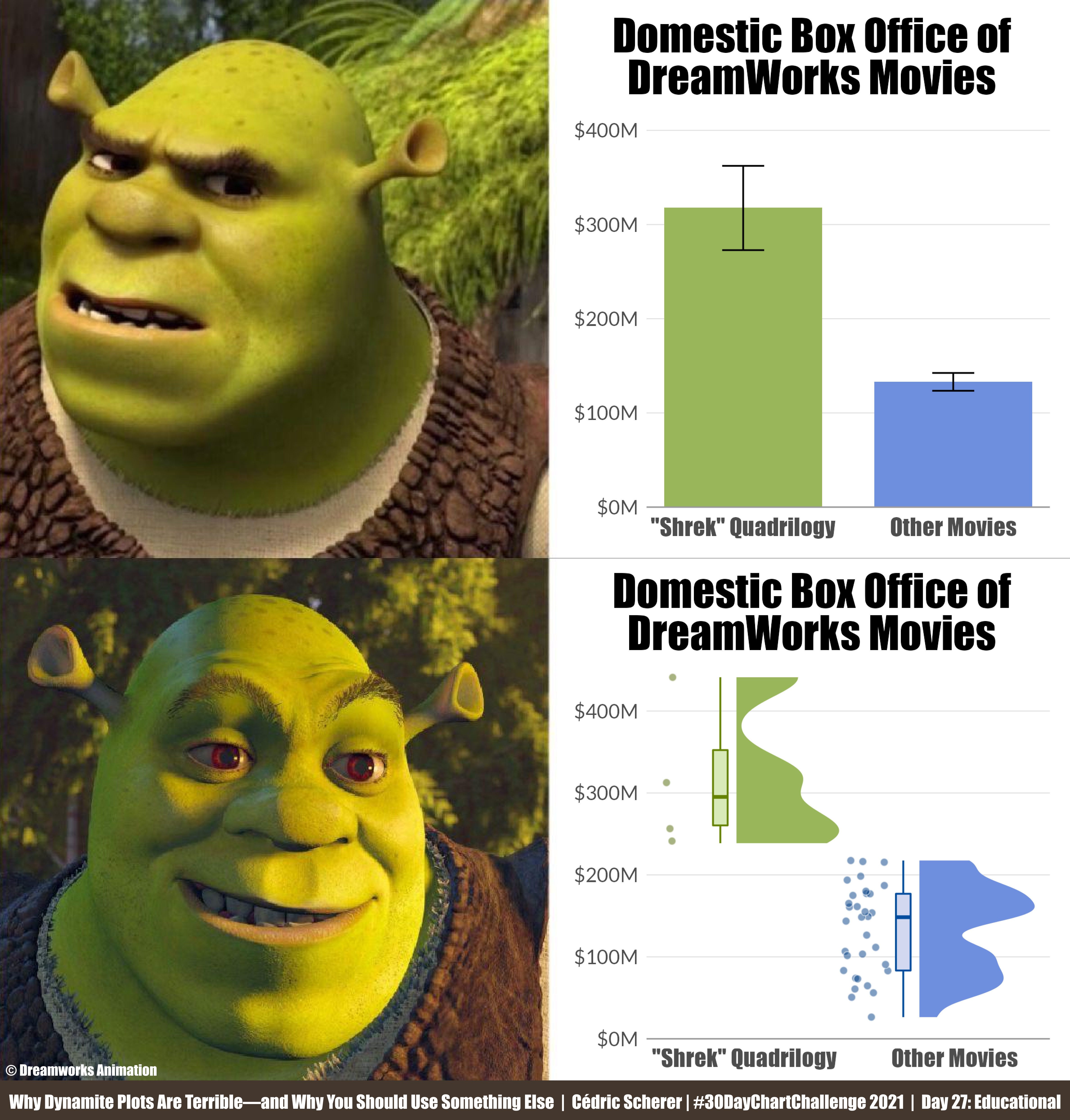
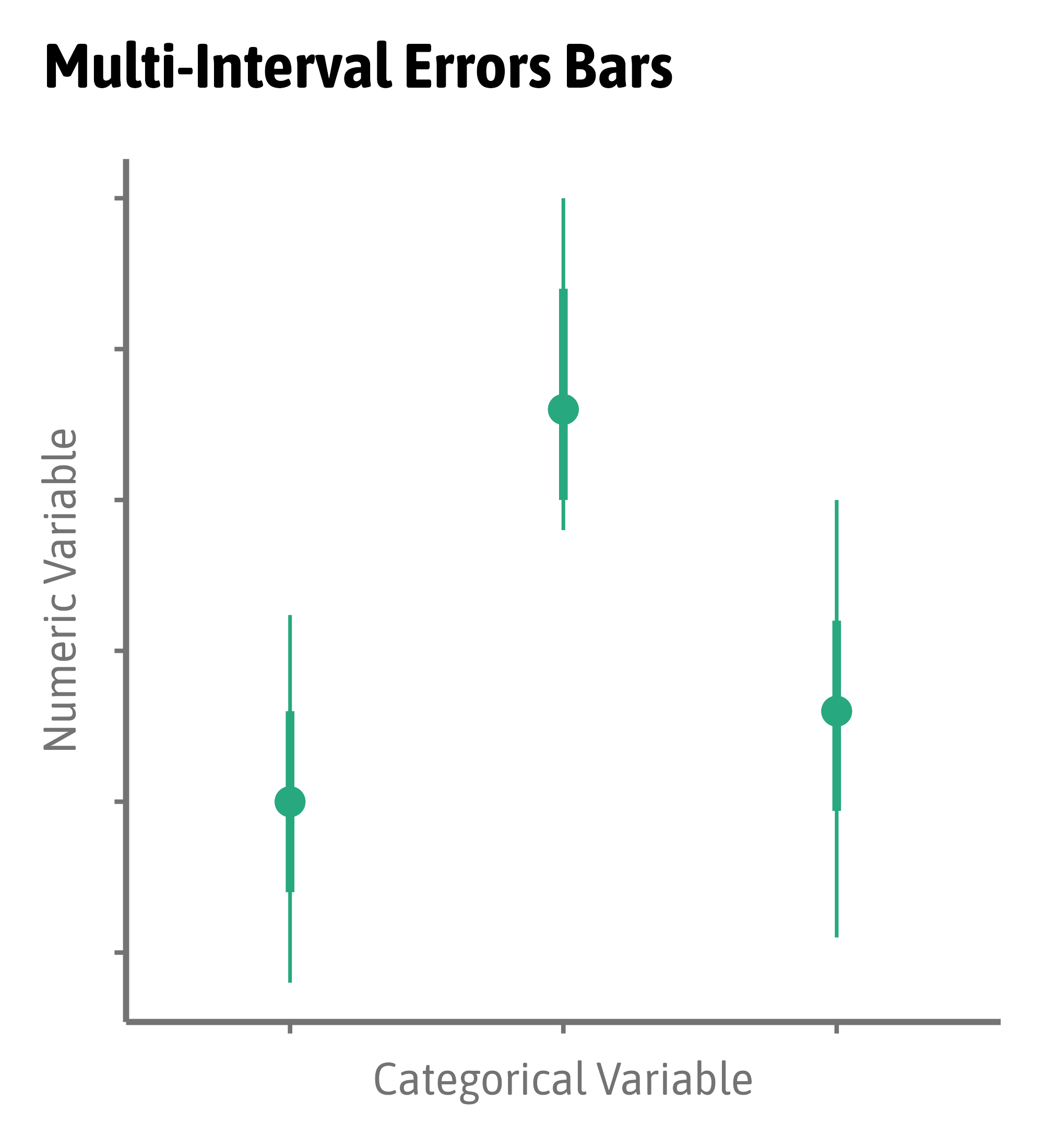
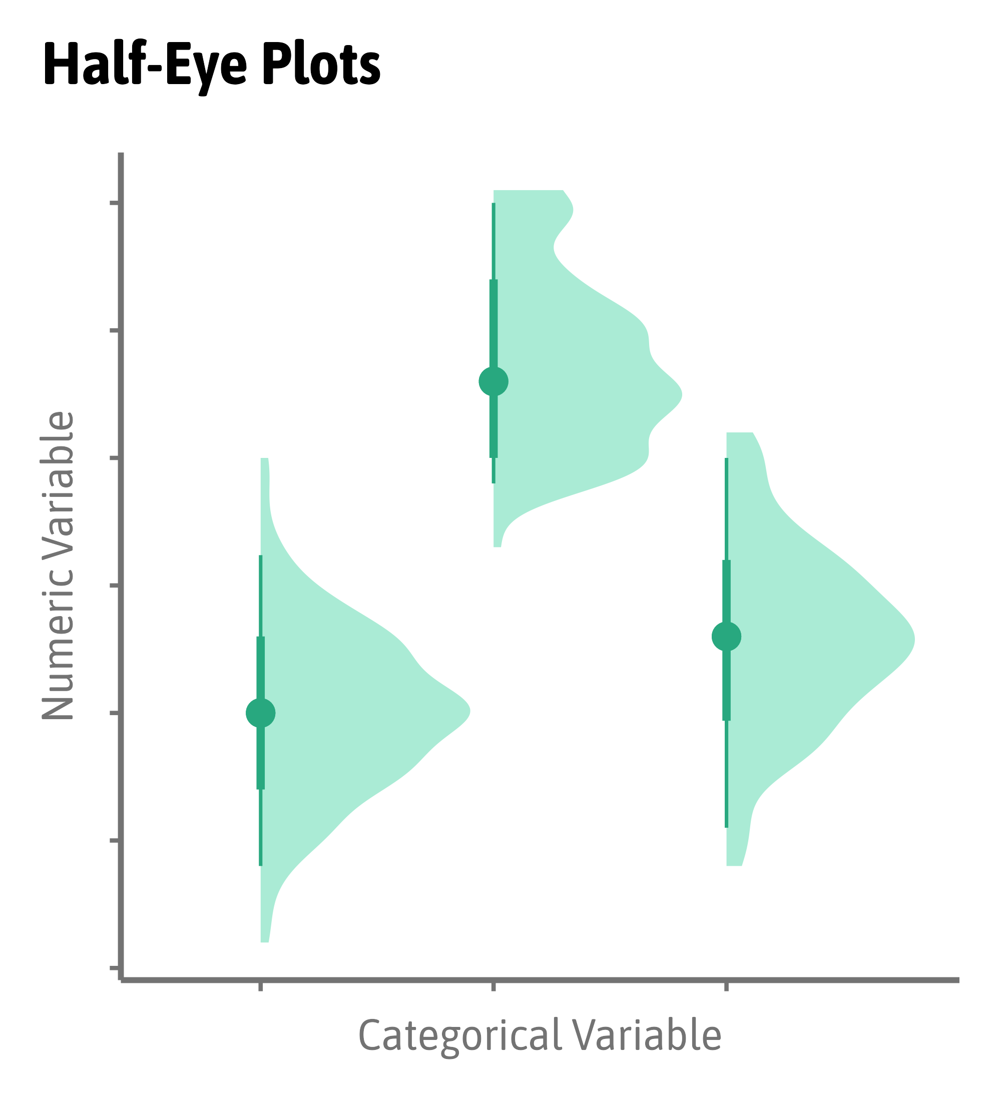
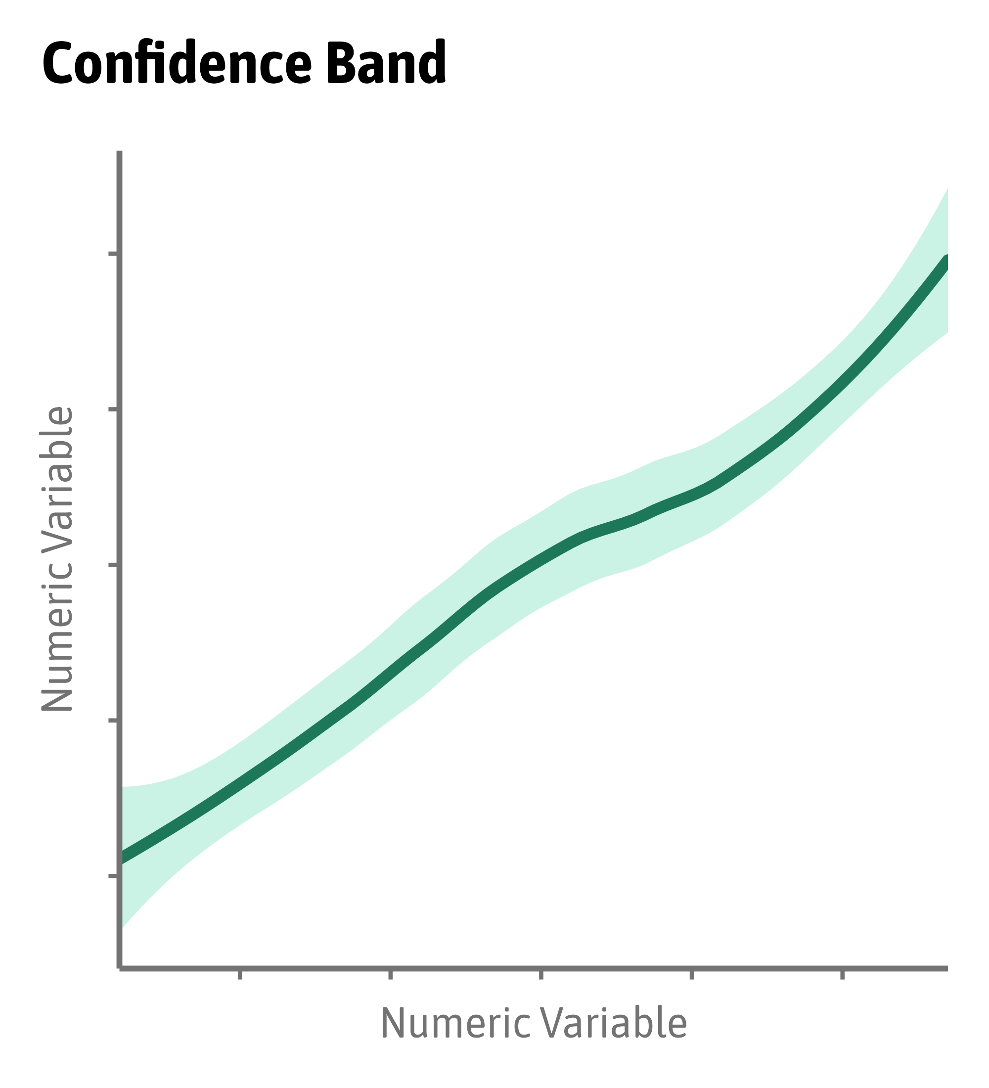
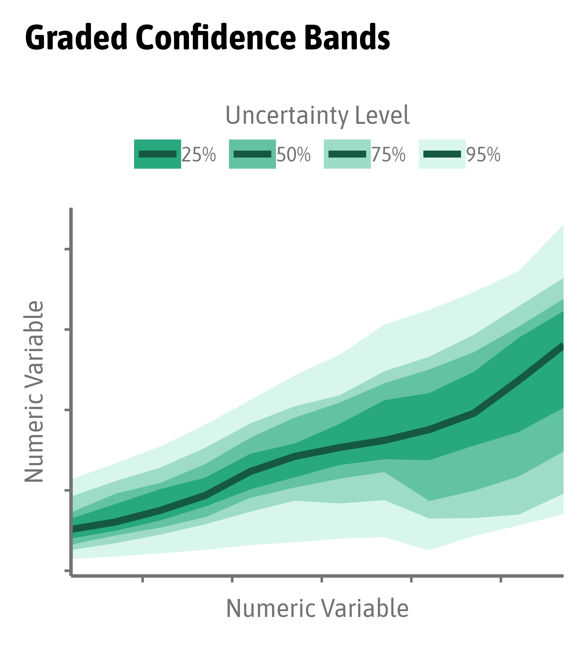
Visualize Uncertainty
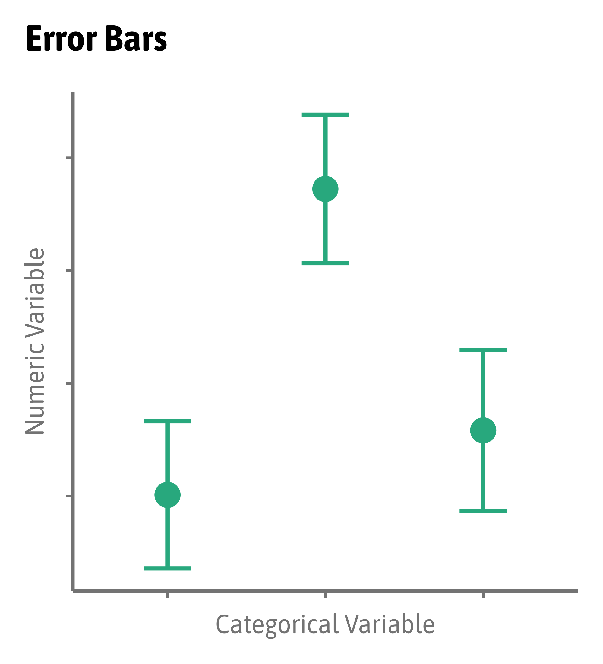
Visualize Uncertainty
Visualize Uncertainty
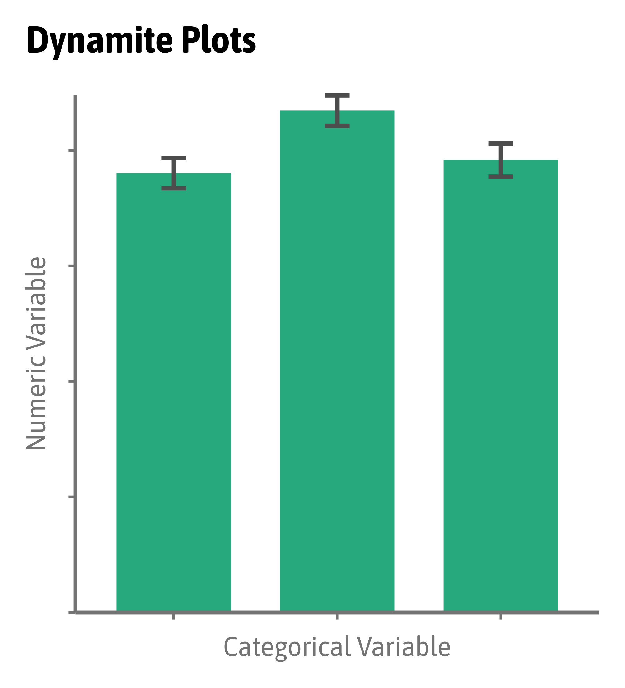
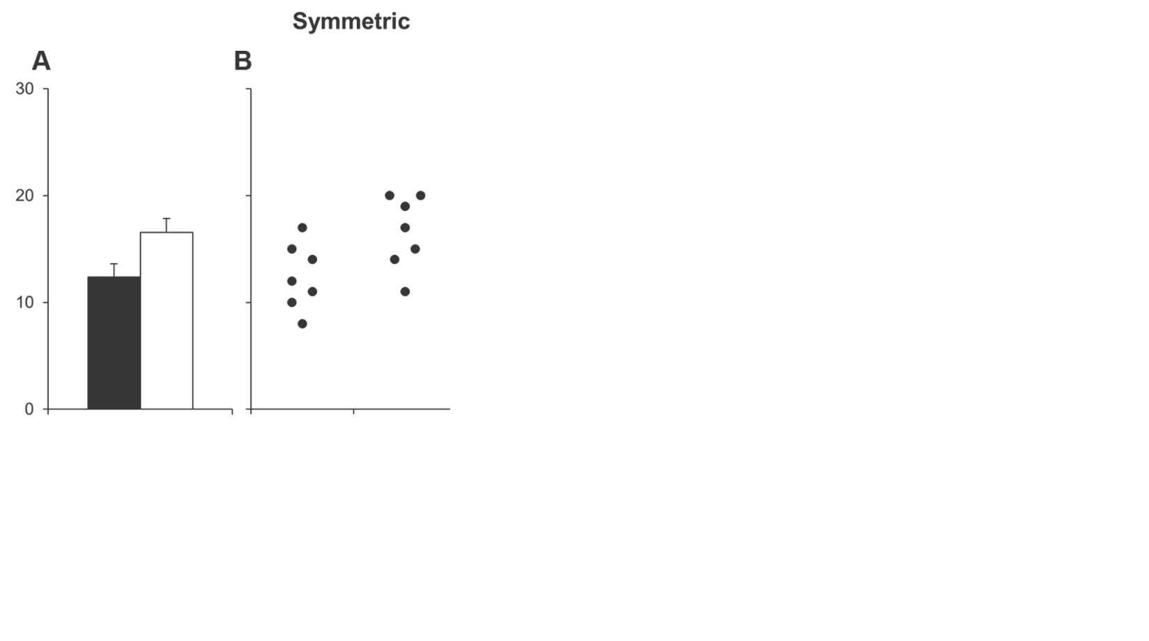
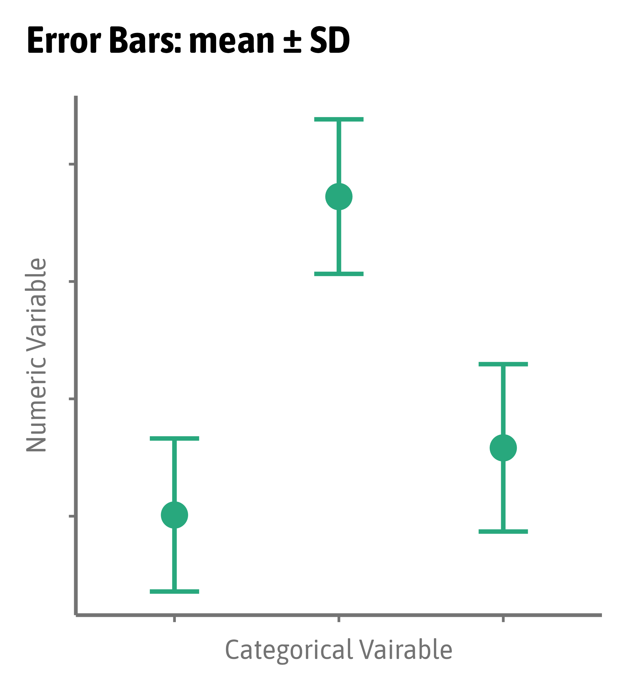
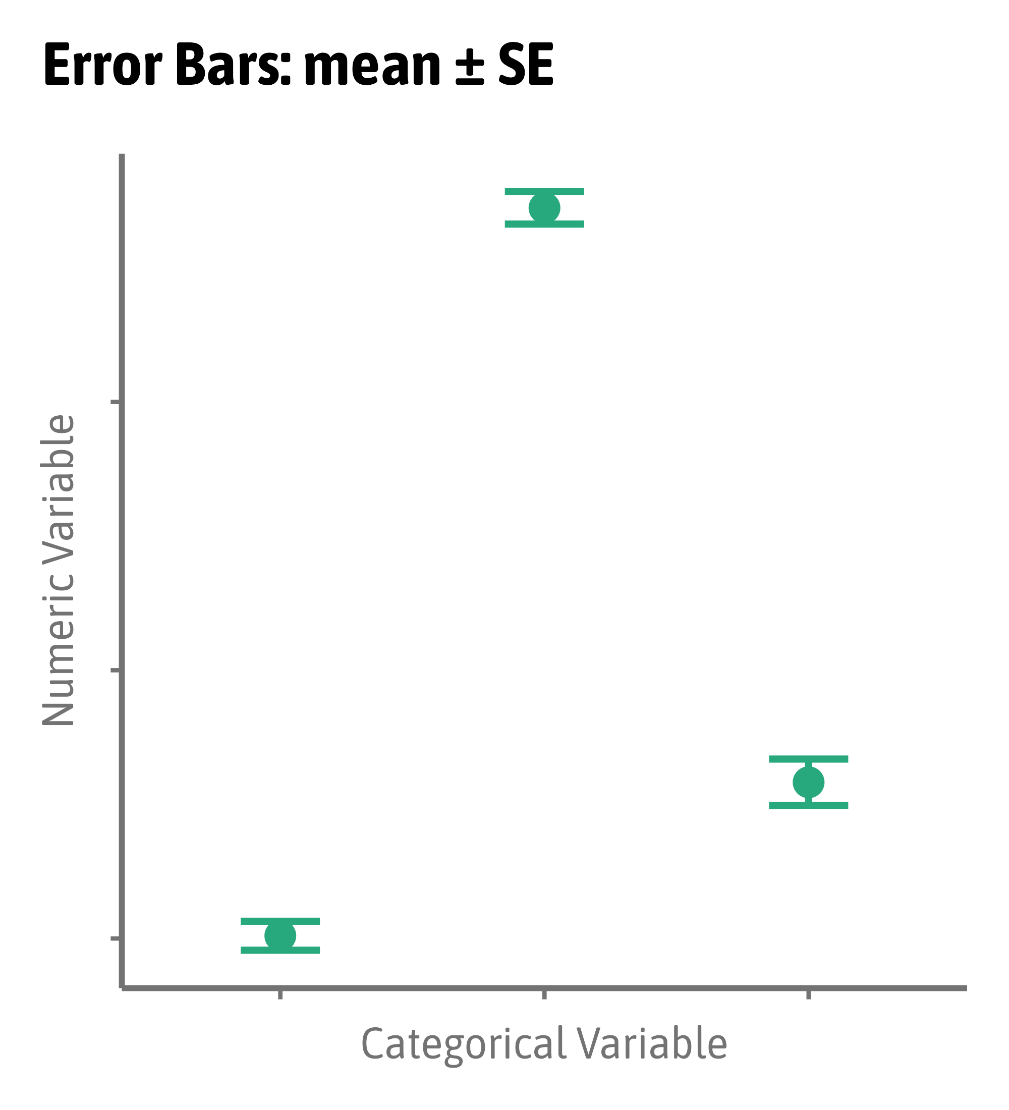
Modified from Weissgerber et al. (2015) PLoS Biology
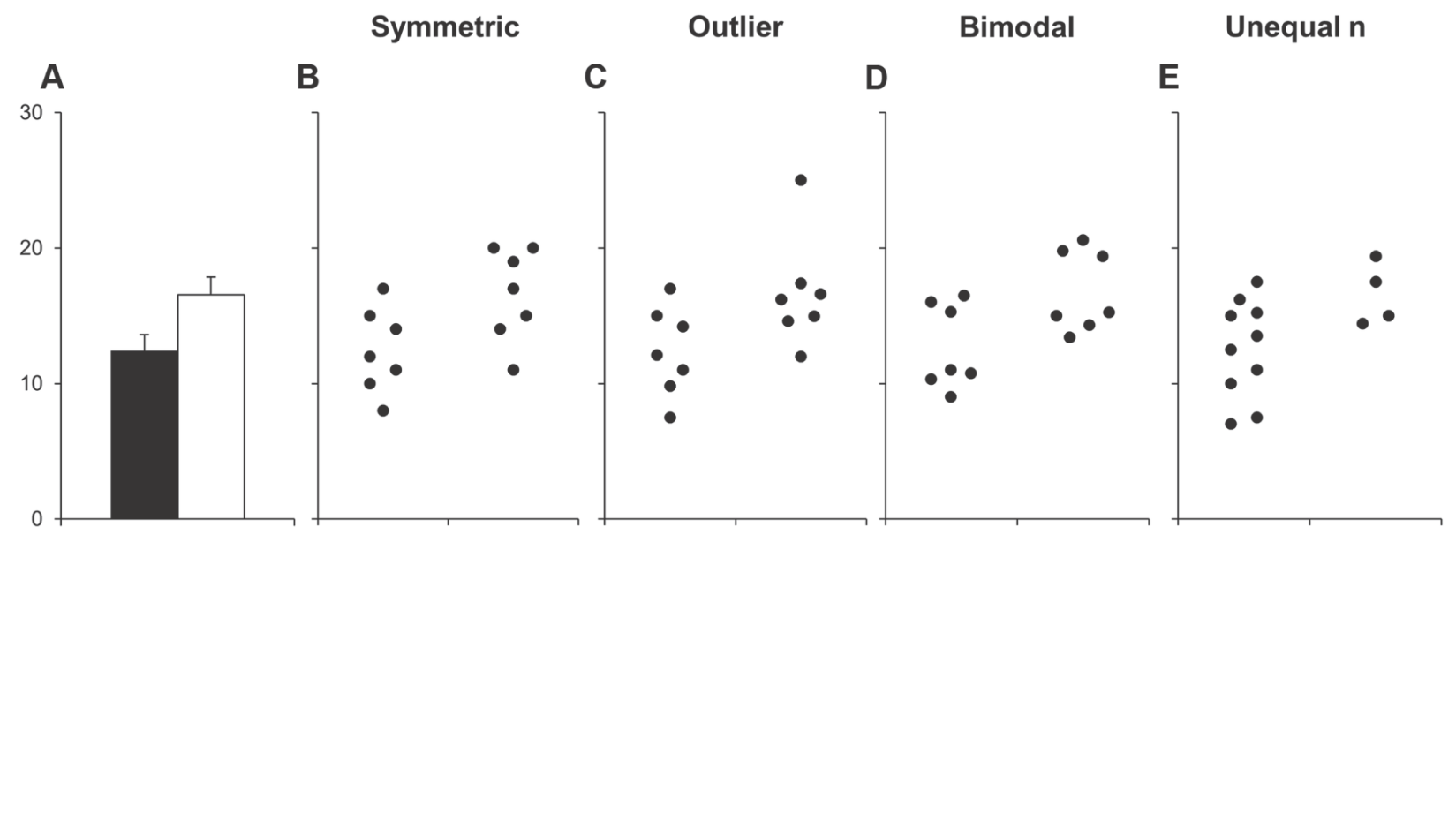
Modified from Weissgerber et al. (2015) PLoS Biology
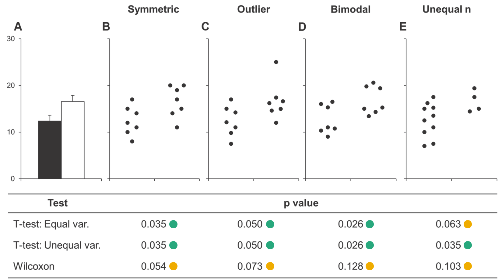
Modified from Weissgerber et al. (2015) PLoS Biology
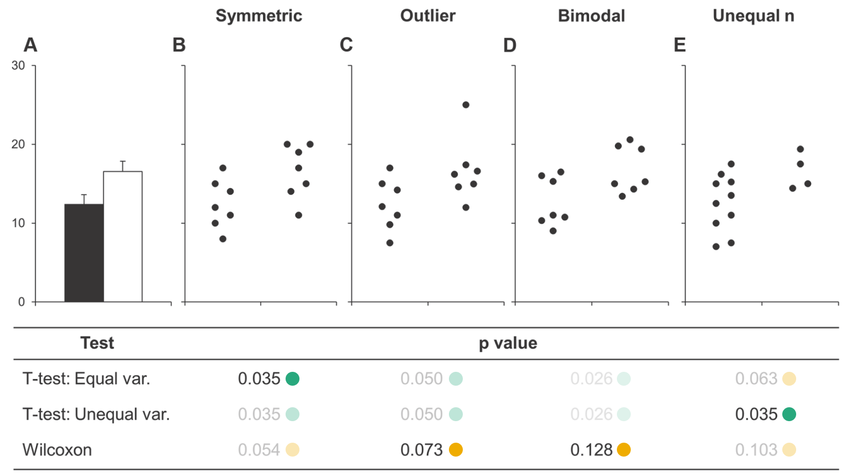
Modified from Weissgerber et al. (2015) PLoS Biology
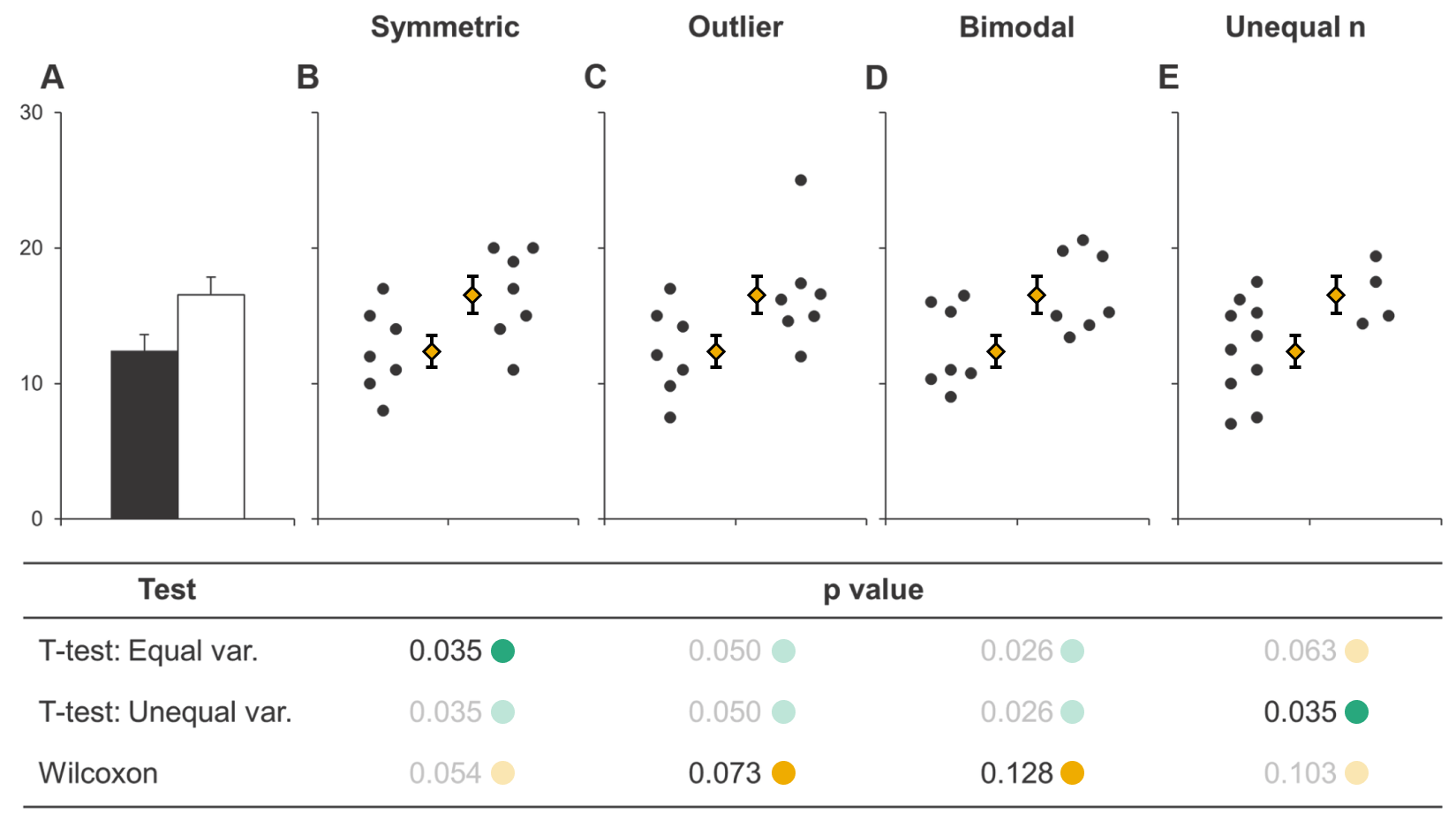
Modified from Weissgerber et al. (2015) PLoS Biology
Modified from Weissgerber et al. (2015) PLoS Biology
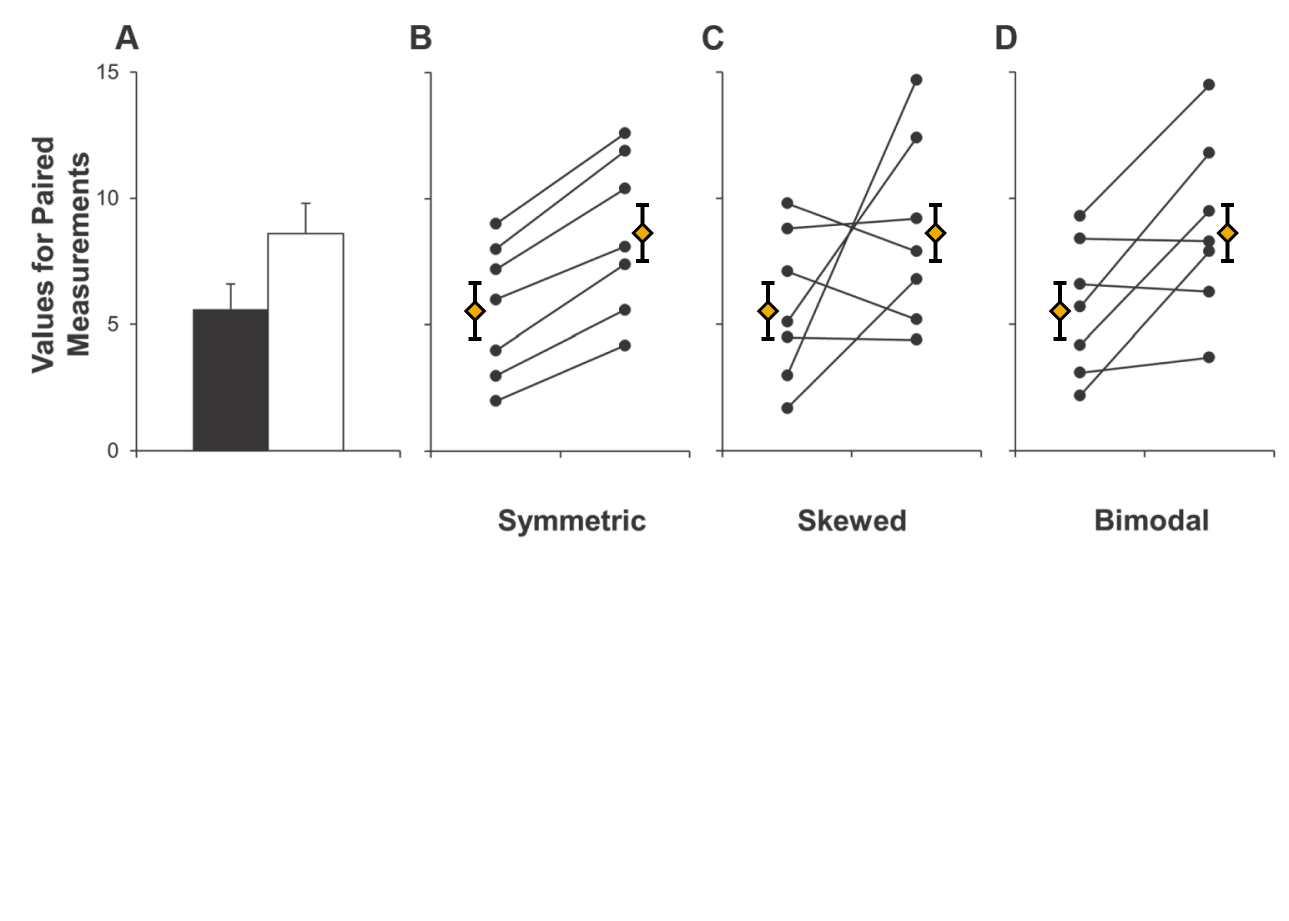
Modified from Weissgerber et al. (2015) PLoS Biology
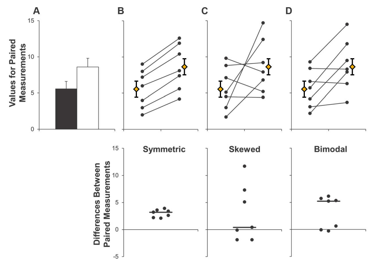
Modified from Weissgerber et al. (2015) PLoS Biology
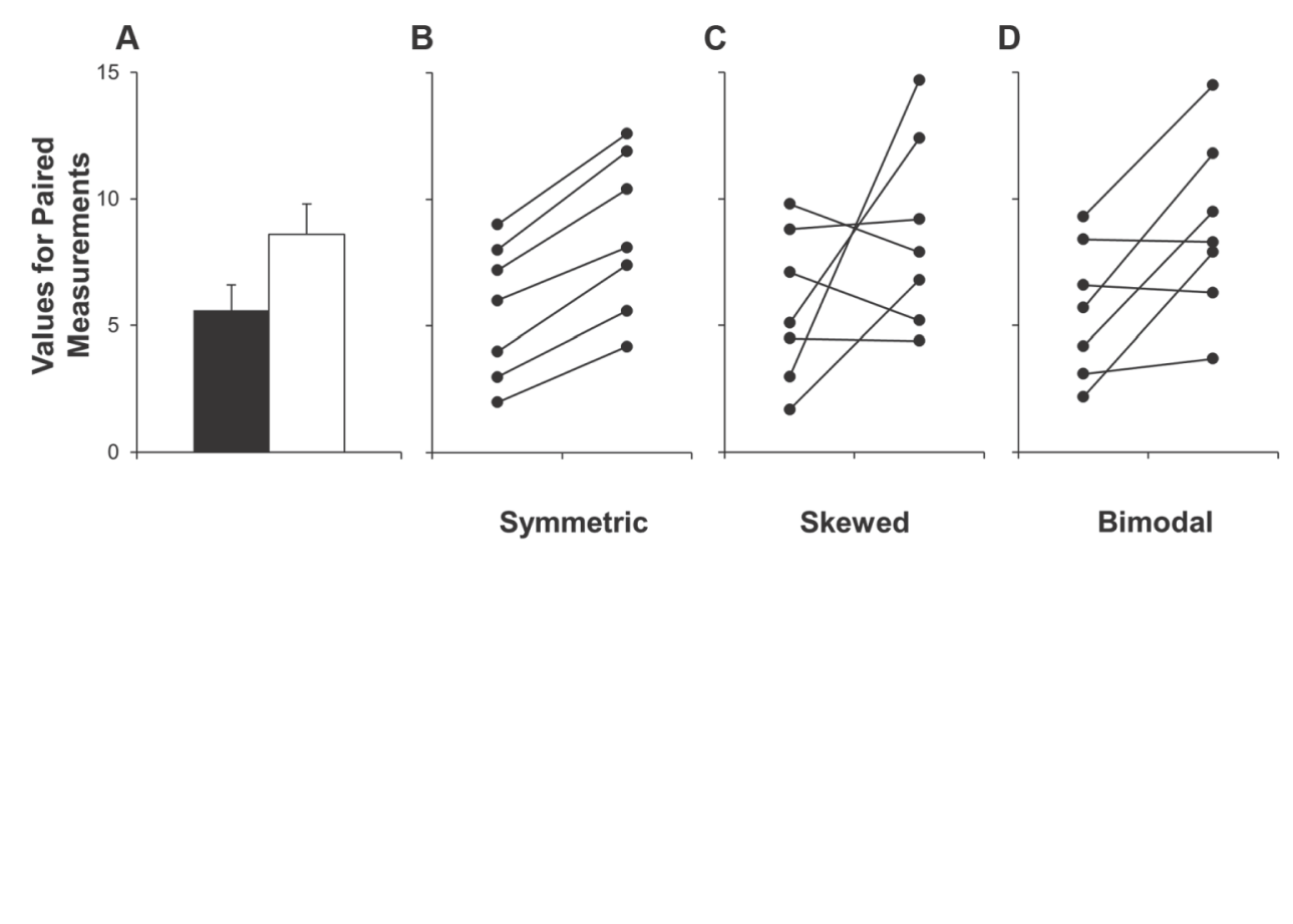
Visualize Uncertainty
Visualize Uncertainty
Visualize Uncertainty
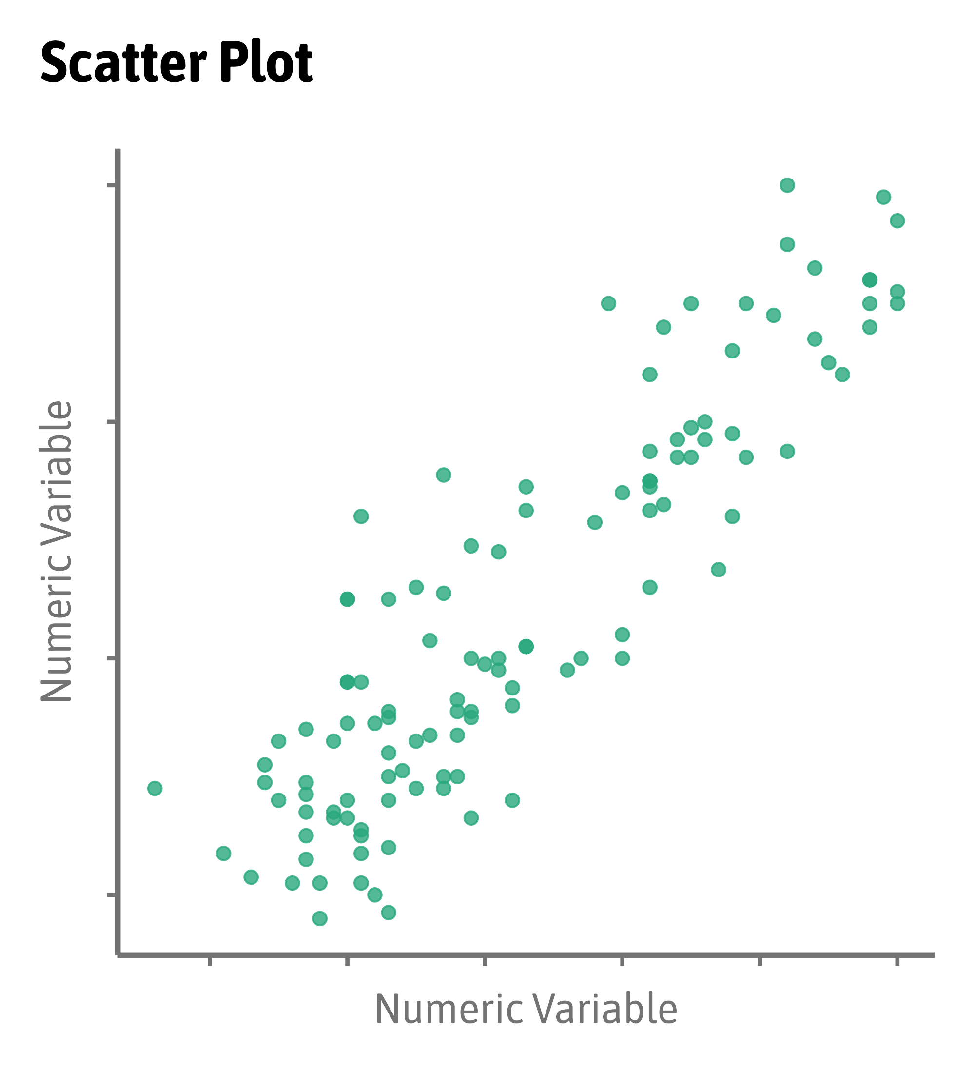
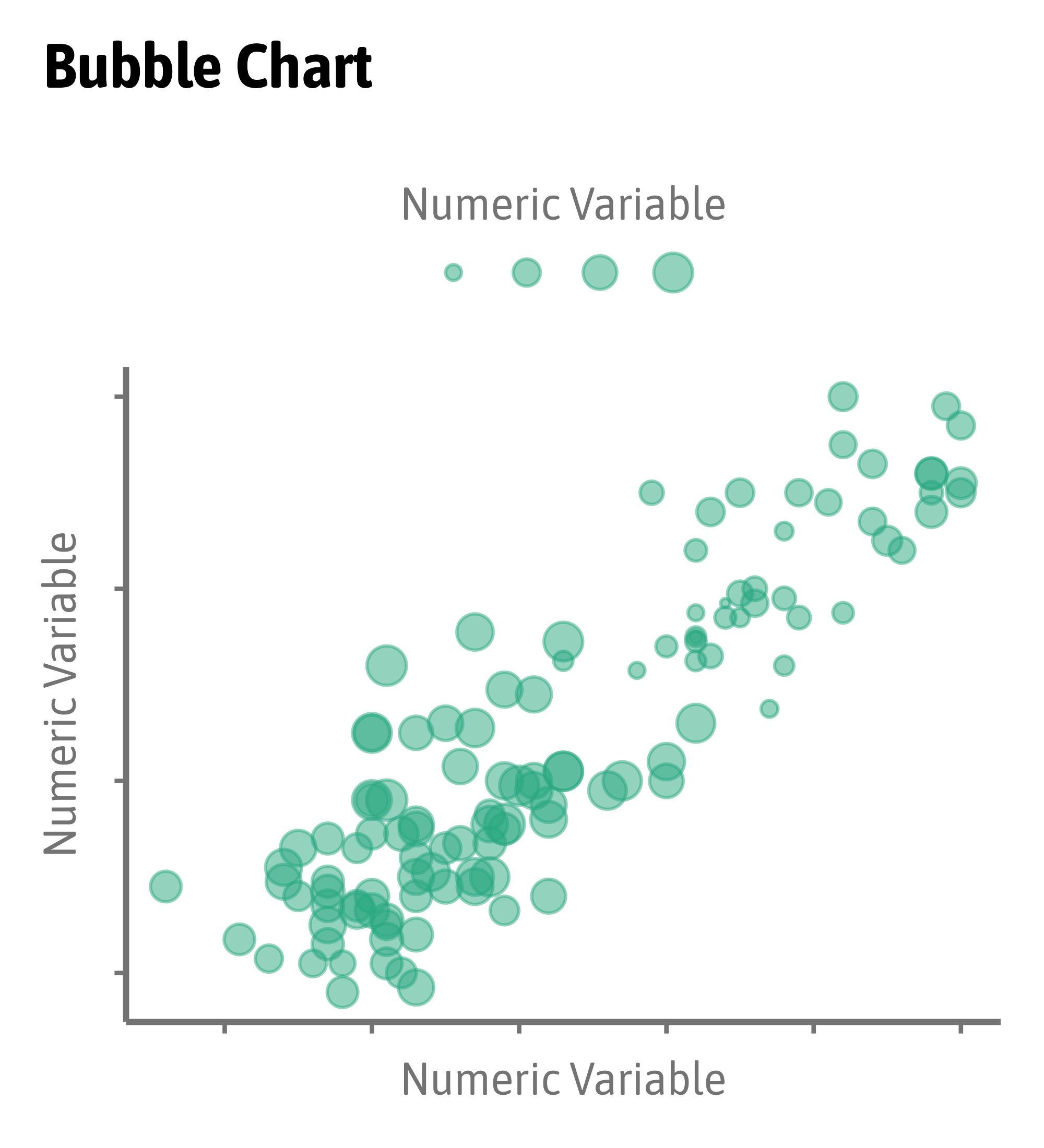
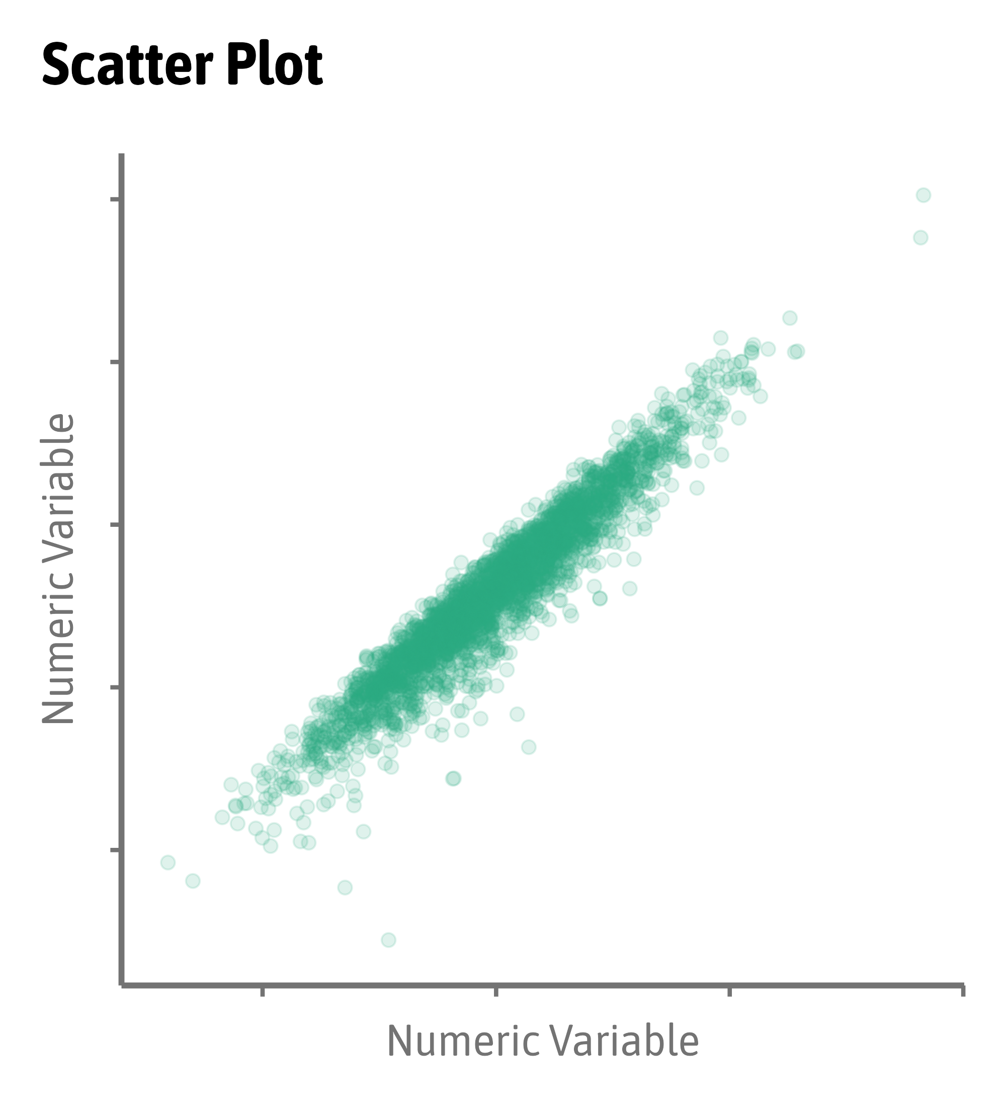
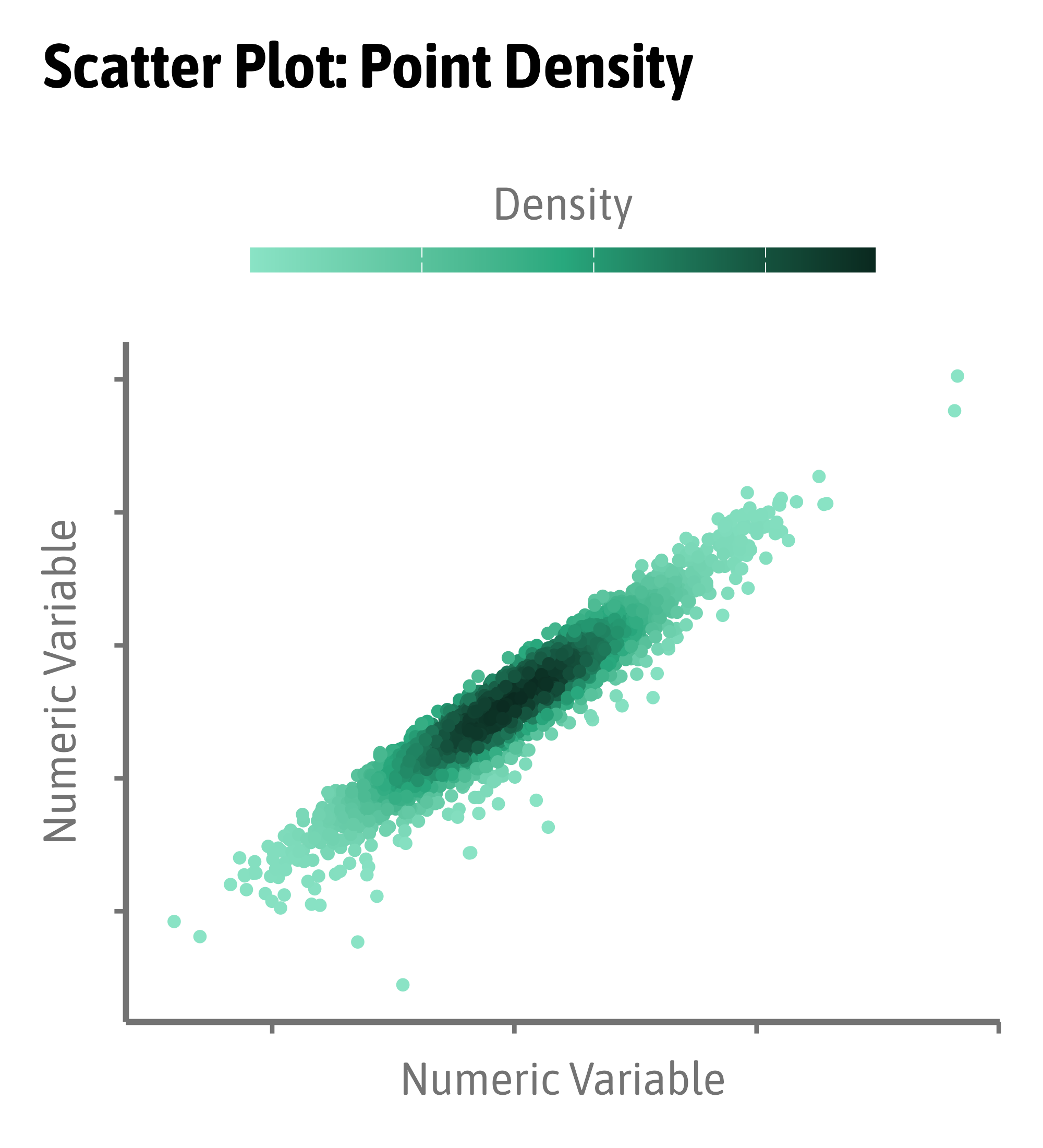
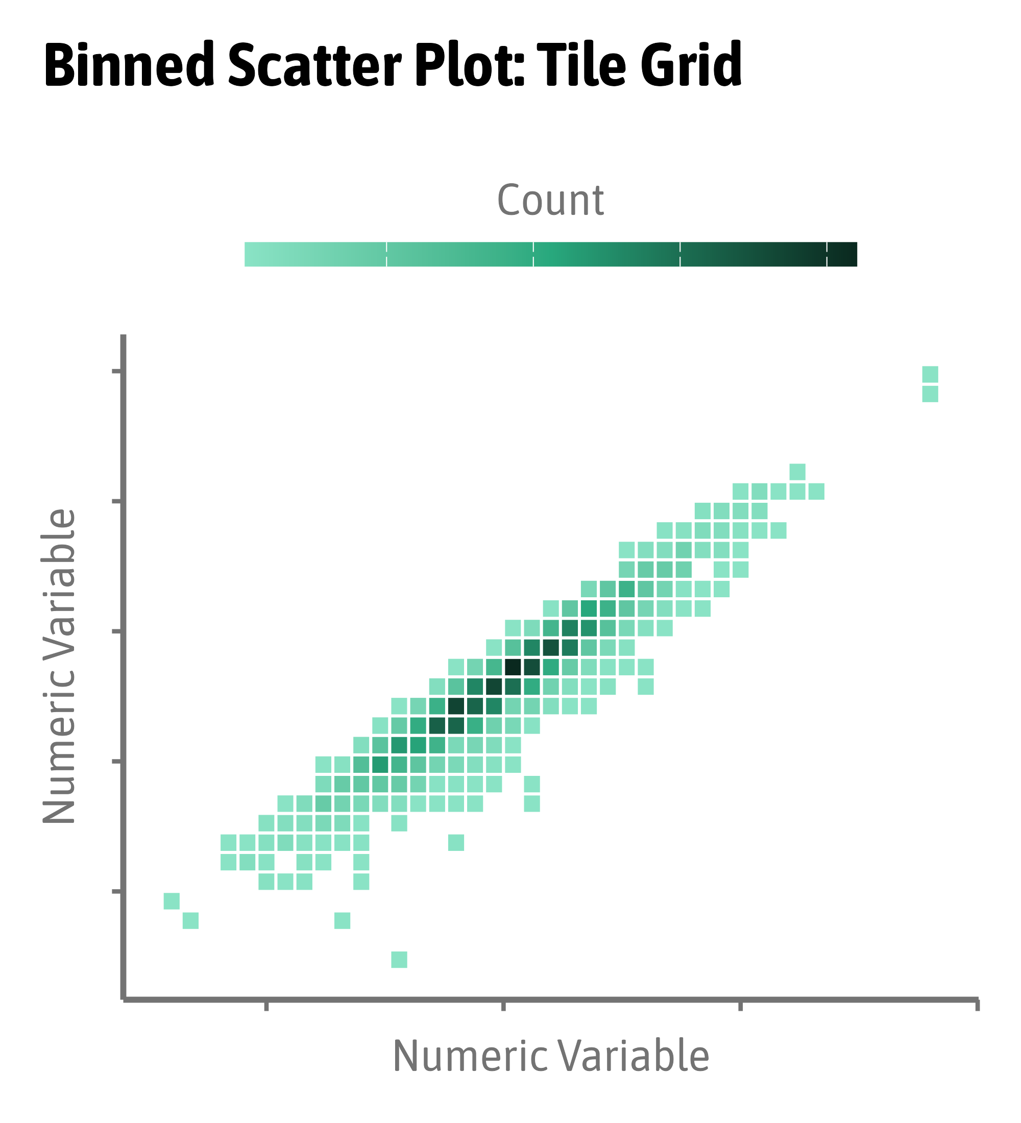
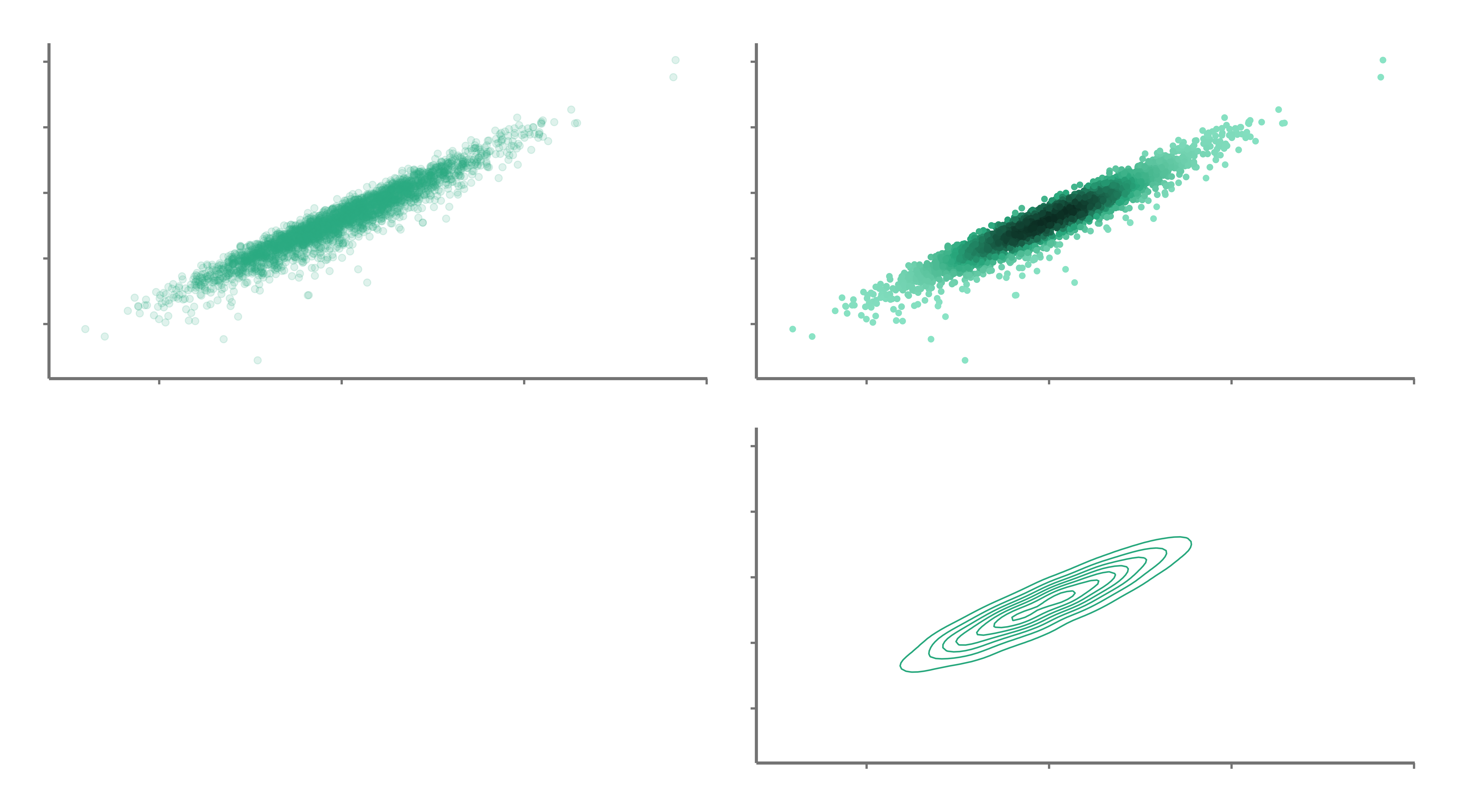
Overplotting Issue
Spaghetti Plots
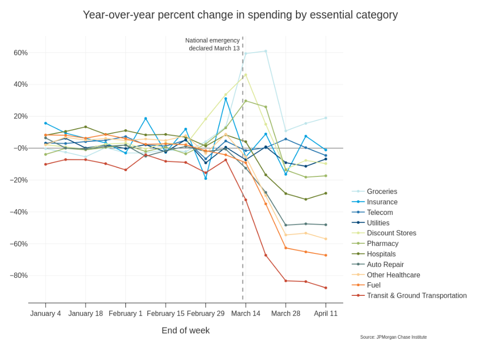
Spaghetti Plots
Spaghetti Plots
Spaghetti Plots
Spaghetti Plots
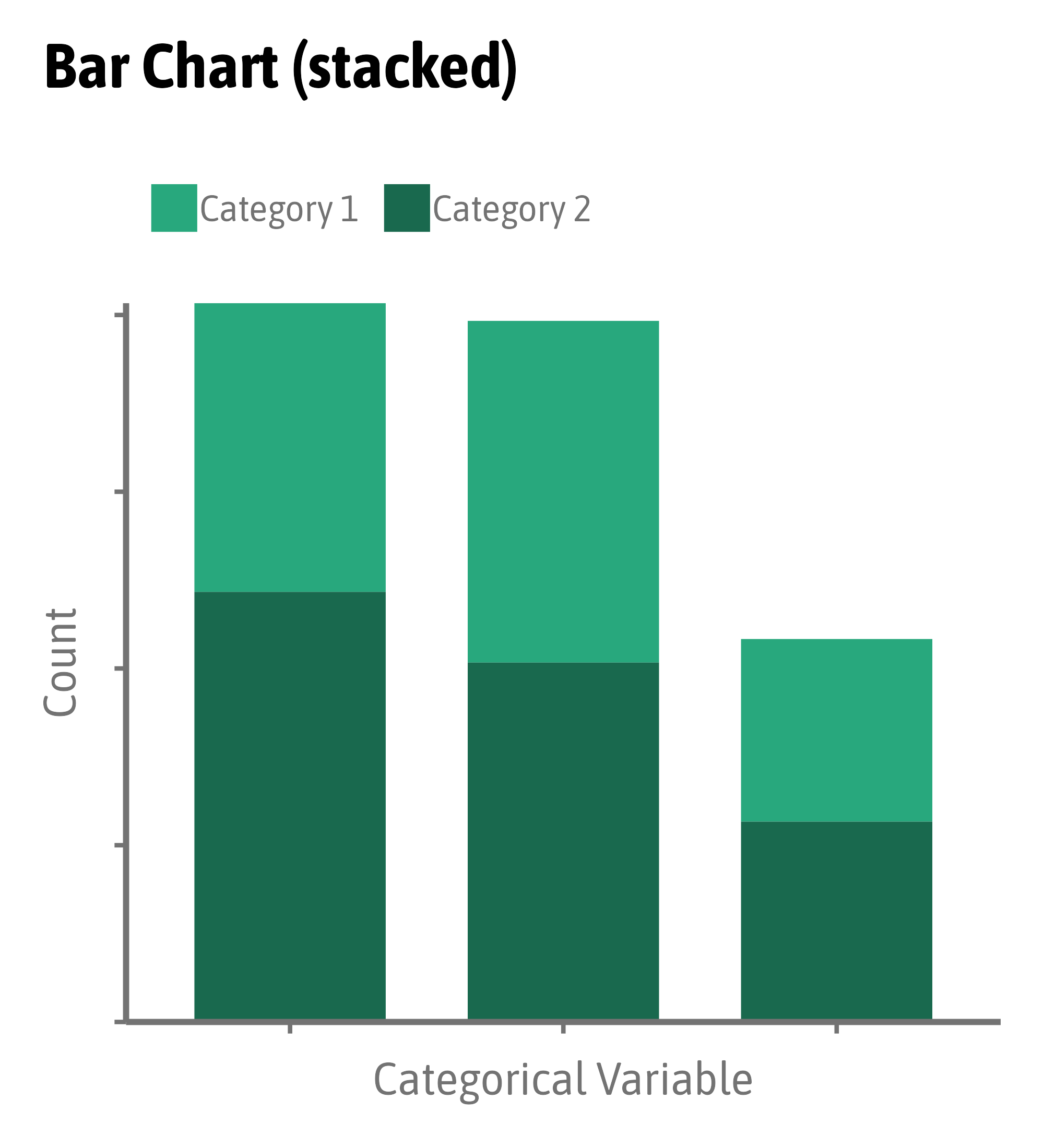
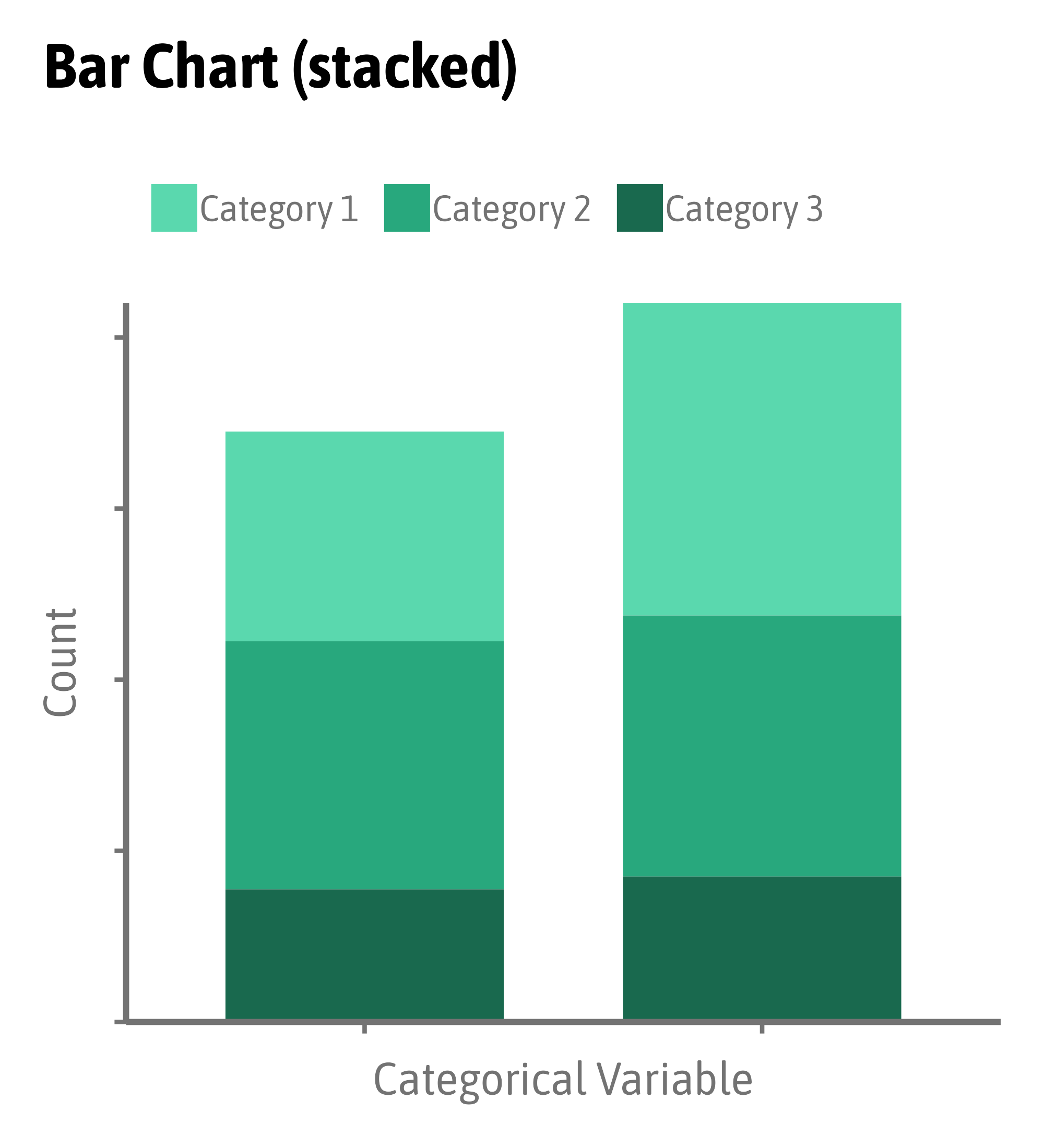
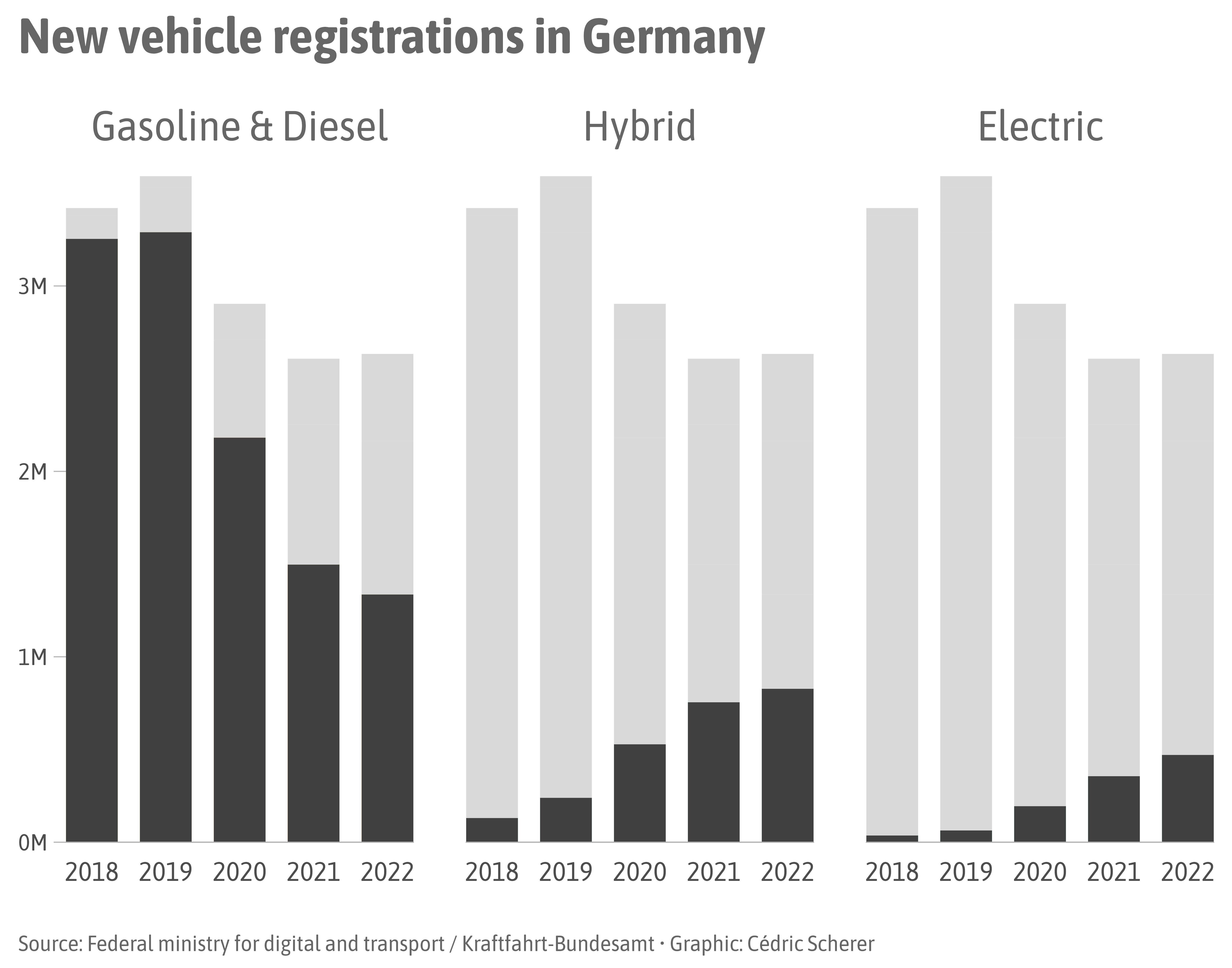
Stacked Bars Issue

Stacked Bars Issue
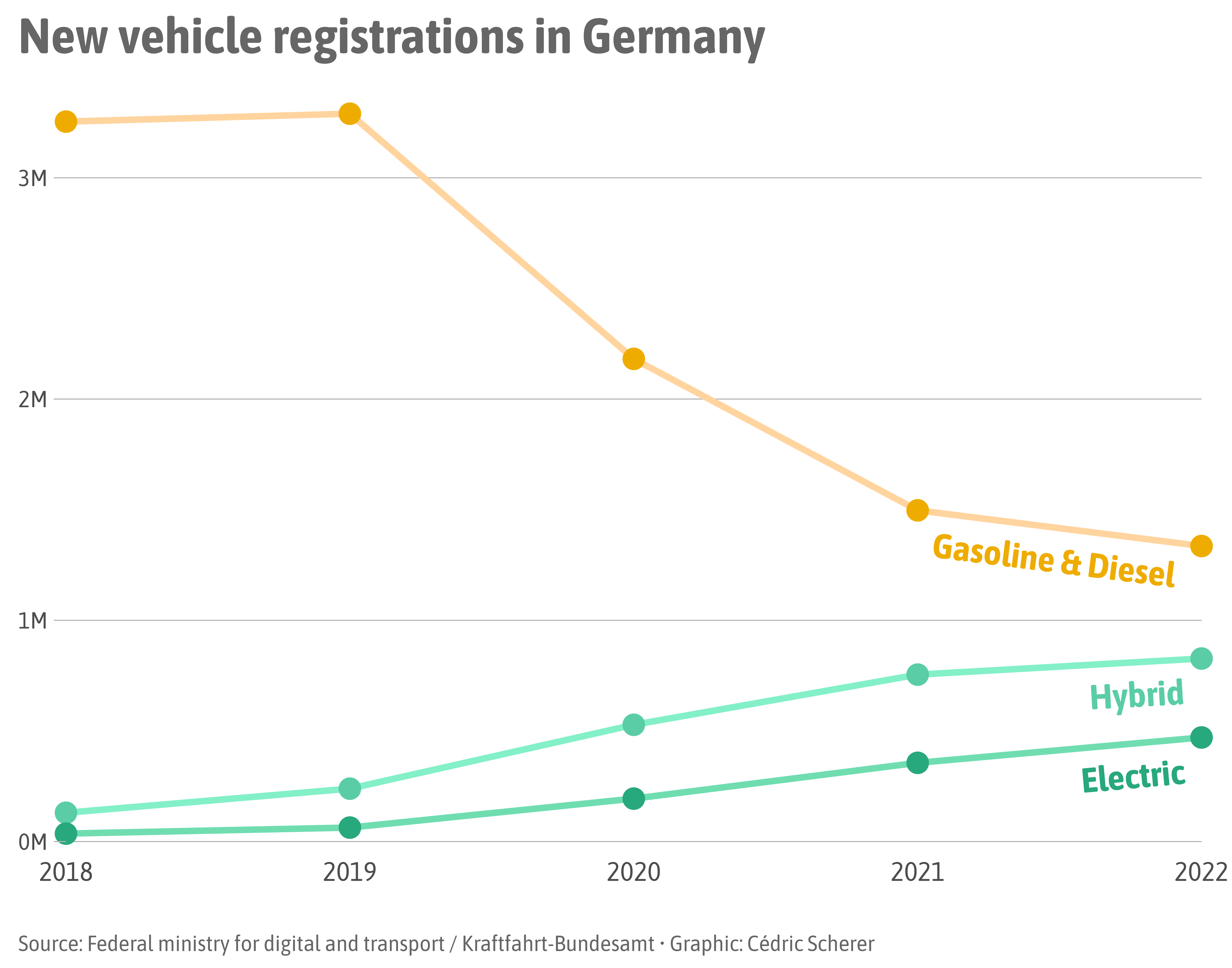
Stacked Bars Issue
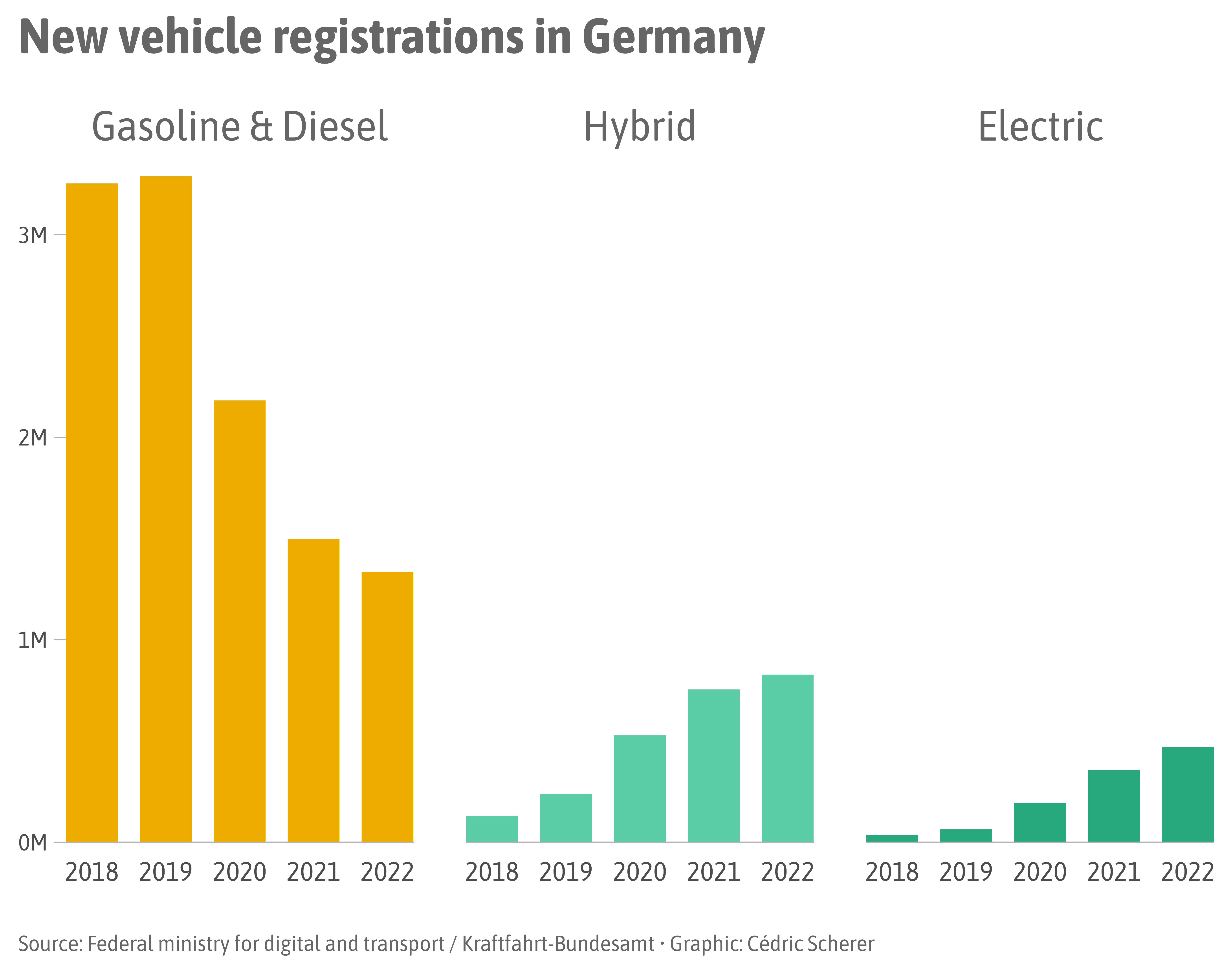
Stacked Bars Issue
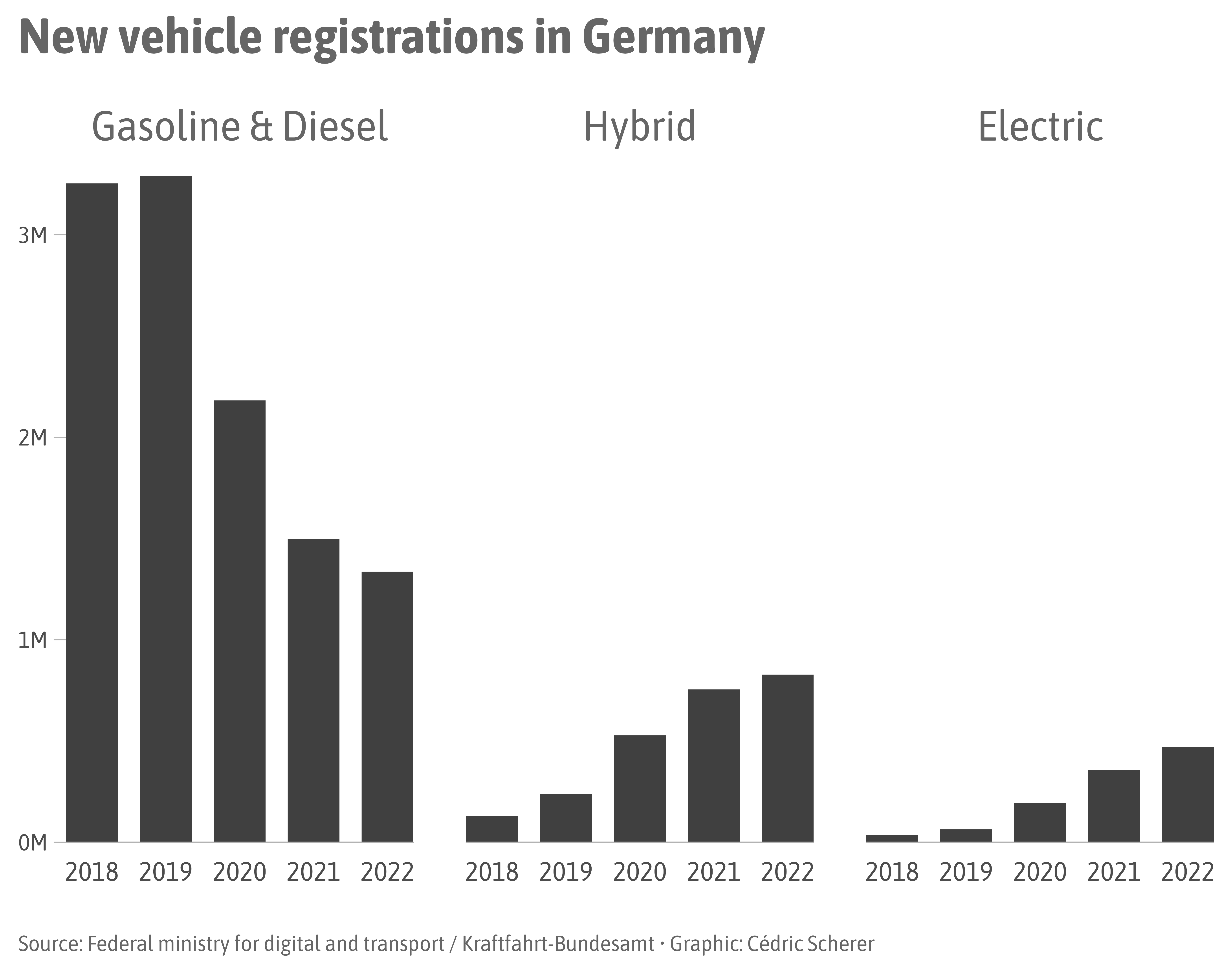
Stacked Bars Issue
Dual Axis Issue
Examples by Lisa Charlotte Muth, DataWrapper Blog
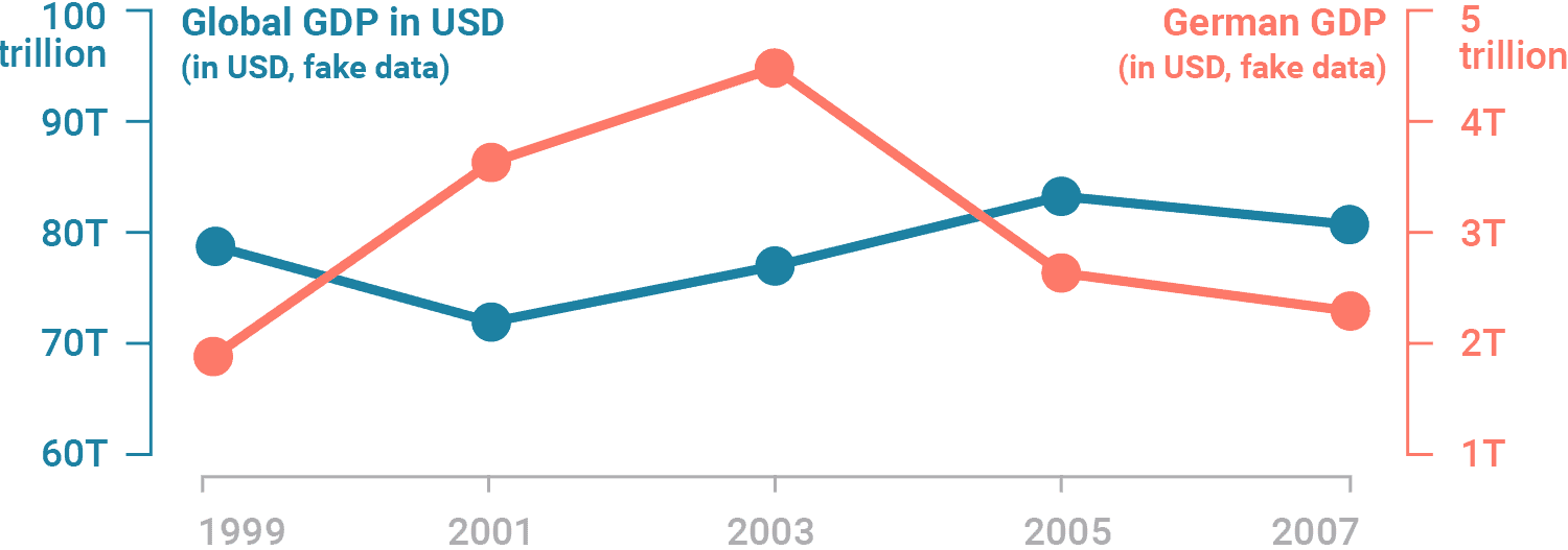
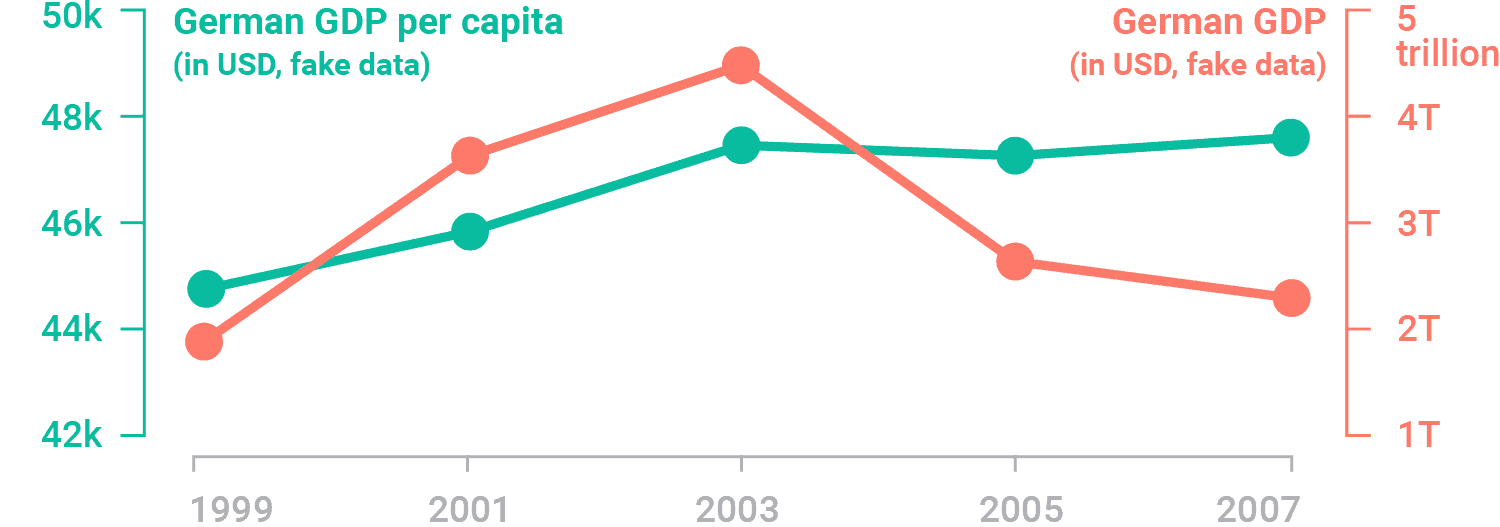
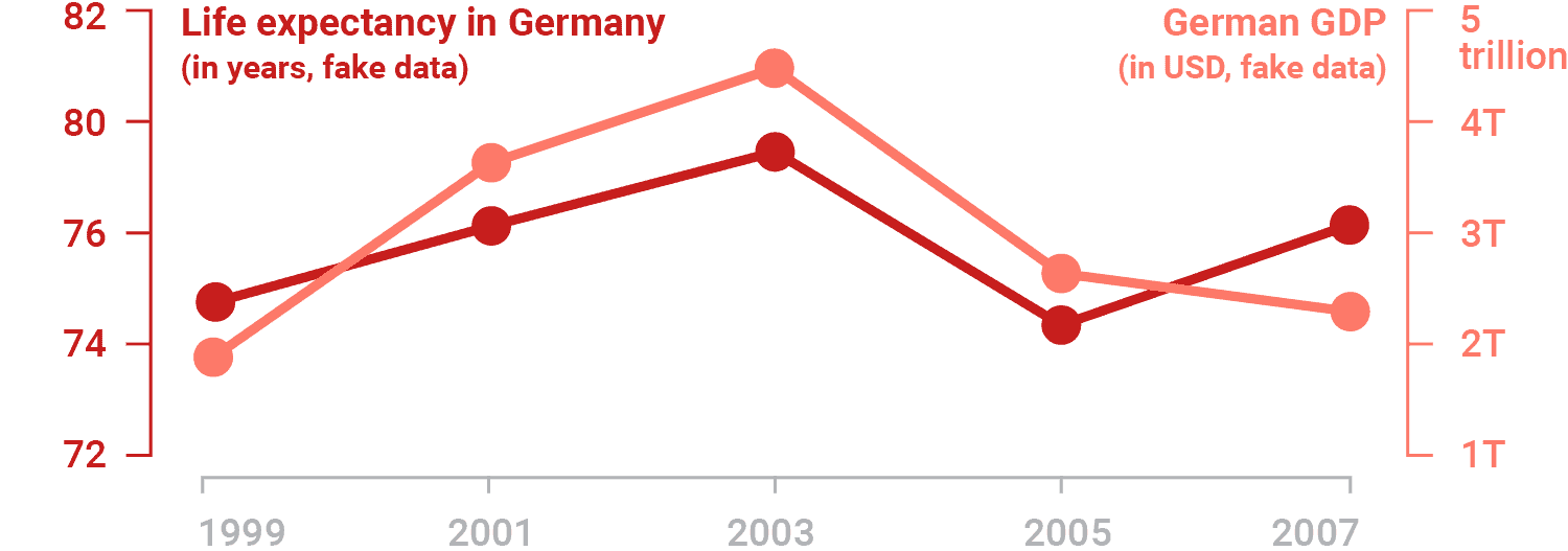
Dual Axis Issue
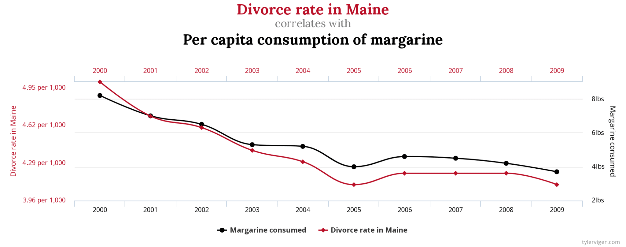
Source: Spurious Correlations
Dual Axis Issue
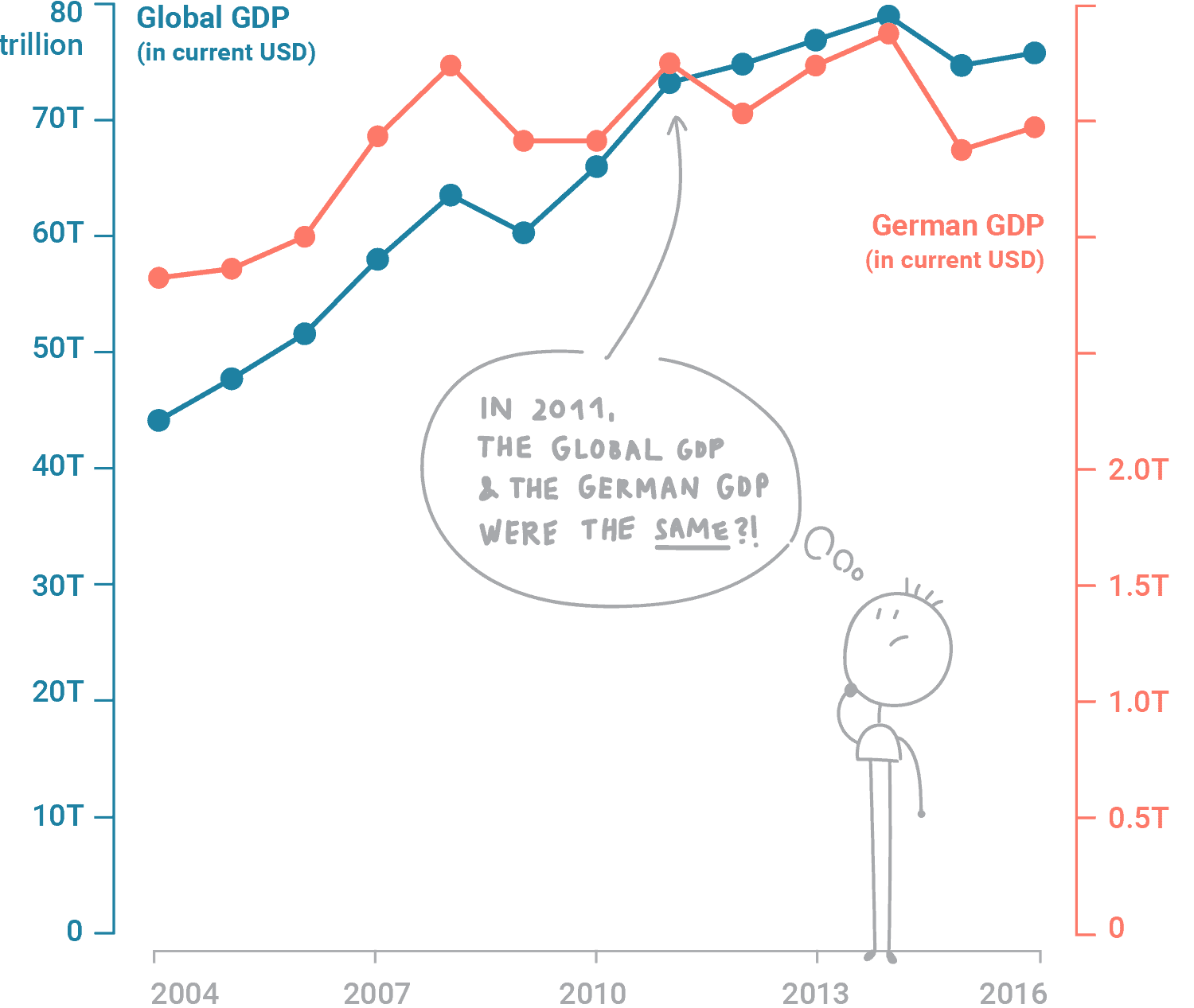
Source: Lisa Charlotte Muth, DataWrapper Blog
Dual Axis Issue
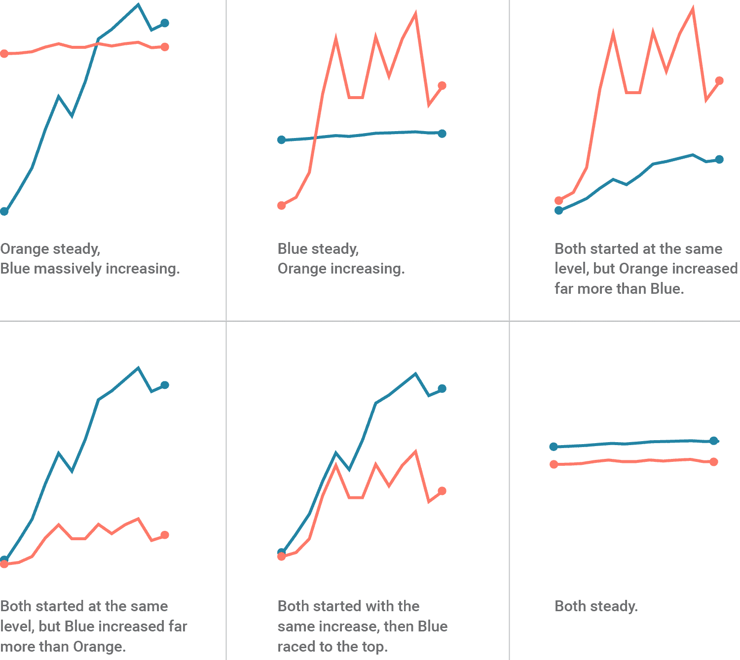
Source: Lisa Charlotte Muth, DataWrapper Blog
Dual Axis Issue
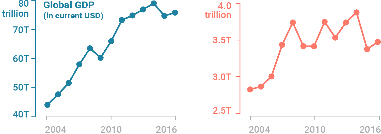
Source: Lisa Charlotte Muth, DataWrapper Blog
Dual Axis Issue
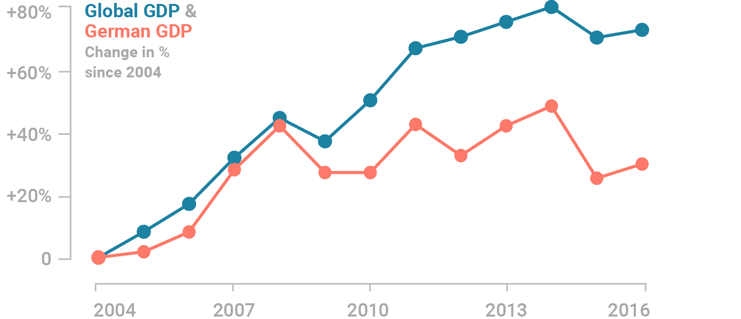
Source: Lisa Charlotte Muth, DataWrapper Blog
Skewed Data
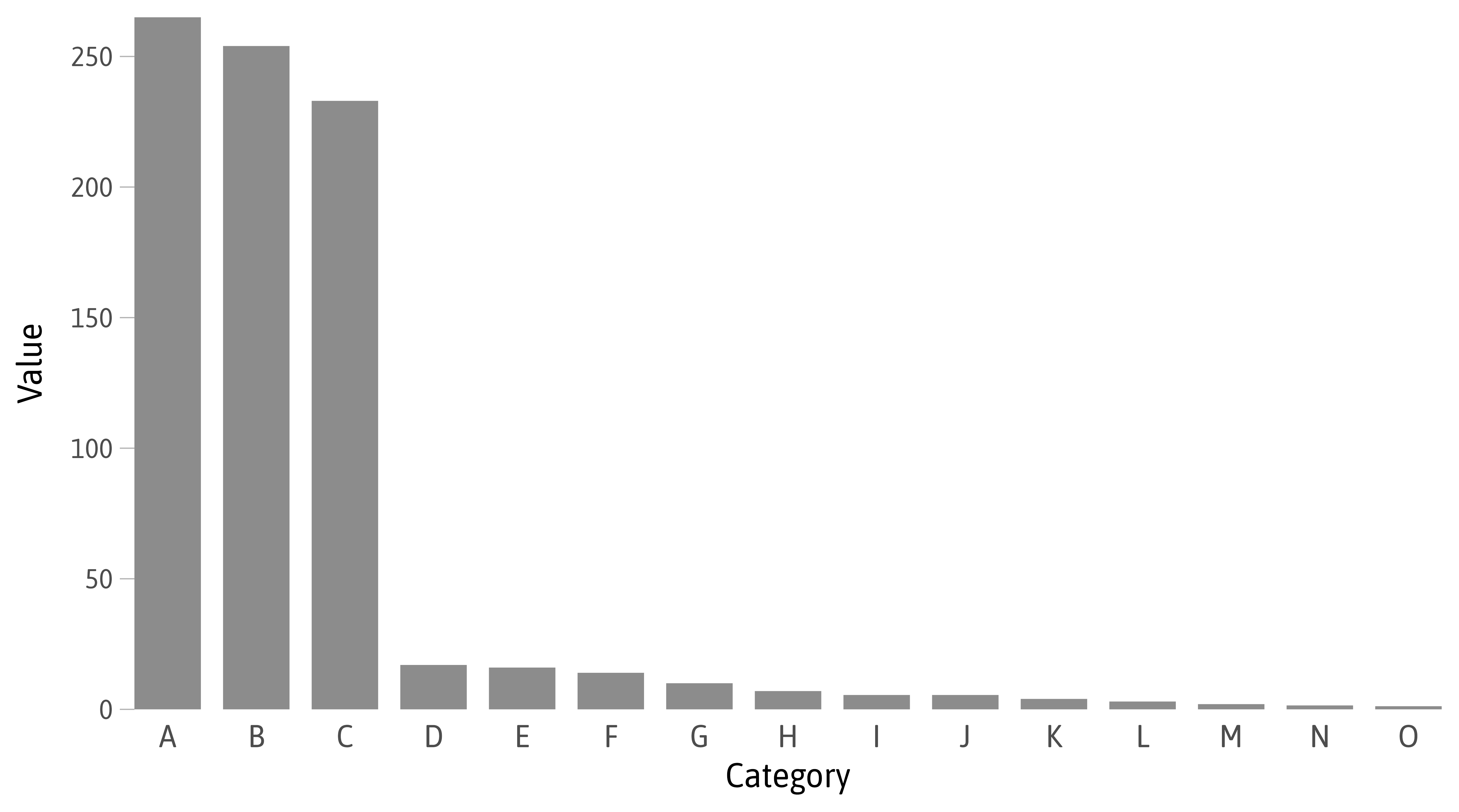
Skewed Data
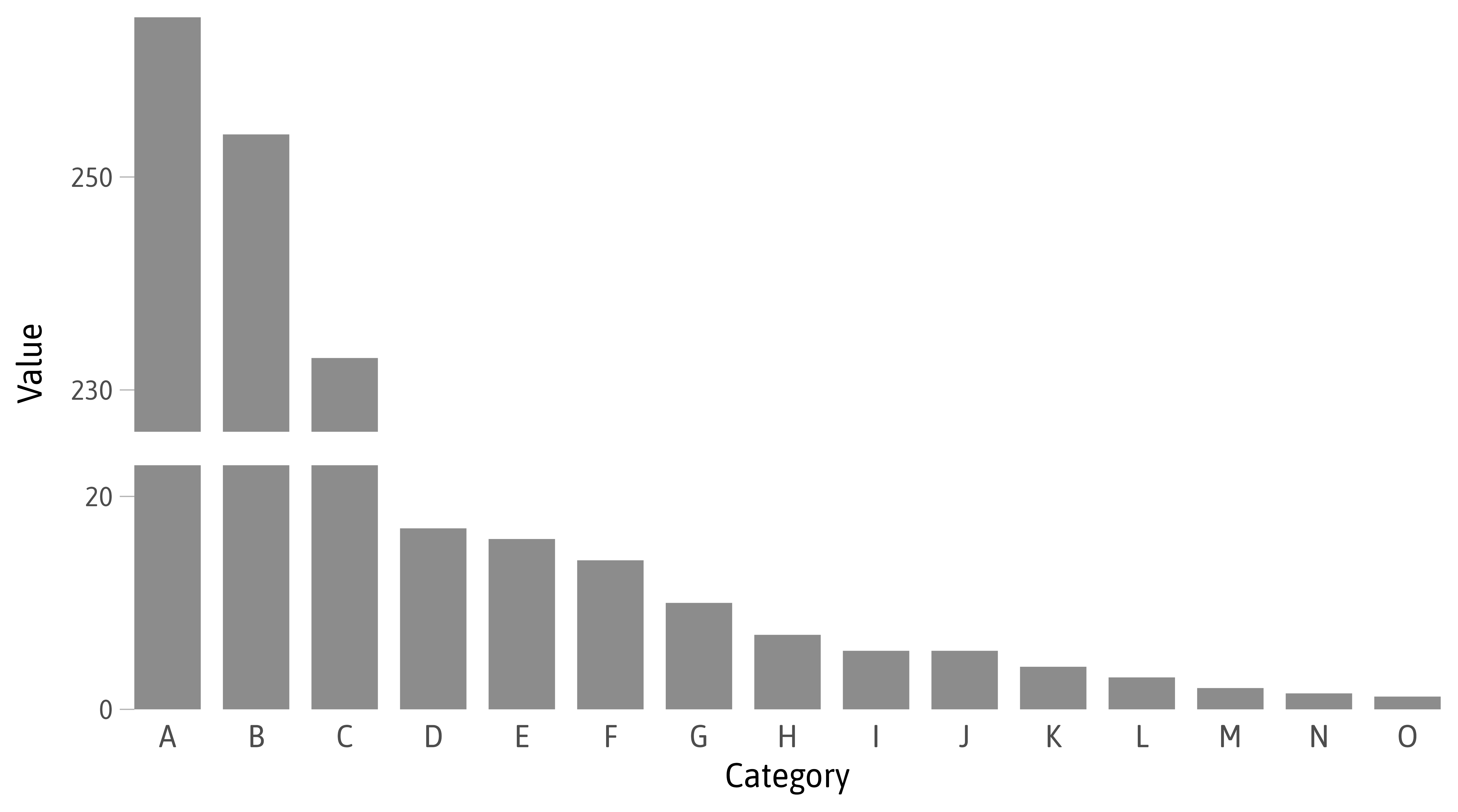
Skewed Data
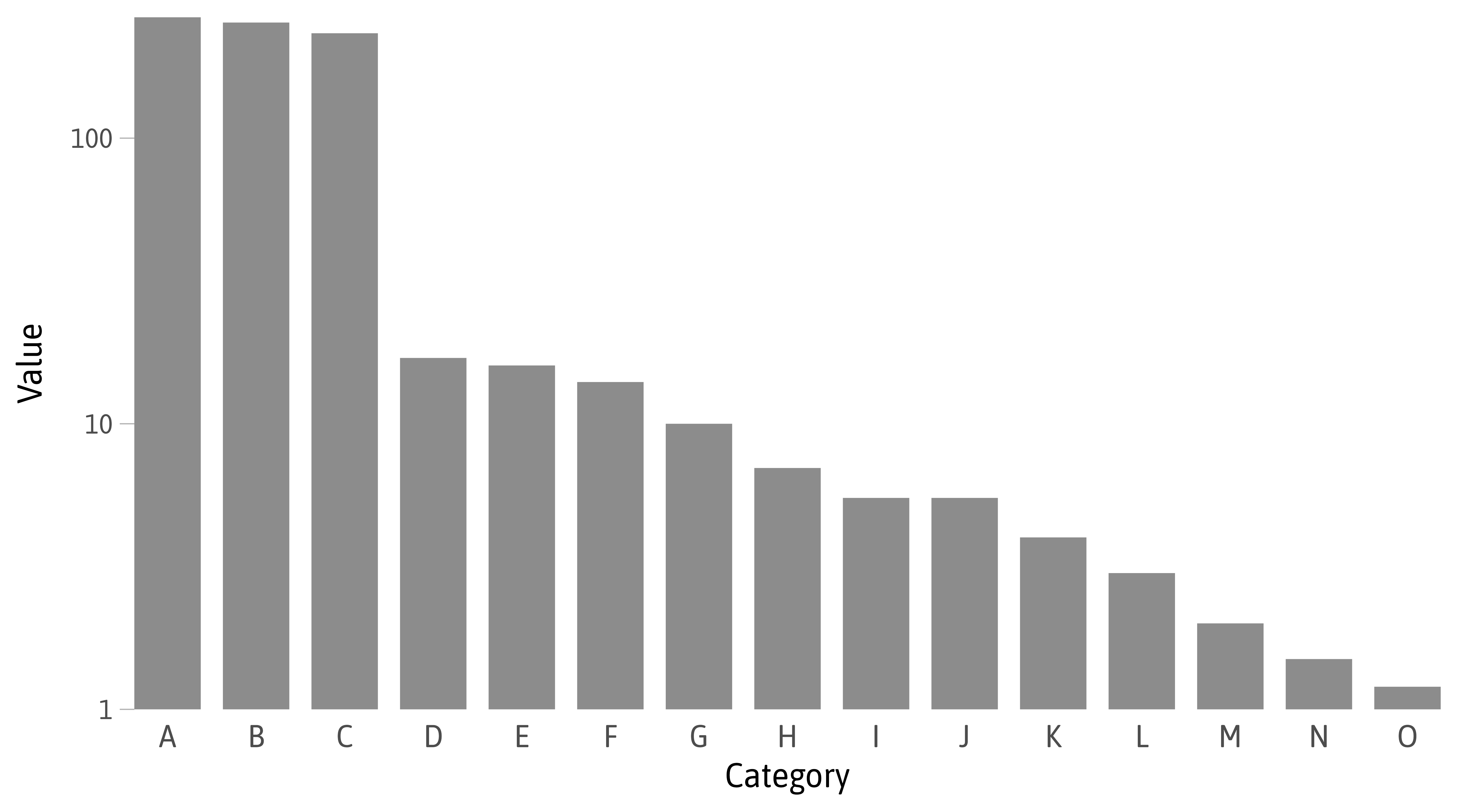
Skewed Data
Skewed Data
Exercise 1
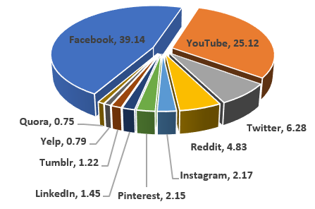
Market share of visits to social network sites in November 2017,
found in the blog post on “Why you shouldn’t use pie charts” by The University of Melbourne