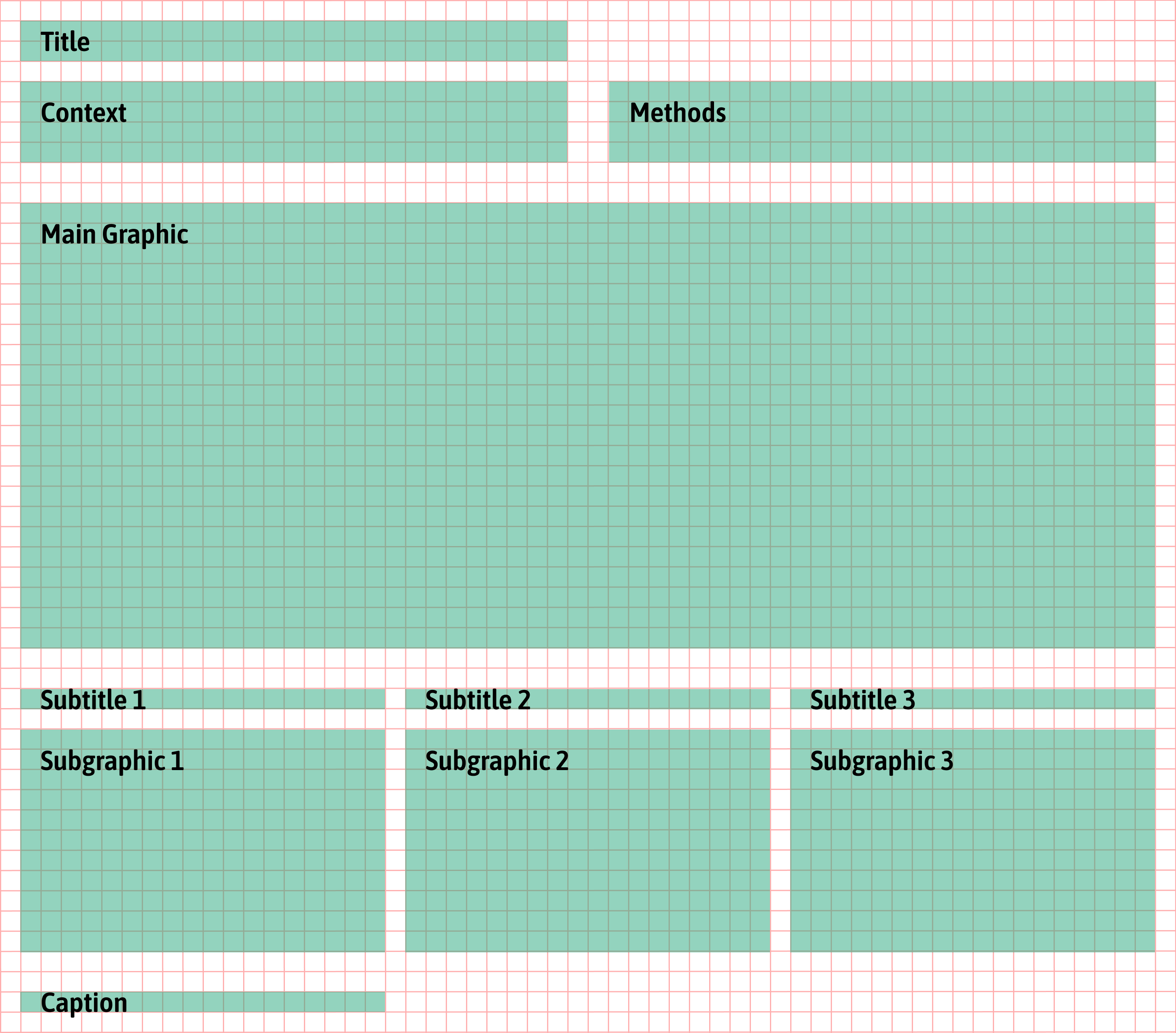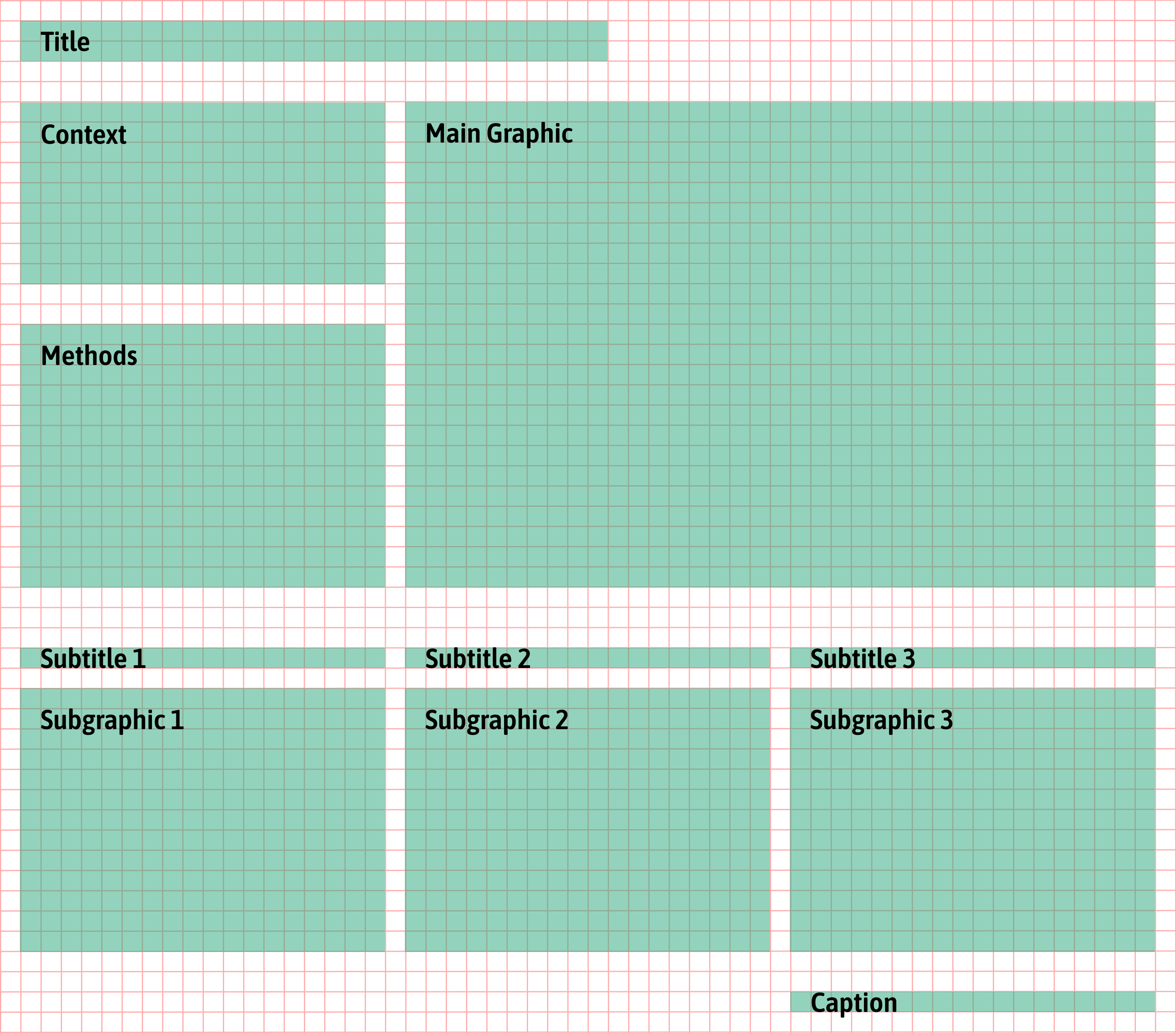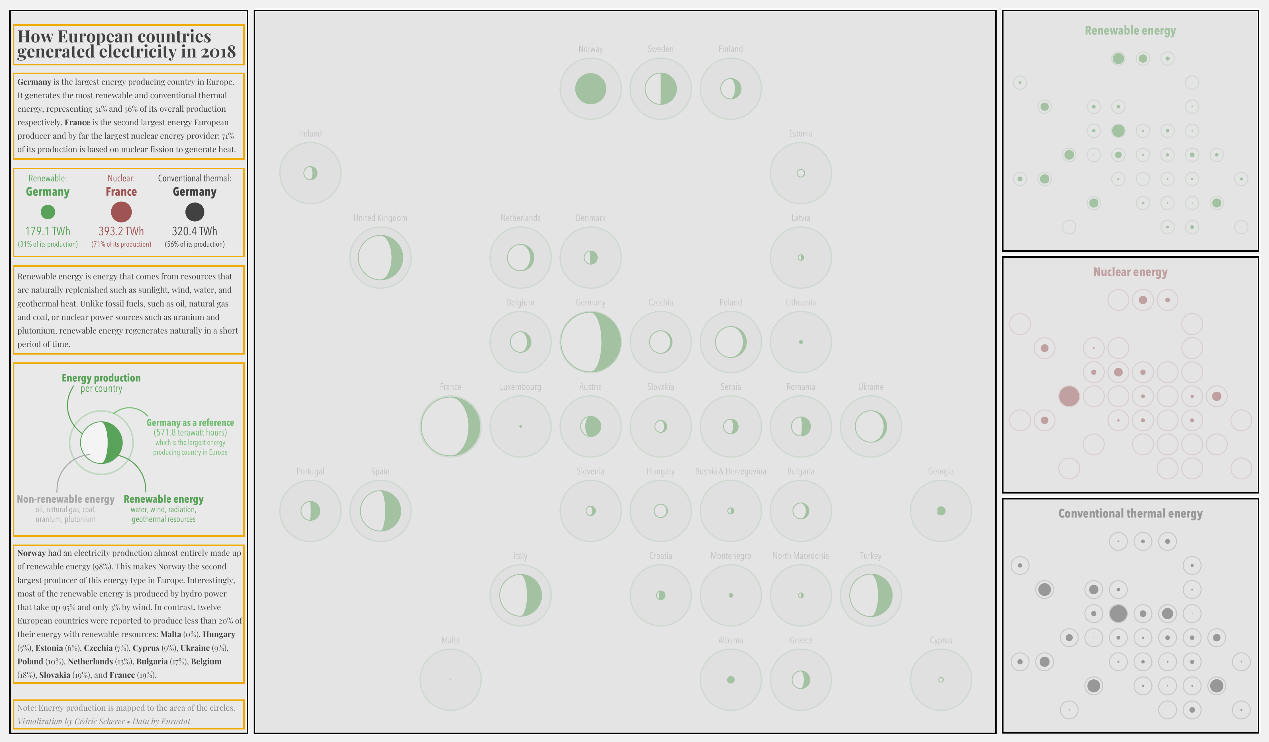


Main Principles of Graphic Design
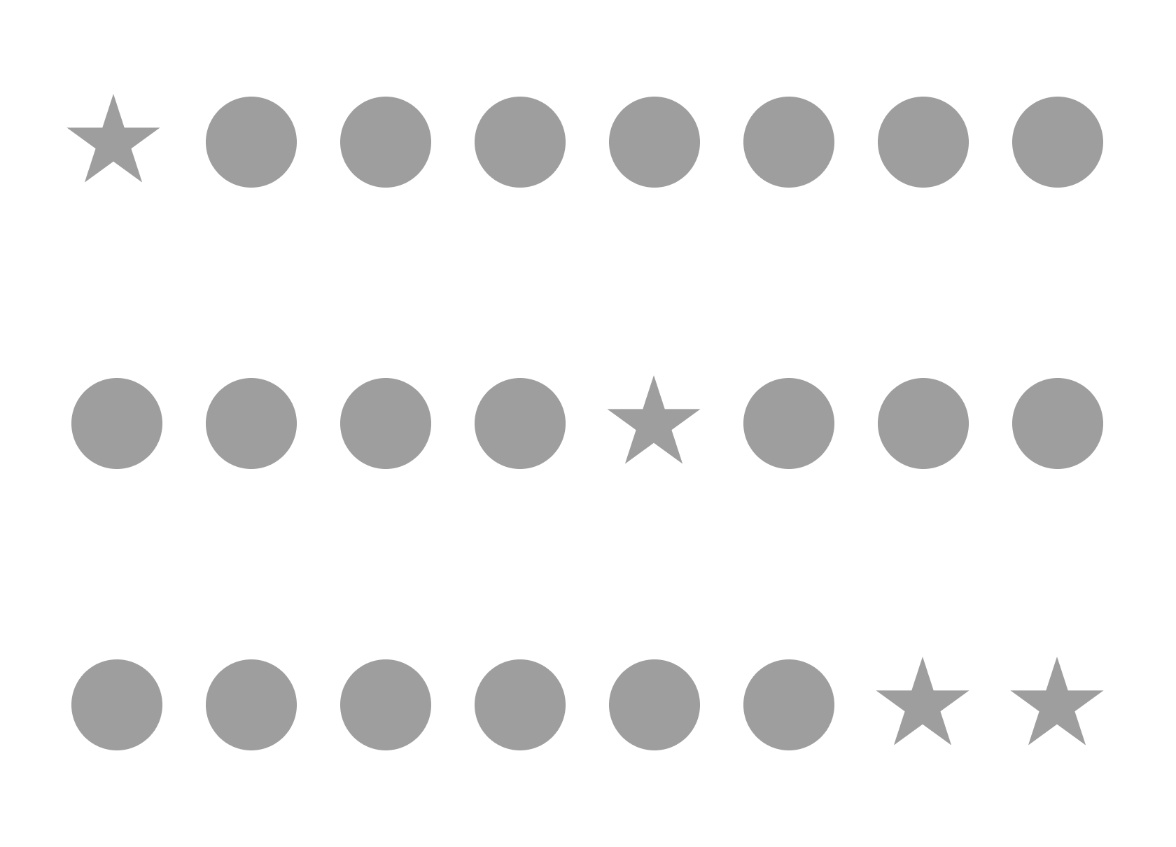
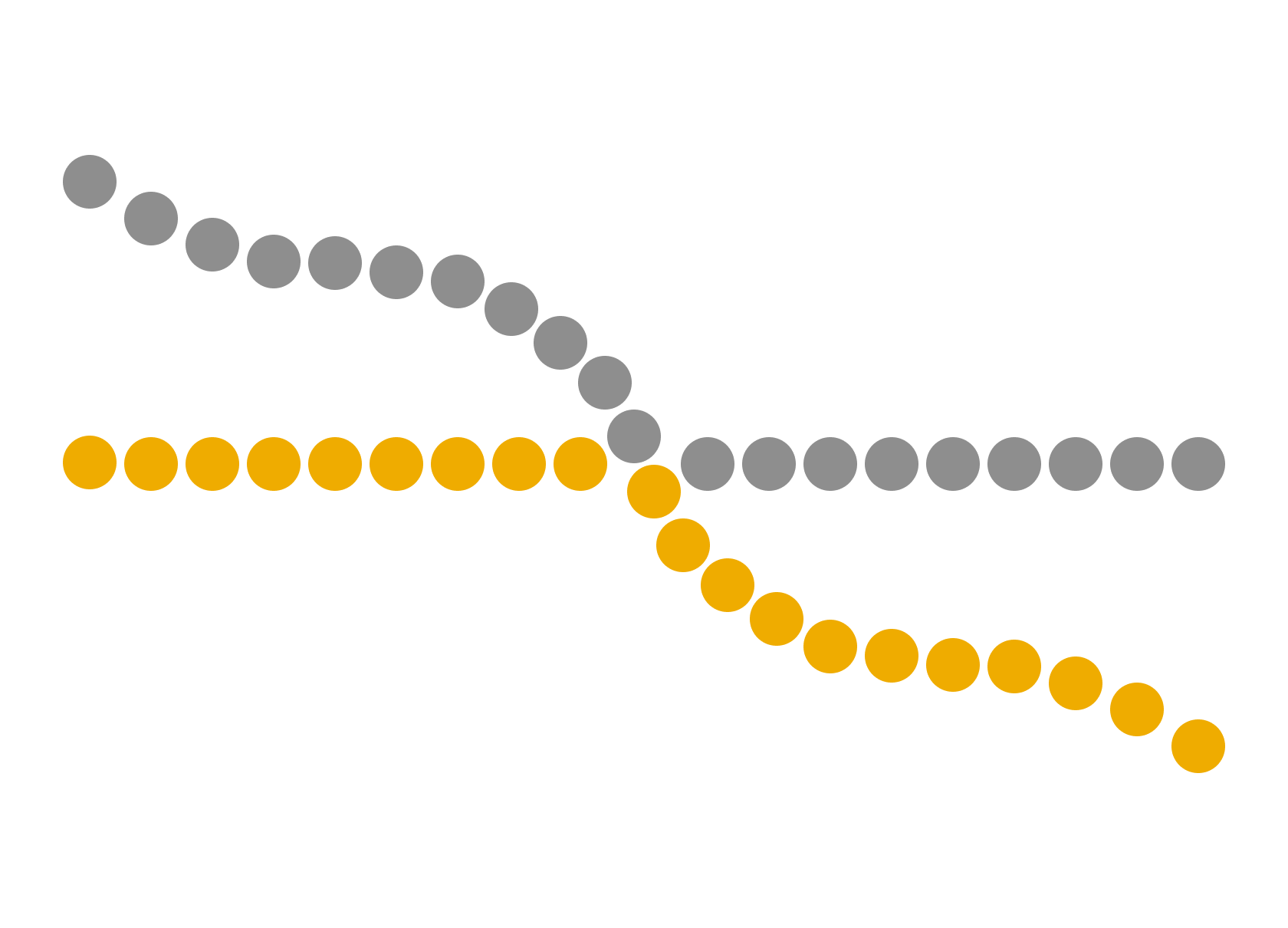
→ Unity
→ Variety
→ Hierarchy
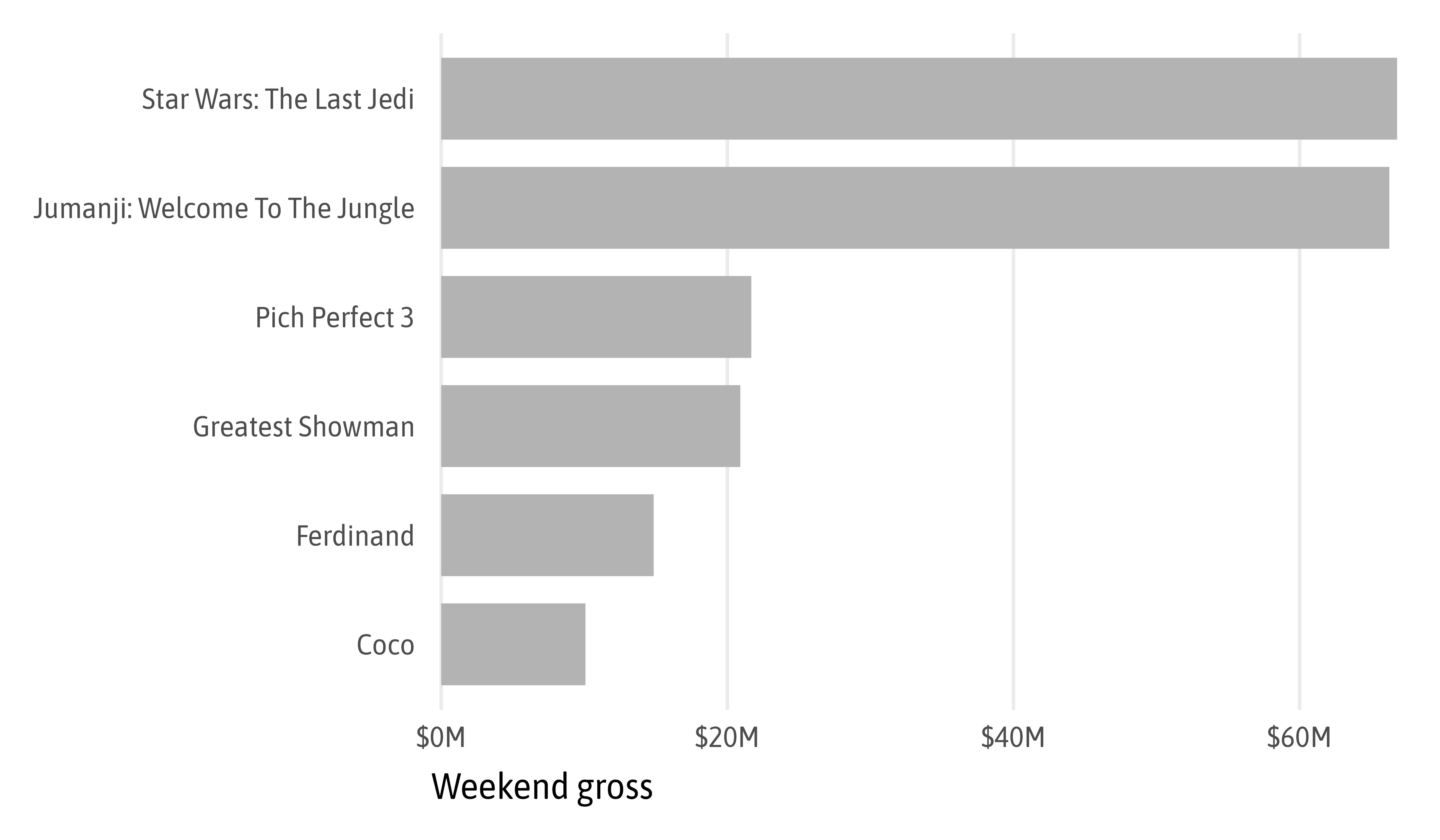
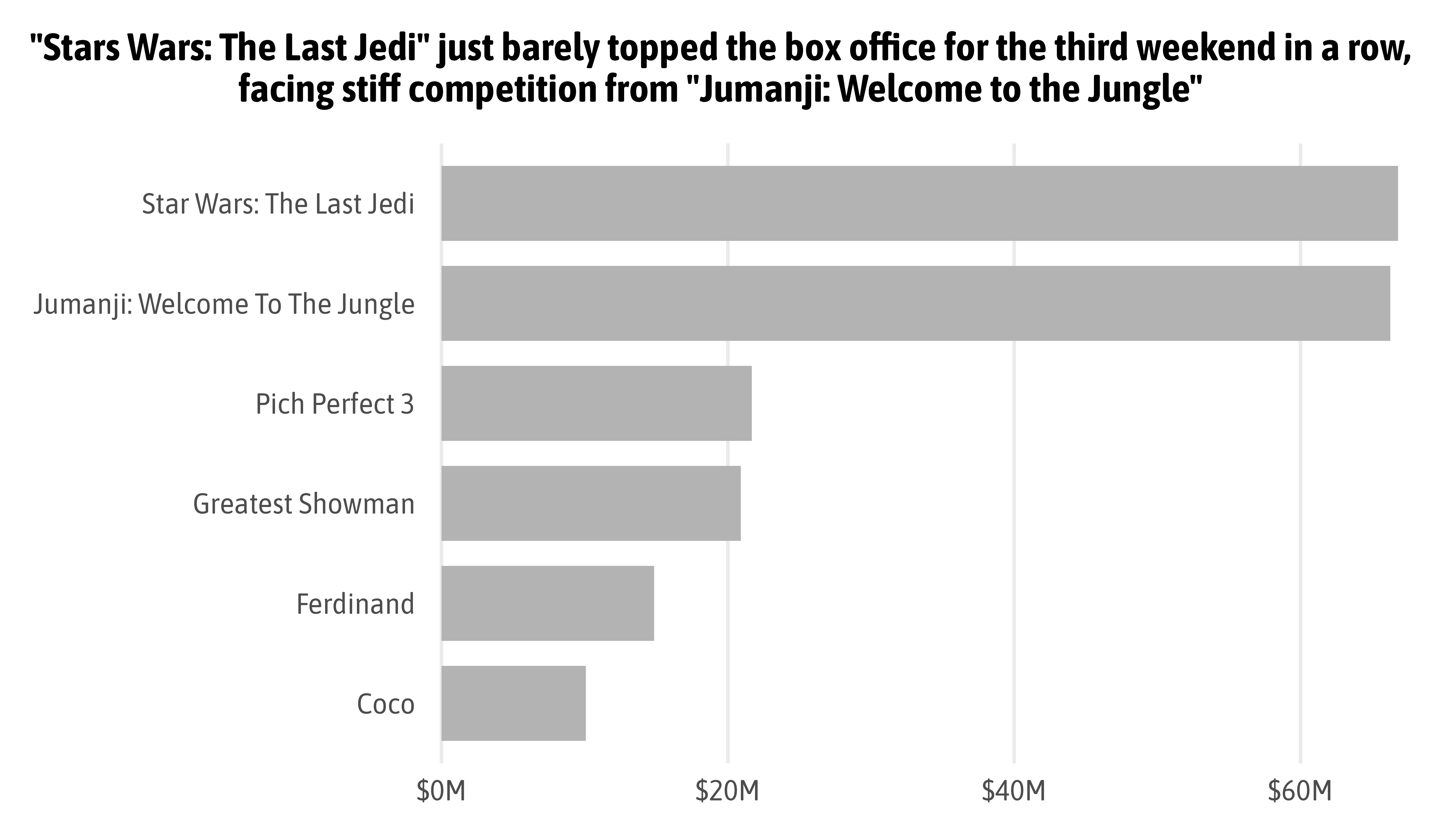
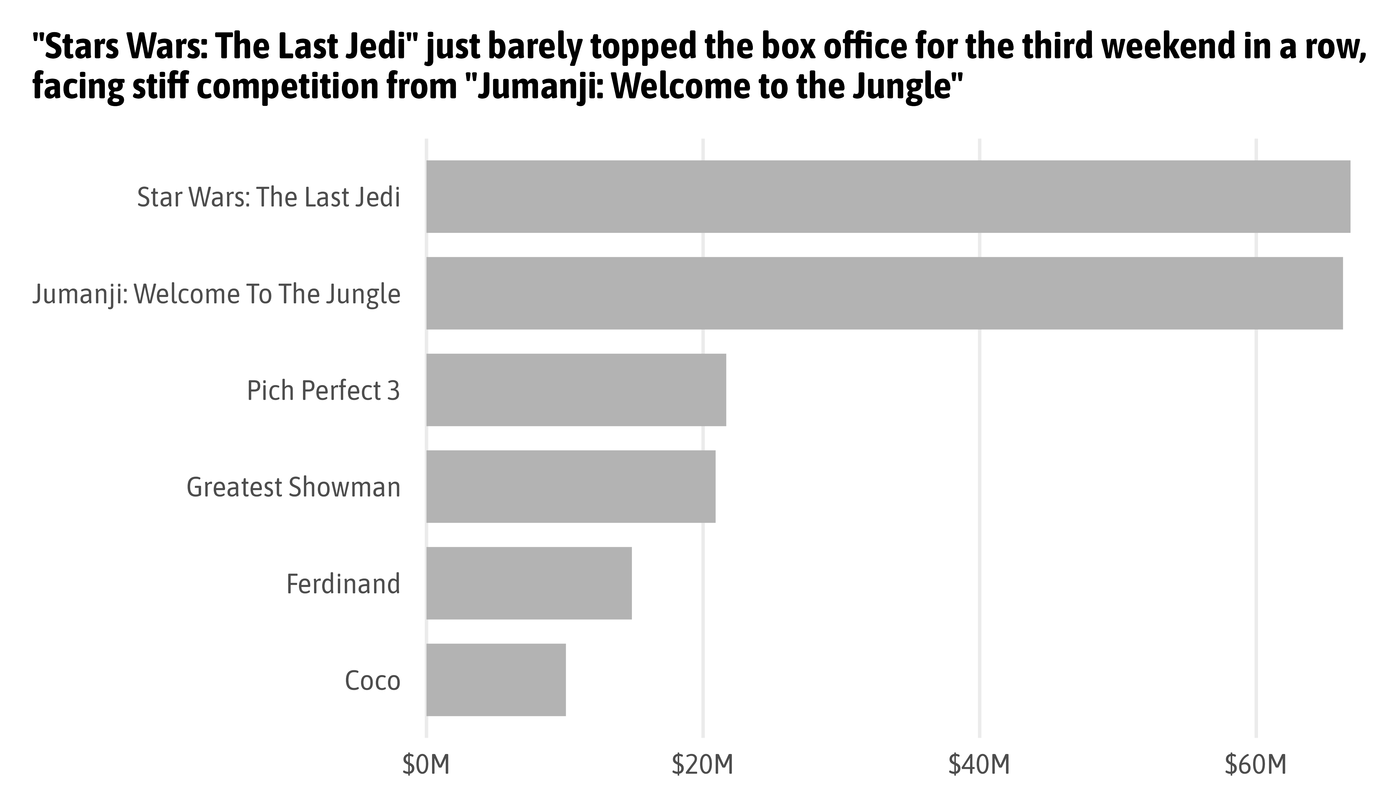
The balance between unity and variety can lead to hierarchy.
Think Like a Designer

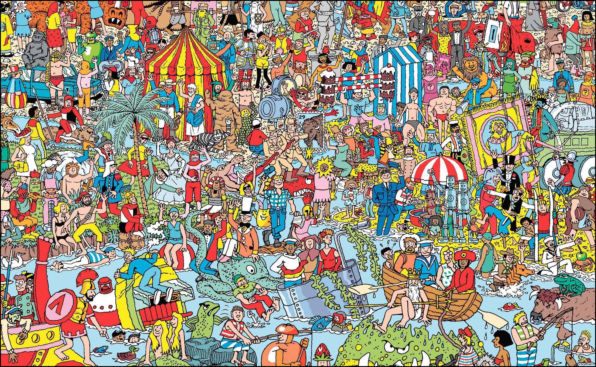
Source: “Where’s Waldo?” by Martin Handford © Kilburn & Strode LLP
Source: “Where’s Waldo?” by Martin Handford © Kilburn & Strode LLP
Adapted from Stephen Few and others

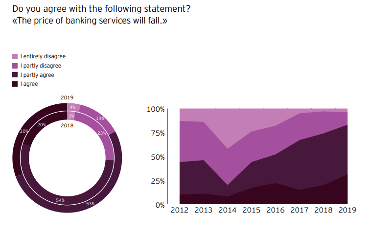
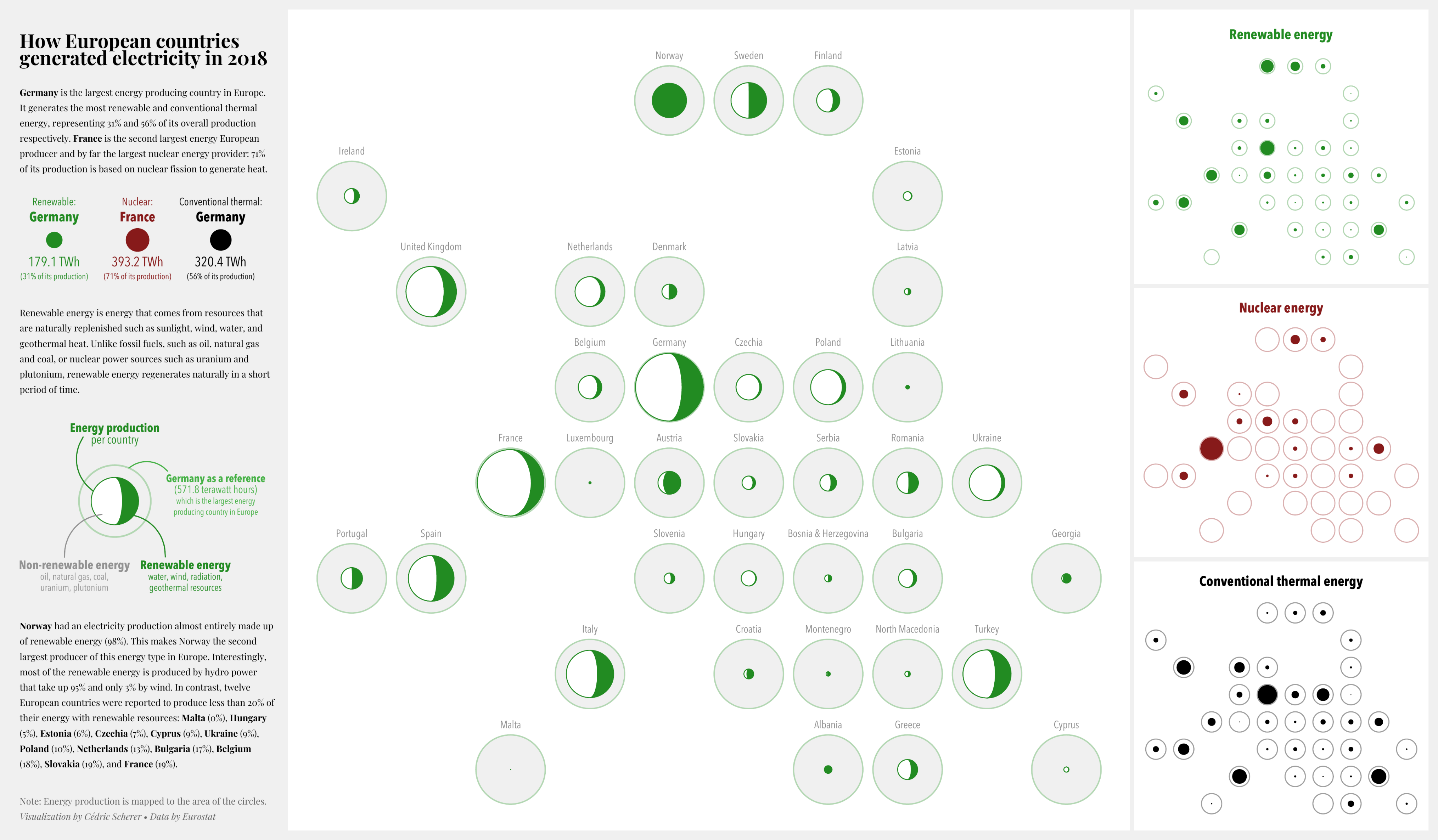
Source: Ernest & Young
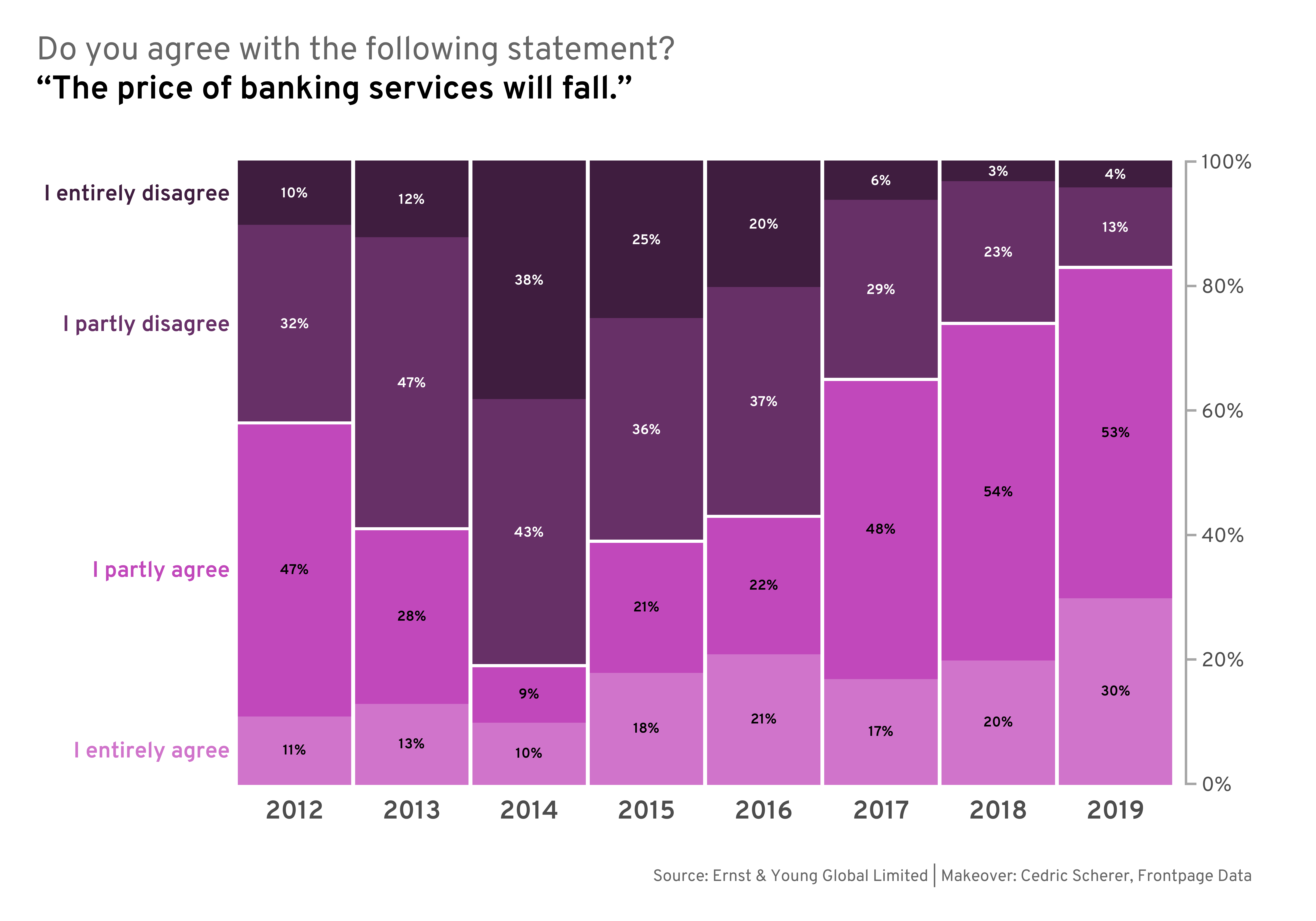
Reworked version of the charts by Ernest & Young
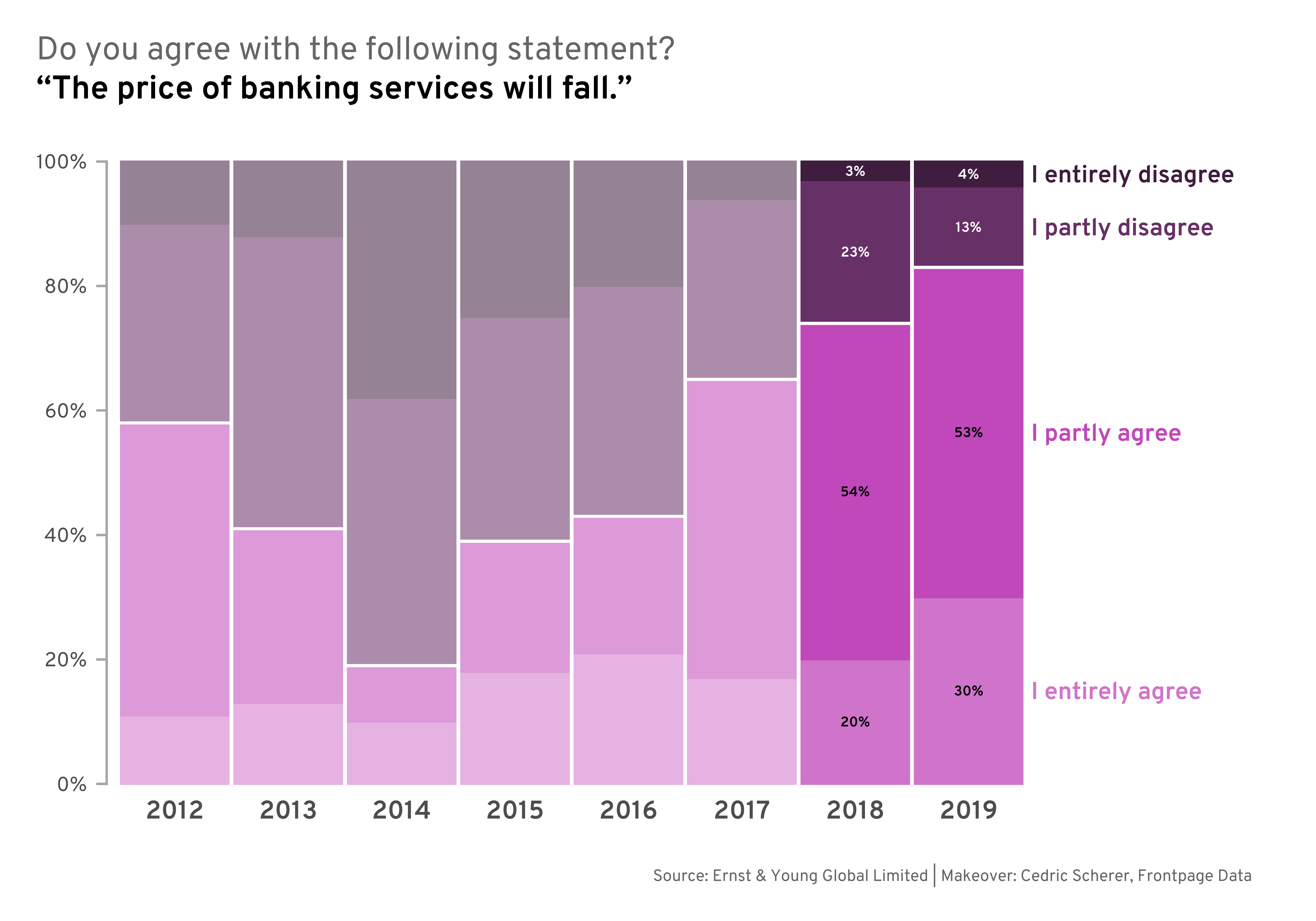
Reworked version of the charts by Ernest & Young
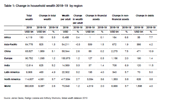
Source: Credit Suisse
Reworked version of the table by Credit Suisse
Reworked version of the table by Credit Suisse
Source: londonphotography.org.uk
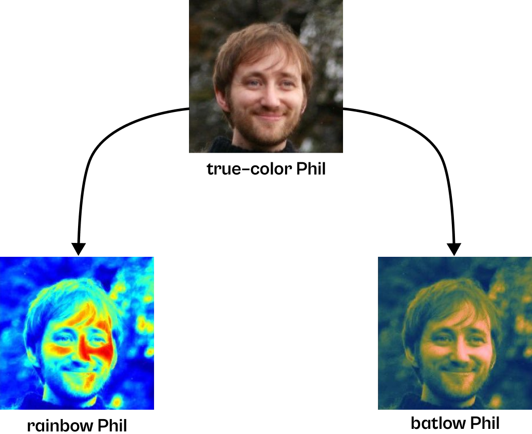
Modified example from Fabio Crameri
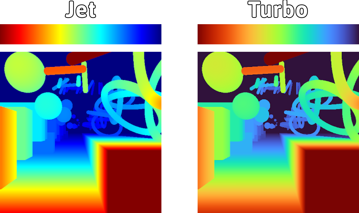
“Turbo, An Improved Rainbow Colormap for Visualization” by Anton Mikhailov (Google Research)
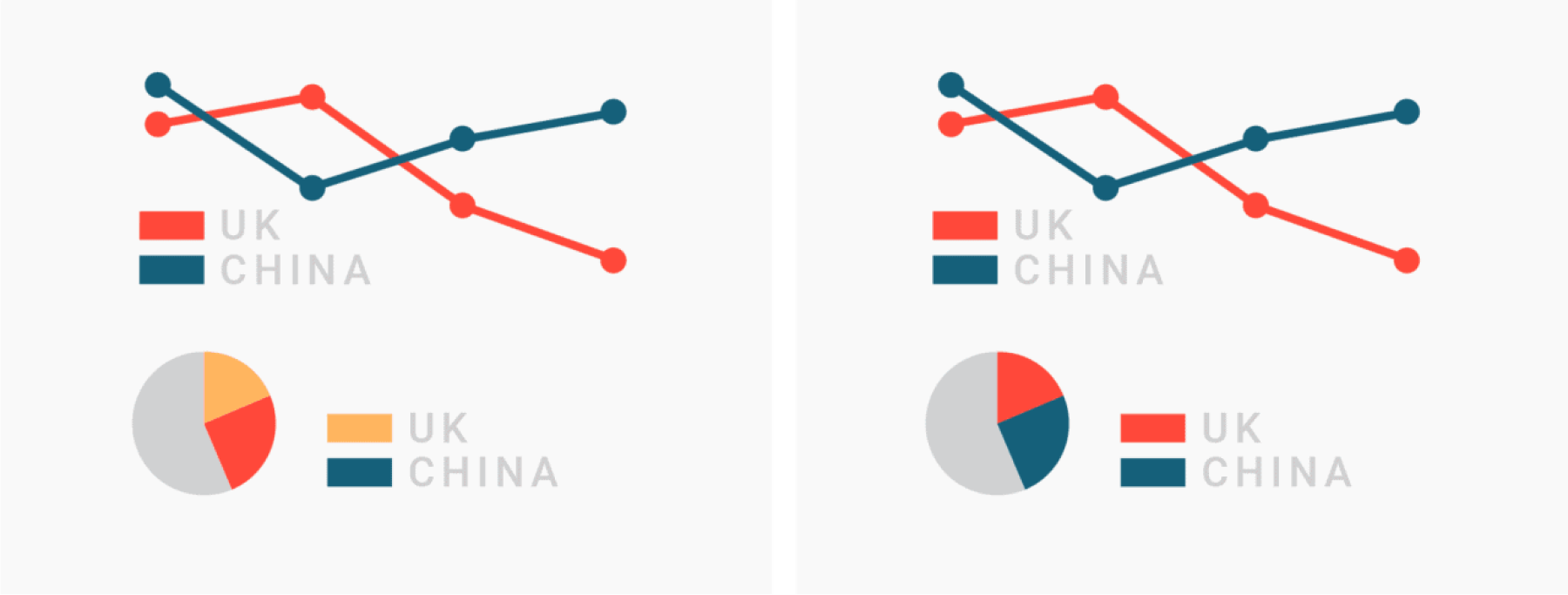
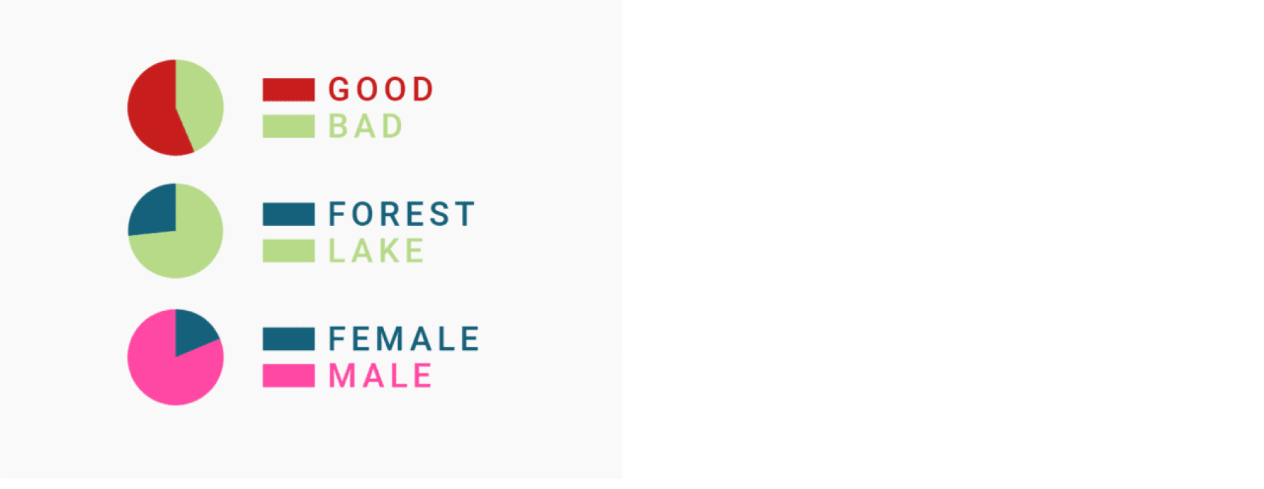
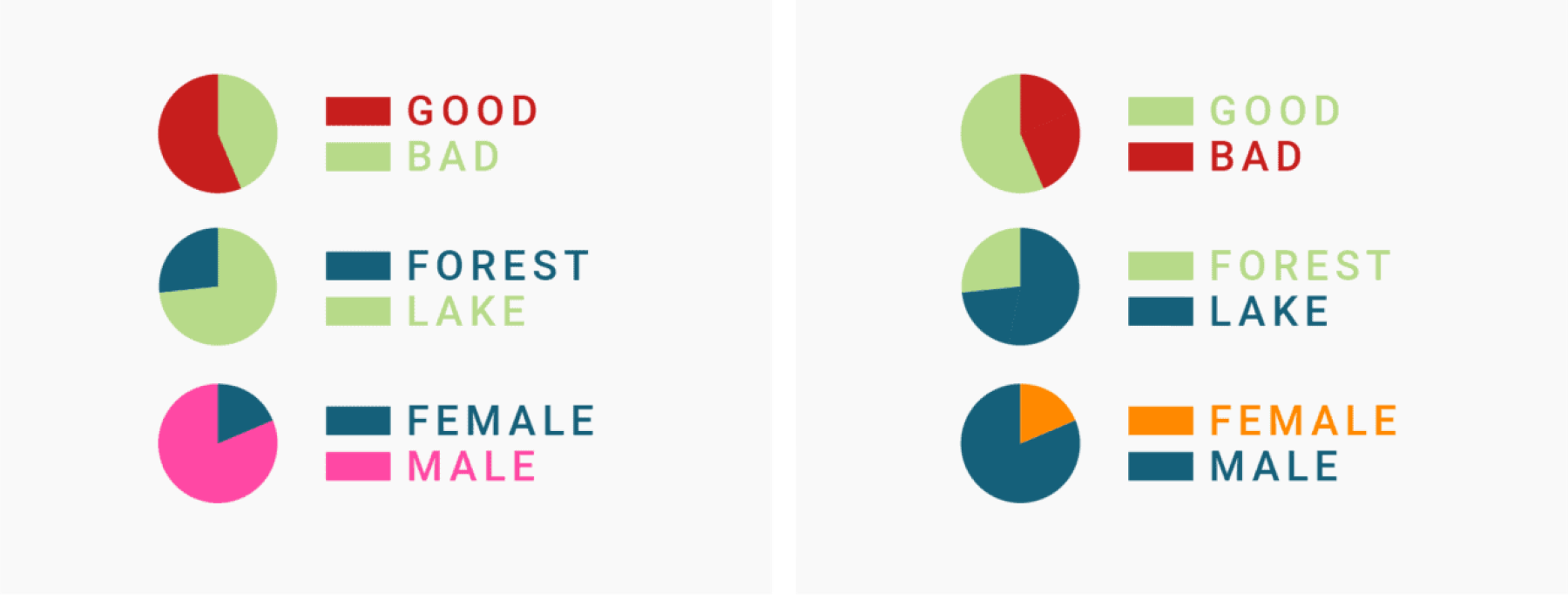
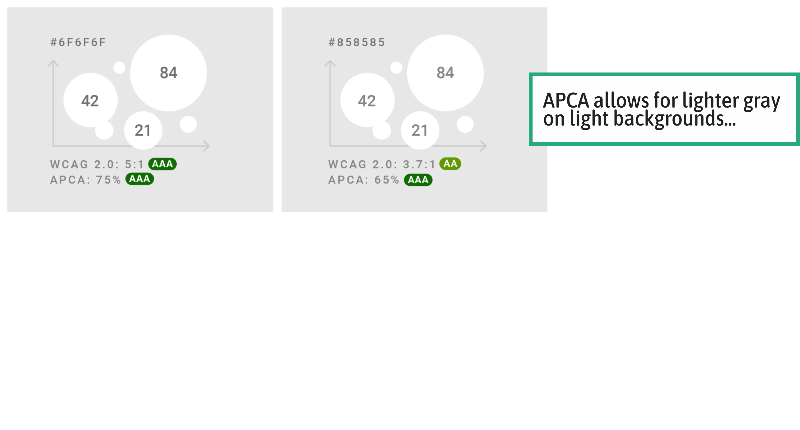
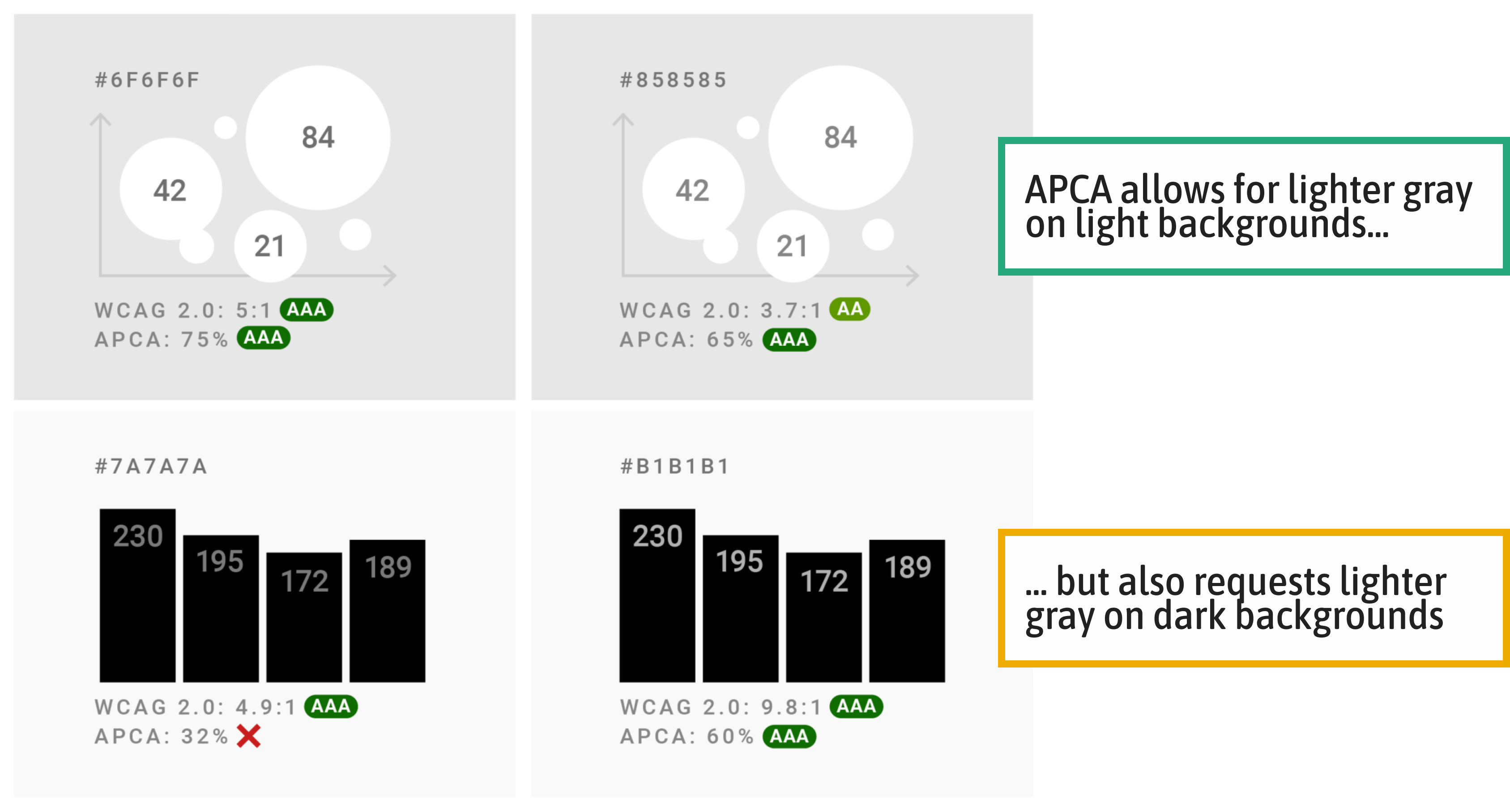
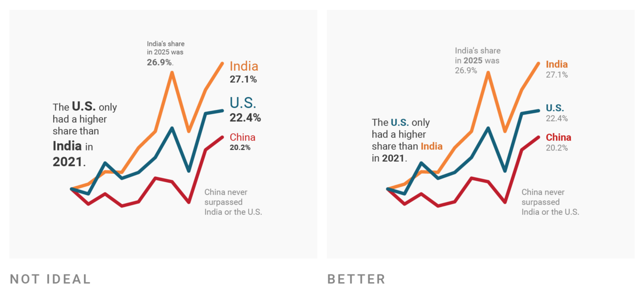
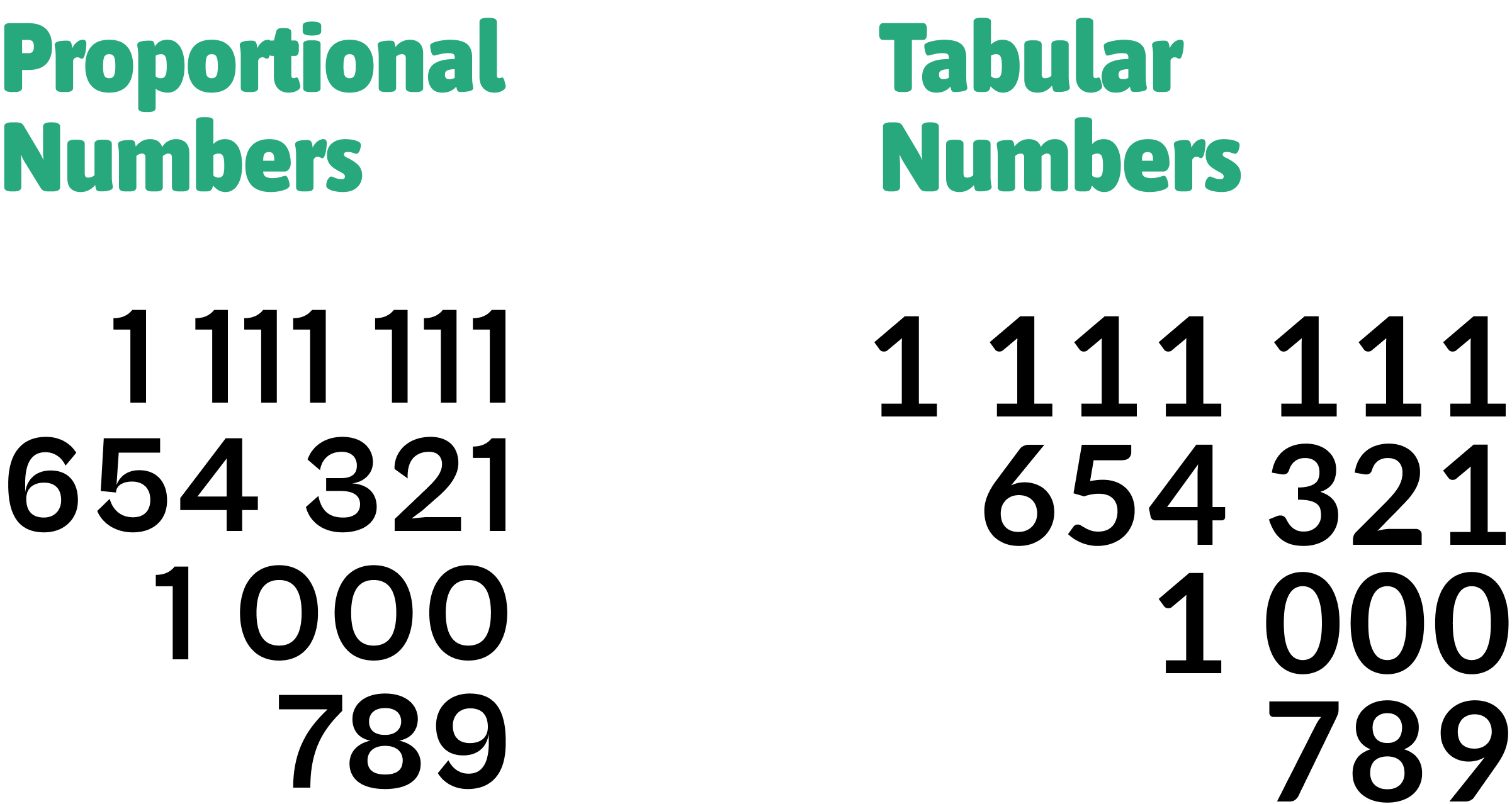
Source: Lisa Charlotte Muth, DataWrapper Blog
Source: Lisa Charlotte Muth, DataWrapper Blog
Source: Lisa Charlotte Muth, DataWrapper Blog
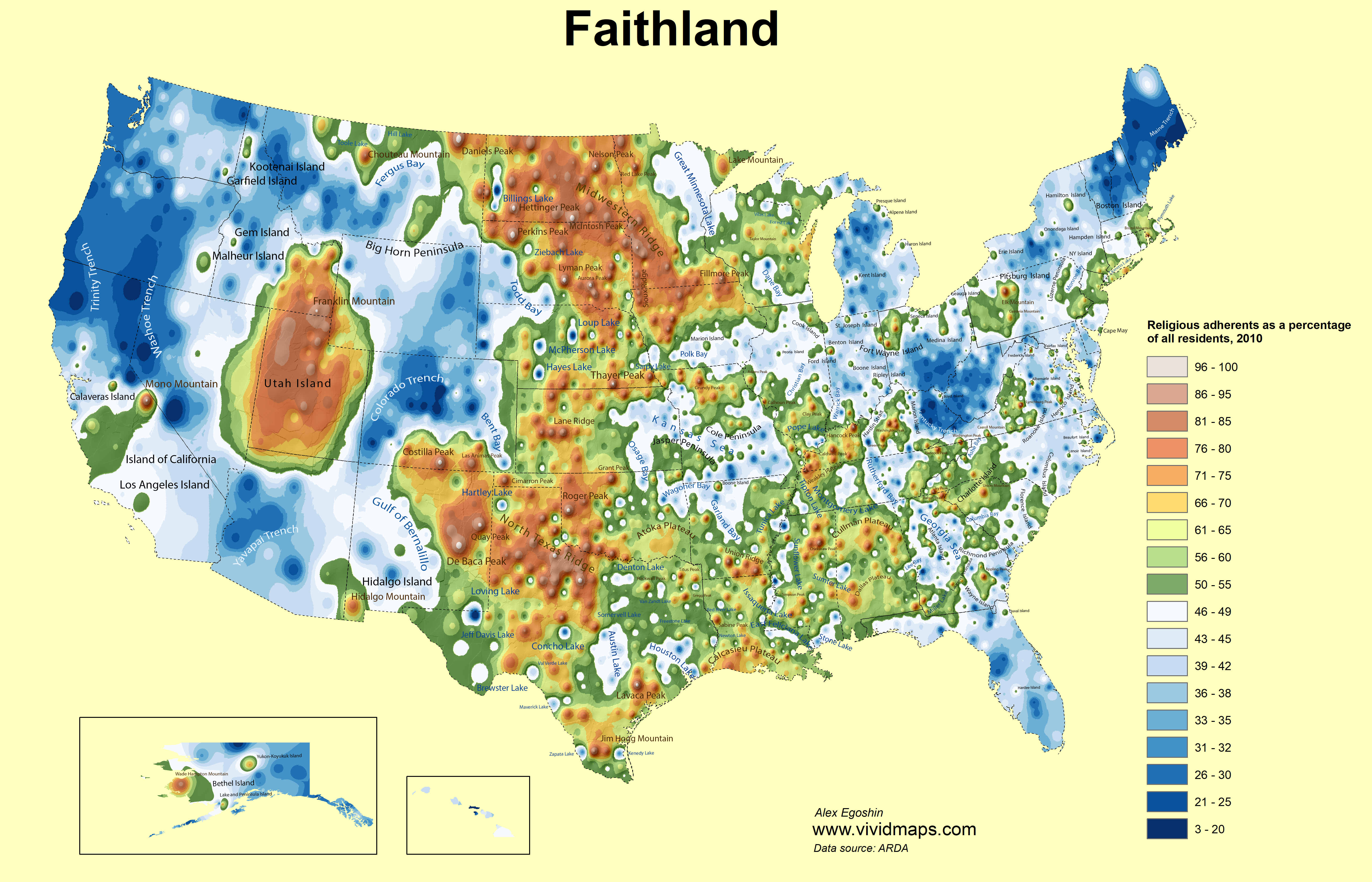
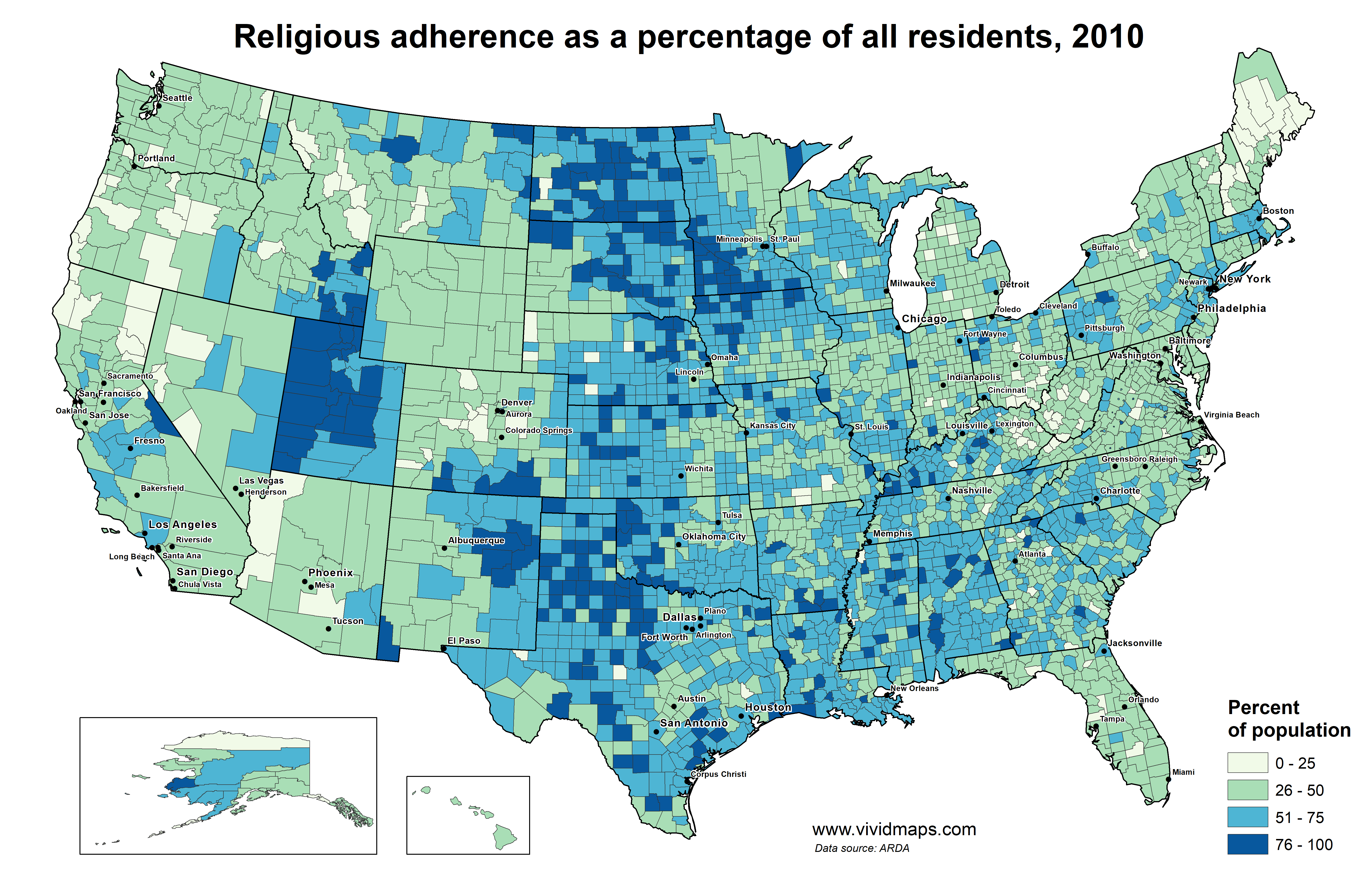
Source: Vivid Maps
Source: Vivid Maps
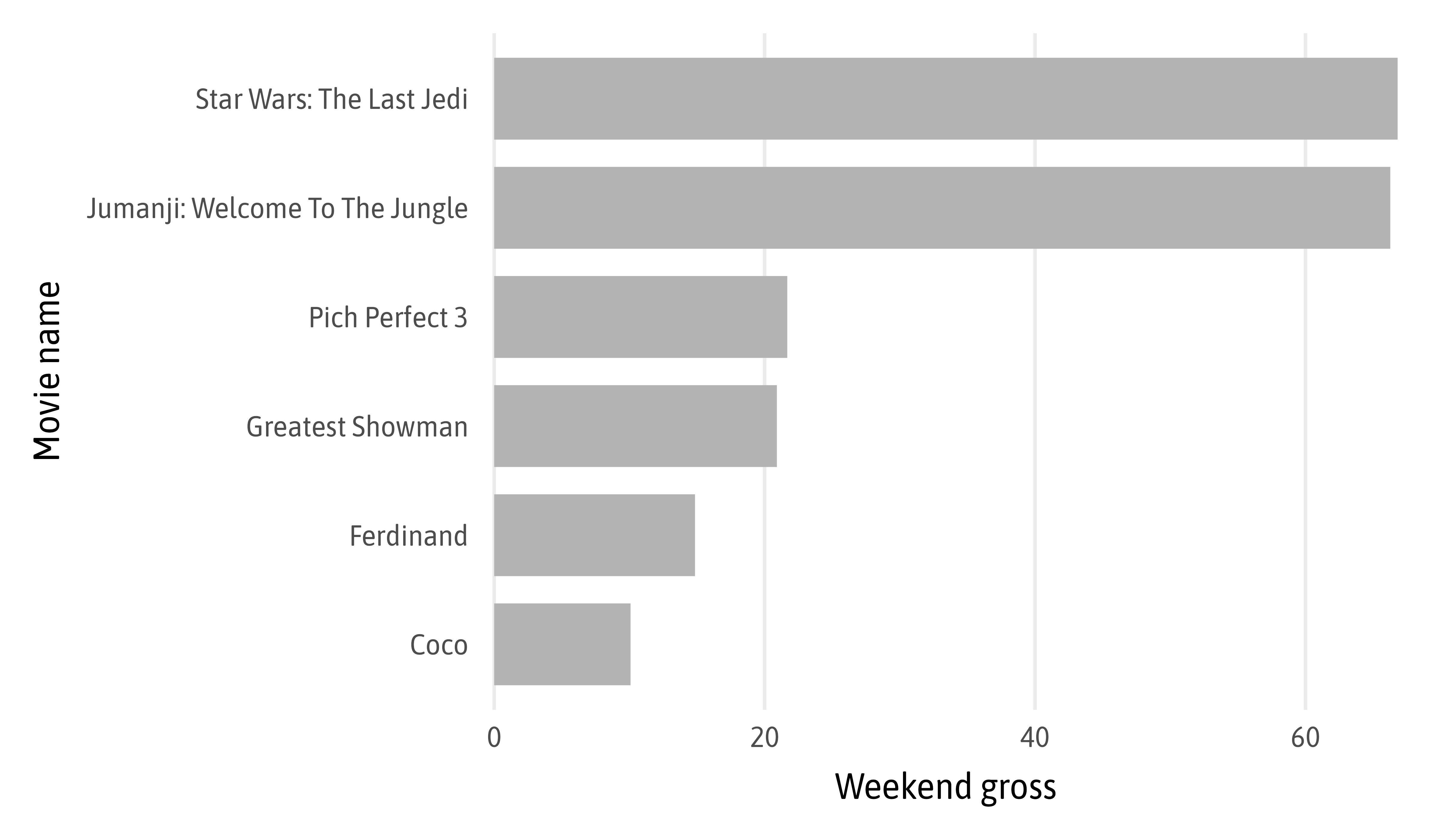
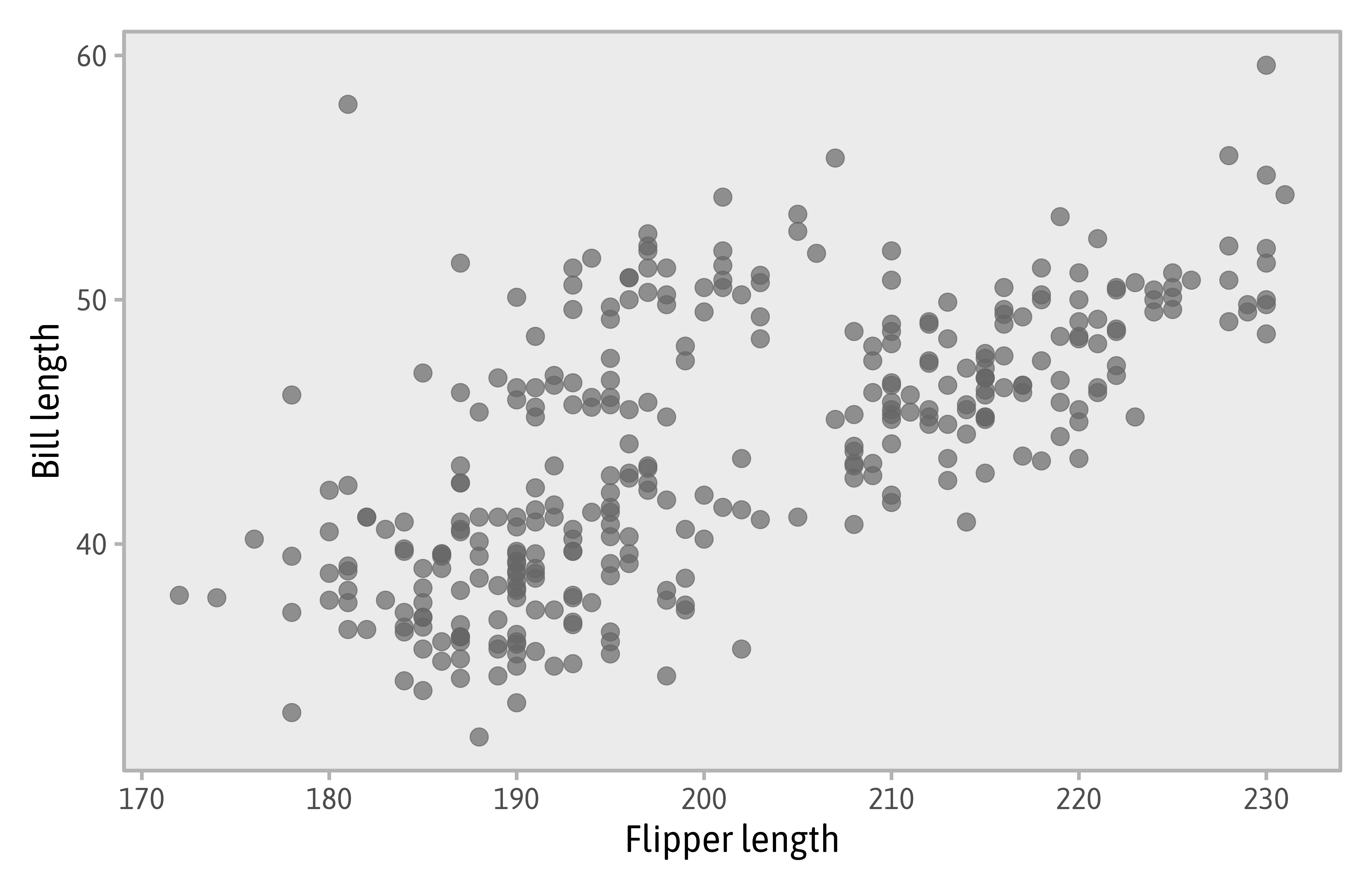
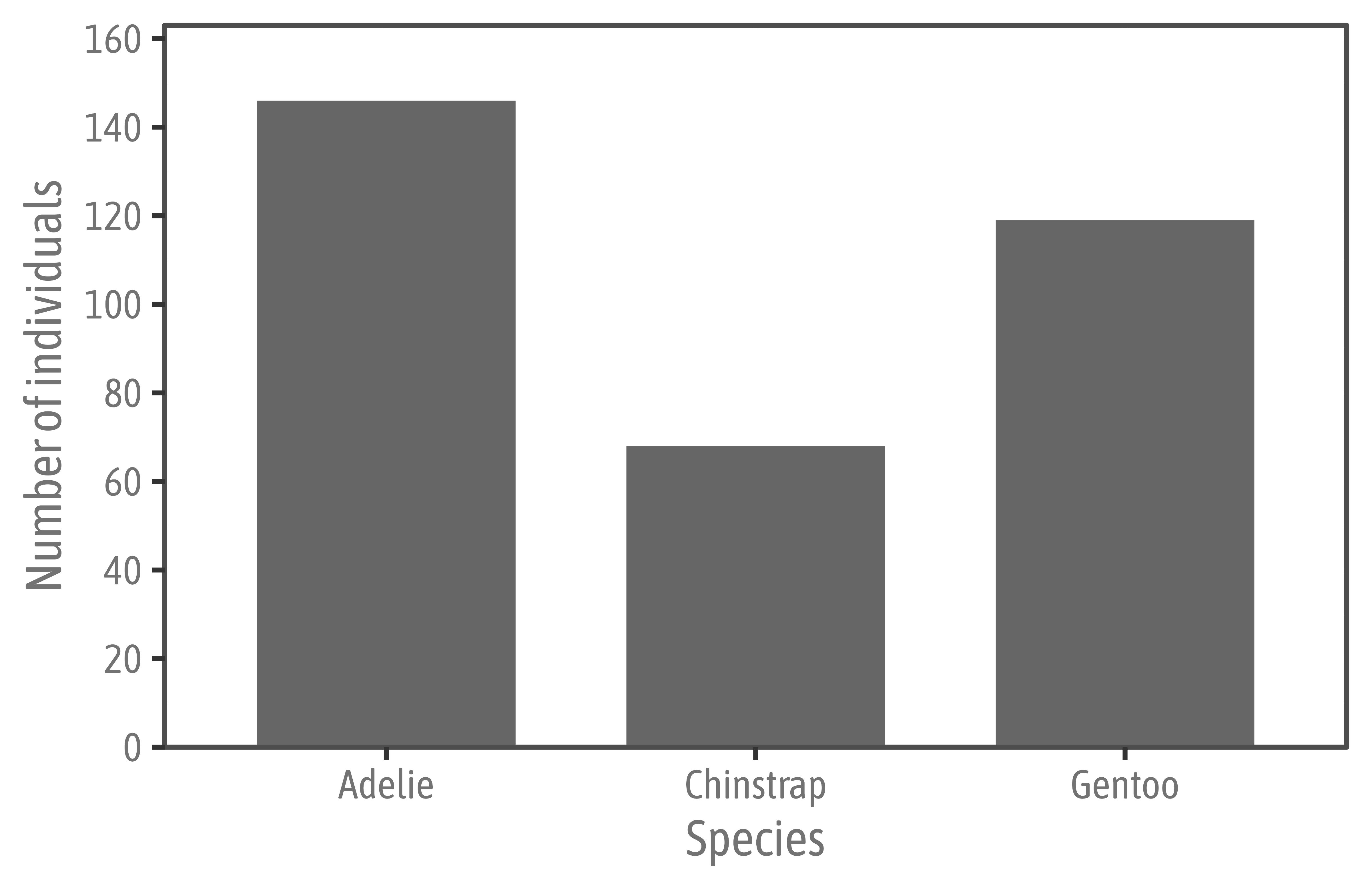
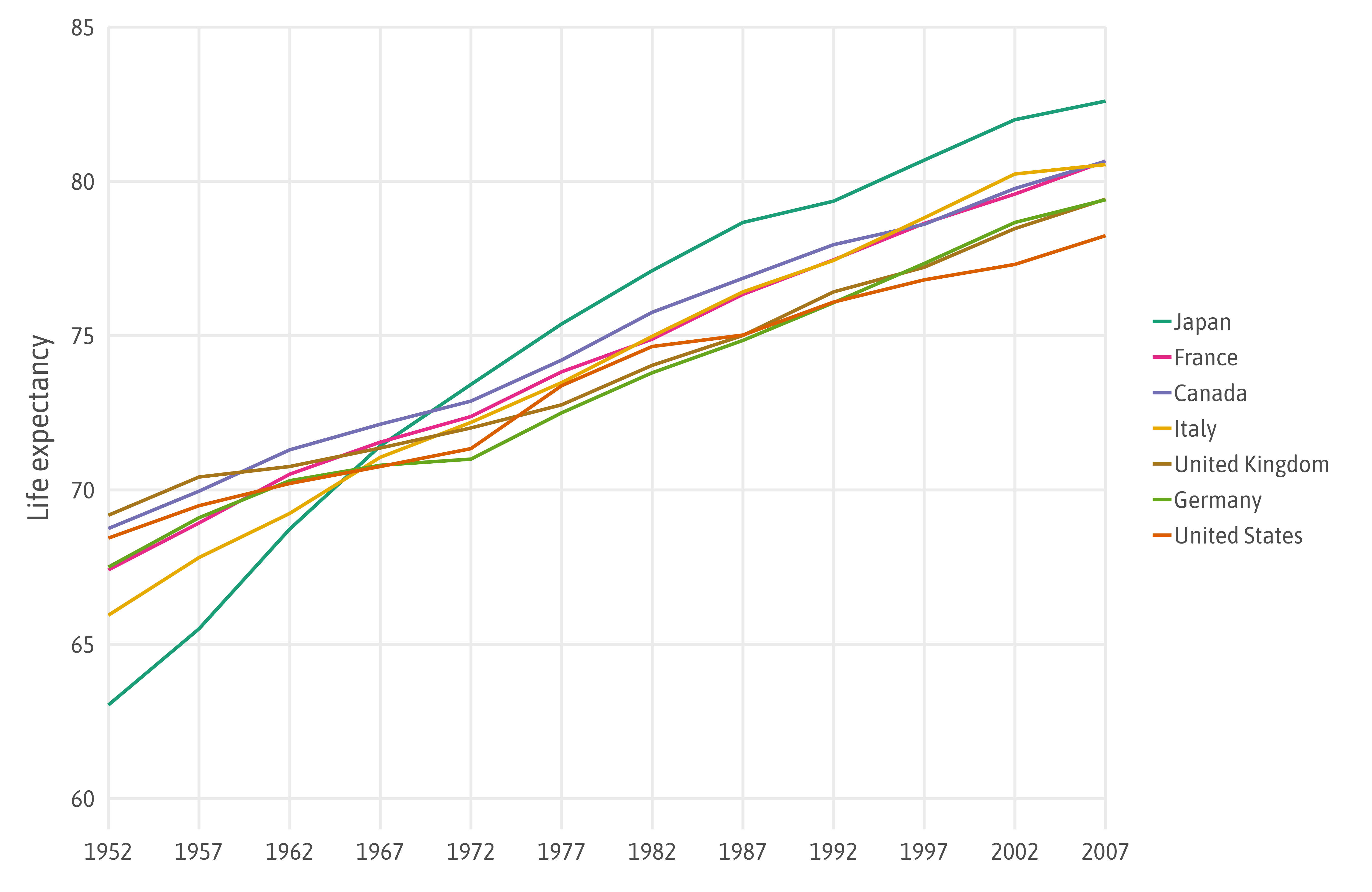
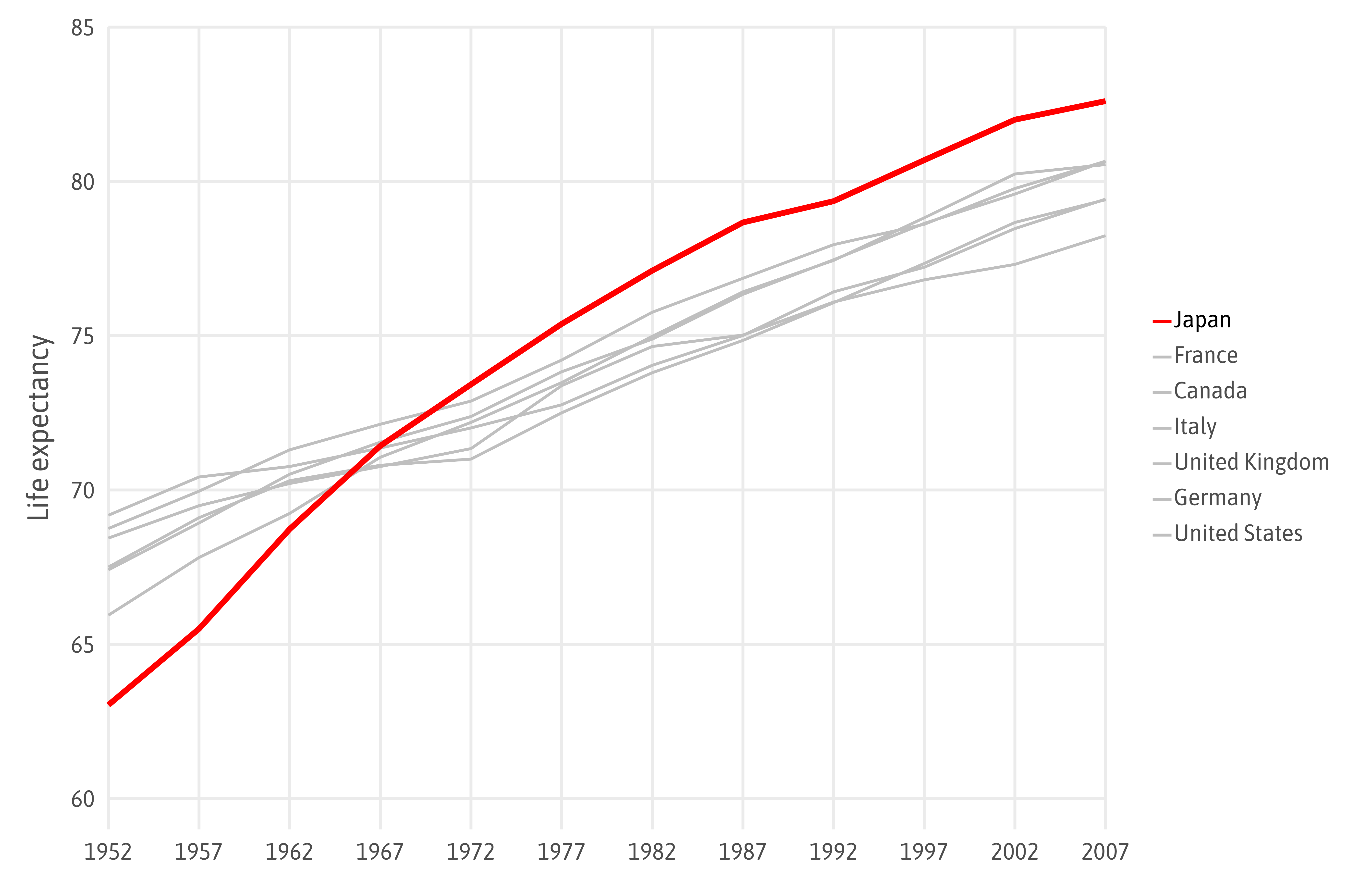
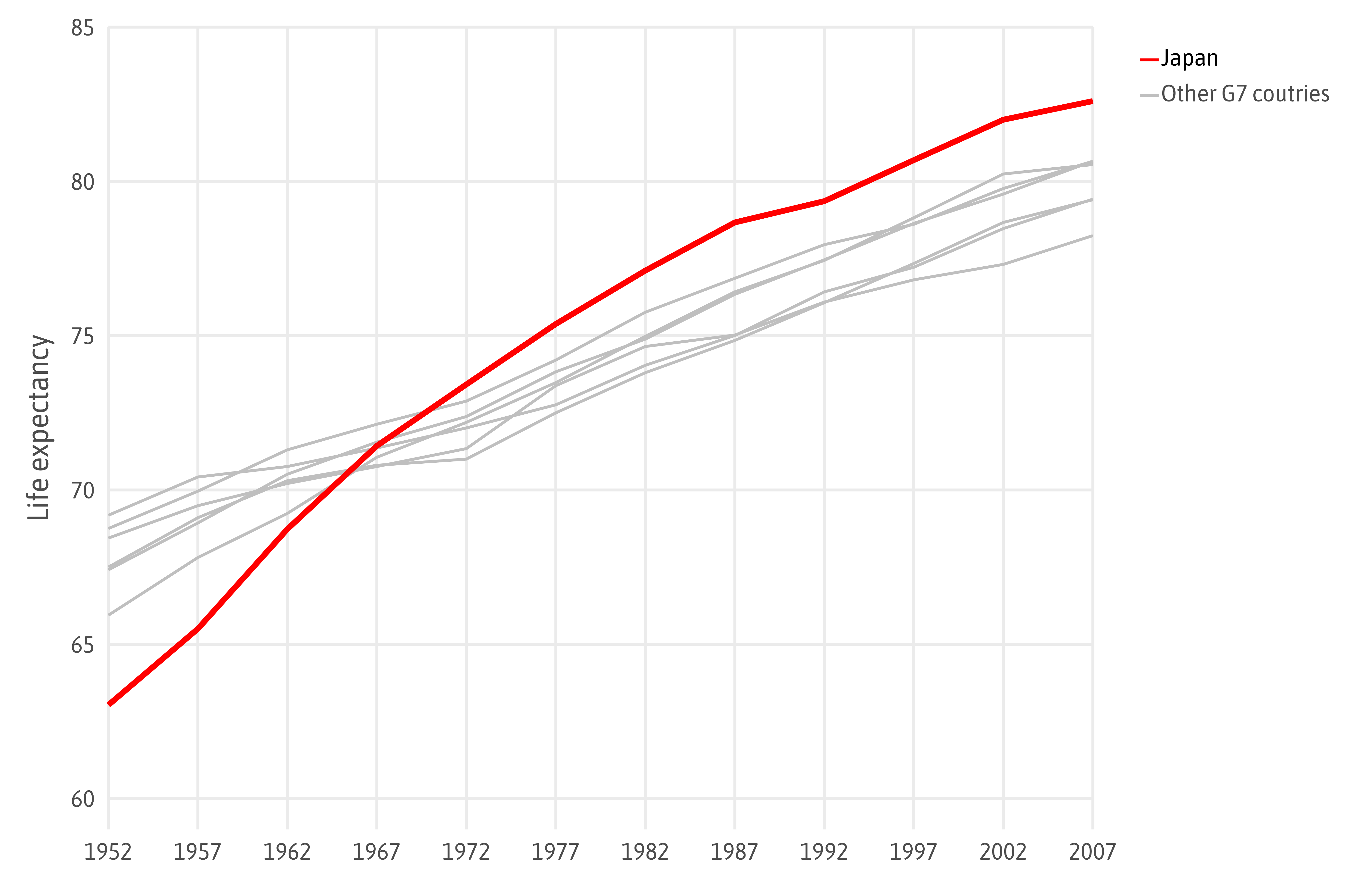
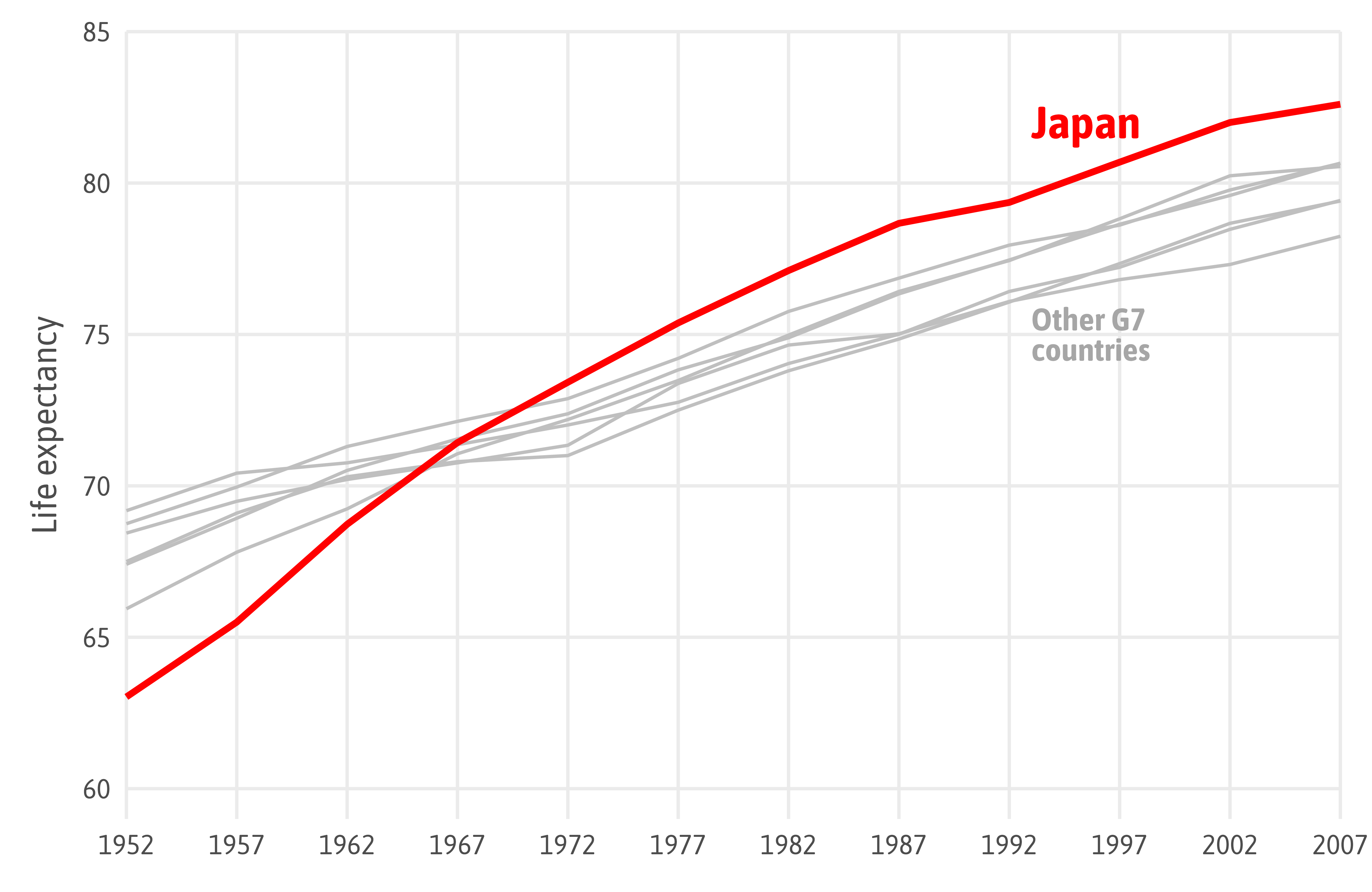
Source: “Fundamentals of Data Visualization” by Claus O. Wilke
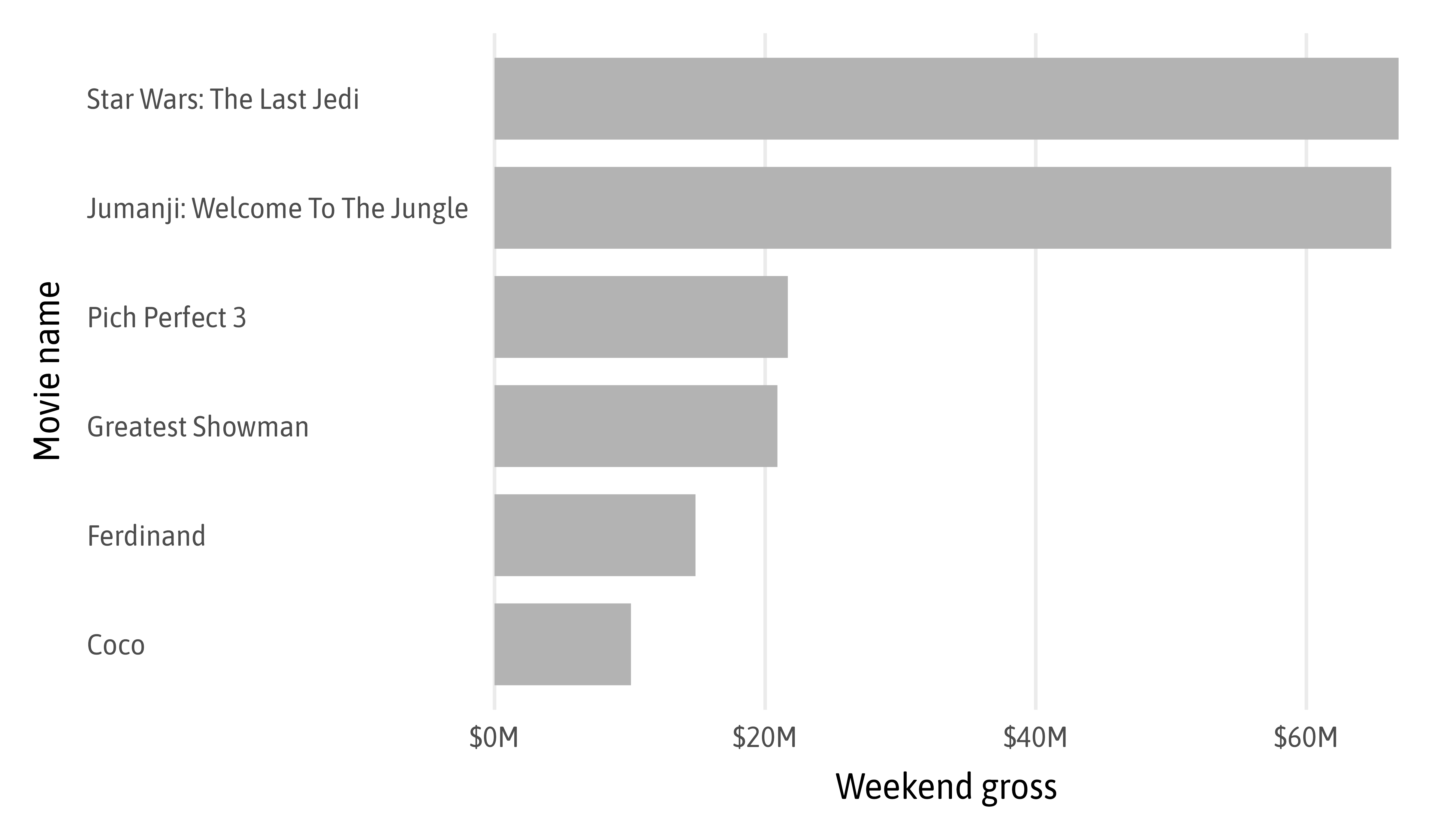
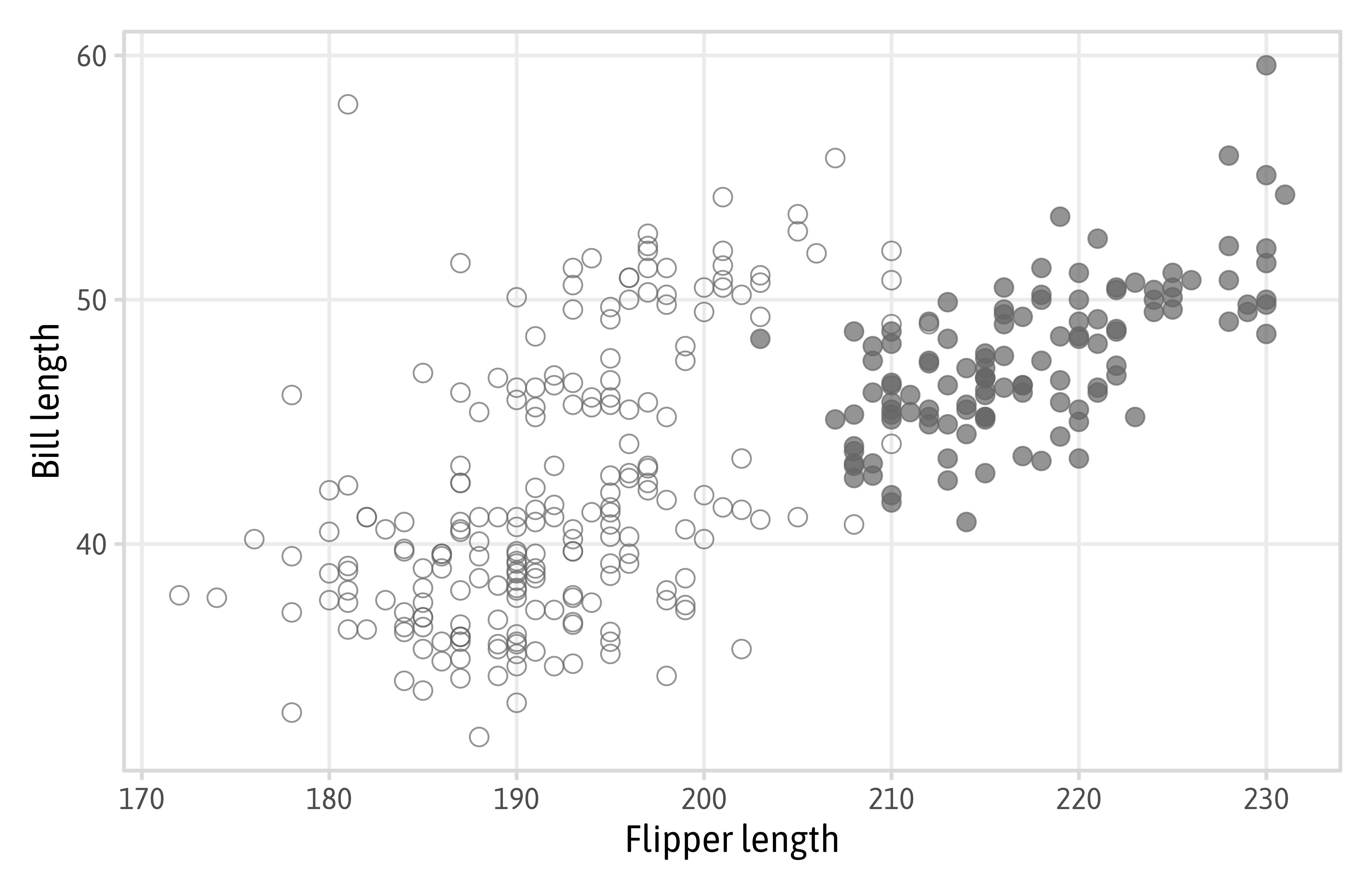
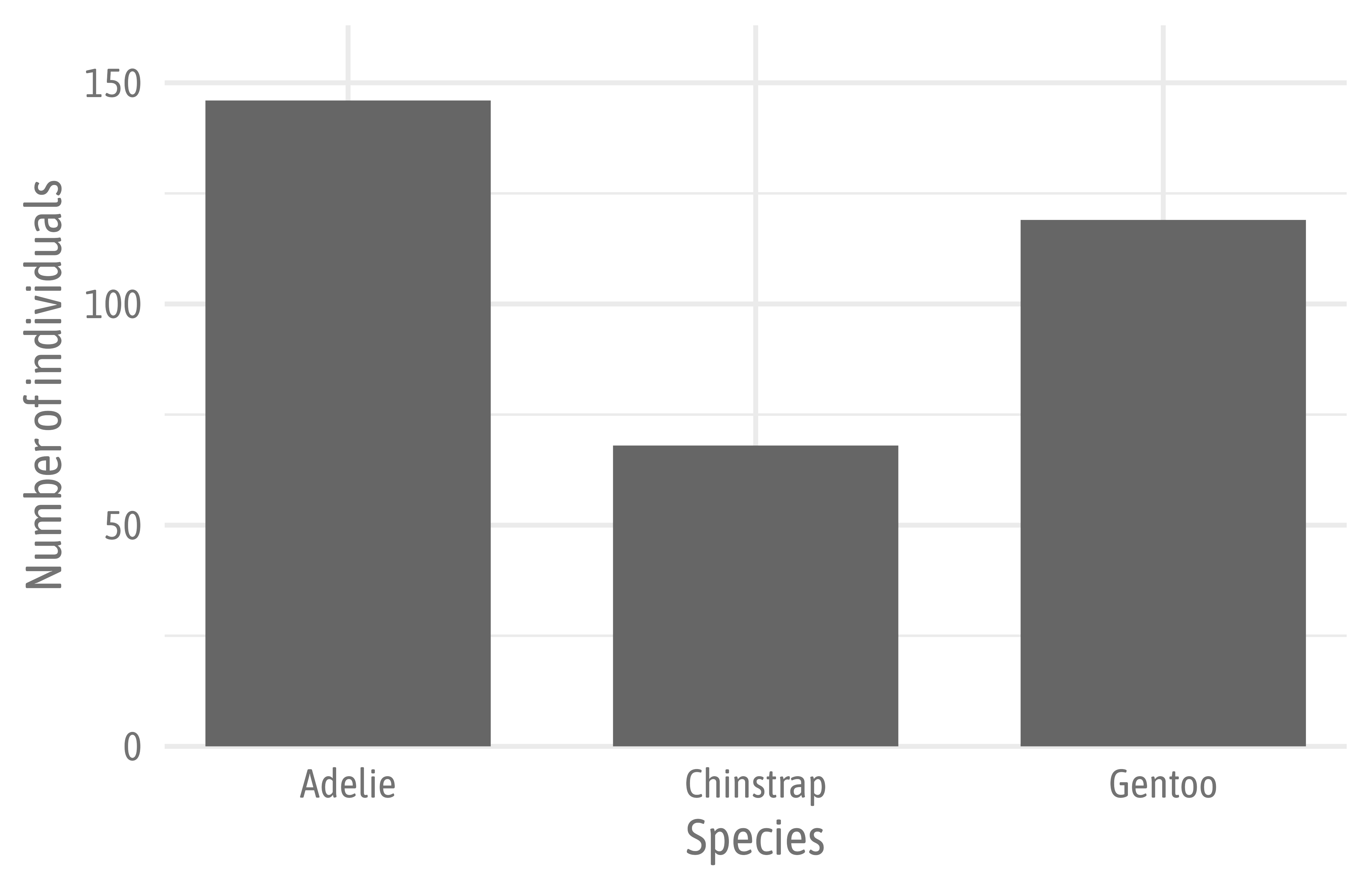
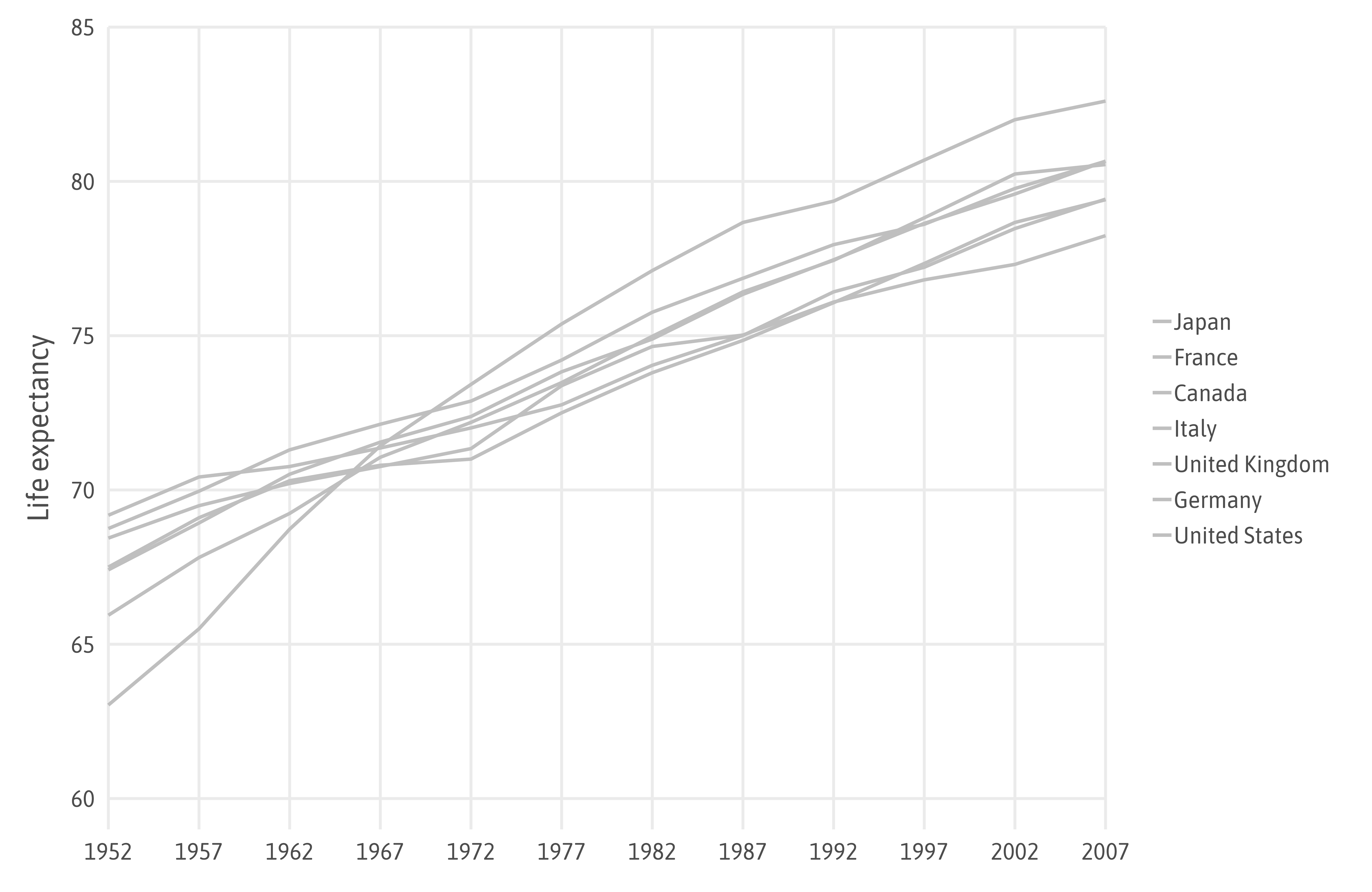
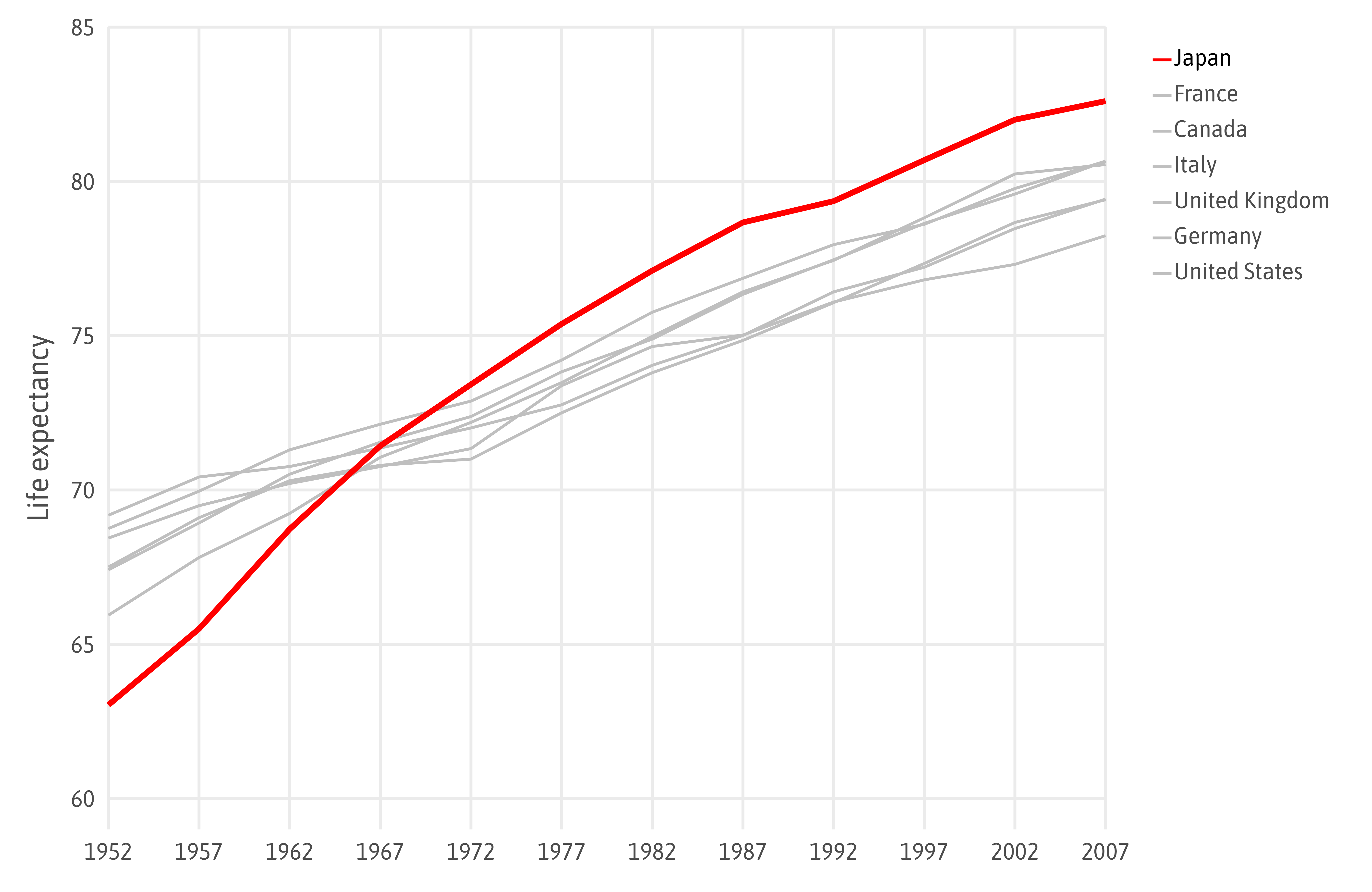
Source: “Fundamentals of Data Visualization” by Claus O. Wilke
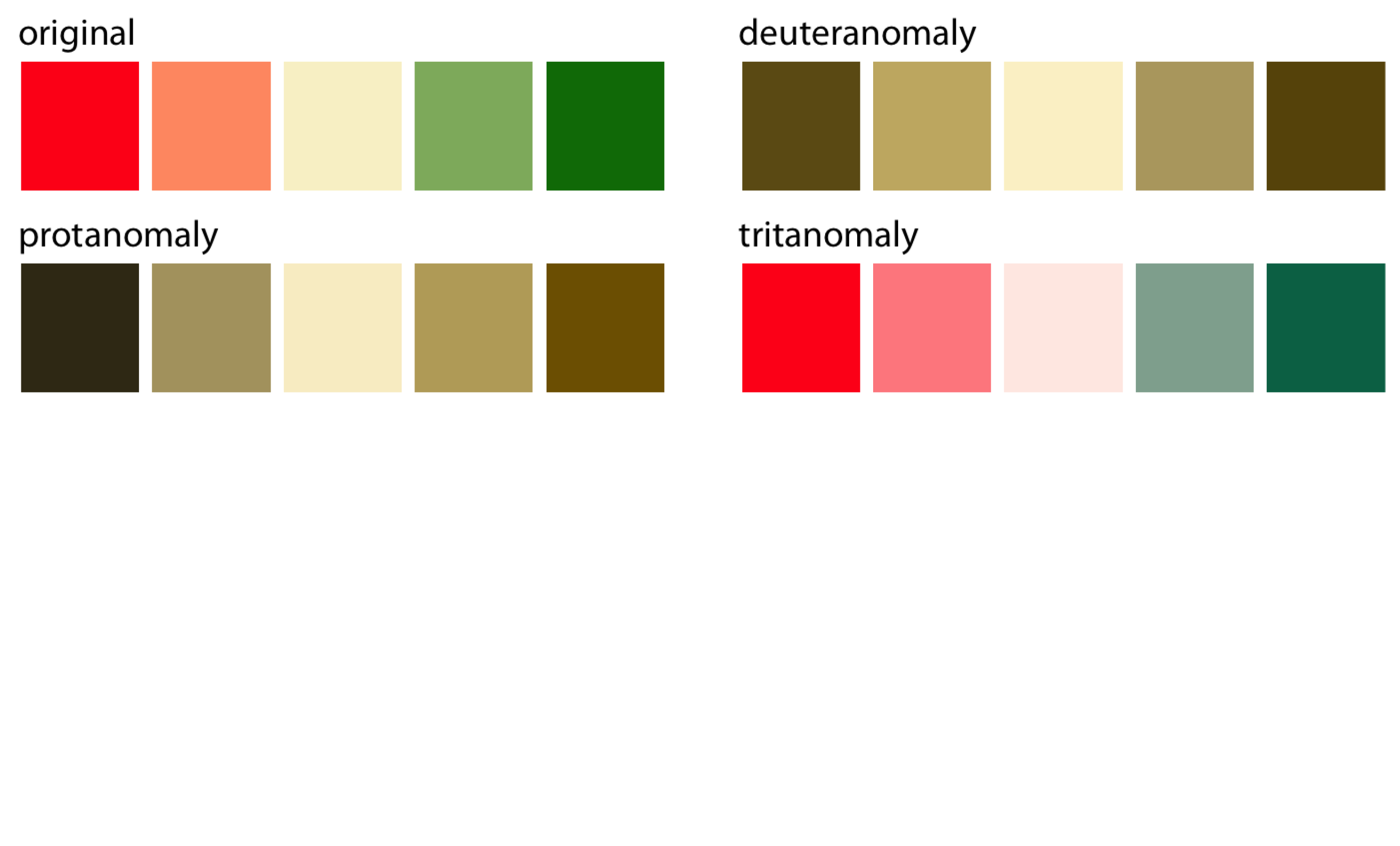
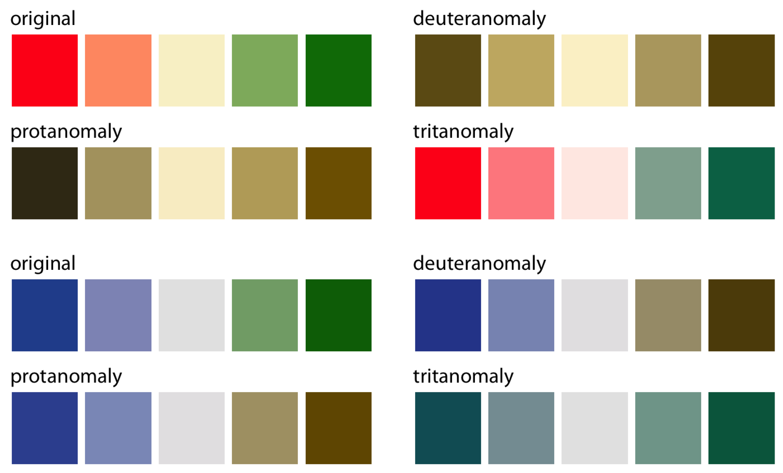
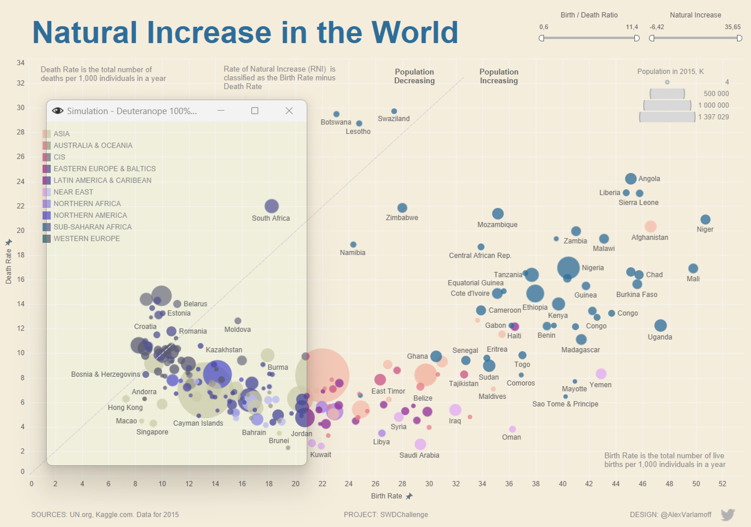
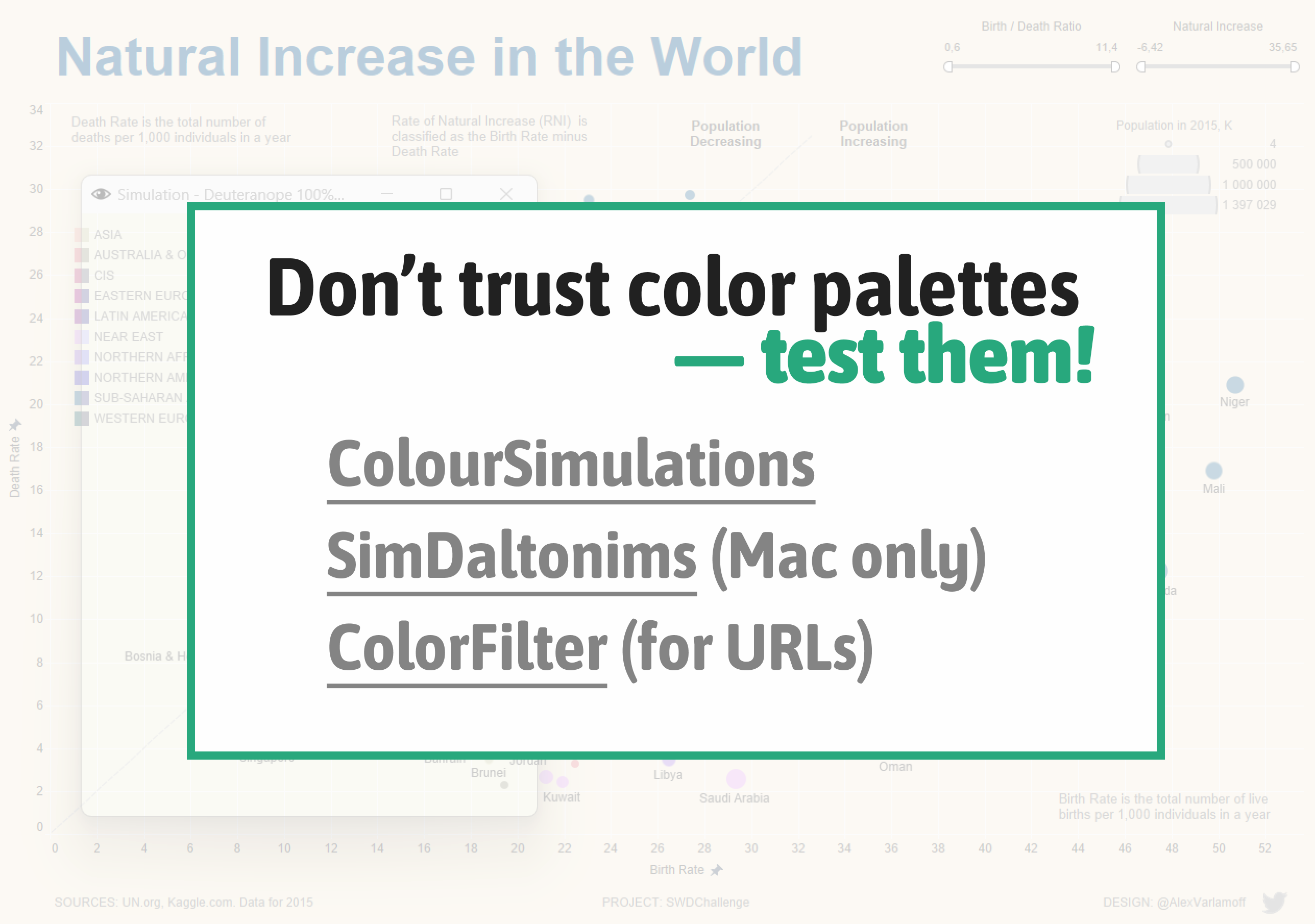
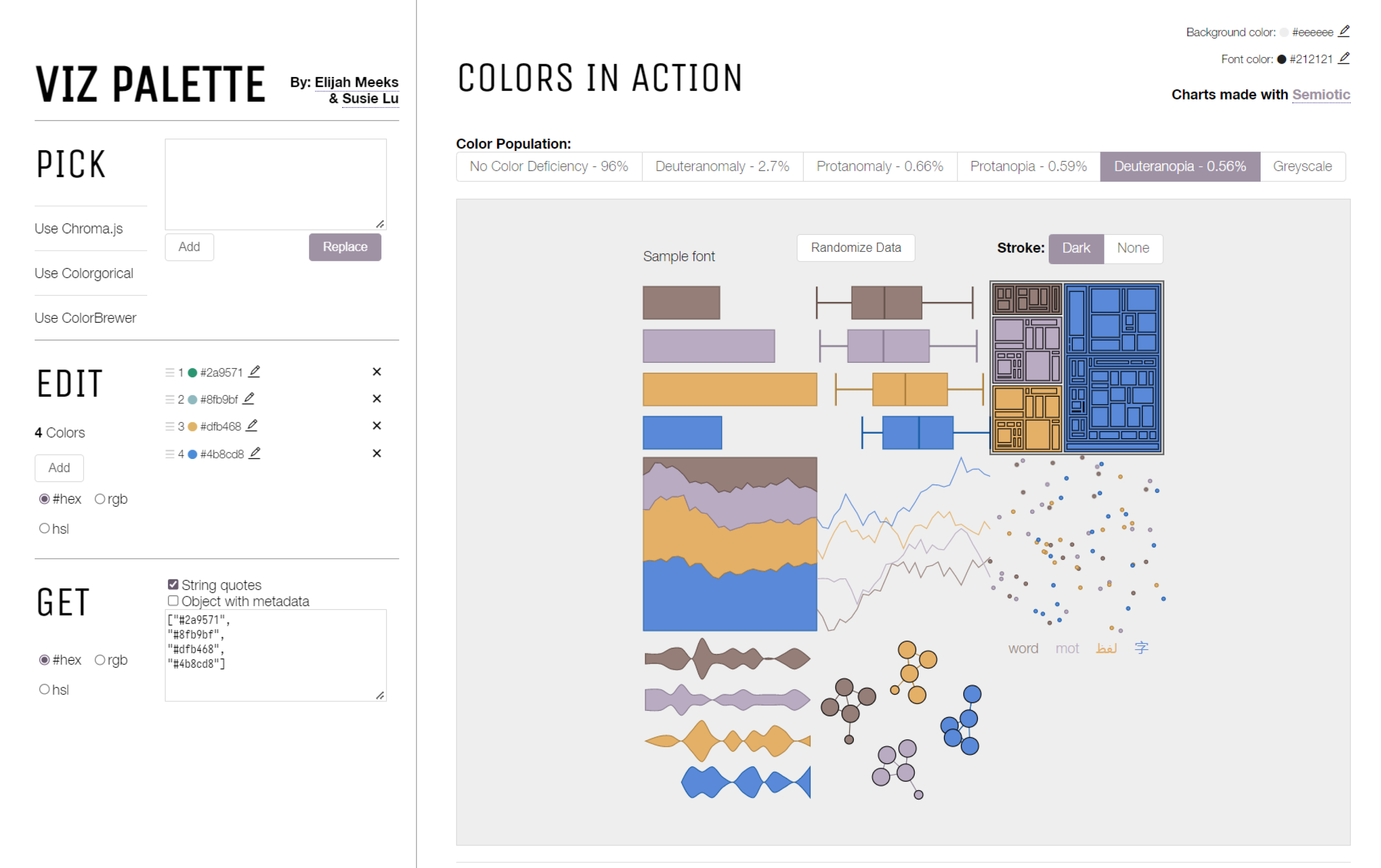
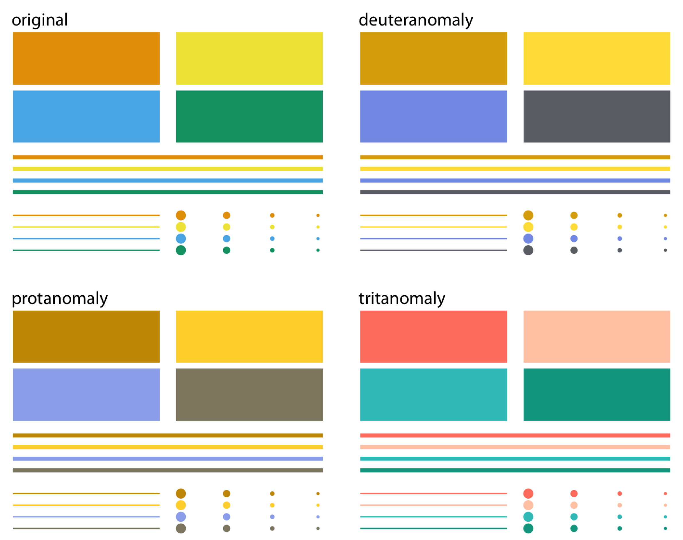
Contribution to the SWDchallenge by Alex Varlamoff — tested with a color-blindness simulator
Contribution to the SWDchallenge by Alex Varlamoff — tested with a color-blindness simulator
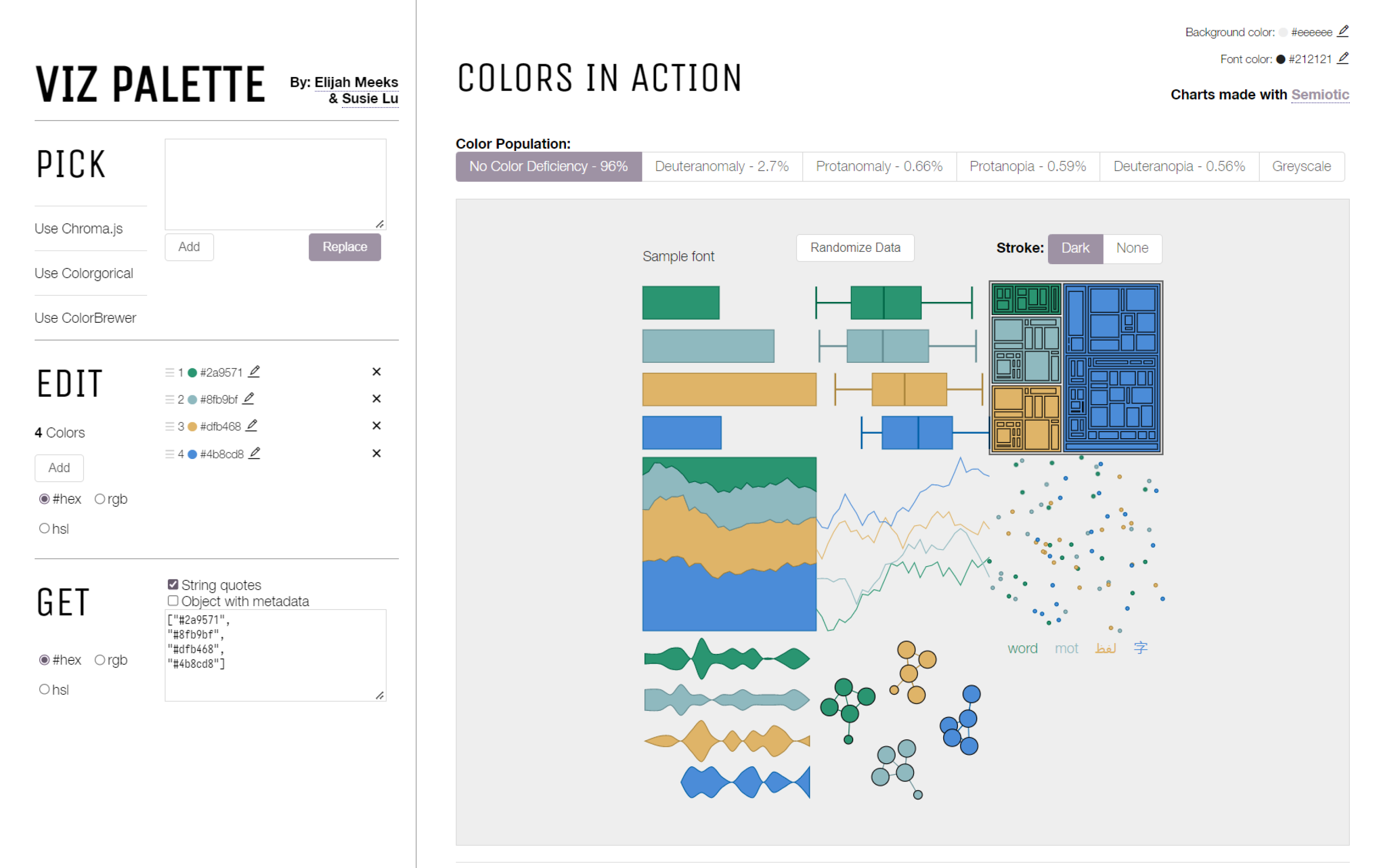
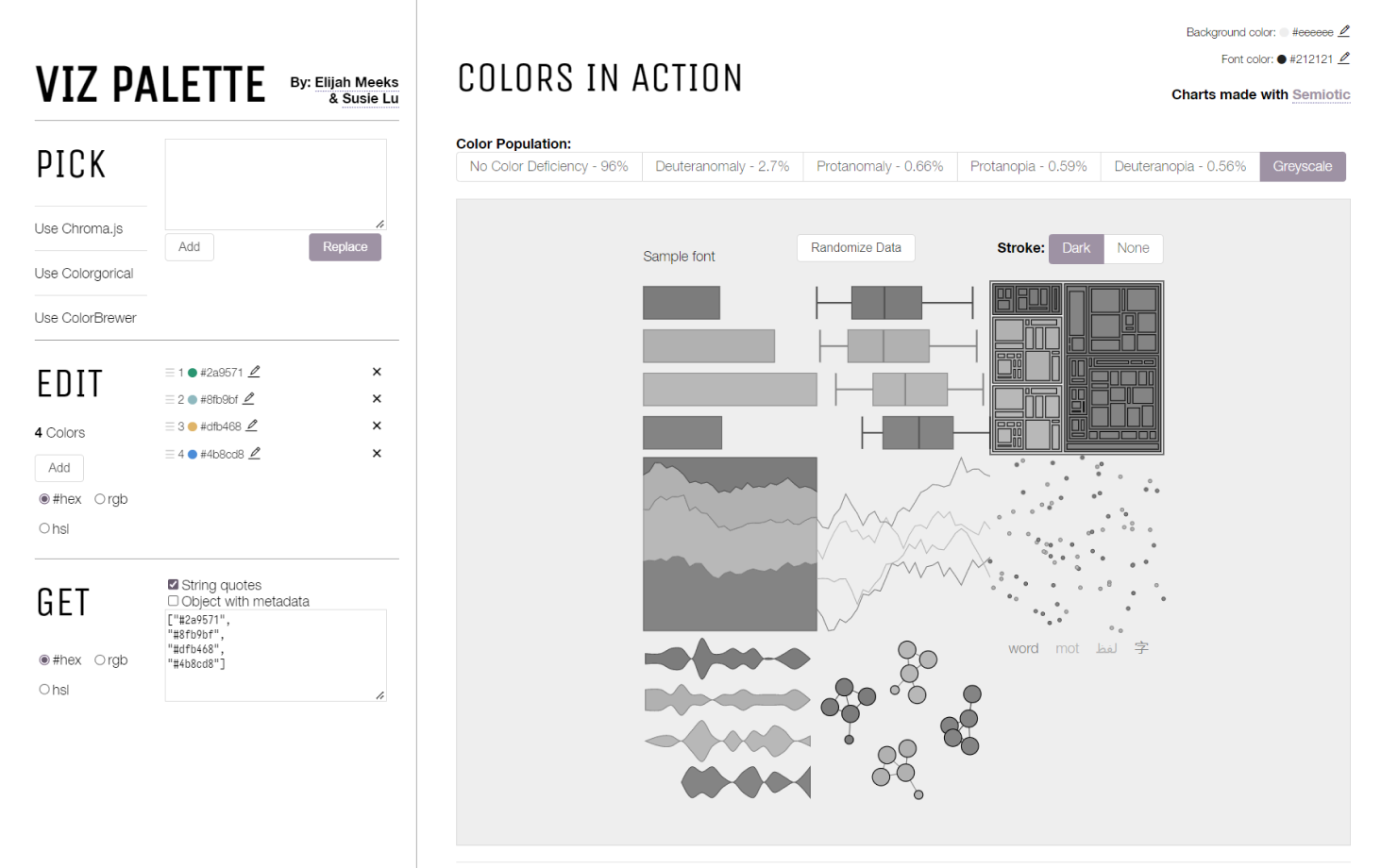
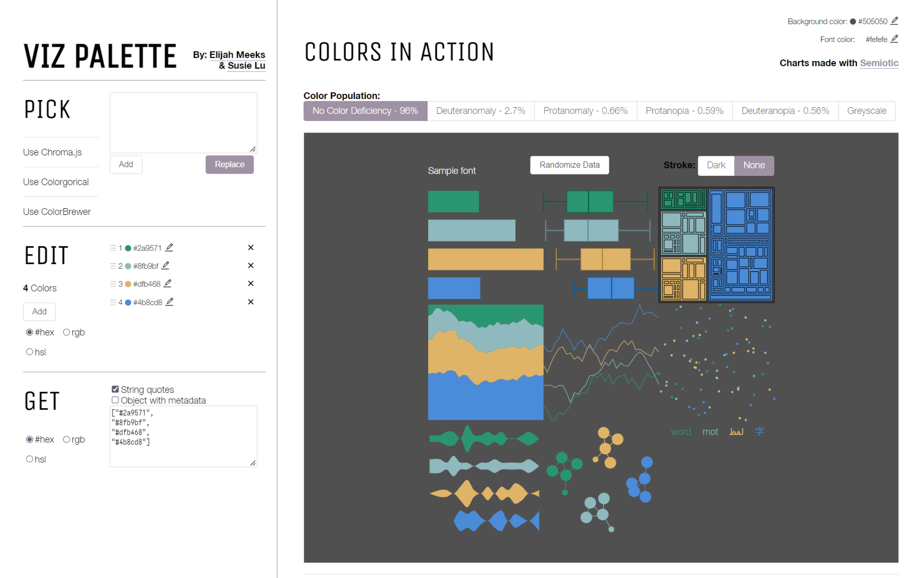
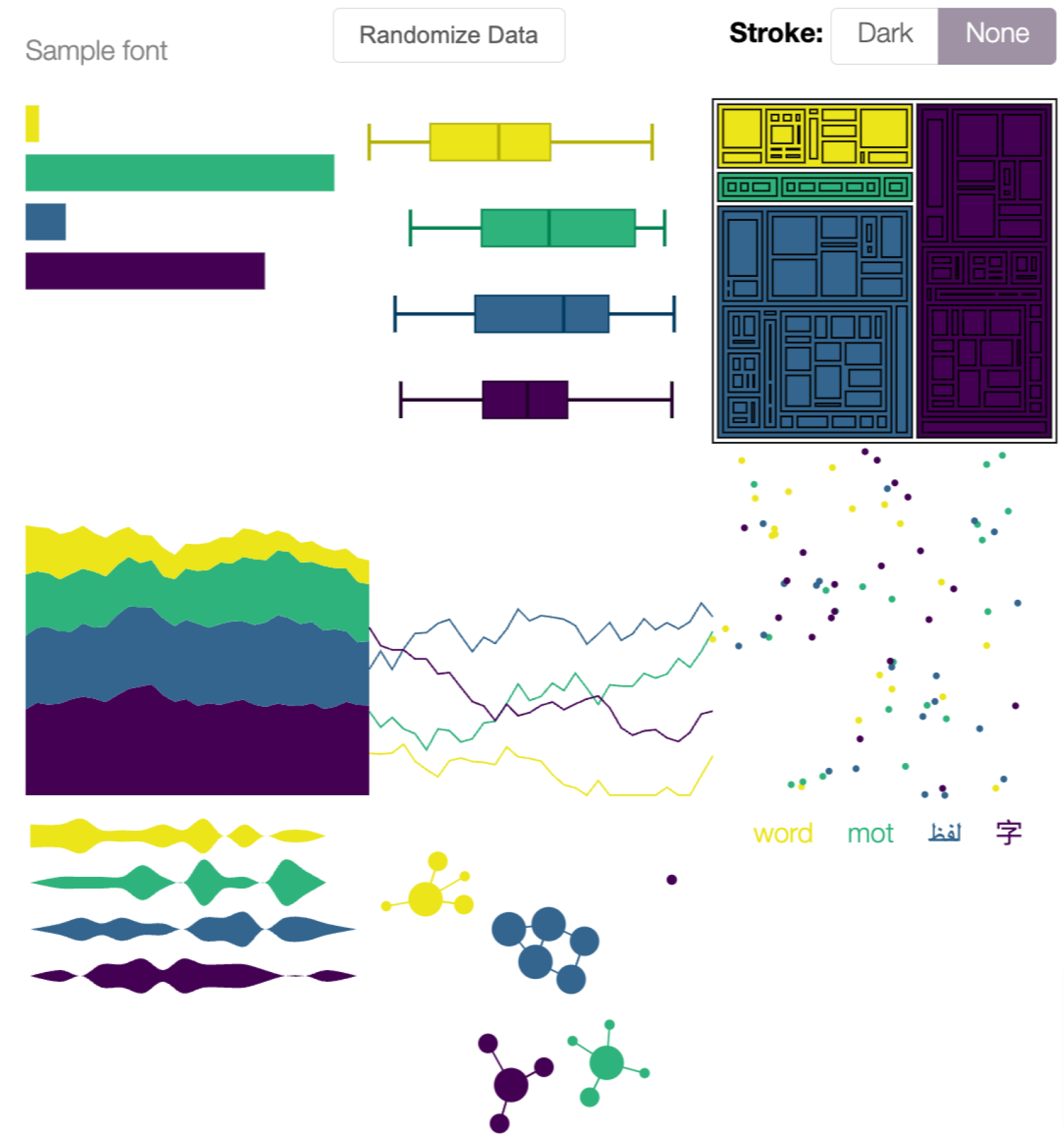
The VizPalette tool tests color palettes for legibility for different chart types, line weights, backgrounds, and font colors.
The VizPalette tool tests color palettes for legibility for different chart types, line weights, backgrounds, and font colors.
The VizPalette tool tests color palettes for legibility for different chart types, line weights, backgrounds, and font colors.
The VizPalette tool tests color palettes for legibility for different chart types, line weights, backgrounds, and font colors.
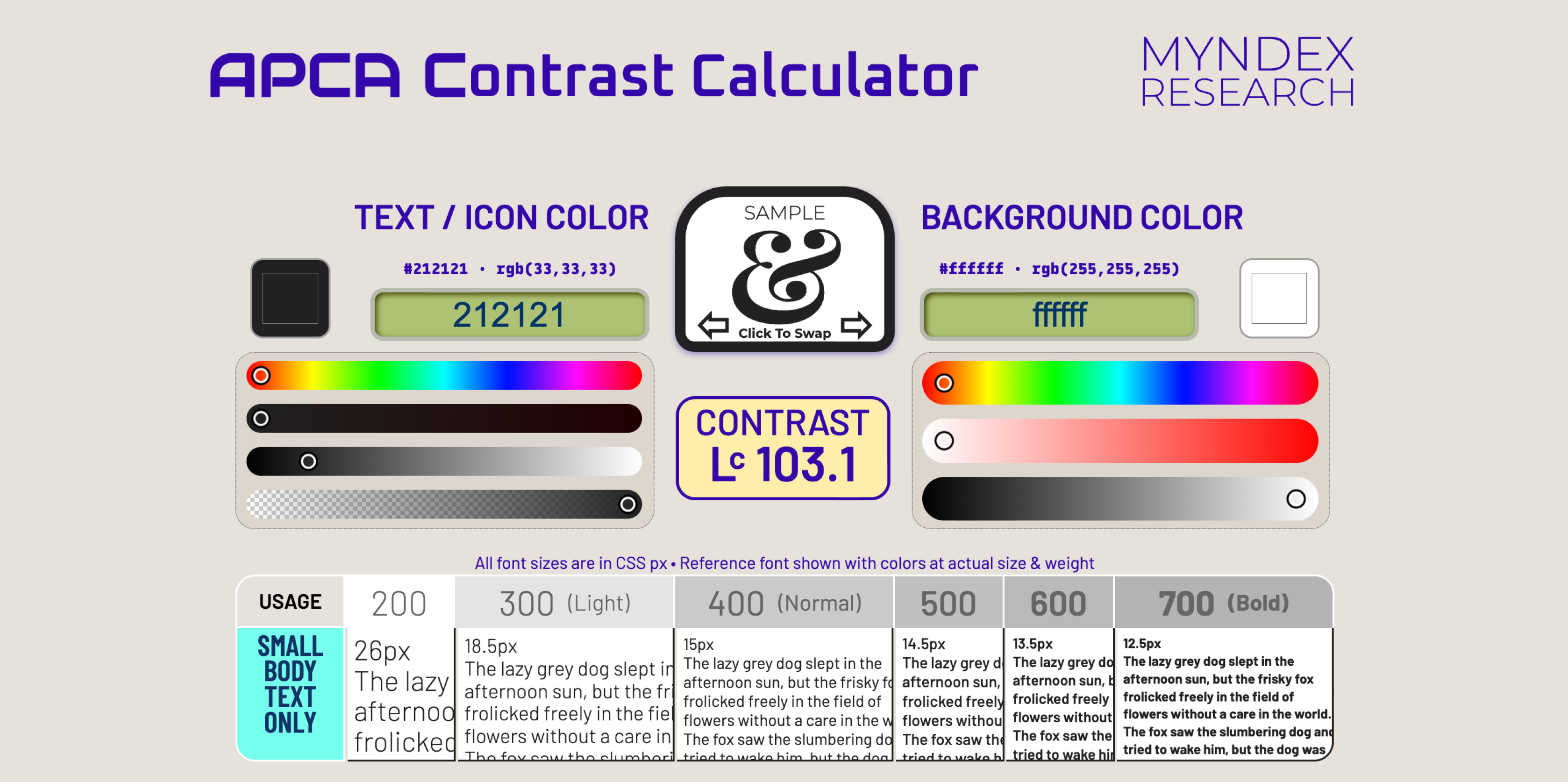
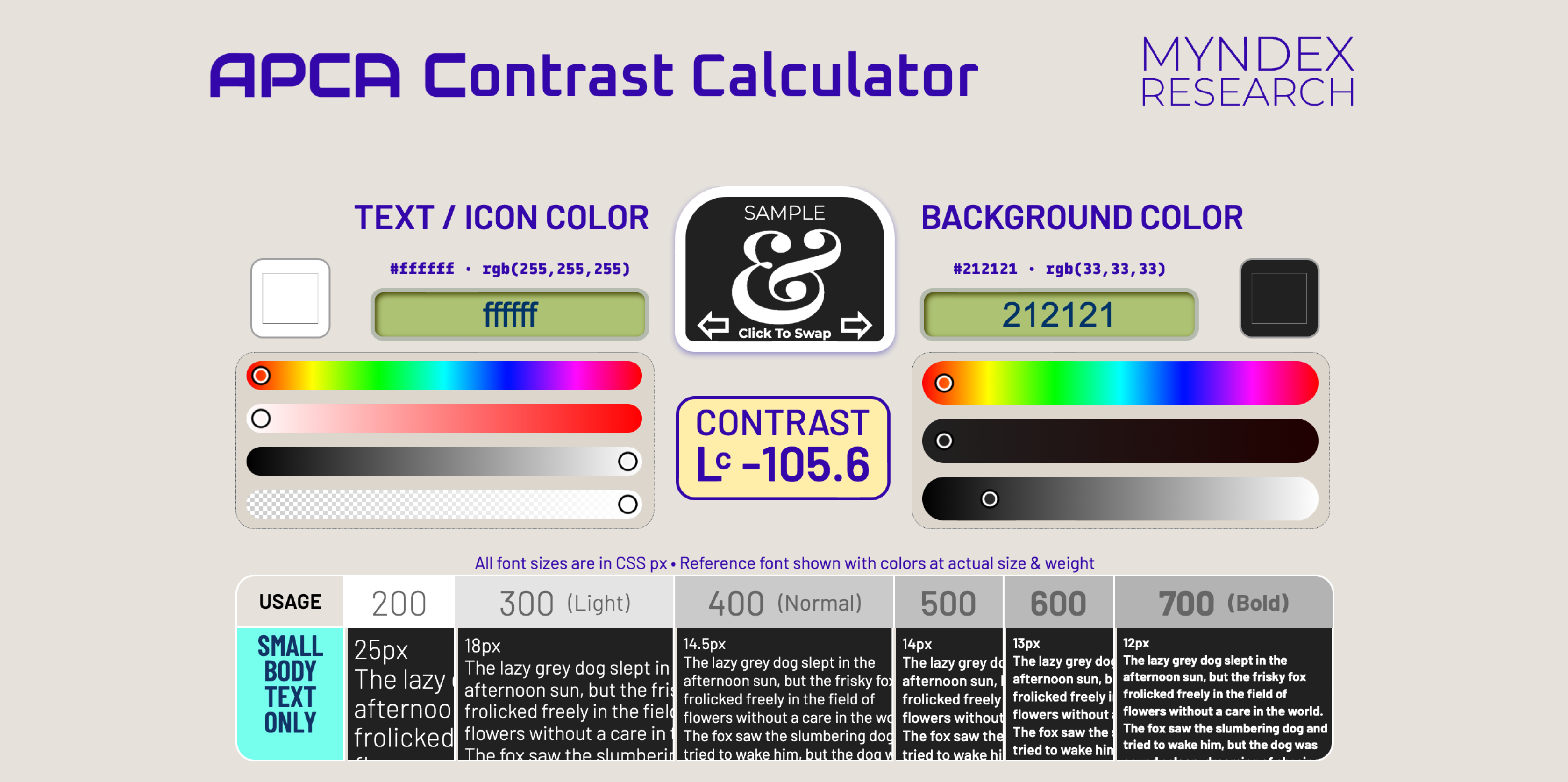
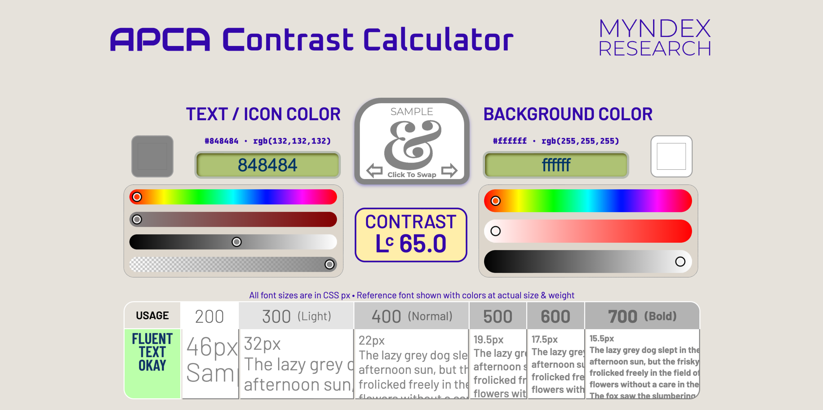
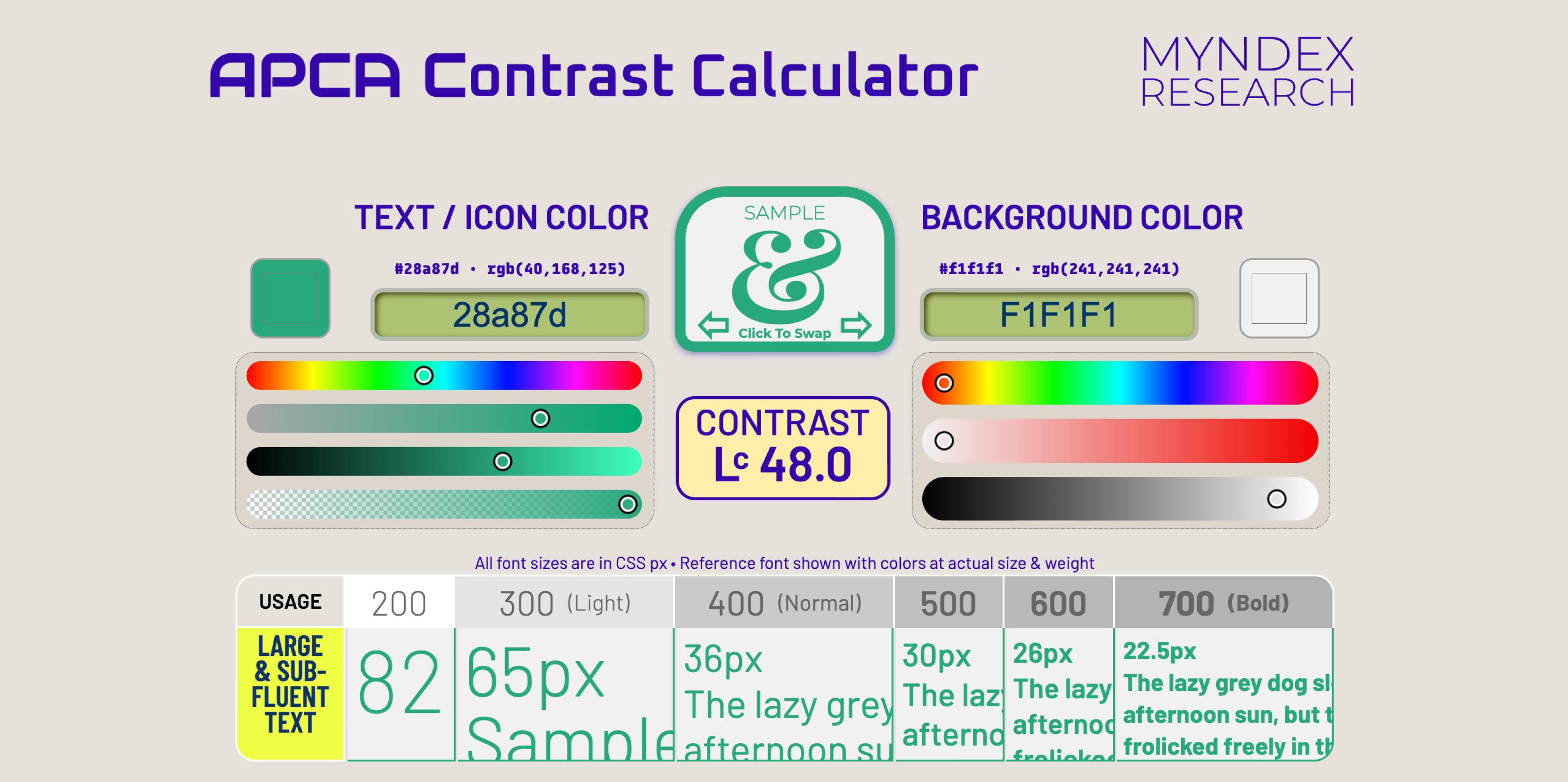
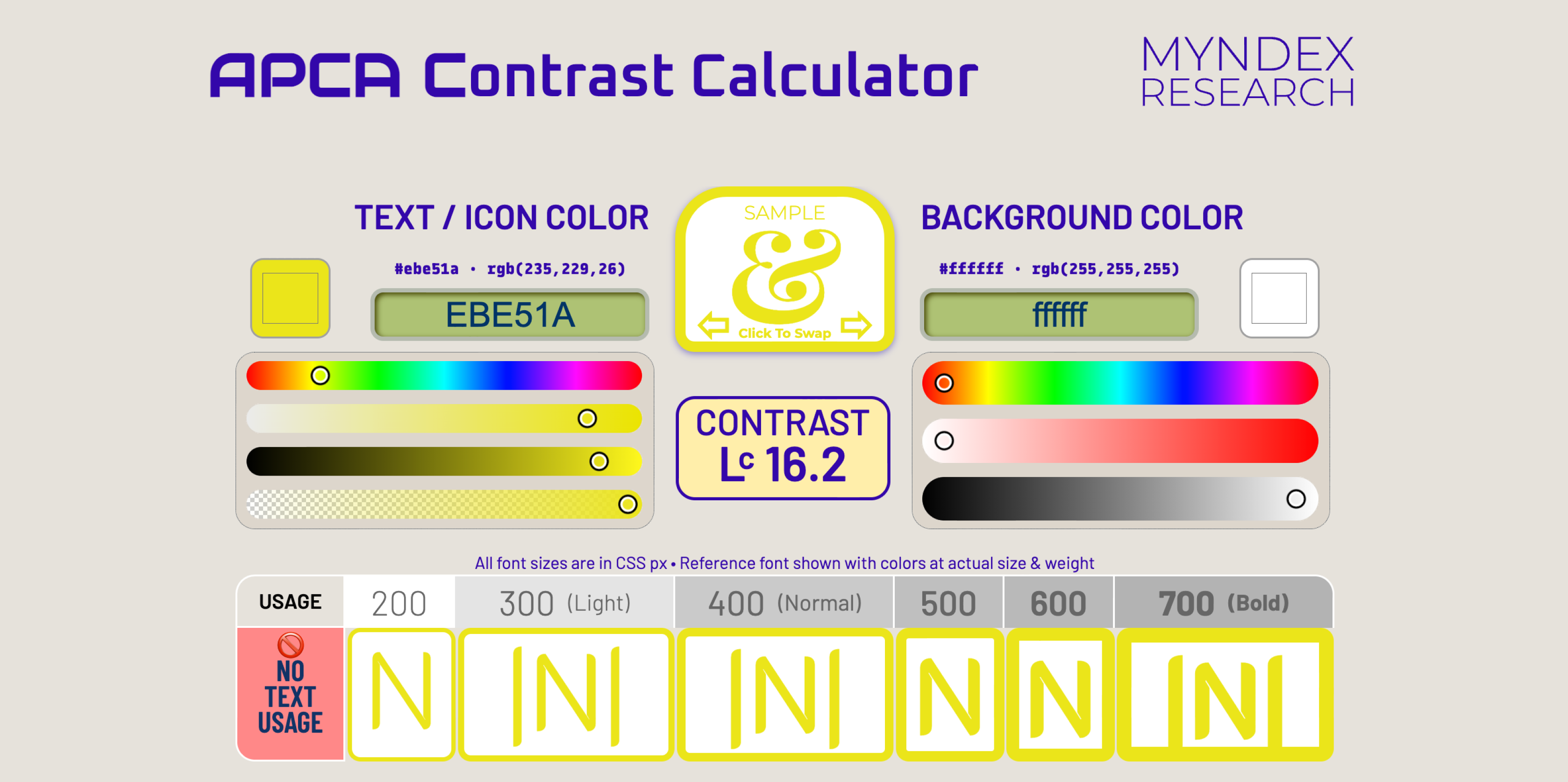
The Myndex APCA Contrast Calculator displays modern contrast ratios for various combinations of text size and font weight
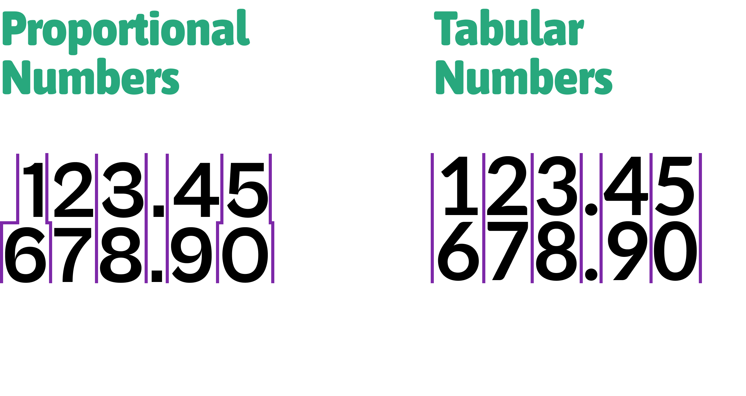
Source: Lisa Charlotte Muth, DataWrapper Blog
The Myndex APCA Contrast Calculator displays modern contrast ratios for various combinations of text size and font weight
The Myndex APCA Contrast Calculator displays modern contrast ratios for various combinations of text size and font weight
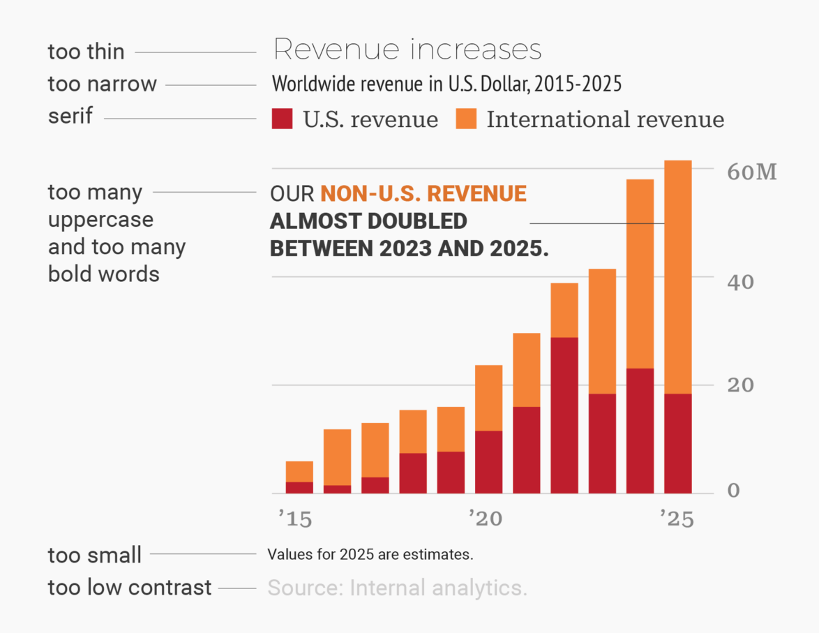
Source: Lisa Charlotte Muth, DataWrapper Blog
Source: Lisa Charlotte Muth, DataWrapper Blog
The Myndex APCA Contrast Calculator displays modern contrast ratios for various combinations of text size and font weight
The Myndex APCA Contrast Calculator displays modern contrast ratios for various combinations of text size and font weight
Viridis colors, tested with VizPalette
Source: “Fundamentals of Data Visualization” by Claus O. Wilke
Source: Lisa Charlotte Muth, DataWrapper Blog
Source: Lisa Charlotte Muth, DataWrapper Blog
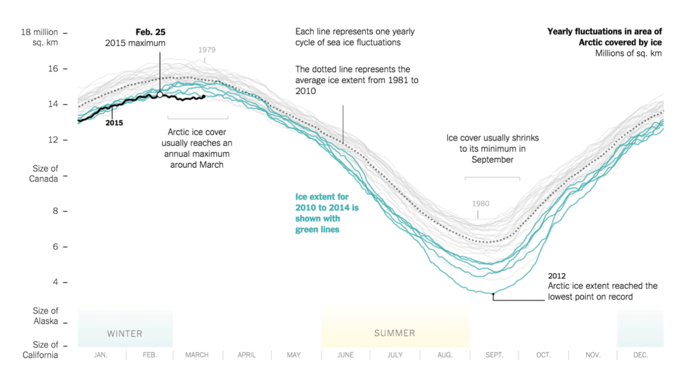
Source: “Yearly Fluctuations in Area of Arctic Covered by Ice” by Derek Watkins (New York Times)
Source: Dr. Robert Rohde (Tweet)