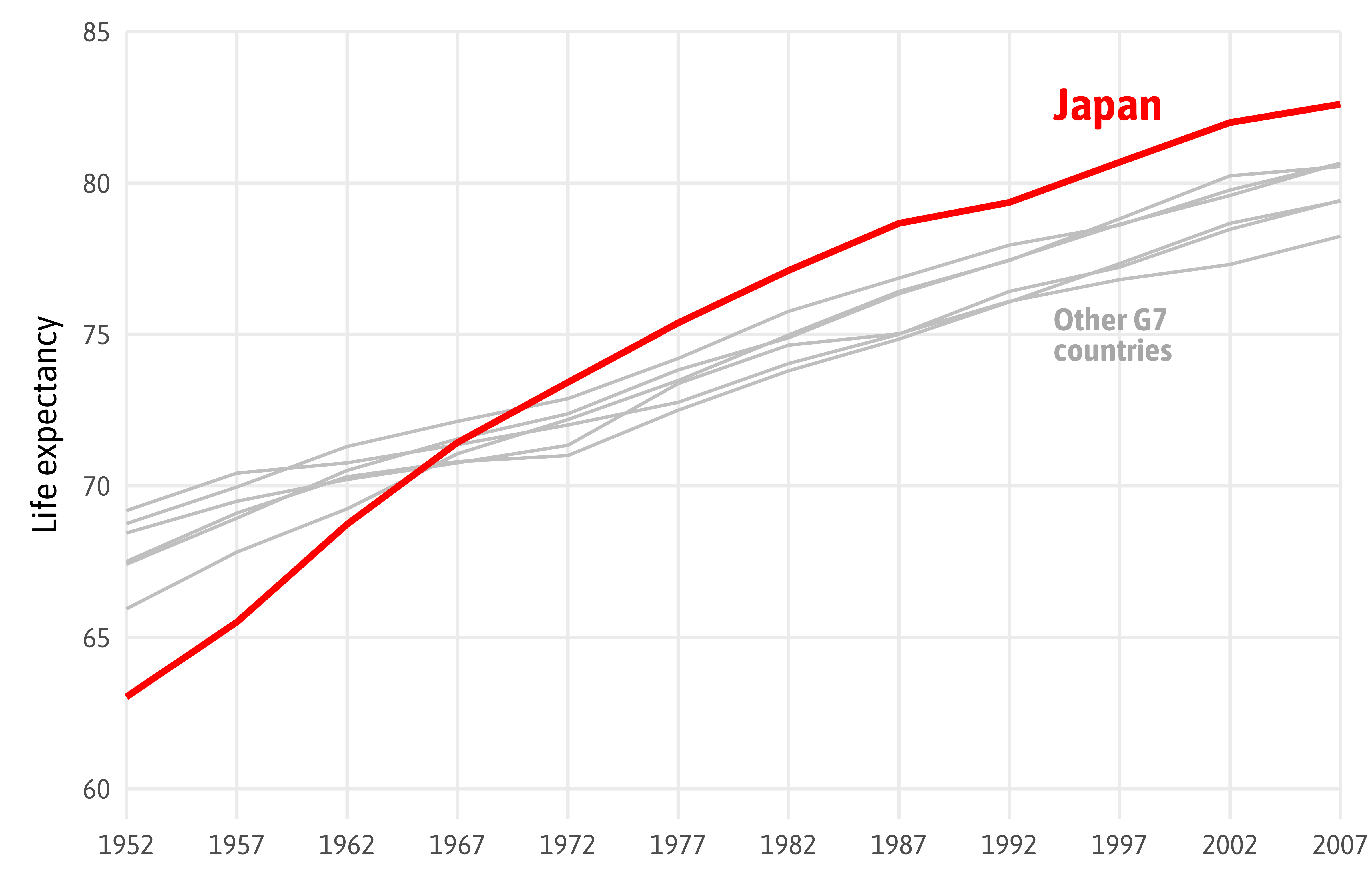
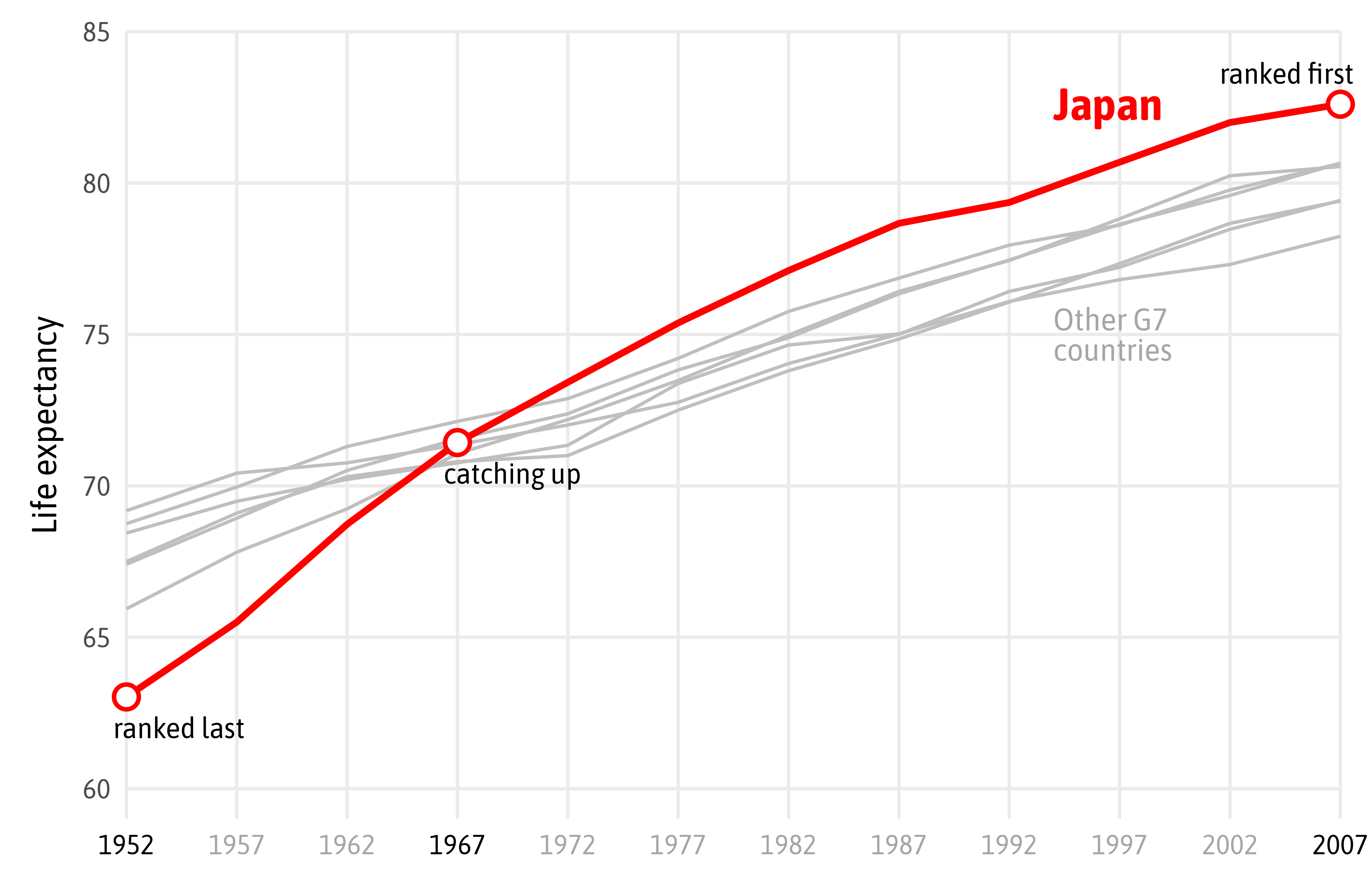
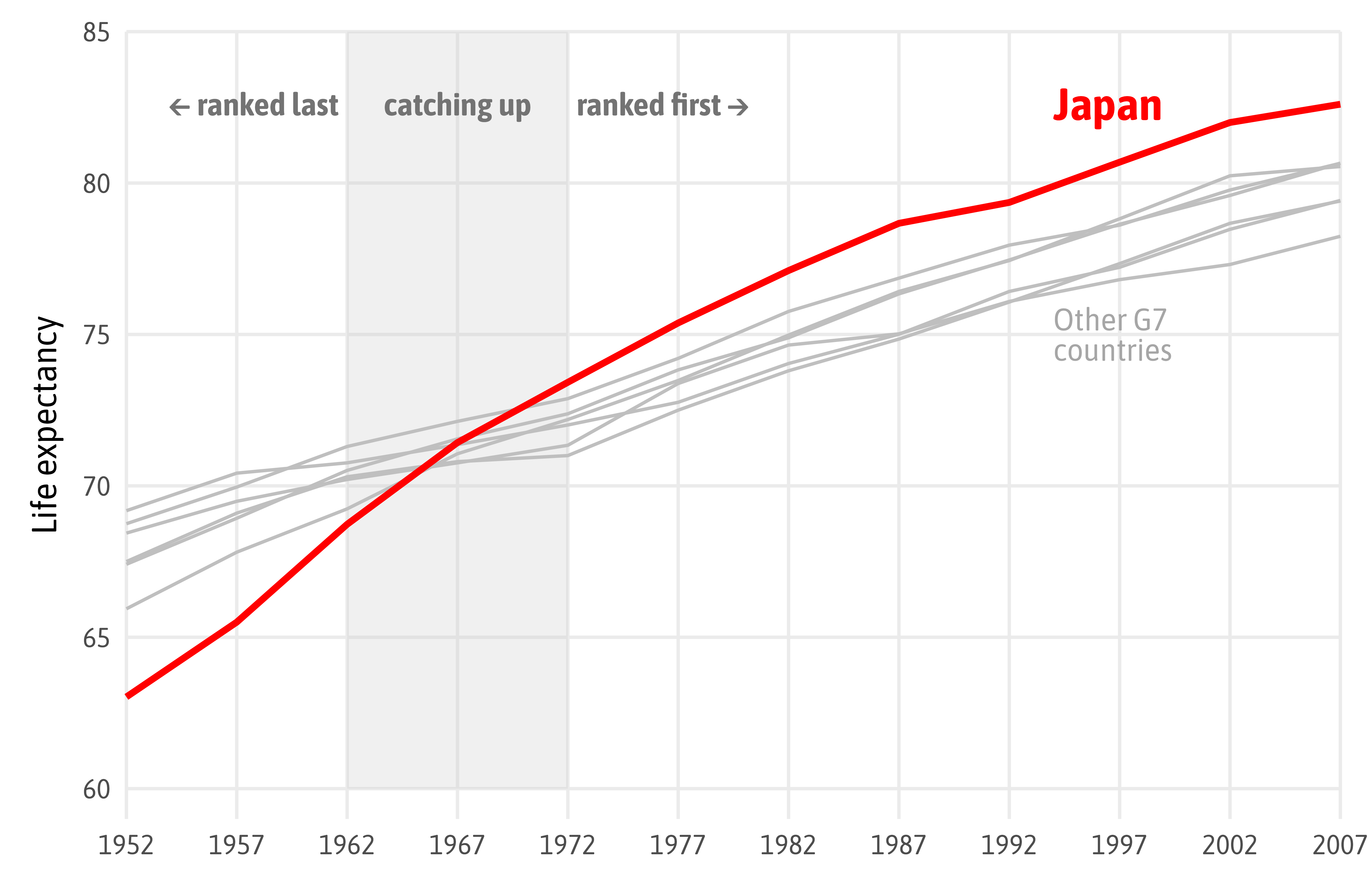
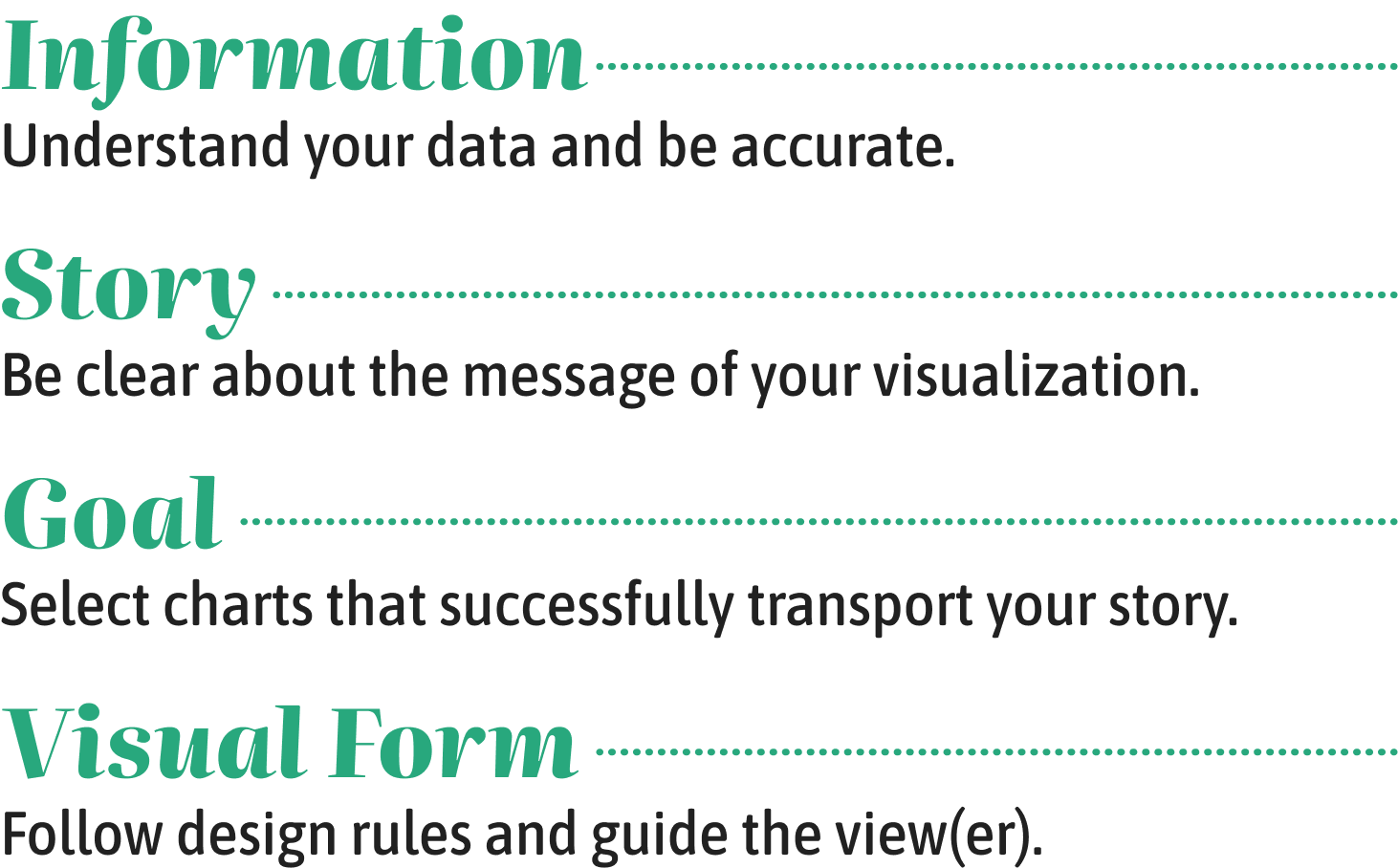
Designing Data Visualizations
to Successfully Tell a Story
Guide the View(er)
David McCandless & Lee Byron, Information is Beautiful (modified)
David McCandless & Lee Byron, Information is Beautiful
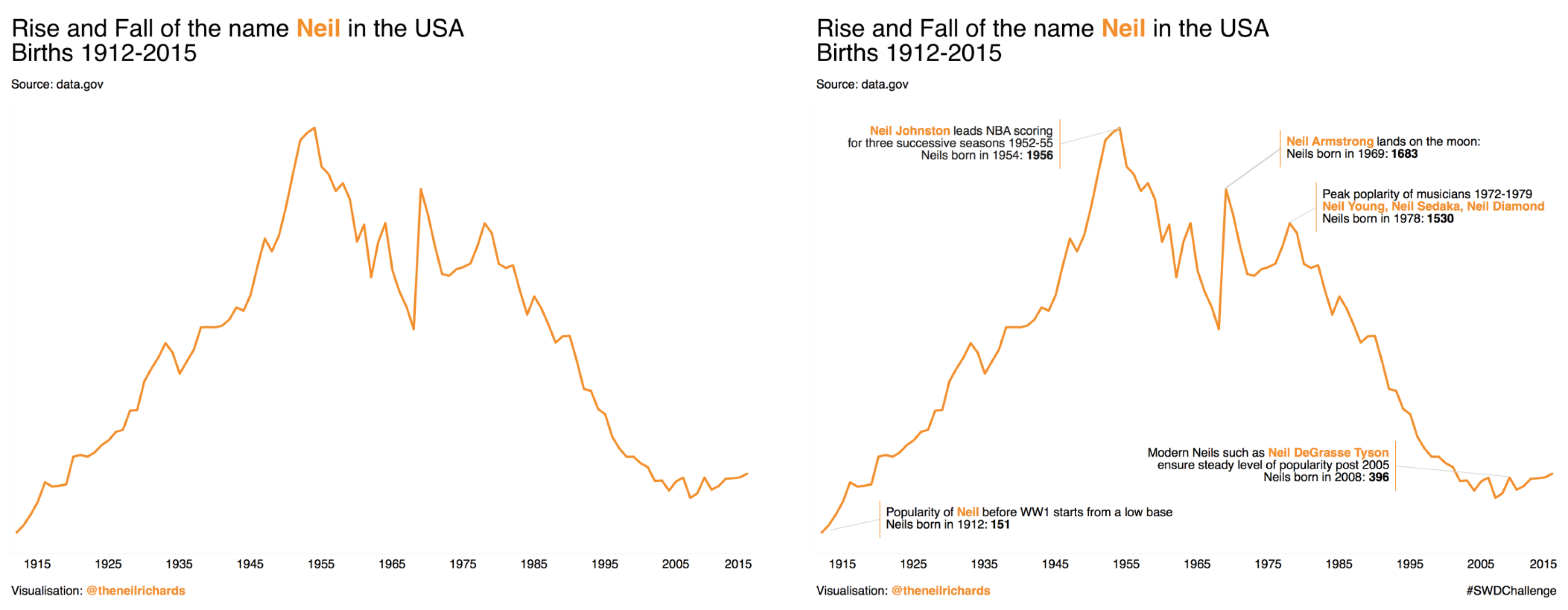
“Is white space always your friend?” by Neil Richards
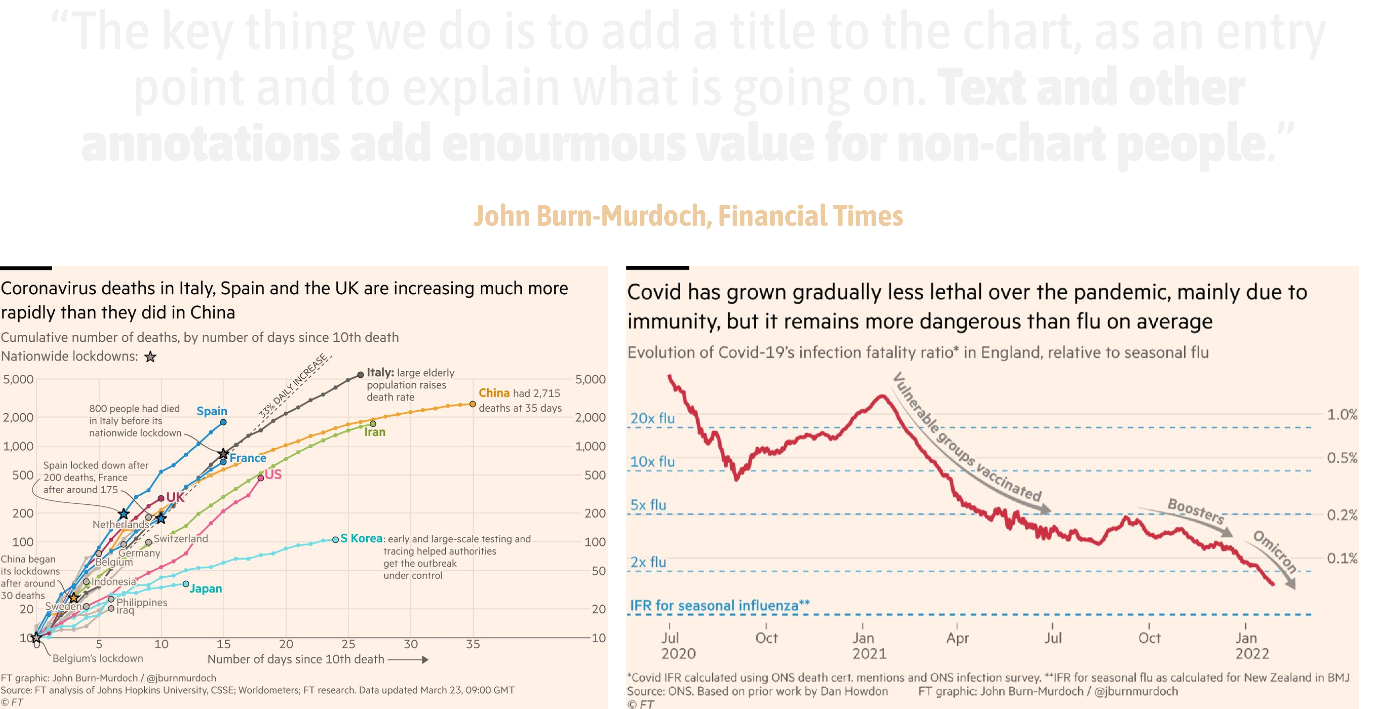
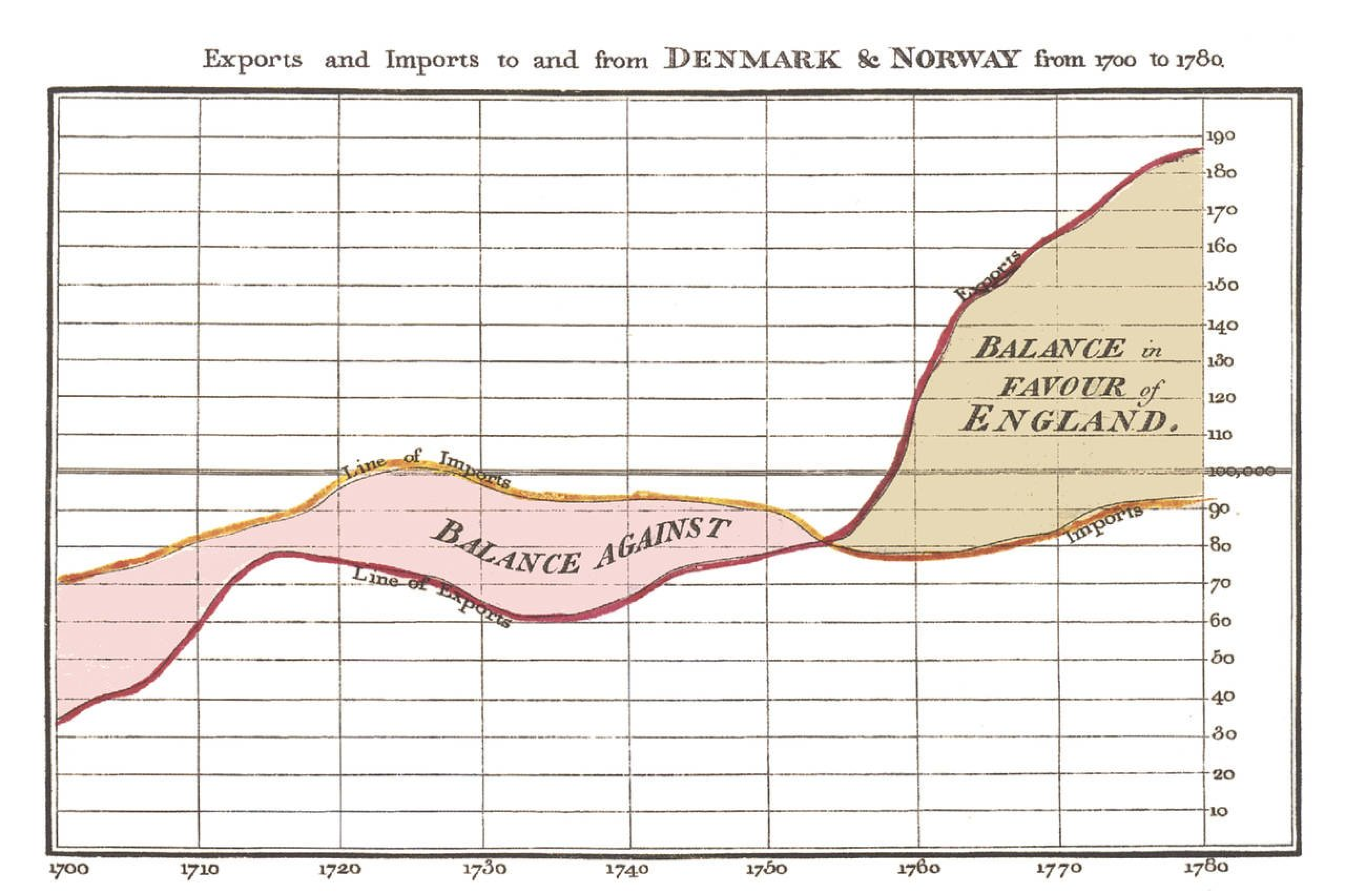
Time series with annotations by William Playfair from “The Commercial and Political Atlas and Statistical Breviary” (1786)
“Yearly Fluctuations in Area of Arctic Covered by Ice” by Derek Watkins (New York Times)

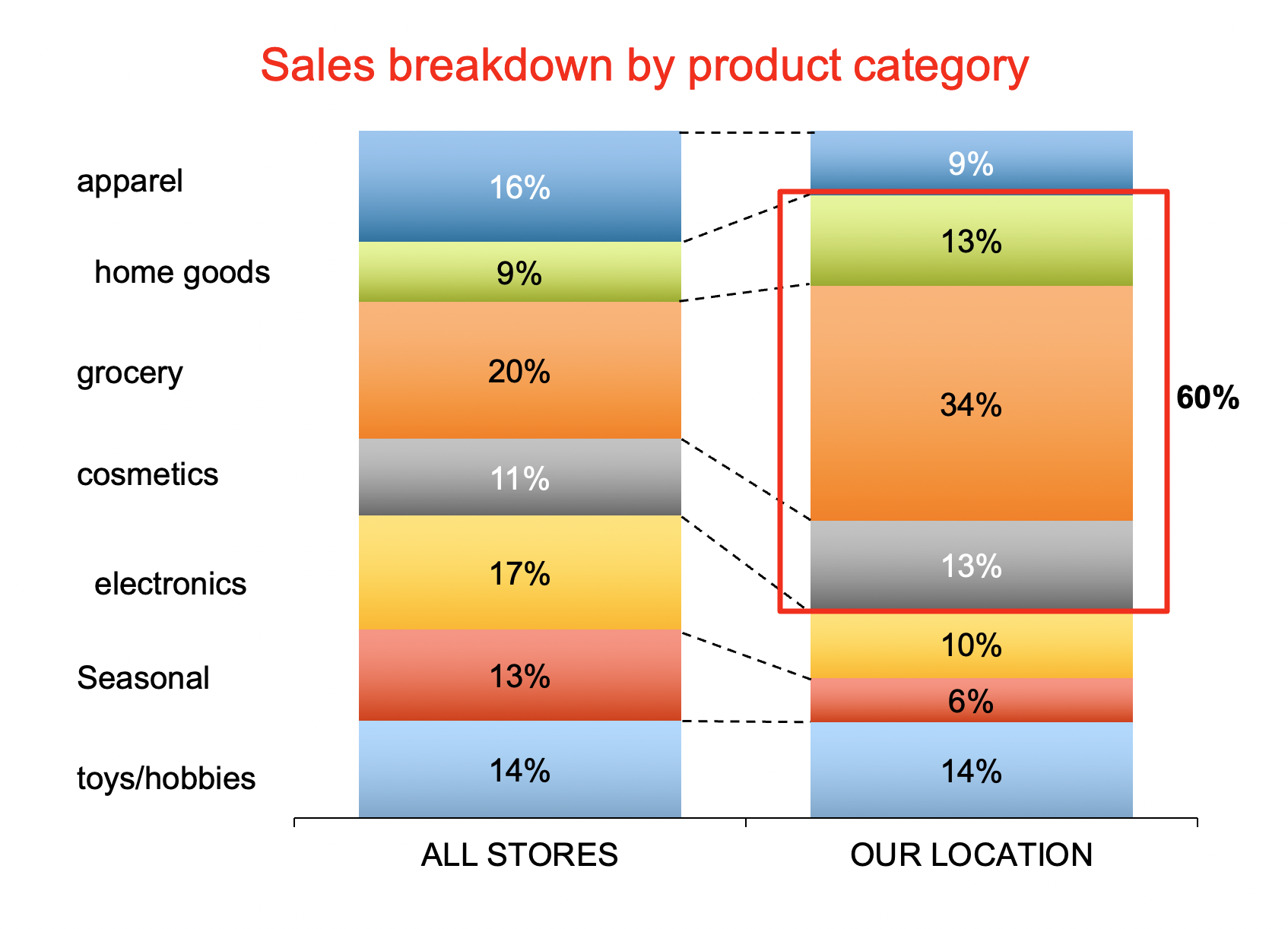
Confuse with Colors
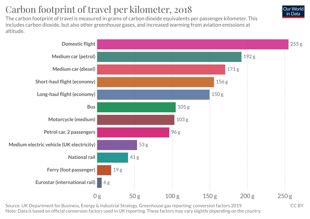
OurWorldInData 2020 (new version)
Confuse with Colors
OurWorldInData 2020, suggested fix
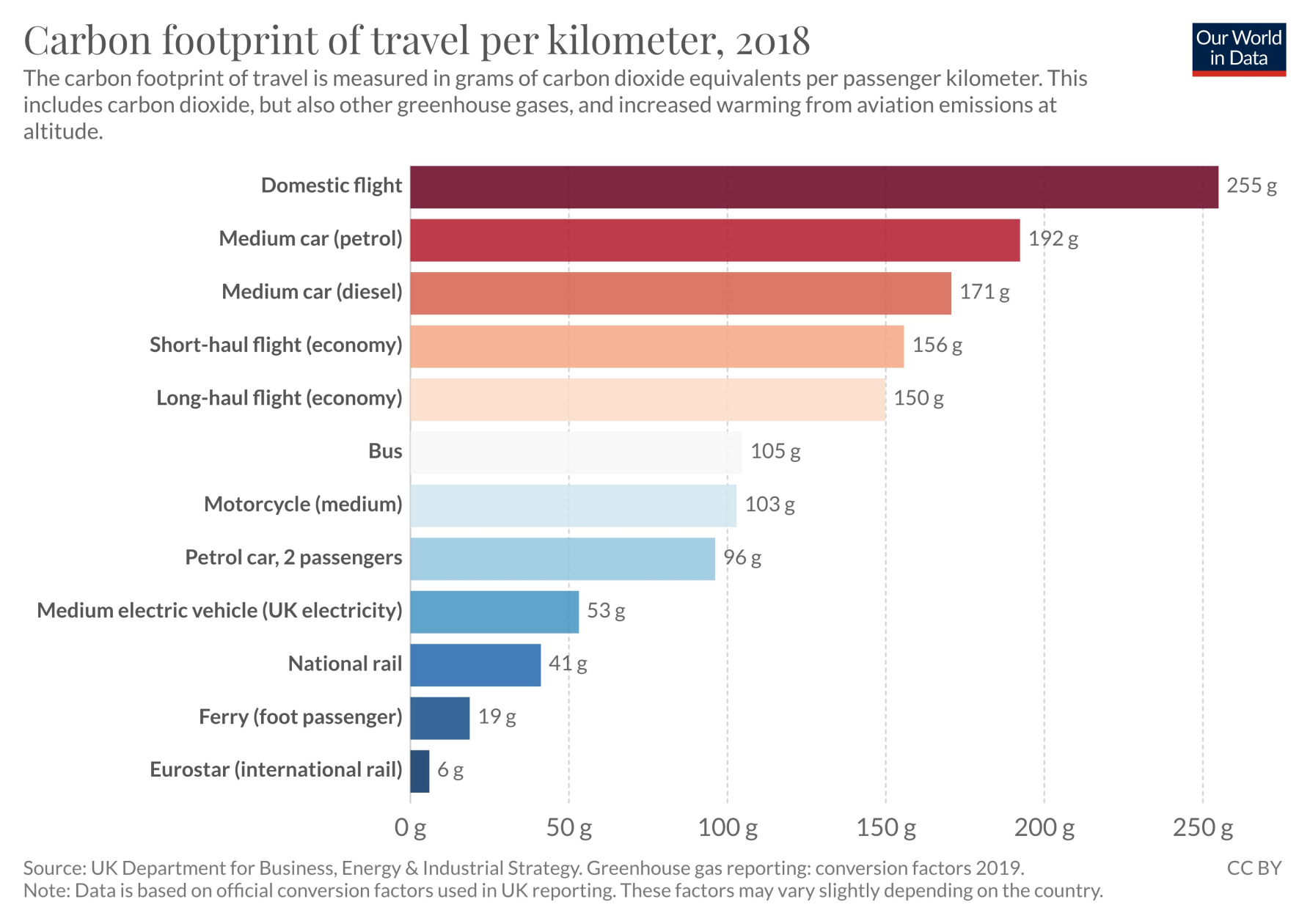
Don’t Confuse with Color
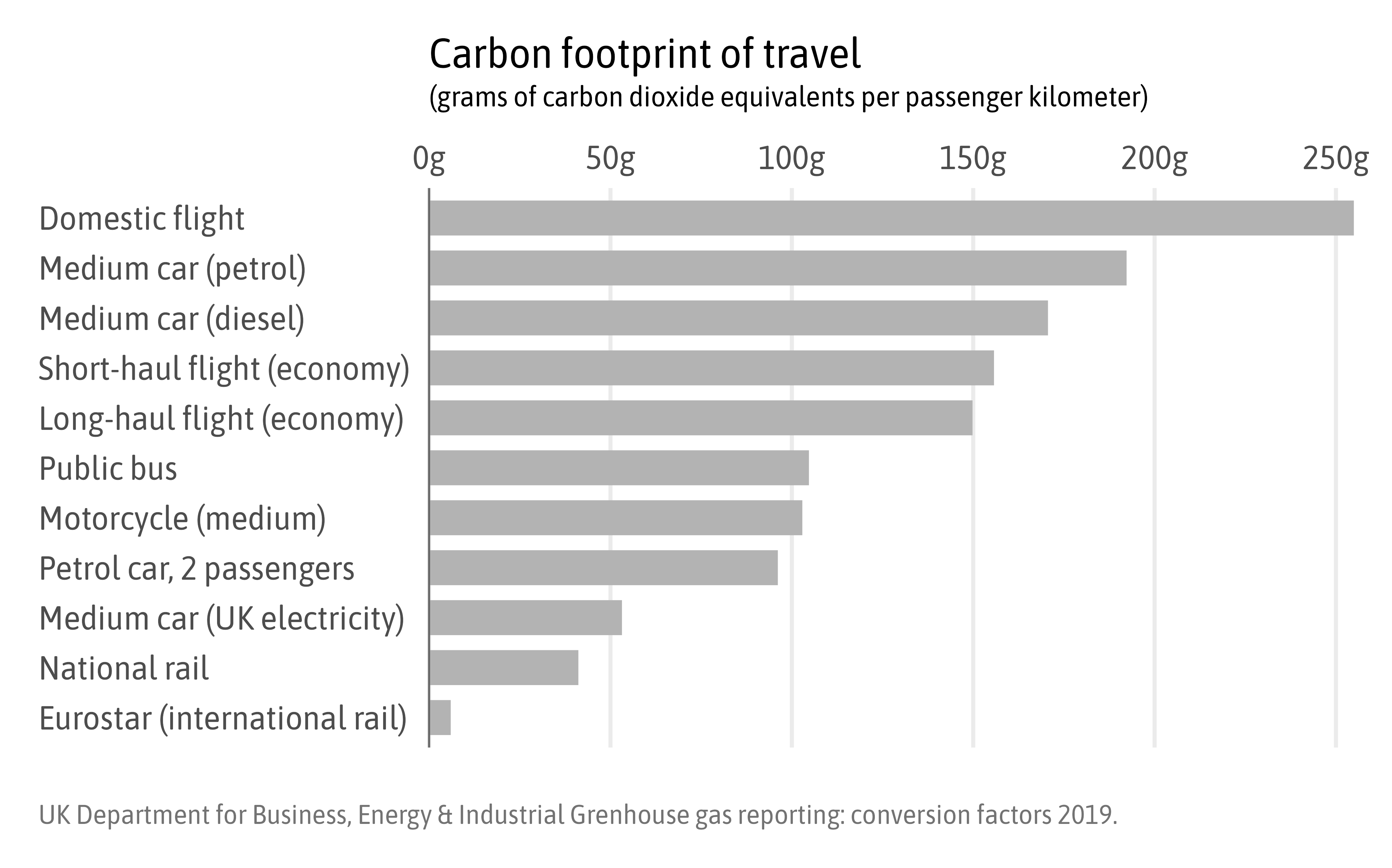
Guide with Colors
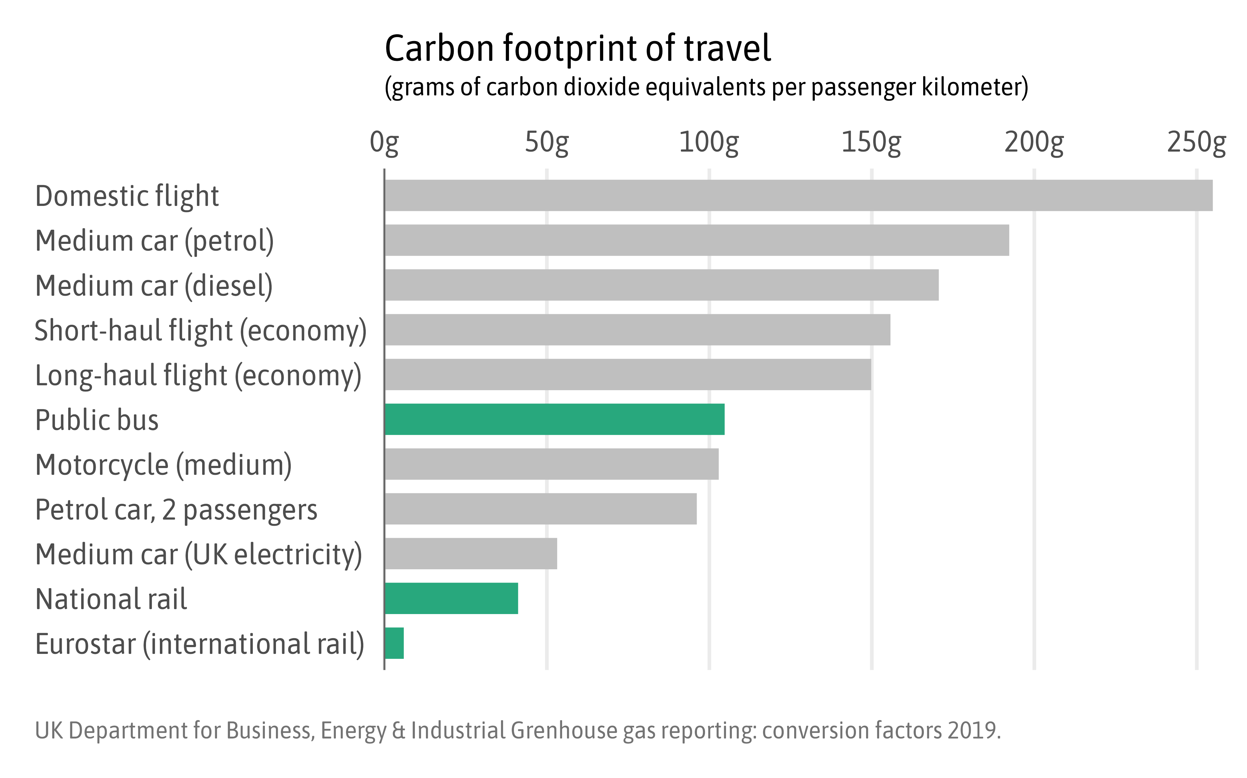
Guide with Colors
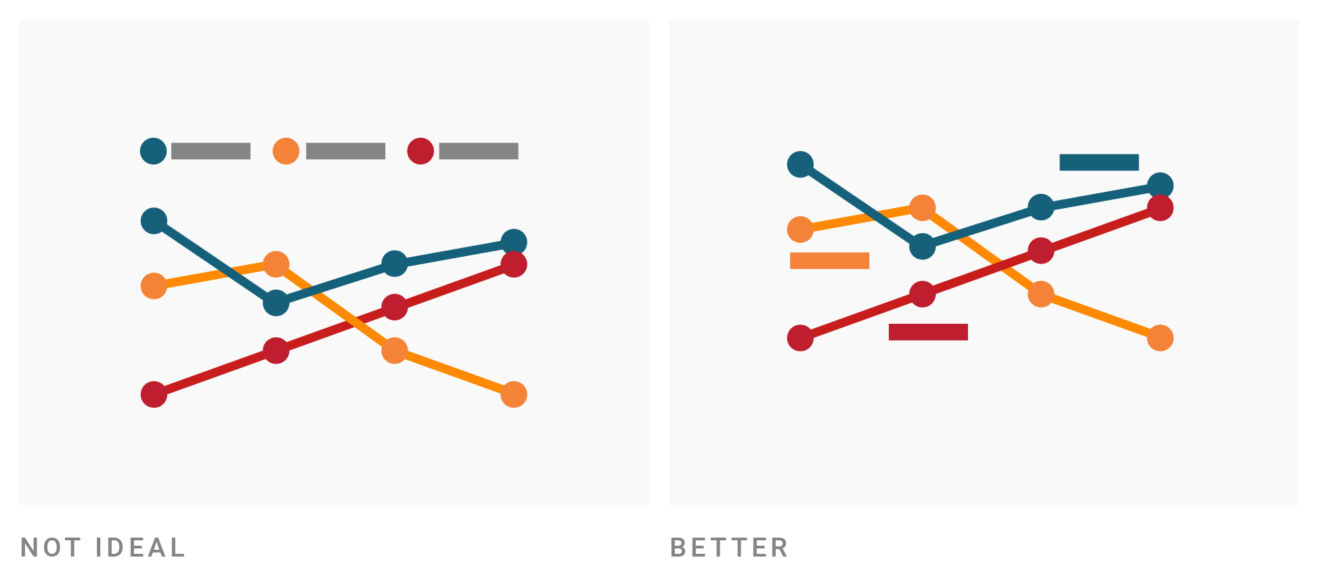
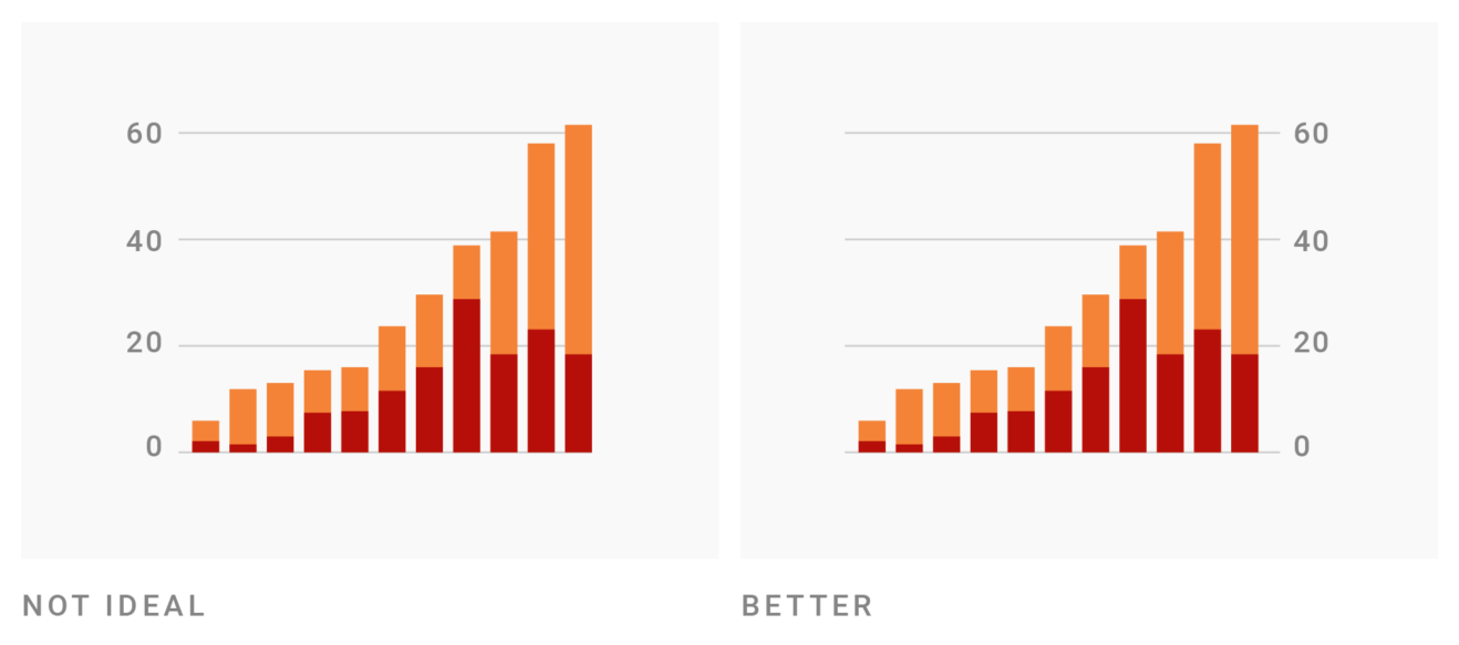
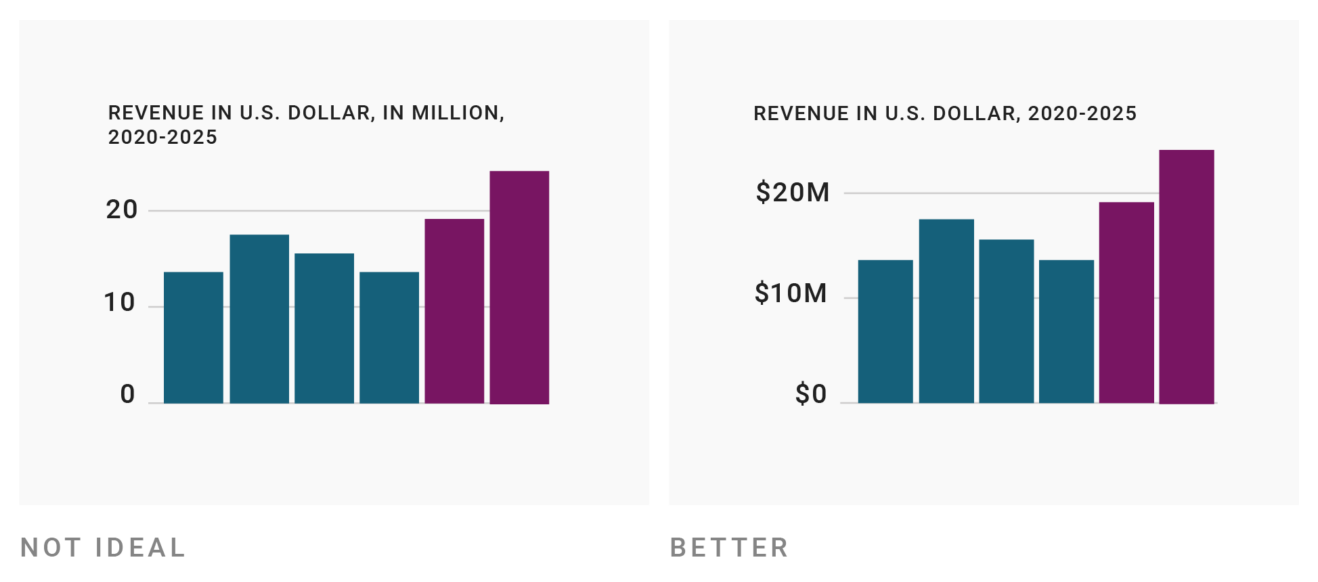
Assist the Viewer
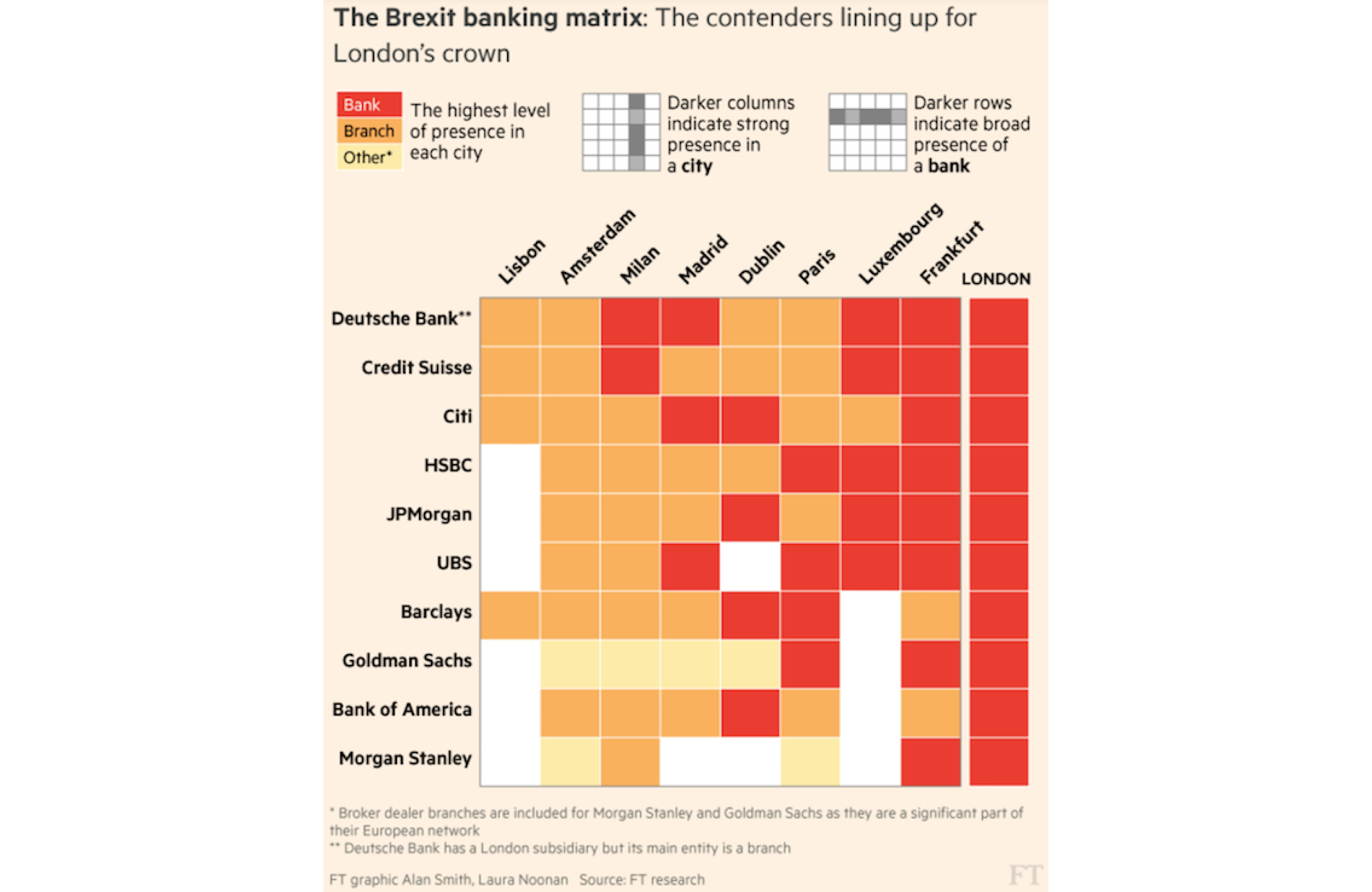
“Frankfurt vies for UK banking jobs post-Brexit” by Alan Smith & Laura Noonan (Financial Times)
Assist the Viewer
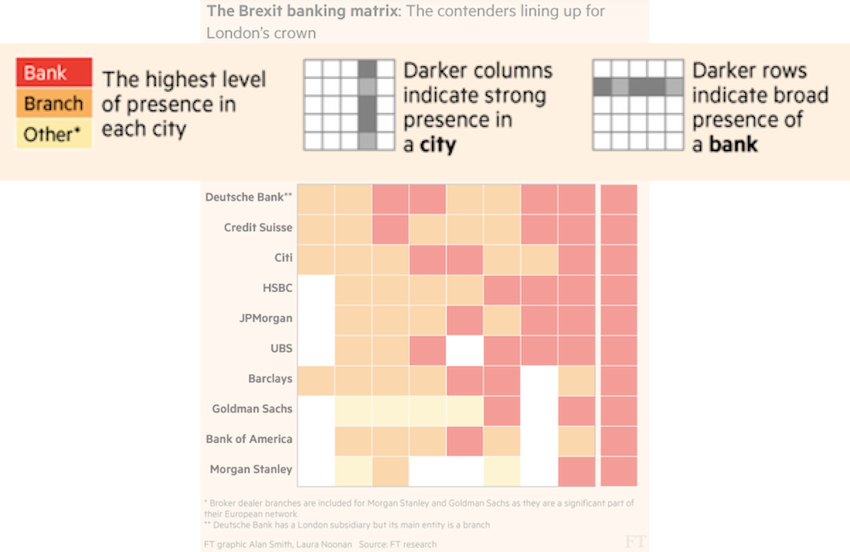
“Frankfurt vies for UK banking jobs post-Brexit” by Alan Smith & Laura Noonan (Financial Times)
Assist the Viewer
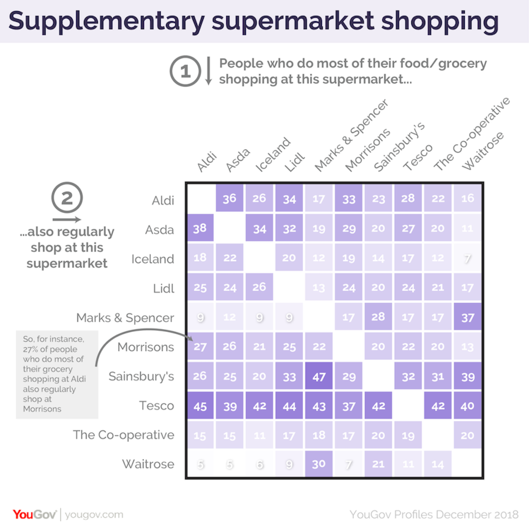
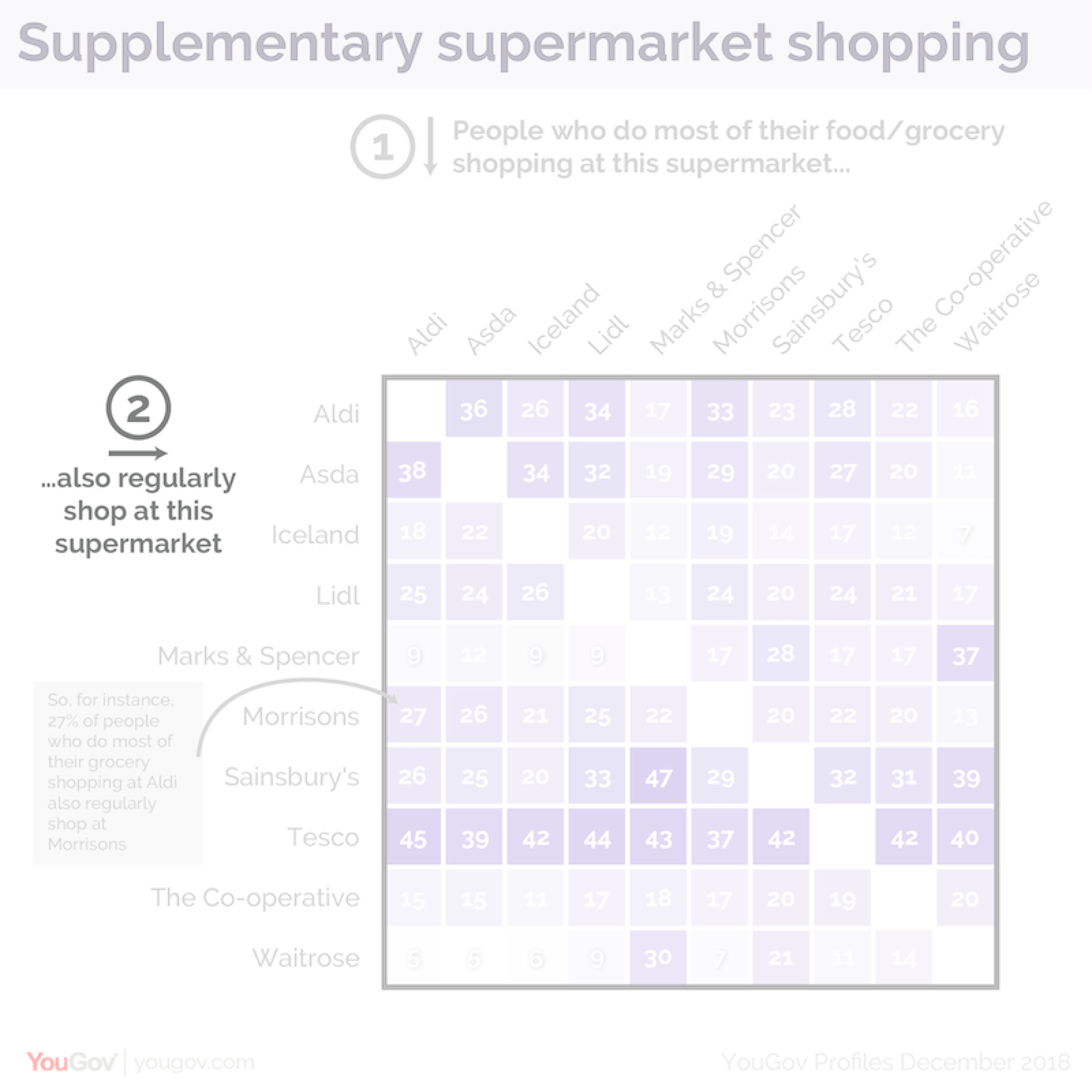
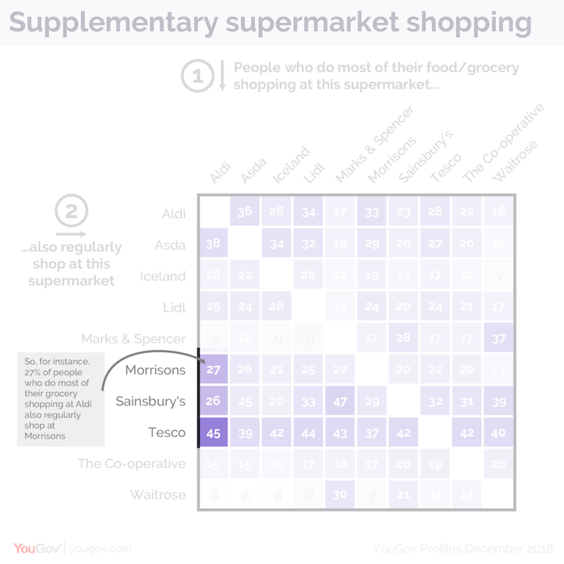
“Tesco is the nation’s primary AND secondary supermarket” by Matthew Smith (YouGov)
Assist the Viewer
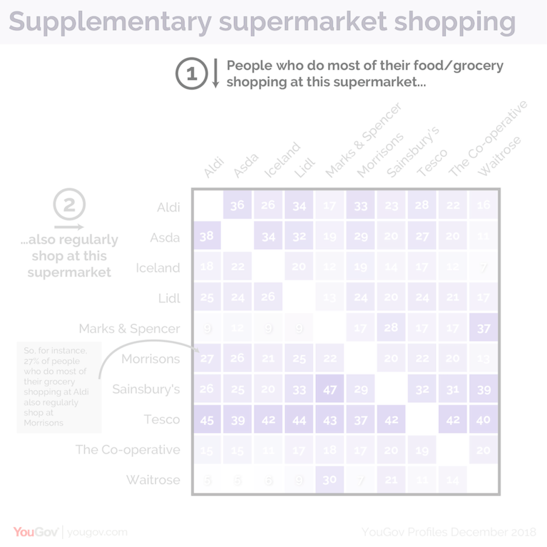
“Tesco is the nation’s primary AND secondary supermarket” by Matthew Smith (YouGov)
Assist the Viewer
“Tesco is the nation’s primary AND secondary supermarket” by Matthew Smith (YouGov)
Assist the Viewer
“Tesco is the nation’s primary AND secondary supermarket” by Matthew Smith (YouGov)
Assist the Viewer
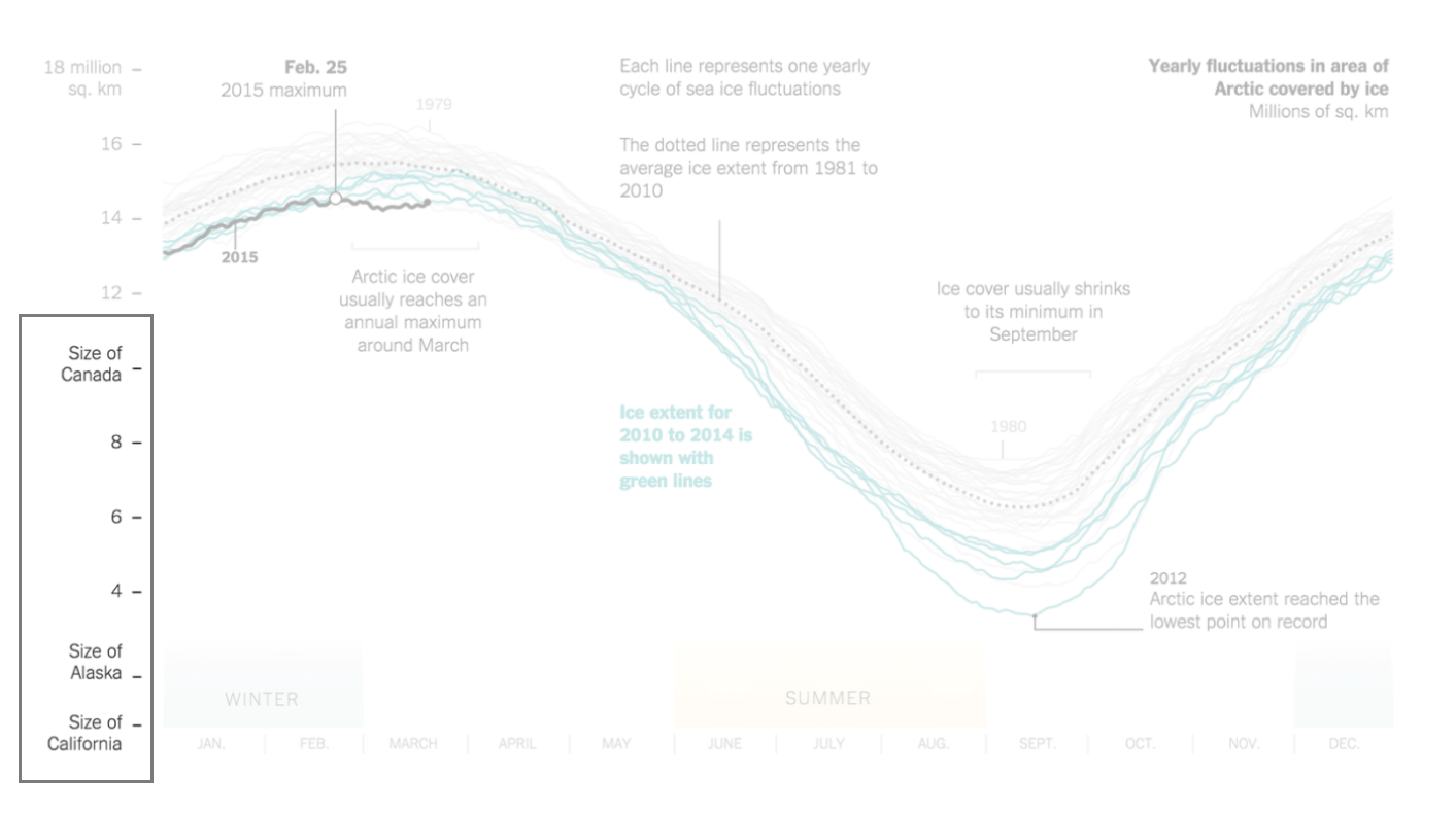
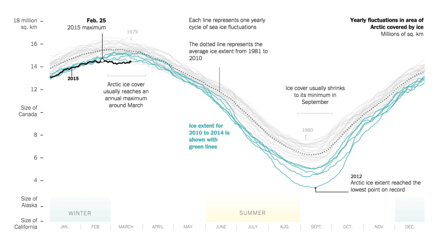
“Yearly Fluctuations in Area of Arctic Covered by Ice” by Derek Watkins (New York Times)
Assist the Viewer
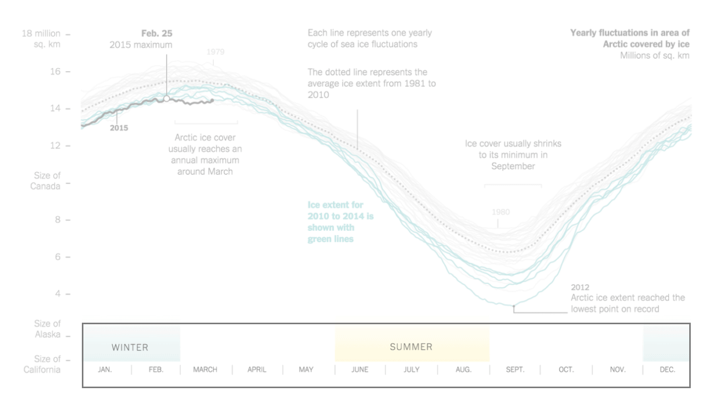
“Yearly Fluctuations in Area of Arctic Covered by Ice” by Derek Watkins (New York Times)
Assist the Viewer
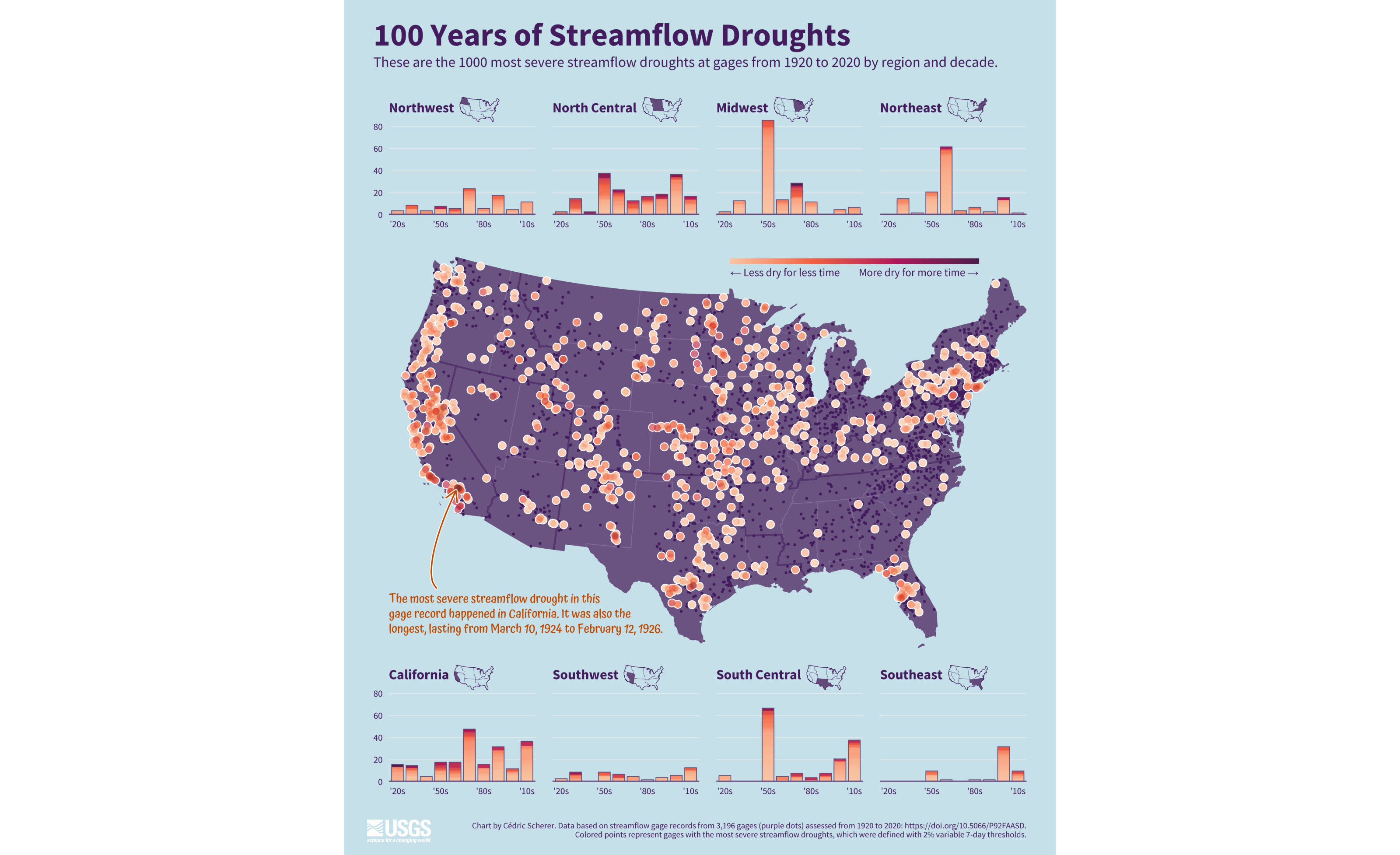
“100 Years of Streamflow Drought”, in collaboration with USGS
Assist the Viewer
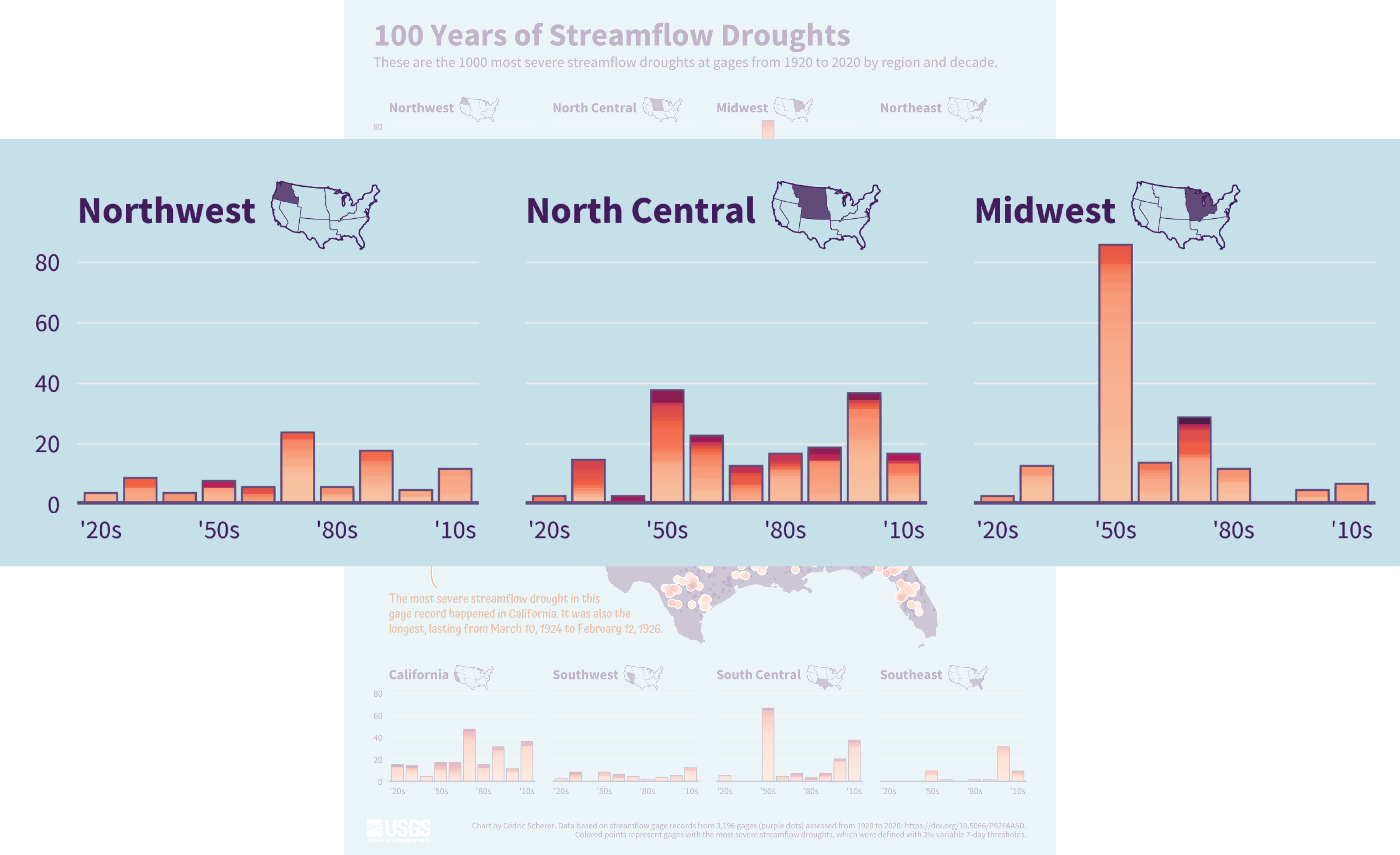
“100 Years of Streamflow Drought”, in collaboration with USGS
Assist the Viewer
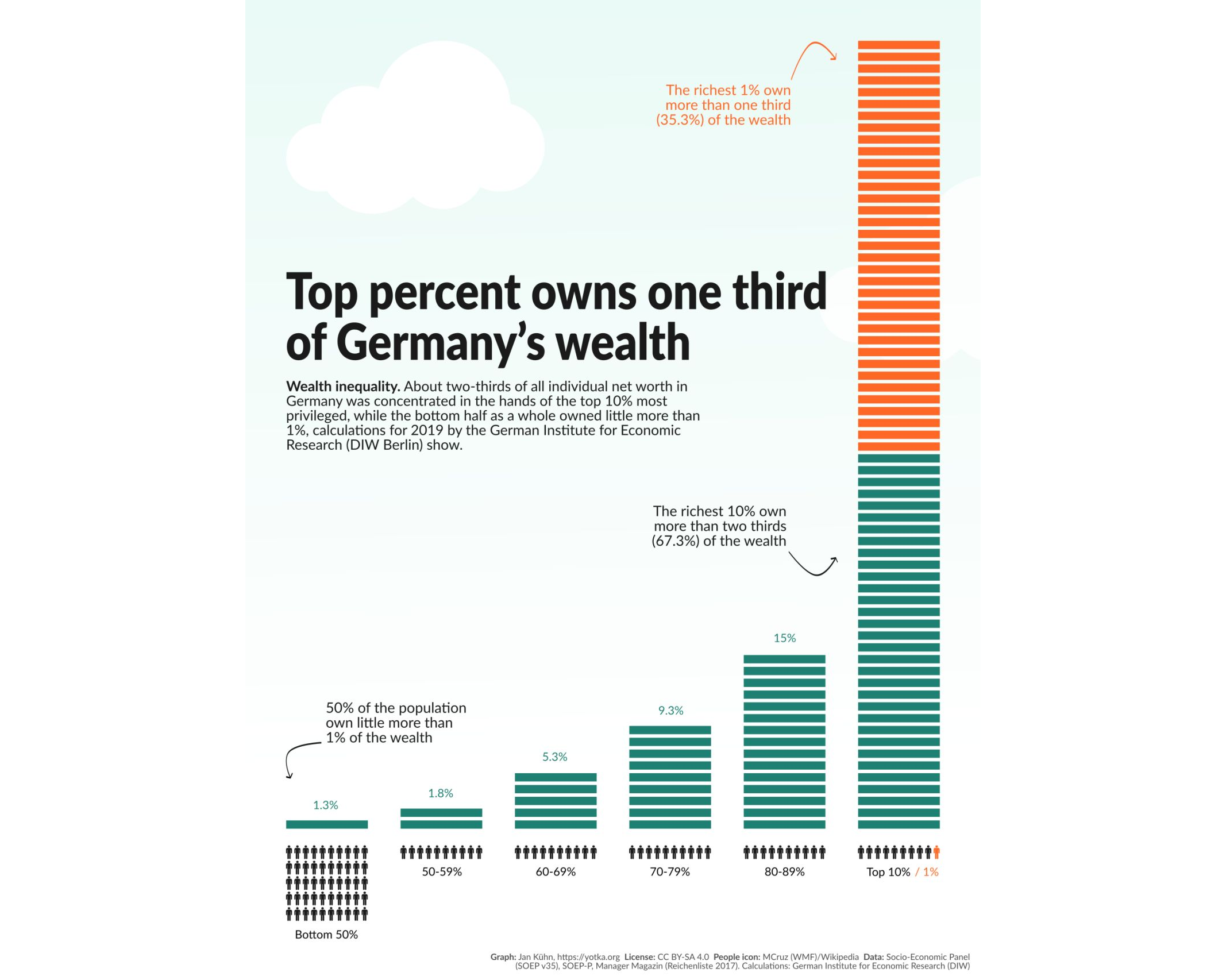
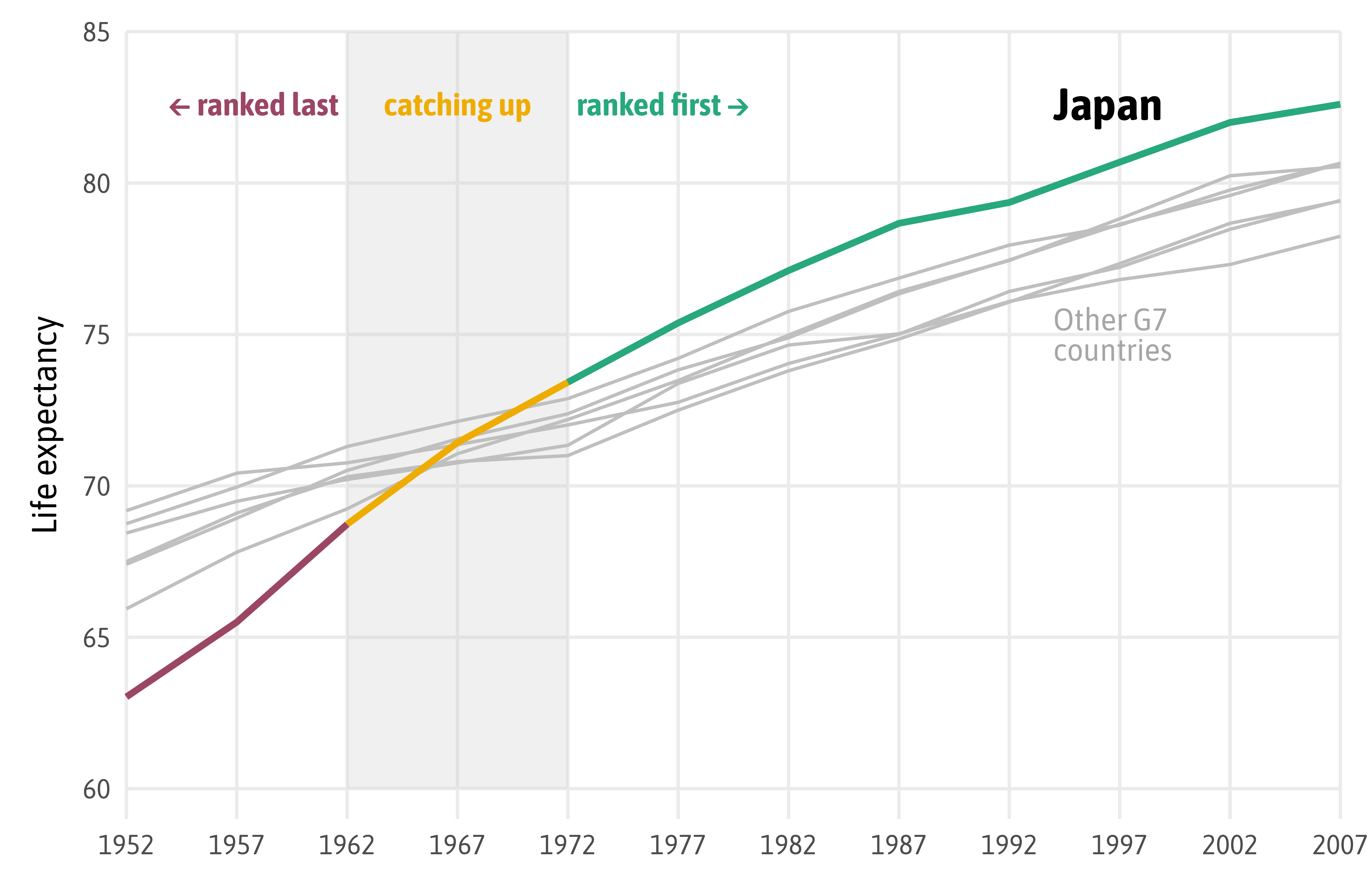
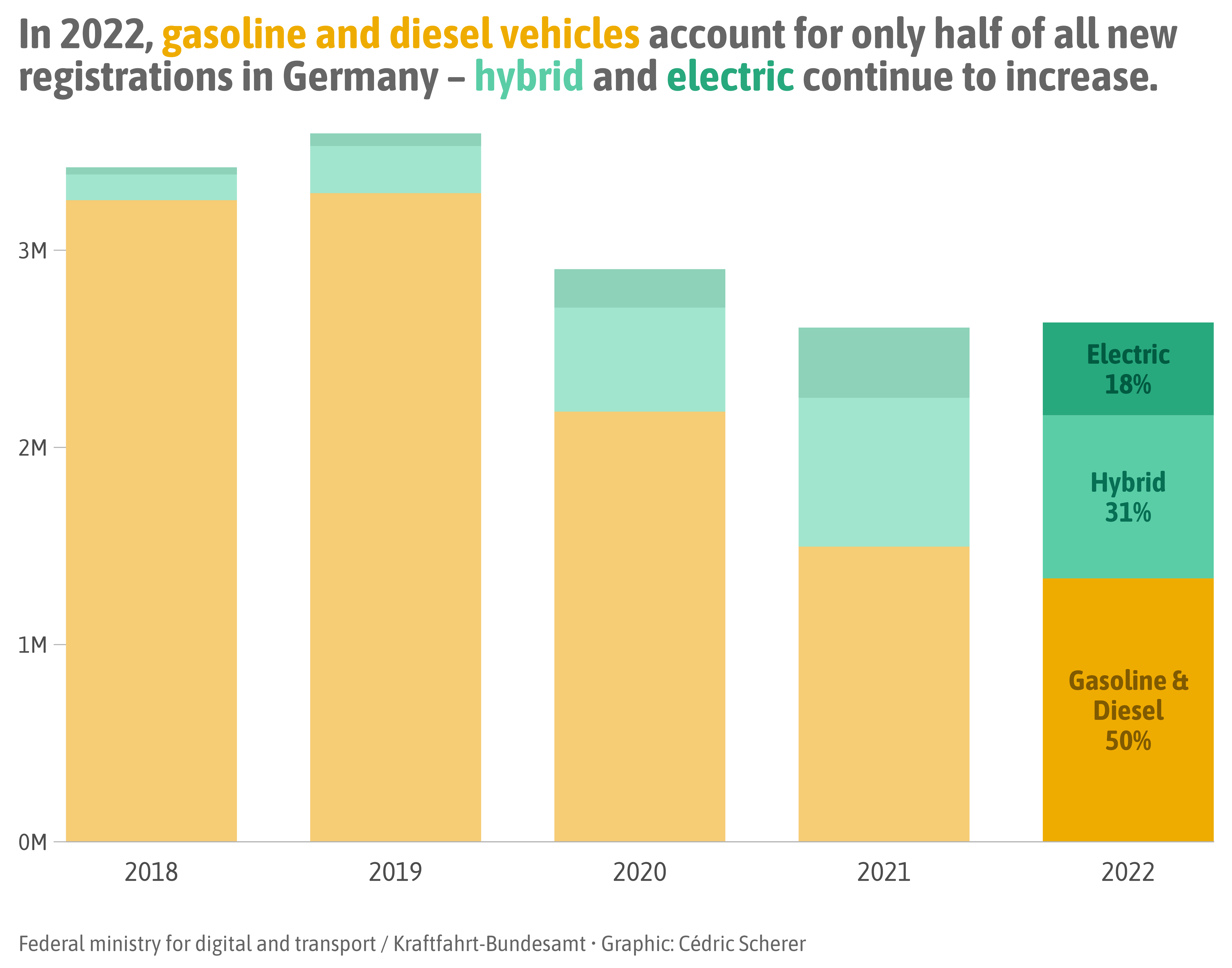
Source: Jan Kühn
Assist the Viewer
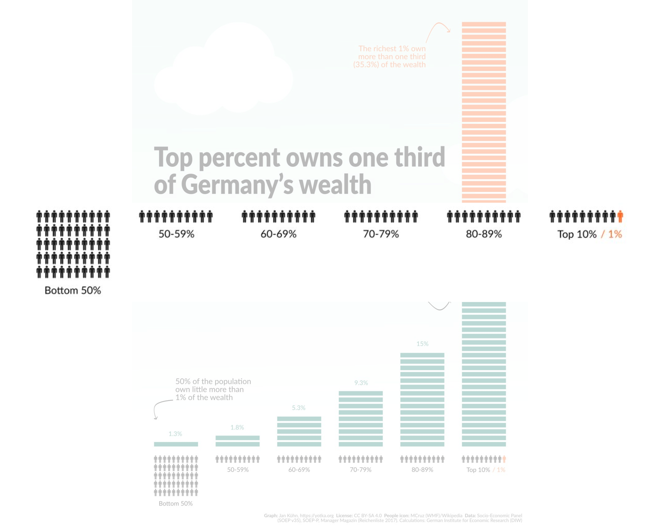
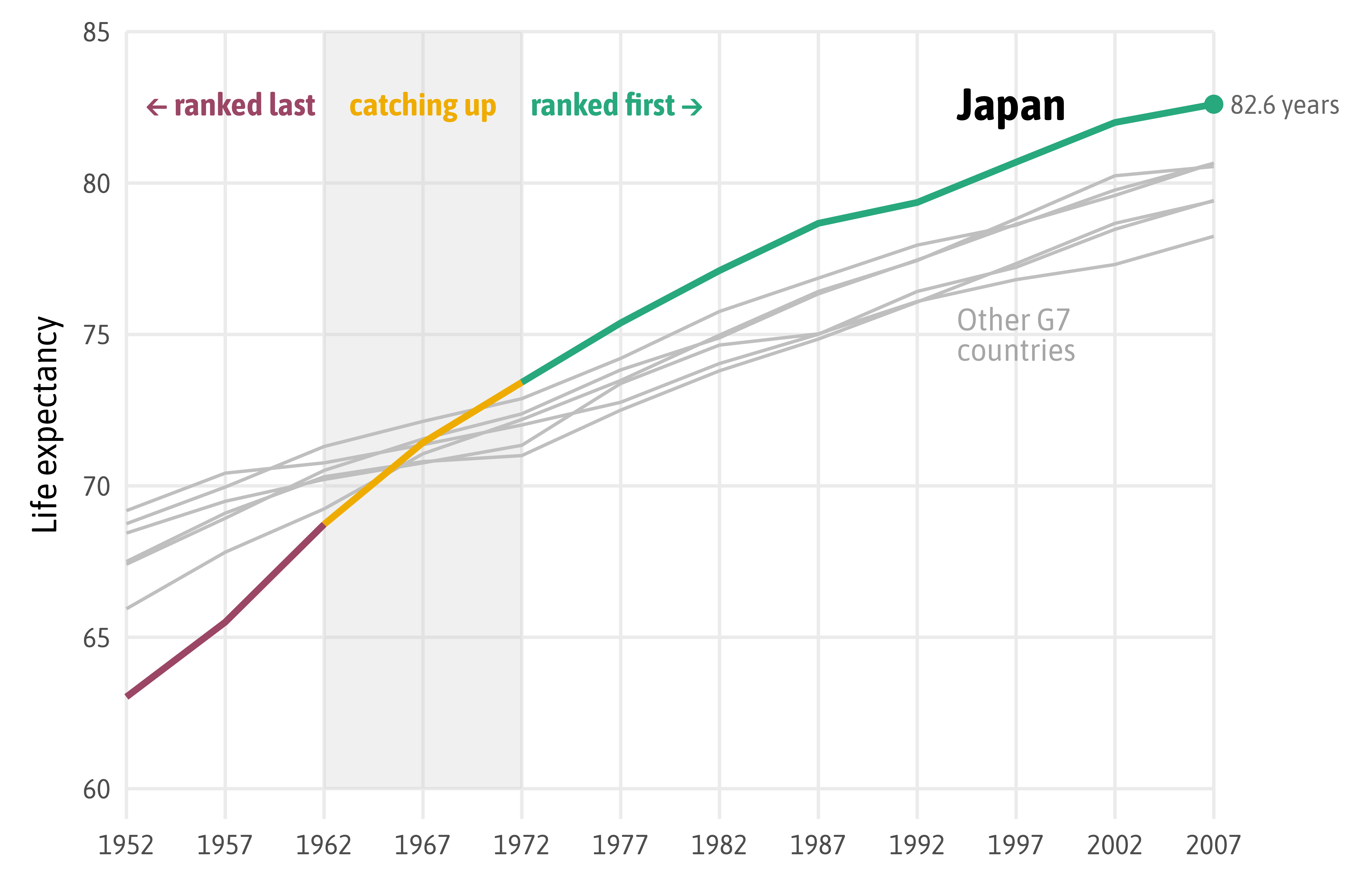
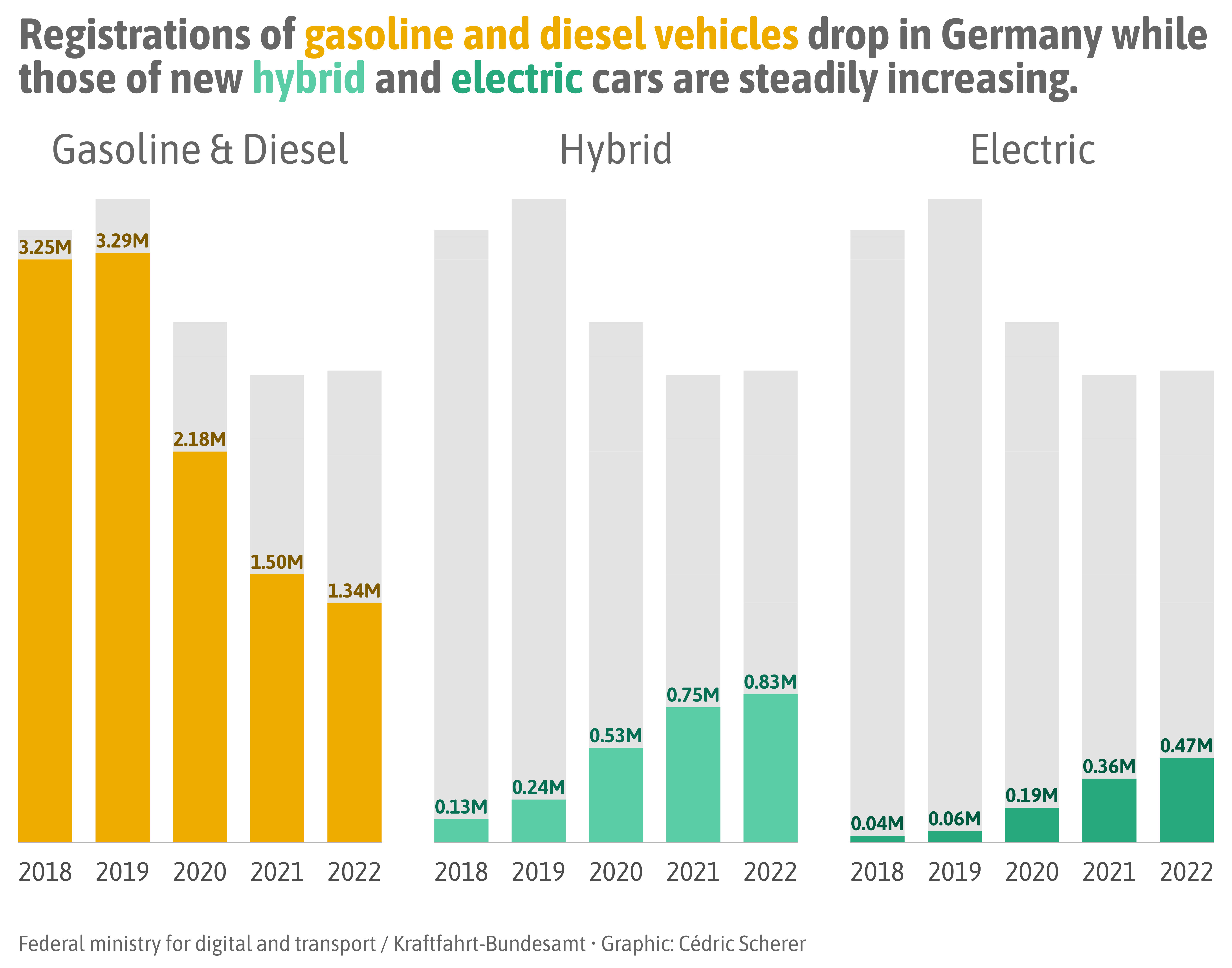
Source: Jan Kühn
Assist the Viewer
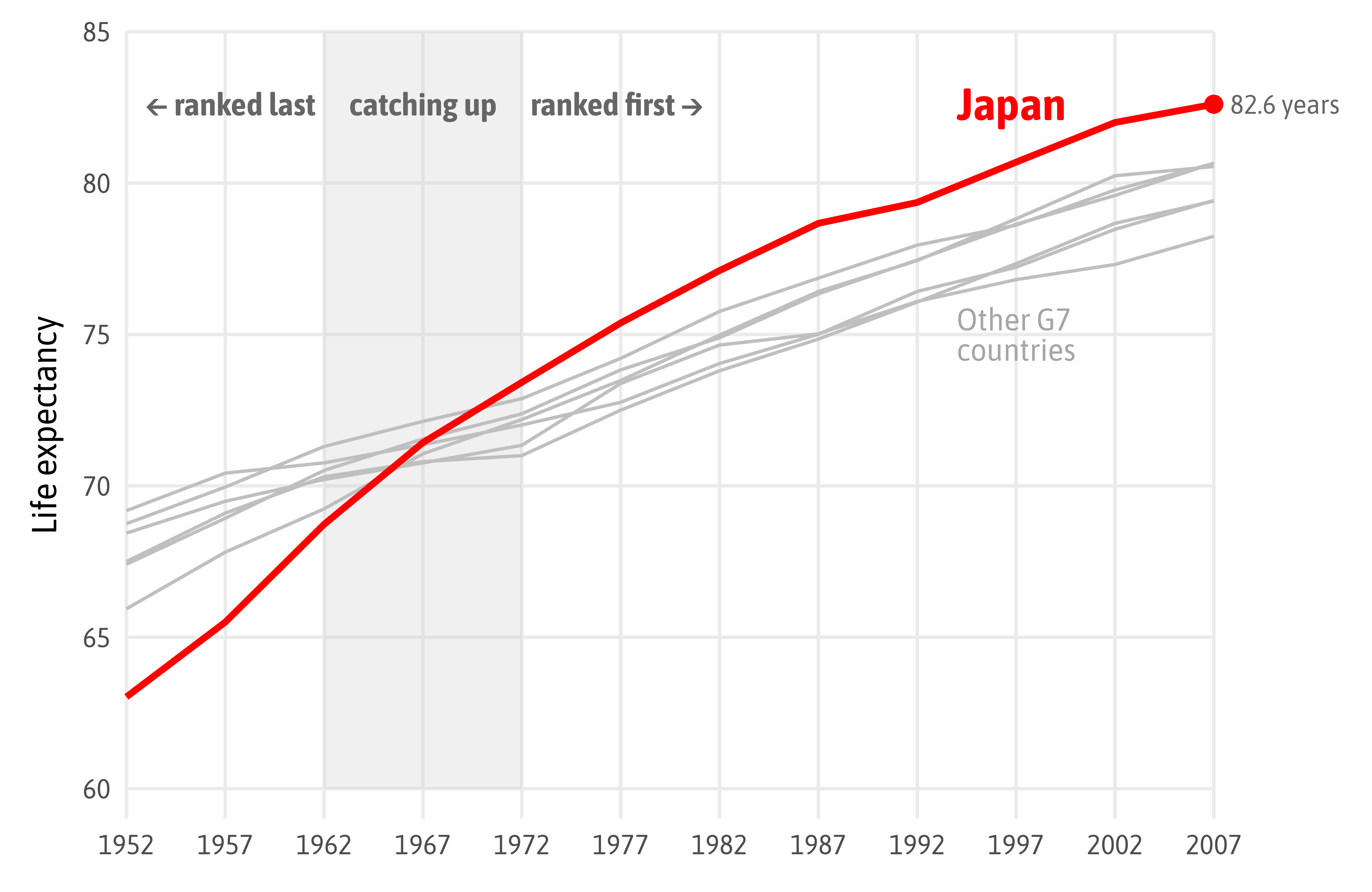
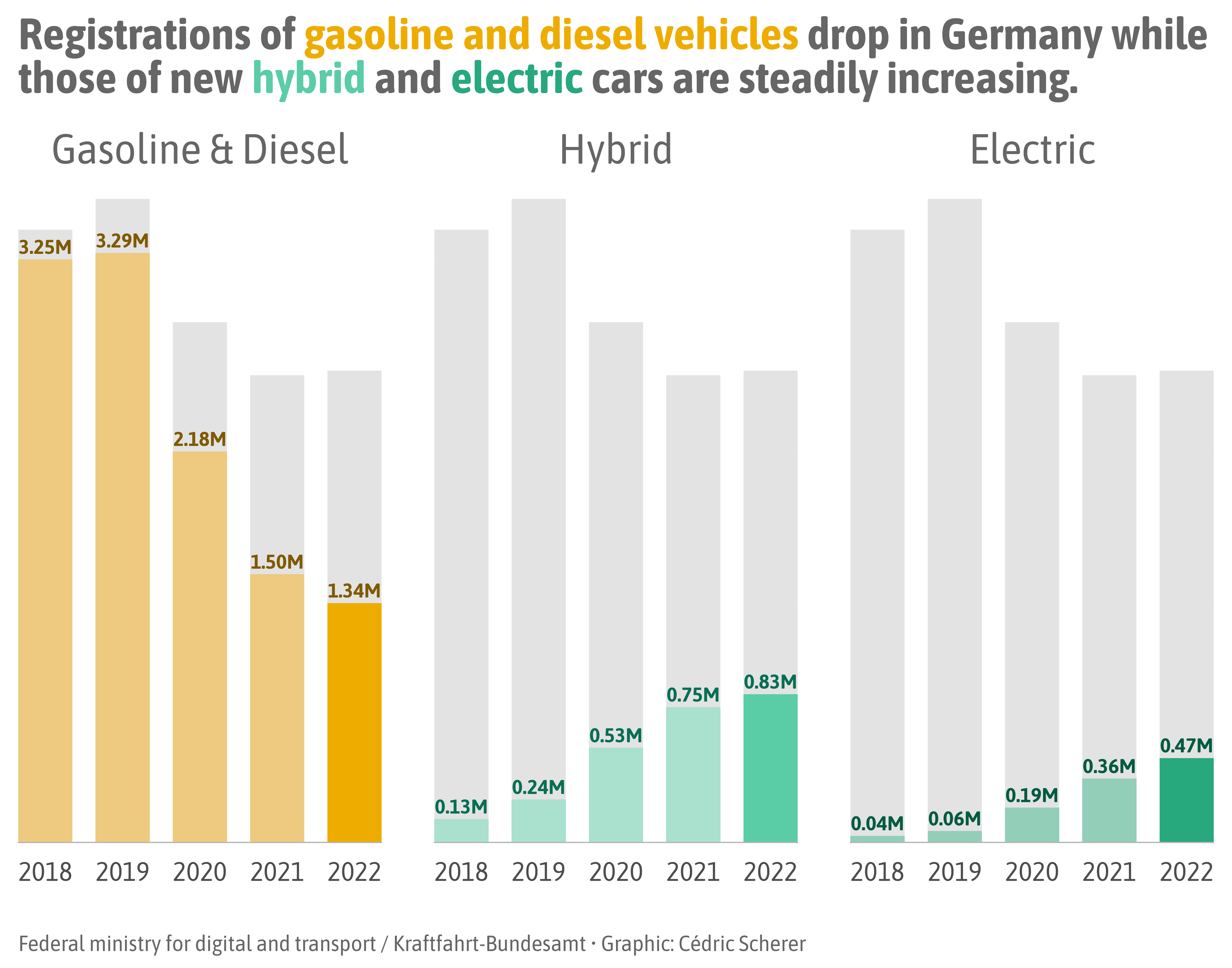
Source: Jan Kühn
Assist the Viewer
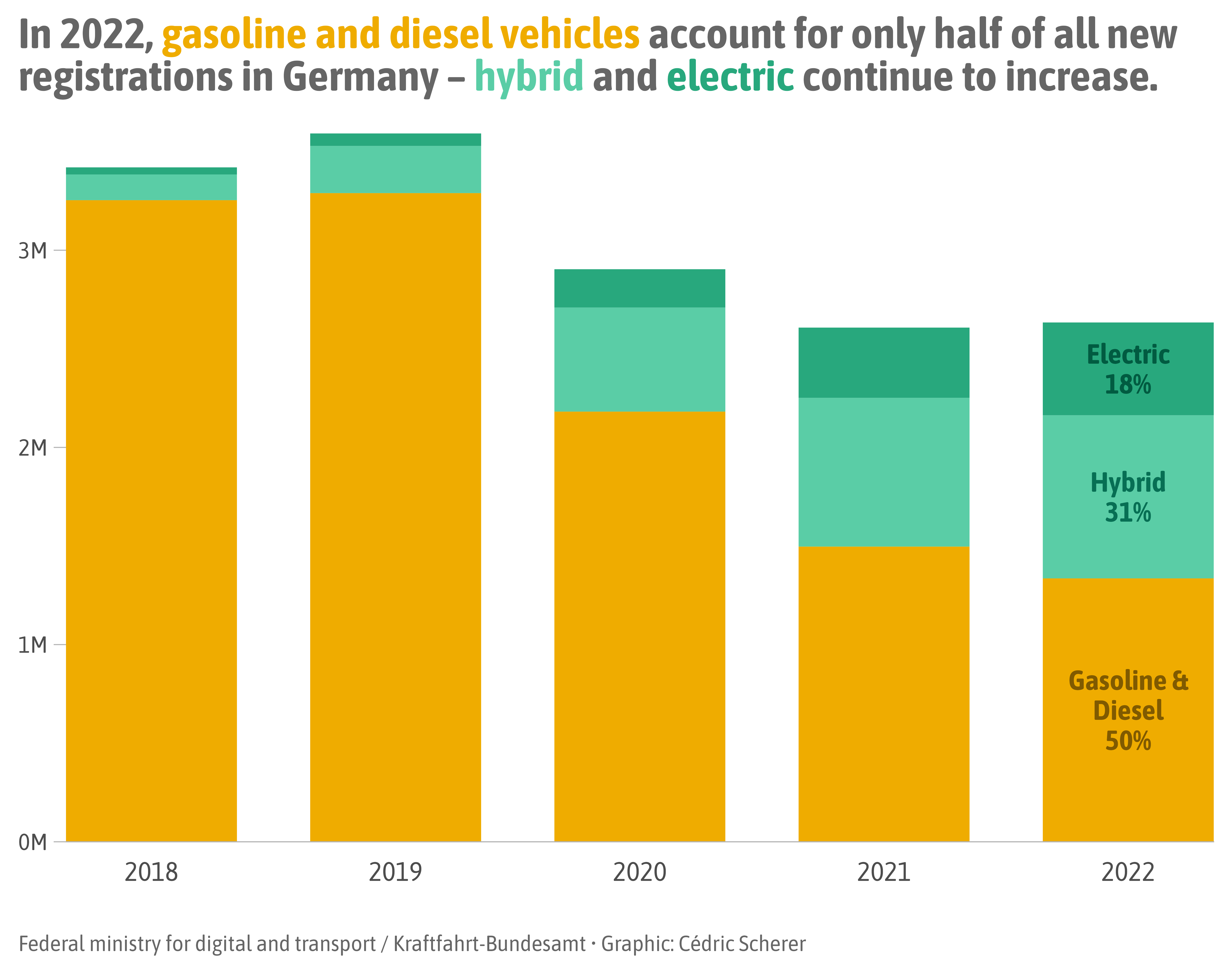
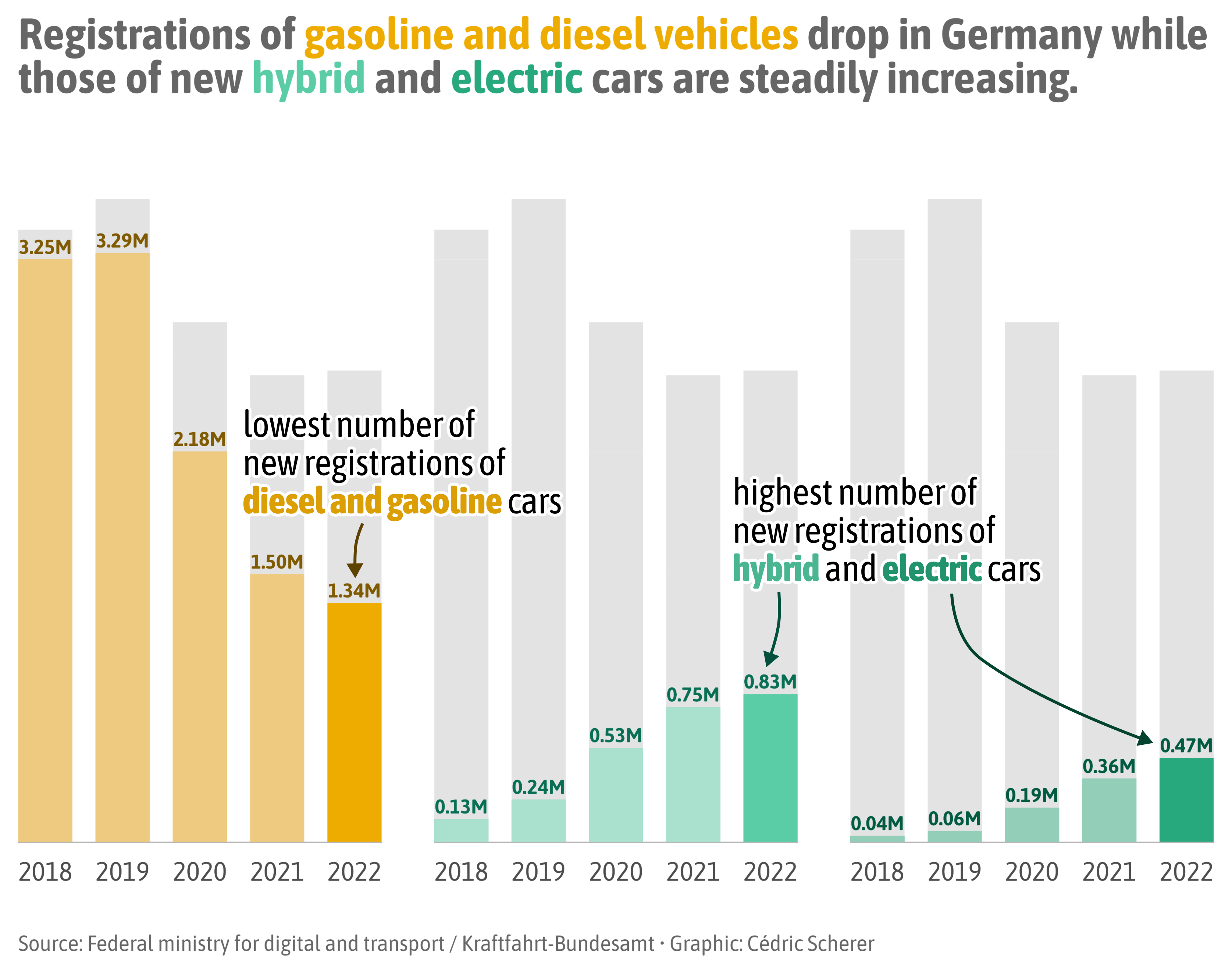
Source: Lisa Charlotte Muth, DataWrapper Blog
Assist the Viewer
Source: Lisa Charlotte Muth, DataWrapper Blog
Assist the Viewer
Source: Lisa Charlotte Muth, DataWrapper Blog
Illustrate with Images
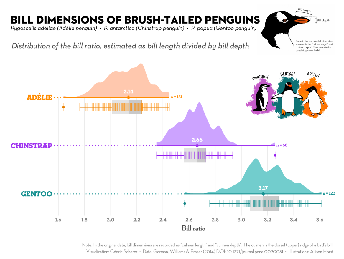
Modified #TidyTuesday Contribution | Images: Allison Horst
Illustrate with Images
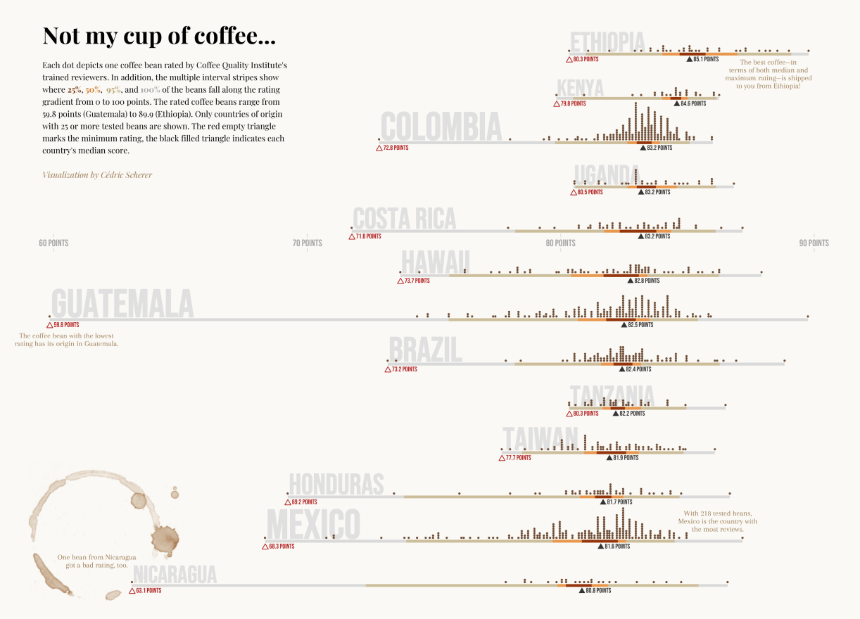
“Not my Cup of Coffee” (#TidyTuesday Contribution)
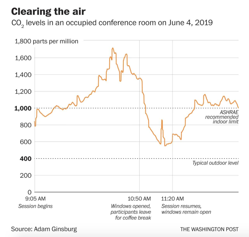
Source: “Clearing the Air” by Adam Ginsburg (Washington Post)
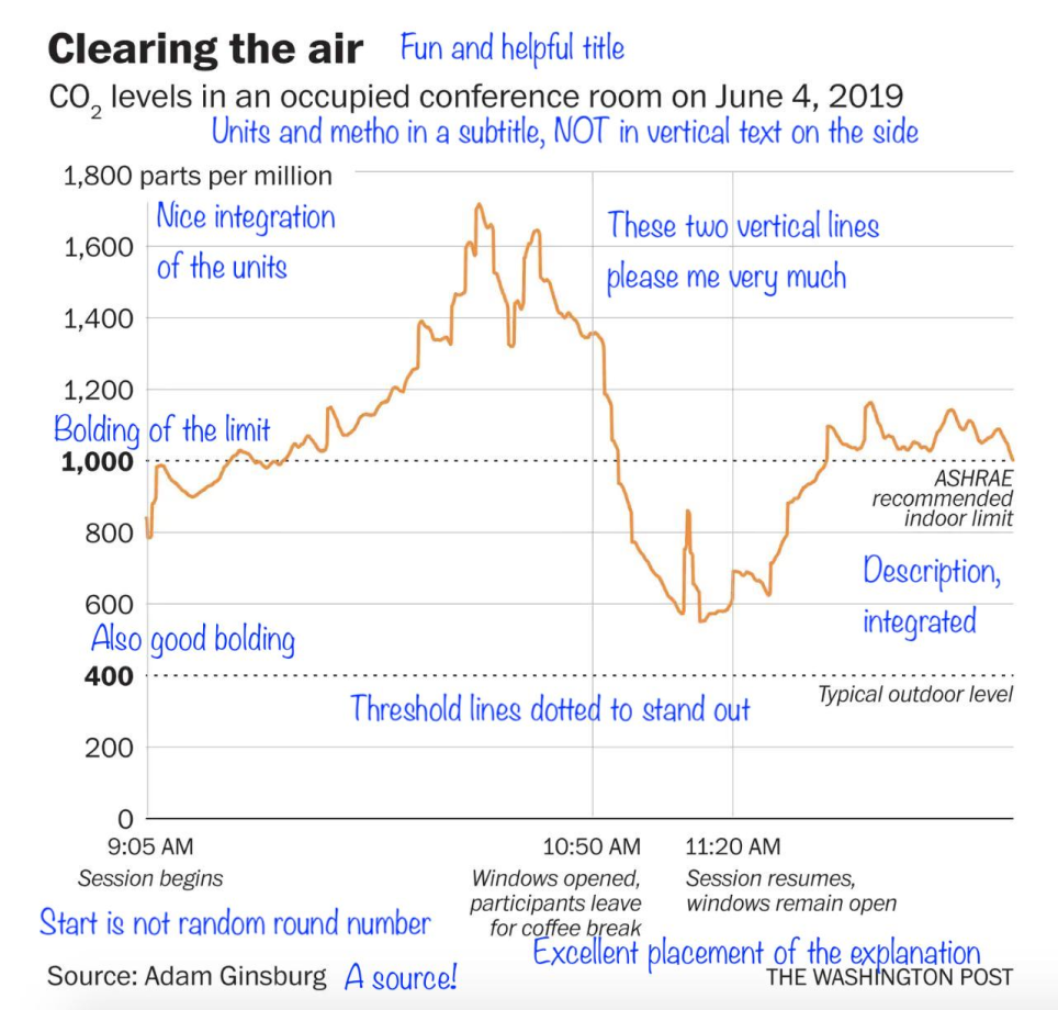
Notes by Francis Gagnon (Voilà)
Exercise 1
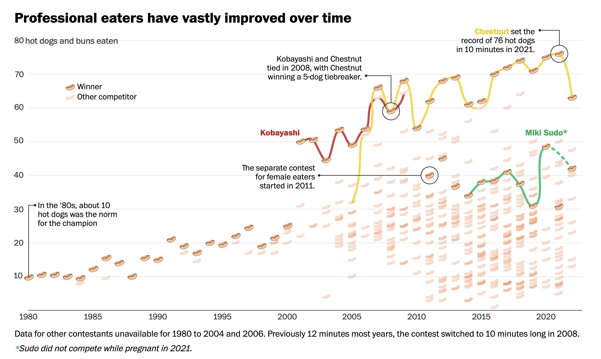
Source: “How hot dog contestants went from eating 10 to 76 hot dogs in 10 minutes” by Carson TerBush (Washington Post)
Exercise 2
Source: Storytelling with Data